* {
		padding: 0;
		margin: 0;
	}
	ul, ol {
		list-style: none;
	}
	a {
		text-decoration: none;
		color: #000;
	}
	section {
		height: 600px;
		border-bottom: 1px solid #000;
		position: relative;
	}
	.big {
		/*利用定位调整树叶位置*/
		position: absolute;
		width: 240px;
		height: 152px;
		background: url(images/page.png);
		left: 400px;
		bottom: 150px;
	}
	.small {
		position: absolute;
		width: 89px;
		height: 63px;
		background: url(images/page.png) 0 -152px;
		left: 250px;
		top: 50px;
		/*调用动画*/
		-webkit-animation: leaf 10s linear 0s infinite;
	}
	/*定义动画*/
	@-webkit-keyframes leaf {
		0% {
			/*在天上准备掉落*/
			opacity: 0;
			/*移动 旋转  每一个状态样式属性必须一一对应*/
			/*一个元素可以有多个变形 用空格隔开*/
			transform: rotate(0deg) translate(0,0);
		}
		30% {
			/*掉落在空中*/
			opacity: 1;
			transform: rotate(5deg) translate(200px,180px);
		}
		60% {
			/*掉落在地下*/
			opacity: 0;
			transform: rotate(10deg) translate(400px,360px);
		}
		100% {
			/*利用60-100对应的时间模拟等待*/
			opacity: 0;
			transform: rotate(10deg) translate(400px,360px);
		}
	}


	</style>
</head>
<body>
	<section>
		<div class="big"></div>
		<div class="small"></div>
	</section>
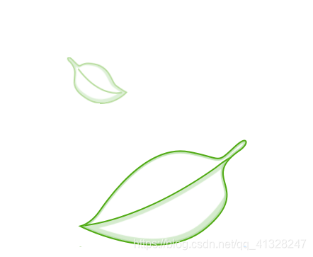


 本文详细介绍了如何使用CSS进行元素的定位与动画效果实现,通过具体案例展示了树叶掉落的动画过程,包括设置初始状态、空中飘落及落地后的效果。通过对opacity和transform属性的精确控制,实现了树叶从透明到可见再到透明的自然过渡,以及旋转和位移的动态展示。


 扫一扫
扫一扫


 2238
2238

 被折叠的 条评论
为什么被折叠?
被折叠的 条评论
为什么被折叠?
 到【灌水乐园】发言


