特点
- 配置化开发
- 校验规则自动生成
- 支持搜索栏模式/普通表单模式/表格模式/勾选模式
- 时间组件可进行时间自由限制
- 搜索栏模式自适应增加折叠按钮
- 增加默认按钮,默认进行校验
- 保留
elementui el-form原有功能
使用方式
<ws-form
:formConfigList="formConfigList"
:buttonConfigList="formButtons"
:allOptions="allOptions"
isSearchForm
@happenEvent="happenEvent"
:formData.sync="formData"
:extraComponents="extraComponents"
ref="wsForm"
>
<template #testSlot="{ fieldItem, formData }">
<el-input
clearable
v-model="formData[fieldItem.prop]"
:placeholder="fieldItem.disabled ? '' : '请输入内容'"
:disabled="fieldItem.disabled"
></el-input>
</template>
<template #download="scope">
<el-button type="primary" size="small" @click="happenEvent(scope)"
>下载</el-button
>
</template>
</ws-form>
export const formConfigList = [
{
component: 'el-select',
prop: 'testSelect',
label: '下拉框',
required: true,
},
{
component: 'el-input',
prop: 'testInput',
label: '输入框',
required: true,
blurHandler: function (value) {
if (/^\d*\.$/.test(value)) {
return value.replace('.', '')
}
return value
},
inputHandler: function (value) {
value = value.replace(/[^0-9.]/g, '')
return value.replace(/^\D*((0|[1-9][0-9]*)(?:\.\d{0,6})?).*$/g, '$1')
},
},
{
component: 'el-input',
prop: 'testTextarea',
label: '文本域',
componentAttrs: {
type: 'textarea',
},
},
{
component: 'el-date-picker',
prop: 'testMinDatetime',
label: '小时间',
required: true,
maxTimeProp: 'testMaxDatetime',
timeDisabled: true,
defaultTimeType: 'today',
componentAttrs: {
type: 'date',
valueFormat: 'yyyy-MM-dd',
},
},
{
component: 'el-date-picker',
prop: 'testMaxDatetime',
label: '大时间',
required: true,
minTimeProp: 'testMinDatetme',
timeDisabled: true,
minAllowEqual: false,
maxAllowEqual: false,
componentAttrs: {
type: 'date',
valueFormat: 'yyyy-MM-dd',
},
},
{
component: 'el-radio-group',
prop: 'testRadio',
label: '单选框',
required: true,
},
{
component: 'el-checkbox-group',
prop: 'testCheckbox',
label: '复选框',
required: true,
},
{
slotName: 'testSlot',
prop: 'testSlot',
label: '插槽',
required: true,
},
]
组件属性
| 参数 | 说明 | 类型 | 可选值 | 默认值 |
|---|
| allOptions | 所有表单下拉框选项集合,同 ws-table | Object | - | - |
| formConfigList | 表单元素配置数组 | Array | - | - |
| buttonConfigList | 按钮组配置 | Array | - | - |
| buttonSize | 按钮组尺寸 | String | - | small |
| formData | 表单数据 | Object | - | - |
| isSearchForm | 是否是搜索控件 | Boolean | - | false |
| useDefaultButtons | 是否使用默认的查询重置按钮 | Boolean | - | true |
| gutter | el-row 属性 | Number | - | 12 |
- formConfigList 内部对象属性(兼容 el-form-item 自带的属性, 不另作说明)
| 参数 | 说明 | 类型 | 可选值 | 默认值 |
|---|
| slotName | 表单元素内容插槽 | String | - | - |
| selectSlotName | 对应搜索框 el-option 插槽 | String | - | - |
| component | 组件名,用于表单组件 | String | - | - |
| blurHandler | el-input 组件失焦时值过滤 | Function(value) | - | - |
| inputHandler | el-input 组件输入时值过滤 | Function(value) | - | - |
| required | 是否必填 | Boolean | - | false |
| maxTimeProp | 时间组件最大值对应的字段 | String | - | - |
| minTimeProp | 时间组件最小值对应的字段 | String | - | - |
| minDate | 固定的最小时间 | String | - | - |
| maxDate | 固定的最大时间 | String | - | - |
| timeDisabled | 时间限制精度是否到时分秒 | Boolean | - | - |
| minAllowEqual | 允许和用于比较的最小时间相等,精度到天 | Boolean | - | true |
| maxAllowEqual | 允许和用于比较的最大时间相等,精度到天 | Boolean | - | true |
| defaultTimeType | 默认时间类型,支持去年/今年/明年的昨天/明天/今天 | String | - | ‘’ |
| componentAttrs | 组件对应的属性 | Object | - | - |
组件事件
| 事件名 | 说明 | 参数 |
|---|
| happenEvent | 行按钮点击事件 | eventData |
slot 插槽
formConfigList 配置 slotName 和 selectSlotName, 也支持按钮组 ws-buttons 配置的插槽
组件图片
普通表单模式
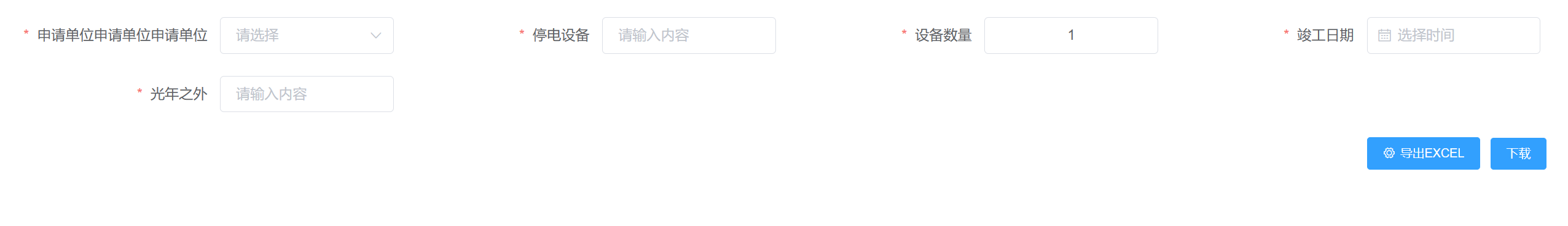
勾选表单模式
 搜索栏模式
搜索栏模式
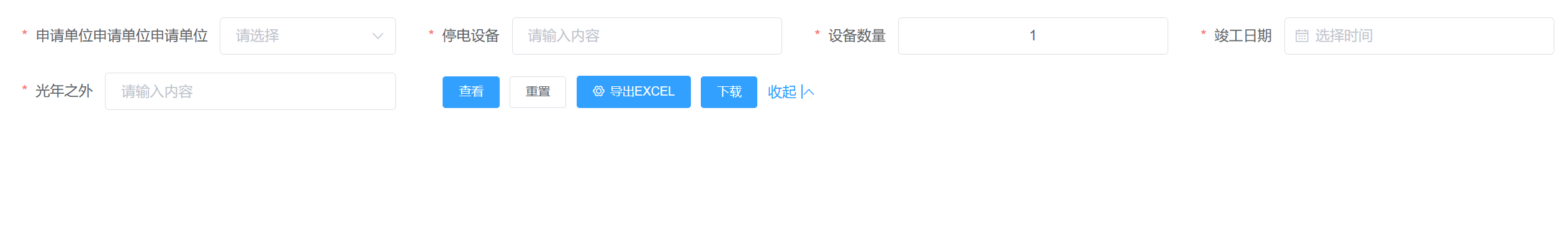
表格模式

组件地址
github地址


 扫一扫
扫一扫
 1211
1211

 被折叠的 条评论
为什么被折叠?
被折叠的 条评论
为什么被折叠?
 到【灌水乐园】发言


