


一、过渡(transiton)
1.四个属性
(1)transition-property:规定设置过渡效果的css属性的名称。
(2)transition-duration:定义过渡效果花费的时间。默认是 0。
(3)transition-timing-function:规定过渡效果的时间曲线。默认是 “ease”。
(4)transition-delay: 规定过渡效果何时开始。默认是 0。
2.实例
<!DOCTYPE html>
<html lang="en">
<head>
    <meta charset="UTF-8">
    <meta name="viewport" content="width=device-width, initial-scale=1.0">
    <title>Document</title>
    <style>
        .box1{
            width: 400px;
            height: 400px;
            background: skyblue;
            margin: 100px auto;
            transition: width 1s;   /*鼠标移出盒子的过渡效果*/
        }
        .box1:hover{
            width: 800px;
            transition: width 1s;
        }
    </style>
</head>
<body>
    <div class="box1"></div>
</body>
</html>
二、动画
1.实例
<html>
<head>
    <style>
        *{margin: 0;padding: 0;}
        body{
            background-color: black;
        }
        .sun{
            height: 300px;
            width: 300px;
            background-color: orange;
            position: absolute;
            top: 50%;
            left: 50%;
            margin-left: -150px;
            margin-top: -150px;
            border-radius: 50%;
            box-shadow: 0 0 120px 10px yellow;
            animation: run 1s infinite alternate;
            //infinite表示动画播放次数,alternate表示动画反向播放
        }
        @keyframes run {
            from{
                box-shadow: 0 0 80px 5px yellow;
            }
            to{
                box-shadow: 0 0 160px 10px yellow;
            }
        }
    </style>
</head>
<body>
    <div class="sun"></div>
</body>
</html>
animation-fill-mode: forwards; //动画停在终点
三、2D和3D转换
1.transform:
(1)translate()方法(移动)
translate(50px,100px); //把元素从左侧移动50像素,从顶端移动100像素
(2)rotate()方法(旋转)
rotate(30deg); //把元素顺时针旋转30度
(3)scale() 方法(放大缩小)
scale(2,4); //把宽度转换为原始尺寸的2倍,把高度转换为原来尺寸的4倍
(4)skew() 方法(绕x、y轴旋转)
skew(30deg,20deg); //围绕 X 轴把元素翻转 30 度,围绕 Y 轴翻转 20 度
实例
transform: rotateX(-30deg) rotateY(30deg);
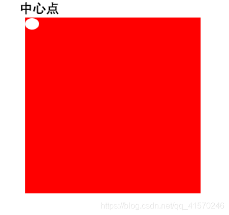
2.transform-origin属性:用来确定元素的中心点(默认50% 50%)
transform-origin:0% 0%; //中心点在元素的最左上角
3.用于3D的一些属性
(1)perspective:视距
(2)transform-style:preserve 子元素保留其3D位置
(3)perspective-origin
(4)backface-visibility: visible|hidden; 背面是可见的|背面是不可见的
4.让元素旋转的实例
元素旋转跟原点(transform-origin)有关。
.bigBox{
            width: 300px;
            height: 300px;
            position: relative;
            margin: 300px auto;
            /*perspective: 800px;*/
            transform-style: preserve-3d;
            transform: rotateX(-30deg) rotateY(30deg);
            perspective-origin: 50% 50%;     /*x,y所组成视点的位置*/
            animation: run 5s linear infinite;
        }
        @keyframes run {
            from{
                transform: rotateX(-30deg) rotateY(30deg);
            }
            to{
                transform: rotateX(-390deg) rotateY(390deg);
            }
        }


 2717
2717


 被折叠的 条评论
为什么被折叠?
被折叠的 条评论
为什么被折叠?
 到【灌水乐园】发言


