


一、下载 deveco-studio 编译器
https://developer.huawei.com/consumer/cn/deveco-studio/#download
二、ArkTs
0、基本数据类型:
3种:string、number、boolean
1、存储数据(变量、常量)
注:类似于 ts
使用 console.log() 打印日志时,需要console.log('names', names)
1)变量声明 let
// let 变量名: 类型 = 值

// 定义字符串
let title : string = '张三'
console.log("title:", title)
// title = '李四'
// console.log("title:", title)

// 定义数字
let age : number = 18
console.log("age:", age)

// 定义布尔
let checked : boolean = true
console.log("checked:", checked)
2)常量声明const
常量:用来存储数据(后续不可修变)
// const 常量名: 类型 = 值
const num1: number = 123
console.log("num1", num1)
注意事项:
- 只能包含数据、字母、下划线、$,不能以数字开头
- 不能使用内置关键字或保留字(比如let、const、this、class)
- 严格区分大小写
3)数组
// 定义数组
// let 数组名: 类型[] = [数据1,数据2,数据3]
let names: string[] = ['张三', '李四', '王武']
console.log('names', names)
let nums: number[] = [1,3,5]
console.log('nums', nums)
注意:数组指定的类型和存储的数据类型必须要一致,否则会报错
获取数组元素:数组名[索引]
4)函数
函数:是可以被重复使用的代码块。
作用:函数是可以把具有相同或相似逻辑的代码包裹起来,有利于代码复用。
// 1、定义函数
/*function 函数名() {
 *	函数体
 * }
 * */

function fn() {
  console.log('五角星', '⭐️')
  console.log('五角星', '⭐️⭐️')
  console.log('五角星', '⭐️⭐️⭐️')
  console.log('五角星', '⭐️⭐️⭐️⭐️')
  console.log('五角星', '⭐️⭐️⭐️⭐️⭐️')
}
// 2、调用函数
// 函数名()
fn()
fn()
fn()
注意:先定义,后使用(变量、函数都是如此)
函数完整写法
根据传入不同的数据,进行处理,返回处理后的结果。
// 函数完整写法
function 函数名(形参1: 类型, 形参2: 类型, ...) {
  编写代码对数据进行处理
  return 处理后对结果
}

let 变量名: 类型 = 函数名(实参1,实参2, ...)
// 实现下面需求
// 传入 价格 和 数量,返回 计算的结果
// 1.苹果 2元/斤,买了3斤,多少钱?
// 2.香蕉 4元/斤,买了4斤,多少钱?

function buy(price: number, num: number) {
  // 1.处理数据
  let result = price * num
  // 2.返回数据
  return result
}

let apple: number = buy(2,3)
console.log('apple', apple)
let banana: number = buy(4, 4)
console.log('banana', banana)
剪头函数
更简洁
/*
 * () => {
 *  函数体
 * }
 * */
let buy = (price: number, num: number) => {
    // 1.处理数据
    let result = price * num
    // 2.返回数据
    return result
}
5)接口和对象
对象是什么?
是一个容器,可以保存不同类型数据。
对象有什么用
可以用来描述物体特征和行为。
如何定义对象?
先定义接口,再基于接口约定对象结构类型,定义对象
如何访问对象属性?
对象.属性名
接口
接口是用来约定对象结构类型的。
定义/使用对象属性:
属性作用是描述对象的特征
// 1.定义接口
interface Person {
  name: string
  age: number
  weight: number
}
// 2.基于接口,定义对象
let person1: Person = {
  name: '张三',
  age: 19,
  weight: 100
}
// 3.获取对象属性值
console.log('name', person1.name)
定义/使用对象方法:
方法作用是描述对象的具体行为
1、约定方法类型
interface 接口名称 {
  方法名: (参数: 类型) => 返回值类型
}
interface Person {
  sing: (song: string) => void
  dance: () => void
}
2、添加方法(剪头函数)
let person1: Person = {
  sing: (song: string) => {
    console.log('唱个歌', song)
  },
  dance: () => {
    console.log('跳个舞')
  }
}
person1.sing('爱的供养')
person1.dance()
// 1.定义接口
interface Person {
  name: string
  age: number
  weight: number
  sing: (song: string) => void
  dance: () => void
}
// 2.基于接口,定义对象
let person1: Person = {
  name: '张三',
  age: 19,
  weight: 100,
  sing: (song: string) => {
    console.log('唱个歌', song)
  },
  dance: () => {
    console.log('跳个舞')
  }
}
// 3.获取对象属性值
console.log('name', person1.name)
person1.sing('爱的供养')
person1.dance()
6)联合类型(由多个类型联合组成的数据类型)
联合类型是一种灵活的数据类型,它修饰的变量可以存储不同类型的数据。
语法:let 变量: 类型1 | 类型2 | 类型3 = 值
let judge: string | number = '优秀'
judge = 99
console.log('judge', judge)
拓展:上面是把变量存储为 多种类型 的数据,也可以把变量值限定在一组数据范围内选择:
语法:let 变量: 数值1 | 数值2 | 数值3 = 数值1
let gender: 'man' | 'woman' | 'secret' = 'man'
7)枚举
枚举类型是一种特殊的数据类型,约定变量只能在一组数据范围内选择值。
1.定义枚举类型(常量列表)
enum 枚举名 {
	常量1 = 值
	常量2 = 值
}
2.使用枚举类型,约束变量
let color: 枚举名 = 枚举名.常量1
例:
enum ThemeColor {
  Red = '#ffaf29',
  Orange = '#ff7100',
  Green = '#30b30e'
}

let color: ThemeColor = ThemeColor.Orange
console.log(color)
枚举特点:
是一种特殊的数据类型。
约定变量也只能在一组数据范围内选择,提高可维护性。
枚举类型怎么使用?
声明枚举类型 - 》使用枚举数据
三、ArkUI
1、组件
ArkUI构建界面最小的单元是 组件。
组件分类:
容器组件:Column、Row
基础组件:Text
布局思路:先排版,再放内容。
注意:build有且只能由一个根元素,且是容器组件。
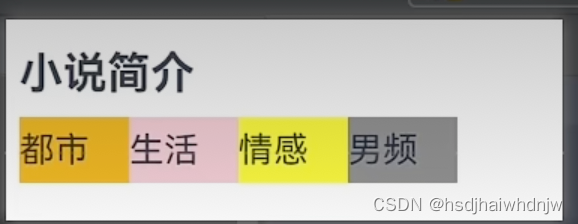
1)Column、Row、Text
//	src/main/ets/pages/Index.ets
@Entry
@Component
struct Index {
  @State message: string = '鸿蒙学习'
  build() {
    Column() {
      Text("小说简介")
      Row() {
        Text("都市")
        Text("生活")
        Text("情感")
        Text("男频")
      }
    }
  }
}
2)Image
  build() {
    Column() {
    	// png图片
      // 网络图片:Image(图片地址)
      // Image('https://www.harmonyos.com/resource/image/partner/harmonyos-connect/pic_shengtai_connect_renzheng.png')
      //   .width(200)

      // 本地图片 Image($r('app.media.图片名称'))
      Image($r('app.media.IMG102346'))
        .width(300)
      Text('漂亮的图片')
        .width(300)
      Row() {
        Image($r('app.media.icon'))
          .width(30)
        Text('永不脱发的萝卜')
      }
      .width(300)
      // 矢量图
	  Image($r("app.media.ic_shouye"))
        .width(50)
        .fillColor(Color.Green)
    }
  }
3)TextInput、Button
  build() {
    Column({ space: 16 }) {
      Image($r('app.media.app_icon'))
        .width(50)
      TextInput({
        placeholder: '请输入用户名'
      })
      TextInput({
        placeholder: '请输入密码'
      })
        .type(InputType.Password)
      Button('登录').width('100%')
      Row({ space: 16 }) {
        Text('前往注册')
        Text('忘记密码')
      }
    }
    .width('100%')
    .padding(32)
  }
4)Flex 伸缩布局
Flex 伸缩布局,默认主轴为 x 轴(从左到右),副轴为 y 轴(从上到下)
当子盒子的总和溢出父盒子,默认进行压缩显示。
1、修改主轴方向
direction:FlexDirection.Row/Column
2、设置主轴对齐方式
justifyContent: FlexAlign.SpaceBetween
3、设置副轴对齐方式
alignItems: ItemAlign.XX
4、换行 wrap
wrap: FlexWrap.Wrap/NoWrap
单行或者单列的情况,优先使用线性布局(本质基于Flex设计的,另外做了优化)
build() {
    Flex({
      direction: FlexDirection.Row,
      justifyContent: FlexAlign.SpaceBetween,
      alignItems: ItemAlign.Center,
      wrap: FlexWrap.Wrap
    }) {
      Text()
        .width(80).height(80)
        .border({ width: 1, color: '#999' })
        .backgroundColor(Color.Pink)
      Text()
        .width(80).height(80)
        .border({ width: 1, color: '#999' })
        .backgroundColor(Color.Pink)
      Text()
        .width(80).height(80)
        .border({ width: 1, color: '#999' })
        .backgroundColor(Color.Pink)
      Text()
        .width(80).height(80)
        .border({ width: 1, color: '#999' })
        .backgroundColor(Color.Pink)
      Text()
        .width(80).height(80)
        .border({ width: 1, color: '#999' })
        .backgroundColor(Color.Pink)
      Text()
        .width(80).height(80)
        .border({ width: 1, color: '#999' })
        .backgroundColor(Color.Pink)
    }.width('100%').height(800).backgroundColor('#ccc')
  }
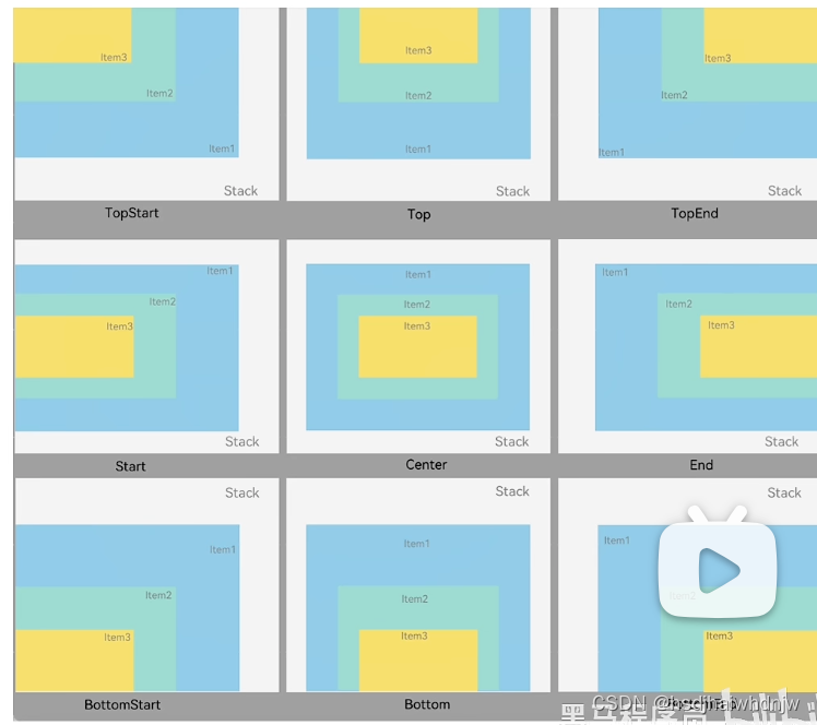
5)Stack 层叠布局
特点:层叠操作更简洁,编码效率更高(绝对定位灵活性更高)。
共有9种对齐方式
Column() {
      Stack({
        alignContent: Alignment.Bottom
      }) {
        Text('元素1')
          .width(300).height(300)
          .backgroundColor(Color.Green)
        Text('元素1')
          .width(200).height(200)
          .backgroundColor(Color.Yellow)
        Text('元素1')
          .width(100).height(100)
          .backgroundColor(Color.Orange)
      }
        .width('100%')
        .height(600)
        .backgroundColor('#ccc')
    }
案例-音乐播放卡片:

build() {
    Column() {
      Column() {
        Stack({
          alignContent: Alignment.Bottom
        }) {
          Image($r('app.media.IMG102346'))
            .width(200)
            .borderRadius({
              topLeft: 10,
              topRight: 10
            })

          Row() {
            Row() {
              Image($r('app.media.ic_video'))
                .width(16)
                .margin({ right: 6 })
                .fillColor(Color.White)
              Text('288万')
                .fontSize(12)
                .fontColor('#fff')
            }
            .margin({right: 10})
            Row() {
              Image($r('app.media.ic_comments'))
                .width(16)
                .margin({ right: 6 })
                .fillColor(Color.White)
              Text('8655')
                .fontSize(12)
                .fontColor('#fff')
            }
            Blank()
            Text('4:33')
              .fontSize(12)
              .fontColor('#fff')
          }
          .width('100%')
          .padding(8)
        }
        Column() {
          Text('【凤凰传奇新歌】欢迎来到国风统治曲:唢呐神曲唢呐神曲唢呐神曲唢呐神曲')
            .lineHeight(16)
            .textOverflow({
              overflow: TextOverflow.Ellipsis
            })
            .maxLines(2)

          Row() {
            Text('19万点赞')
              .fontSize(10)
              .padding(4)
              .borderRadius(4)
              .fontColor('#c87d61')
              .backgroundColor('#fbf4ed')
            Image($r('app.media.ic_more'))
              .width(14)
              .fillColor('#c5c5c5')
          }
          .width('100%')
          .margin( { top: 10 })
          .justifyContent(FlexAlign.SpaceBetween)
        }
        .width('100%')
        .padding(9)
        .backgroundColor(Color.White)
      }
      .width(200)
      .height(200)
    }
    .width('100%')
    .height(800)
    .padding({ top: 80 })
    .backgroundColor('#ccc')
  }
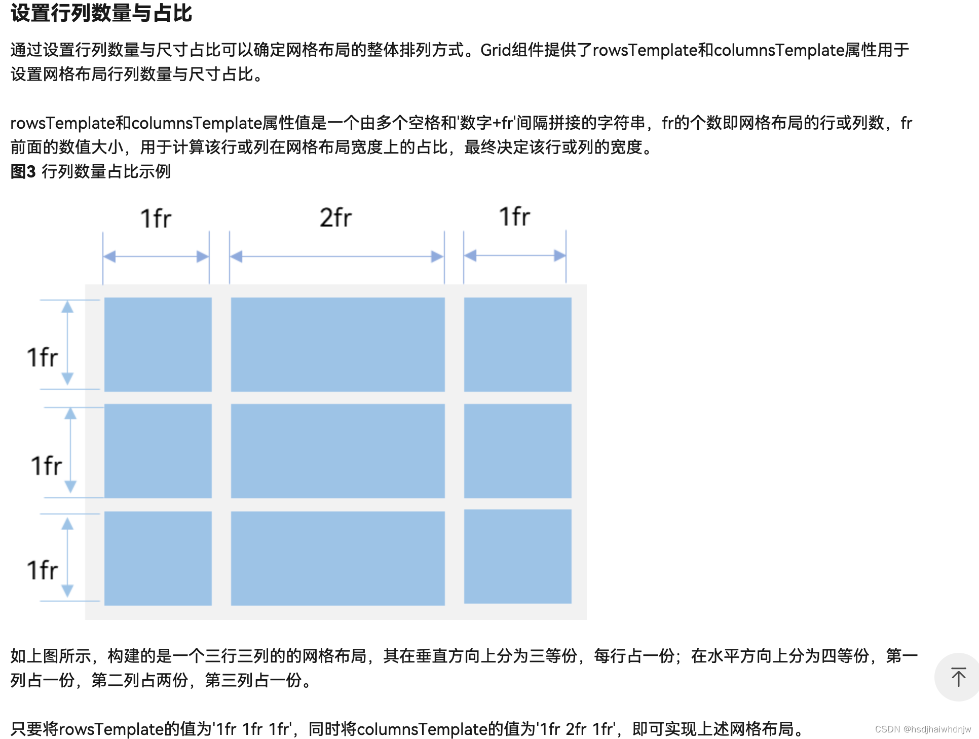
6)栅格布局 Grid
Grid() {
  ForEach([0, 1,2,3,4,5,6,7,8,10,11,12], (item) => {
    GridItem() {
      Badge({
        count: 1,
        style: {
          fontSize: 14
        }
      }) {
        Image($r('app.media.bg_01'))
          .width(80)
      }
    }.backgroundColor(Color.Blue)
  })
}
  .columnsTemplate('1fr 1fr 1fr 1fr')
  .rowsTemplate('1fr 1fr 1fr')
  .columnsGap(0)
  .rowsGap(10)
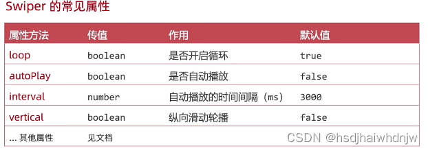
7)Swiper
Column() {
      Swiper() {
        Text('1').backgroundColor(Color.Pink)
        Text('2').backgroundColor(Color.Yellow)
        Text('3').backgroundColor(Color.Green)
        Text('4').backgroundColor(Color.Blue)
      }
        .width('100%')
        .height(100)
        .loop(true) // 是否循环
        .autoPlay(true) // 是否自动播放
        .interval(1000) // 自动播放间隔
        .vertical(false) // 是否纵向轮播
        .indicator(true)  // 是否需要导航点
        .indicatorStyle({
          size: 40,
          color: Color.White,
          selectedColor: Color.Black
        })

    }
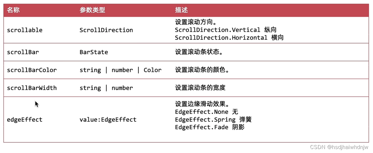
8)Scroll
1.用法:
1.设置尺寸
2.设置溢出的子组件(只支持一个子组件)
3.滚动方向(支持横向和纵向,默认纵向)
常用属性:
2.滚动容器 Scroller - 控制器
步骤:
- 实例化 Scroller 的控制器
myScoller: Scroller = new Scroller() - 绑定给 Scroll 组件
- 控制器的方法 控制滚动(如
this.myScoller.scrollEdge(Edge.Top)控制滚动到顶部),控制器属性 获取滚动距离(如this.myScoller.currentOffset().yOffset获取滚动到 y 轴上的距离)
3.滚动容器 Scroll - 事件
.onScroll((x,y) => {console.log('y:',this.myScoller.currentOffset().yOffset)})列表滚动就会触发
@Entry
@Component
struct Index {
  // 1、创建 Scroll 对象(实例化一个 Scroll 对象)
  myScoller: Scroller = new Scroller()
  build() {
    Column({space: 18}) {
      // 将实例对象绑定给 Scroll 组件
      Scroll(this.myScoller) {
        Column({space: 10}) {
          ForEach(Array.from({length: 24}), (item:string, index) => {
            // Text('12')
            Text(`测试文本${index}`)
              .height(60)
              .width('100%')
              .borderRadius(10)
              .backgroundColor(Color.Orange)
          })
        }
      }
      .height(600)
      .padding(10)
      .scrollable(ScrollDirection.Vertical) // 设置滚动方向(水平|垂直)
      .scrollBar(BarState.On)  // 设置滚动条状态(是否显示)
      .scrollBarColor(Color.Blue)  // 设置滚动条颜色
      .scrollBarWidth(20) // 设置滚动条宽度
      .edgeEffect(EdgeEffect.Fade)  // 设置边缘(顶部、底部)滑动效果
      .onScroll((x,y) => {
        console.log('y:',this.myScoller.currentOffset().yOffset)
      })

      Button('控制滚动条位置')
        .onClick(() => {
          this.myScoller.scrollEdge(Edge.Top)
        })

      Button('获取已经滚动的距离')
        .onClick(() => {
          let y = this.myScoller.currentOffset().yOffset
          AlertDialog.show({
            message: `y:${y}`
          })
        })
    }
    .width('100%')
    .height('100%')
  }
}
案例:
/*
- 案例:模仿京东
- 1、点击回到顶部按钮,列表滚动到最上面
- 2、按钮显示效果切换
- 默认隐藏
- 滚动距离超过 400,显示,反之 隐藏
- */
/*
 * 案例:模仿京东
 * 1、点击回到顶部按钮,列表滚动到最上面
 * 2、按钮显示效果切换
 *    默认隐藏
 *    滚动距离超过 400,显示,反之 隐藏
 * */
@Entry
@Component
struct Index {
  // 1、创建 Scroll 对象(实例化一个 Scroll 对象)
  myScoller: Scroller = new Scroller()
  @State yOffset:number = 0
  build() {
    Column({space: 18}) {
      // 将实例对象绑定给 Scroll 组件
      Scroll(this.myScoller) {
        Column({space: 10}) {
          ForEach(Array.from({length: 24}), (item:string, index) => {
            // Text('12')
            Text(`测试文本${index}`)
              .height(60)
              .width('100%')
              .borderRadius(10)
              .backgroundColor(Color.Orange)
          })
        }
      }
      .height('100%')
      .padding(10)
      .scrollable(ScrollDirection.Vertical) // 设置滚动方向(水平|垂直)
      .scrollBar(BarState.On)  // 设置滚动条状态(是否显示)
      .scrollBarColor(Color.Blue)  // 设置滚动条颜色
      .scrollBarWidth(20) // 设置滚动条宽度
      .edgeEffect(EdgeEffect.Fade)  // 设置边缘(顶部、底部)滑动效果
      .onScroll((x,y) => {
        this.yOffset = this.myScoller.currentOffset().yOffset
        // console.log('y:',this.myScoller.currentOffset().yOffset)
      })

      if(this.yOffset >= 400) {
        Text('回到顶部')
          .width(80)
          .height(50)
          .fontColor(Color.White)
          .textAlign(TextAlign.Center)
          .borderRadius(25)
          .offset({x:100, y:-90})
          .backgroundColor(Color.Grey)
          .onClick(() => {
            this.myScoller.scrollEdge(Edge.Top)
          })
      }
    }
      .width('100%')
      .height('100%')
  }
}
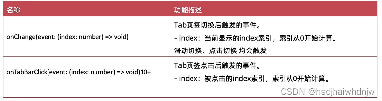
9)容器组件 Tabs
- 参数:barPosition 设置导航栏居于什么位置
- 属性:
.vertical(false) // 调整导航 水平 或 垂直
.animationDuration(200) // 点击滑动动画时间,为 0 时没有动画
.scrollable(false) // 调整是否 手势滑动 切换
.barMode(BarMode.Scrollable) // 调整导航栏是否滚动(导航tab较多时使用)
 titles: string[] = [
    '首页', '关注', '热门', '军事', '体育',
    // '八卦', '数码', '财经', '美食', '旅行'
  ]
  build() {
    Tabs({barPosition: BarPosition.Start}) {
      ForEach(this.titles, (item:string, index) => {
        TabContent() {
          Text(`${item}内容`)
        }
        .tabBar(item)
      })
    }
      .vertical(false) // 调整导航 水平 或 垂直
      .animationDuration(200) // 点击滑动动画时间,为 0 时没有动画
      .scrollable(false)  // 调整是否 手势滑动 切换
      .barMode(BarMode.Scrollable)  // 调整导航栏是否滚动(导航tab较多时使用)
  }
}
- 方法:
使用 @Builder 抽取 tabBar 的结构或样式
案例:
@State selectIndex:number = 0
@Builder
tabBarBuilder(itemIndex, title, img: ResourceStr, selectImg: ResourceStr) {
Column() {
Image(itemIndex === this.selectIndex ? selectImg : img)
.width(20)
Text(title)
.fontColor(itemIndex === this.selectIndex ? Color.Orange:Color.Black)
}
}
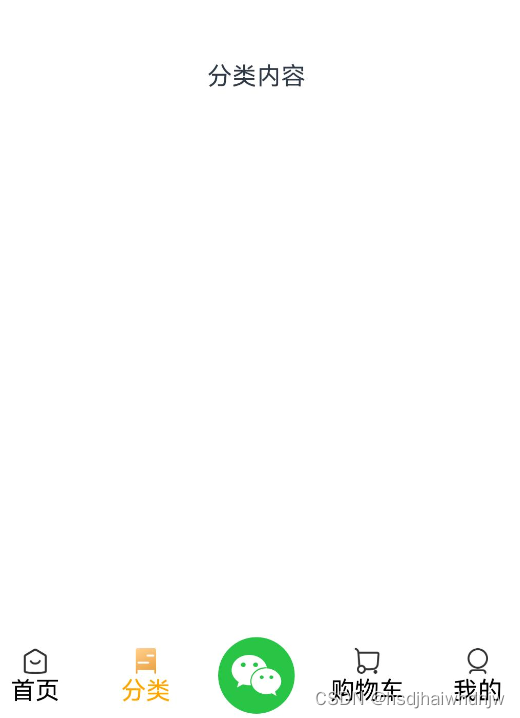
@Builder
centerTabBarBuilder() {
Image($r('app.media.ic_weixin'))
.width(50)
}
build() {
Tabs({barPosition: BarPosition.End}) {
TabContent() {
Text('首页内容')
}.tabBar(this.tabBarBuilder(0,'首页',$r('app.media.ic_tabbar_icon_0'),$r('app.media.ic_tabbar_icon_0_selected')))
TabContent() {
Text('分类内容')
}.tabBar(this.tabBarBuilder(1,'分类',$r('app.media.ic_tabbar_icon_1'),$r('app.media.ic_tabbar_icon_1_selected')))
TabContent() {
Text('活动内容')
}.tabBar(this.centerTabBarBuilder())
TabContent() {
Text('购物车内容')
}.tabBar(this.tabBarBuilder(3,'购物车',$r('app.media.ic_tabbar_icon_2'),$r('app.media.ic_tabbar_icon_2_selected')))
TabContent() {
Text('我的内容')
}.tabBar(this.tabBarBuilder(4,'我的',$r('app.media.ic_tabbar_icon_3'),$r('app.media.ic_tabbar_icon_3_selected')))
}
.onChange((index) => {
this.selectIndex = index
})
}
10)List

List() {
   ForEach(Array.from({ length:20 }), () => {
     ListItem(){
       Row() {

       }
       .width('50%')
       .height(100)
       .margin(10)
       .backgroundColor(Color.Blue)
     }
   })
 }
 .width('100%')
 .layoutWeight(1)
 .backgroundColor(Color.Gray)
 .listDirection(Axis.Vertical) // 设置主轴方向(垂直/水平)
 .lanes(3)  // 交叉轴布局,设置列数
 .alignListItem(ListItemAlign.Center)  // 设置列对齐方式
 .scrollBar(BarState.Auto) // 设置滚动条状态
 .divider({
   strokeWidth: 10,  // 设置分割线宽度
   color: Color.White, // 设置分割线颜色
   startMargin: 10,  // 设置分割线左边边距
   endMargin: 10 // 设置分割线右边边距
 })
组件都可以链式调用设置属性。
| 组件 | 使用 |
|---|---|
| Column | 容器组件,纵向排列,接收一个对象,可以配置内部组件的间距。Column({space: 10}) {} |
| Row | 容器组件,横向排列 |
| Text | 文本组件 |
| Image | 图片组件,有两种写法:①网络图片Image(图片地址),②本地图片Image($r('app.media.imageName')),表示引入 路径MyApplication/entry/src/main/resources/base/media 下的图片 imageName。该标签适用于 png、svg等图片,svg图片相对于其他类型图片来说,除了可以使用 width、height等常见属性,还可以使用 fillColor 设置图片样式,且图片尺寸的修改不会使图片失真,图片名,通常以 ic_ 开头。 |
| TextInput | 输入框组件,接收一个对象,可配置 placeholder,可链式调用设置type。TextInput({ placeholder: '请输入密码'}).type(InputType.Password) |
| Button | 按钮组件 |
| Blank | 填充组件,高度拉伸。(常用于底部按钮上方,使按钮在不同尺寸的设备上都居于底部。) |
| Flex | 伸缩布局,默认主轴为 x 轴(从左到右),副轴为 y 轴(从上到下)。Flex({ direction: FlexDirection.Row, justifyContent: FlexAlign.SpaceBetween, alignItems: ItemAlign.Center, wrap: FlexWrap.Wrap }) |
| Stack | 层叠布局。层叠布局具有较强的组件层叠能力,可以配置组件对齐方式Stack({alignContent: Alignment.Bottom}) {},共有9种对齐方式。场景:卡片层叠效果等。 |
| Scroll | 滚动组件。可配置属性:scrollable(水平|垂直滚动) |
| List | 列表组件,也可滚动,相对于 Scroll 来说,list 有更多可配置项。子组件需要是 ListItem。 |
| Tabs | 容器组件(滚动导航栏)。接收参数如 barPosition(导航栏位置:上下左右),属性:vertical(调整导航栏水平|垂直)、animationDuration(调整内容区域滑动到时间)、scrollable(是否可以使用 手势滑动 切换内容区域)、barMode(调整导航栏是否可以滚动);方法:onChange、onClick |
| AlertDialog | 对话框组件。语法:AlertDialog.show({ message: '这是一个对话框' }) |
| Badge | 徽章组件(如微信右上角加消息通知个数)。Badge({count:1,style:{fontSize: 14...}}) {Image()},count 和style 是必填项,没有回报错 |
| Grid | 栅格布局。内部要使用 GridItem 组件。关键属性有:.columnsTemplate('1fr 1fr 1fr 1fr')几个 fr 表示显示几列,数字代表列宽对应的比例;.rowsTemplate('1fr 1fr 1fr')与 columnsTemplate 类似;.columnsGap(10)设置列与列之间的间隔;.rowsGap(10)设置行与行之间的间隔。 |
| GridItem | 栅格内的每一项 |
| Swiper | 轮播组件。可配置:loop(是否循环播放)、autoPlay(是否自动播放)、interval(卡片切换间隔)、vertical(是否纵向轮播)、indicator(是否需要导航点)、indicatorStyle(导航点样式)等属性 |
2、组件属性方法
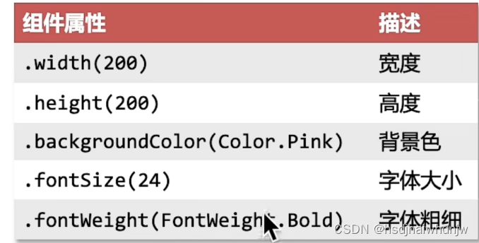
1)width、height、fontSize、fontWeight
build() {
 Column() {
    Text("小说简介")
      .width('100%')
      .height(40)
      .fontSize(20)
      .fontWeight(FontWeight.Bold)
    Row() {
      Text("都市")
        .width(40)
        .height(30)
        .backgroundColor(Color.Orange)
      Text("生活")
        .width(40)
        .height(30)
        .backgroundColor(Color.Pink)
      Text("情感")
        .width(40)
        .height(30)
        .backgroundColor(Color.Yellow)
      Text("男频")
        .width(40)
        .height(30)
        .backgroundColor(Color.Gray)
    }
    .width('100%')
  }
}

@Entry
@Component
struct Index {
  @State message: string = '鸿蒙学习'
  build() {
    Column() {
      Text('鸿蒙开发,大势所趋')
        .width('100%')
        .height(50)
        .fontWeight(FontWeight.Bold)
        .fontSize(28)
      Row() {
        Text('置顶  ')
          .fontColor('#df3c50')
        Text('新华社  ')
          .fontColor('#a1a1a1')
        Text('345评论')
          .fontColor('#a1a1a1')
      }
      .width('100%')
    }
  }
}
fontColor:设置文字颜色Text('鸿蒙').fontColor('#df3c50'),色值可以使用鸿蒙内嵌的颜色枚举fontColor(Color.Gray),也可使用色值fontColor('#a1a1a1')
2)textOverflow、maxLines、lineHeight
build() {
    Column() {
      Text('方舟开发框架(简称ArkUI)为 HarmonyOS 应用的 UI 开发提供了完整的基础设施,包括简洁的 UI 语法、丰富的 UI 功能(组件、布局、动画以及交互事件),以及实现界面预览工具等,可以支持开发者进行可视化界面开发。')
        .width('100%')
        .lineHeight(30)
        .textOverflow({
          overflow: TextOverflow.Ellipsis
        })
        .maxLines(3)
    }
  }
3)padding、margin
build() {
    Column() {
      Text('哇哈哈')
        .backgroundColor(Color.Red)
        // .padding(20)
        .padding({
          top: 20,
          right: 20,
          bottom: 10,
          left: 10
        })
          // .margin(20)
        // .margin({
        //   top: 20,
        //   right: 20,
        //   bottom: 10,
        //   left: 10
        // })
    }
  }
4)border
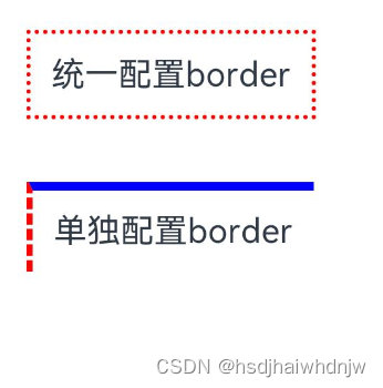
  build() {
    Column() {
      Text('统一配置border')
        .padding(10)
        .margin({ bottom: 30 })
        .border({
          width: 2,
          color: Color.Red,
          style: BorderStyle.Dotted
        })
      Text('单独配置border')
        .padding(10)
        .border({
          width: { left: 2, top: 4 },
          color: { left: Color.Red, top: Color.Blue },
          style: { left: BorderStyle.Dashed, top: BorderStyle.Solid }
        })
    }.padding(20)
  }
5)borderRadius
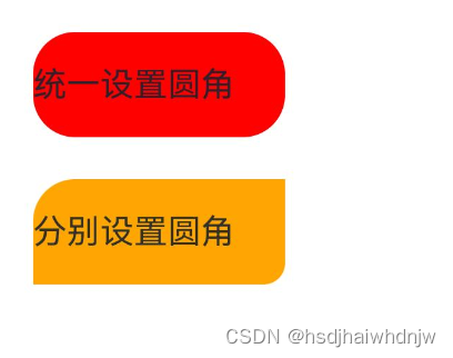
  build() {
    Column() {
      Text('统一设置圆角')
        .width(120)
        .height(50)
        .margin({ bottom: 20})
        .backgroundColor(Color.Red)
        .borderRadius(20)
      Text('分别设置圆角')
        .width(120)
        .height(50)
        .backgroundColor(Color.Orange)
        .borderRadius({
          topLeft: 20,
          bottomRight: 10
        })
    }.padding(20)
  }
6)backgroundImage、backgroundImagePosition、backgroundImageSize
backgroundImagePosition 有两种用法:
.backgroundImagePosition({ x: 200, y: 300 }):x、y的值为数字,以px为单位。.backgroundImagePosition(Alignment.Center):Alignment 为枚举,值有:Center(水平垂直居中),TopStart(左上对齐)等。
backgroundImagePosition 使用数字单独设置 x、y偏移量时(如想要设置宽高的一半,是图片右上角居于盒子中心),位置会出现偏差,原因是单位问题:
背景定位默认单位是 px:实际的物理像素点,设备出厂,就定好了【分辨率单位】。
宽高默认单位是 vp:虚拟像素,相对于不同的设备会自动转换,保证不同设备视觉一致(推荐,感觉类似于百分比)。
要解决单位不一致导致位置出现误差的情况,可以使用一个函数来进行转换:
vp2px(100):将100vp转换为Xpx。
build() {
    Column() {
      Text('背景图')
        .width(200)
        .height(300)
        .fontSize(30)
        .fontWeight(700)
        .border({
          width: 1
        })
        // .backgroundColor(Color.Pink)
        // backgroundImage(图片地址,是否平铺,取枚举 ImageRepeat 值)
        // .backgroundImage($r('app.media.icon'), ImageRepeat.XY)
        .backgroundImage($r('app.media.icon'))
        // backgroundImagePosition 取值如下:
        // 1、传入对象,设置位置坐标(背景图左顶点){x: 坐标值, y: 坐标值}
        // 2、Alignment 枚举, Center 水平、垂直居中,TopStart 左上对齐
        // .backgroundImagePosition({
        //   x: 200,
        //   y: 300
        // })
        // .backgroundImagePosition(Alignment.Center)
        // width、height 默认单位是 vp,背景图设置位移的单位是 px
        // vp2px(100) 是将 100vp 转换为 对应数值的 px
        .backgroundImagePosition({
          x: vp2px(100),
          y: vp2px(150)
        })
    }.padding(30)
  }
Column() {
      Text()
        .width(300)
        .height(200)
        .border({width:1, color: '#999'})
        .backgroundImage($r('app.media.IMG102346'))
        .backgroundImagePosition(Alignment.Center)
        // .backgroundImageSize({
        //   // width: 200
        //   height: 200
        // })
        // 枚举 ImageSize 取值:
        // 1) Contain:等比缩放,展示整张图片,可能会留白
        // 2)Cover: 等比缩放,让图片铺满整个容器,不会留白,但是有可能会有部分内容显示不出来
        .backgroundImageSize(ImageSize.Auto)

    }.padding(30)
7)justifyContent(设置主轴对齐方式)、alignItems(设置交叉轴对齐方式)
  build() {
    // Column() {
    //   Text()
    //     .width(200).height(100).backgroundColor(Color.Pink)
    //     .border({ width: 1, color: '#999' })
    //   Text()
    //     .width(200).height(100).backgroundColor(Color.Pink)
    //     .border({ width: 1, color: '#999' })
    //   Text()
    //     .width(200).height(100).backgroundColor(Color.Pink)
    //     .border({ width: 1, color: '#999' })
    //   Text()
    //     .width(200).height(100).backgroundColor(Color.Pink)
    //     .border({ width: 1, color: '#999' })
    // }
    // .width('100%').height('100%')
    // // justifyContent 设置排布方向的对齐方式(主轴)
    // // 1、Start (排布主方向)主轴起始位置对齐
    // // 2、Center 主轴居中对齐
    // // 3、End 主轴结束位置对齐
    // // 4、SpaceBetween 贴边显示,中间元素均匀分布
    // // 5、SpaceAround 间隙环绕,元素间隙分别是 0.5  1  1 ...  0.5(靠边只有一半间隙)
    // // 6、SpaceEvenly 间隙均匀环绕,所有元素均匀分布
    // .justifyContent(FlexAlign.SpaceEvenly)
    // .alignItems(HorizontalAlign.End)


    Row() {
      Text()
        .width(50).height(100).backgroundColor(Color.Pink)
        .border({ width: 1, color: '#999' })
      Text()
        .width(50).height(100).backgroundColor(Color.Pink)
        .border({ width: 1, color: '#999' })
      Text()
        .width(50).height(100).backgroundColor(Color.Pink)
        .border({ width: 1, color: '#999' })
      Text()
        .width(50).height(100).backgroundColor(Color.Pink)
        .border({ width: 1, color: '#999' })
    }
    .width('100%').height('100%')
    // justifyContent 设置排布方向的对齐方式(主轴)
    // 1、Start (排布主方向)主轴起始位置对齐
    // 2、Center 主轴居中对齐
    // 3、End 主轴结束位置对齐
    // 4、SpaceBetween 贴边显示,中间元素均匀分布
    // 5、SpaceAround 间隙环绕,元素间隙分别是 0.5  1  1 ...  0.5(靠边只有一半间隙)
    // 6、SpaceEvenly 间隙均匀环绕,所有元素均匀分布
    .justifyContent(FlexAlign.SpaceEvenly)
    // alignItems 设置主轴的交叉轴上的对齐方式
    // 交叉轴为 y 轴时,VerticalAlign 取值 Top(顶部对齐)、Center(垂直居中)、Bottom(底部对齐)
    // 交叉轴为 x 轴时,HorizontalAlign 取值 Start(左对齐)、Center(水平居中)、End(右对齐)
    .alignItems(VerticalAlign.Bottom)
  }
8、layoutWeight
    Column() {
      Row() {
        Text('左侧自适应')
          .height(40)
          // layoutWeight 自适应伸缩:按照份数权重,分配剩余空间。
          .layoutWeight(1)
          .backgroundColor(Color.Yellow)
        Text('右侧固定宽度')
          .width(120)
          .height(40)
          .backgroundColor(Color.Orange)
      }
      .width('100%')
      .height(40)
      .backgroundColor(Color.White)
    }.width('100%').padding(10).backgroundColor('#ddd')
9)案例-京东登录
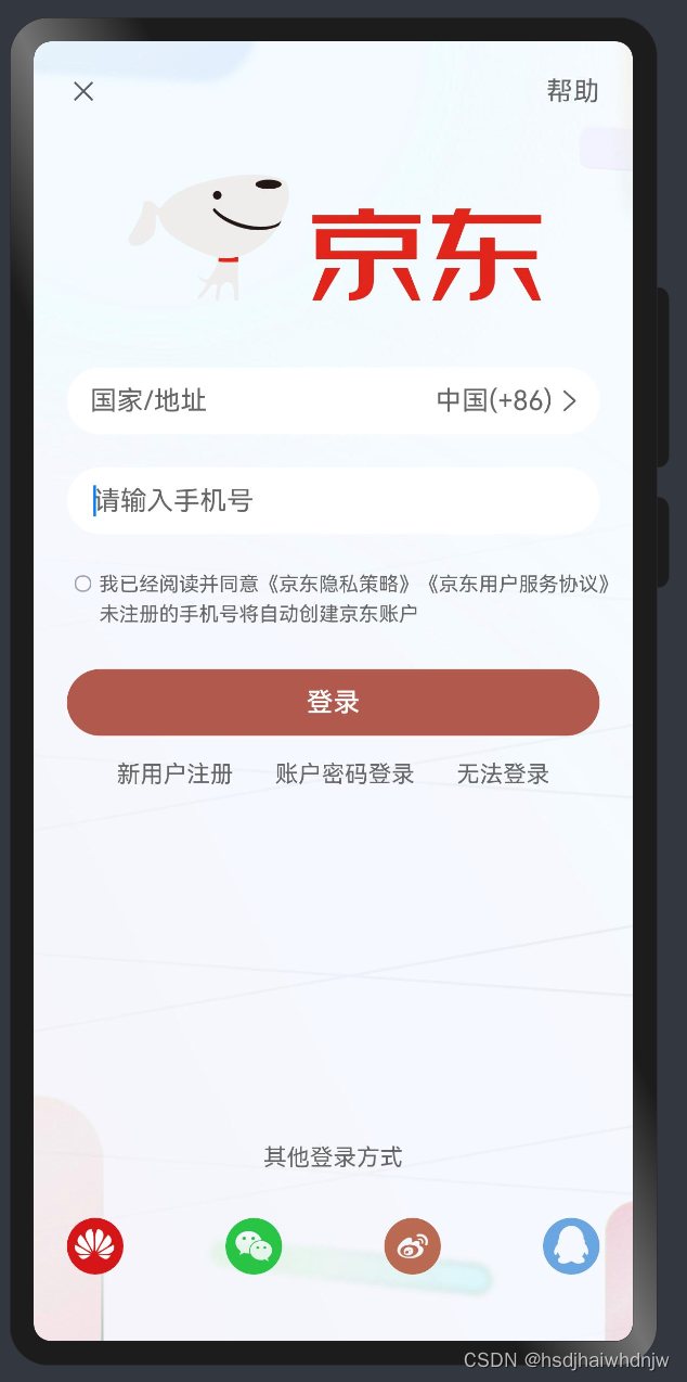
build() {
    Column() {
      // 顶部
      Row() {
        Image($r('app.media.ic_close')).width(20)
        Text('帮助').fontColor('#666')
      }.width('100%')
      .justifyContent(FlexAlign.SpaceBetween)

      // 内容
      Image($r('app.media.ic_jingdong'))
        .width(250).margin({top: 40, bottom: 40})
      // 国家/地址
      Row() {
        Text('国家/地址').fontColor('#666').layoutWeight(1)
        Text('中国(+86)').fontColor('#666')
        Image($r('app.media.ic_arrow_right')).width(20).fillColor('#666')
      }.width('100%').height(40).padding({left: 14, right: 8})
      .backgroundColor('#fff')
      .borderRadius(20)

      // 手机号
      TextInput({ placeholder: '请输入手机号' })
        .height(40)
        .margin({top: 20})
        .backgroundColor('#fff')
        .placeholderColor('#666')

      // 隐私策略
      Row() {
        Checkbox().width(10)
        Text() {
          Span('我已经阅读并同意')
          Span('《京东隐私策略》')
          Span('《京东用户服务协议》')
          Span('未注册的手机号将自动创建京东账户')
        }.fontColor('#666')
        .fontSize(12)
        .lineHeight(18)
      }.width('100%')
      .margin({ top: 20 })
      .alignItems(VerticalAlign.Top)

      // 登录按钮
      Button('登录')
        .width('100%')
        .margin({top: 25})
        .backgroundColor('#b2594e')

      Row({space: 25}) {
        Text('新用户注册').fontColor('#666').fontSize(14)
        Text('账户密码登录').fontColor('#666').fontSize(14)
        Text('无法登录').fontColor('#666').fontSize(14)
      }.margin({top: 15})

      // 底部
      Blank()
      Text('其他登录方式')
        .fontSize(14)
        .fontColor('#666')
        .margin({ bottom: 28 })

      Row() {
        Image($r('app.media.ic_huawei')).width(34)
        Image($r('app.media.ic_weixin')).width(34)
        Image($r('app.media.ic_xinlang')).width(34).fillColor('#ba6a51')
        Image($r('app.media.ic_qq')).width(34)
      }
      .width('100%')
      .margin({bottom: 20})
      .justifyContent(FlexAlign.SpaceBetween)
    }.width('100%').height('100%').padding(20)
    .backgroundImage($r('app.media.js_bgc'))
    .backgroundImageSize(ImageSize.Cover)
  }
10)position、zIndex
build() {
    Column() {
      Text()
        .width(100)
        .height(100)
        .backgroundColor(Color.Pink)
      // position 绝对定位:可以控制组件的位置,可以实现层叠效果。
      // .position({x:100,y:100})
      // 特点:
      // 1、相对于父组件左顶点进行偏移
      // 2、不占用原本的位置,可以任意调整位置,不影响其他元素
      // 后写的组件层级更高,会盖住前面的组件,可以使用 .zIndex(数字)来调整显示层级。
      Text()
        .width(100)
        .height(100)
        .backgroundColor(Color.Yellow)
        .position({
          x: 100,
          y: 50
        })
        .zIndex(1)
      Text()
        .width(100)
        .height(100)
        .backgroundColor(Color.Green)
    }
    .width('100%')
    .height(600)
    .backgroundColor('#ccc')
  }
10)案例-支付宝首页
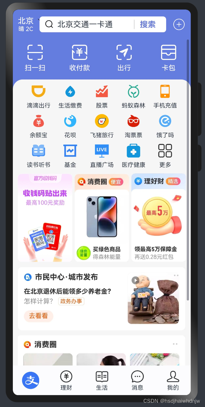
build() {
    Stack({
      alignContent: Alignment.Bottom
    }) {
      // 主题内容区
      Stack({alignContent: Alignment.Top}) {
        // header 部分
        Row() {
          Column() {
            Text('北京').fontColor('#fff')
            Text('晴 2C').fontColor('#fff').fontSize(12)
            Image($r('app.media.zfb_head_down'))
              .width(16)
              .fillColor(Color.White)
              .position({
                x: 40
              })
          }

          Row() {
            Image($r('app.media.zfb_head_search'))
              .width(20)
              .margin({right: 6})
            Text('北京交通一卡通').layoutWeight(1)
            Text('搜索')
              .width(55)
              .fontWeight(700)
              .border({
                width: {left: 1},
                color: '#ccc'
              })
              .textAlign(TextAlign.Center)
              .fontColor('#697cd8')
          }
          .height(32)
          .padding({left: 10, right: 10})
          .layoutWeight(1)
          .margin({left: 12, right: 12})
          .backgroundColor(Color.White)
          .borderRadius(6)

          Image($r('app.media.zfb_head_plus'))
            .width(28)
            .fillColor(Color.White)
        }
        .width('100%')
        .height(60)
        .padding({left: 10, right: 10})
        .backgroundColor('#657cdf')
        .zIndex(10)
        // 内容区
        Scroll() {
          Column() {
            // 快捷按钮
            Row() {
              Column({space: 6}) {
                Image($r('app.media.zfb_top_scan'))
                  .width(35)
                  .fillColor(Color.White)
                Text('扫一扫')
                  .fontColor(Color.White)
                  .fontSize(14)
              }
              .layoutWeight(1)

              Column({space: 6}) {
                Image($r('app.media.zfb_top_pay'))
                  .width(35)
                  .fillColor(Color.White)
                Text('收付款')
                  .fontColor(Color.White)
                  .fontSize(14)
              }
              .layoutWeight(1)

              Column({space: 6}) {
                Image($r('app.media.zfb_top_travel'))
                  .width(35)
                  .fillColor(Color.White)
                Text('出行')
                  .fontColor(Color.White)
                  .fontSize(14)
              }
              .layoutWeight(1)

              Column({space: 6}) {
                Image($r('app.media.zfb_top_card'))
                  .width(35)
                  .fillColor(Color.White)
                Text('卡包')
                  .fontColor(Color.White)
                  .fontSize(14)
              }
              .layoutWeight(1)
            }

            Column() {

              // 功能按钮
              Column({space: 10}) {
                Row() {
                  Column({space: 8}) {
                    Image($r('app.media.zfb_nav1'))
                      .width(28)
                    Text('滴滴出行')
                      .fontSize(12)
                  }
                  .layoutWeight(1)

                  Column({space: 8}) {
                    Image($r('app.media.zfb_nav2'))
                      .width(28)
                    Text('生活缴费')
                      .fontSize(12)
                  }
                  .layoutWeight(1)

                  Column({space: 8}) {
                    Image($r('app.media.zfb_nav3'))
                      .width(28)
                    Text('股票')
                      .fontSize(12)
                  }
                  .layoutWeight(1)

                  Column({space: 8}) {
                    Image($r('app.media.zfb_nav4'))
                      .width(28)
                    Text('蚂蚁森林')
                      .fontSize(12)
                  }
                  .layoutWeight(1)

                  Column({space: 8}) {
                    Image($r('app.media.zfb_nav5'))
                      .width(28)
                    Text('手机充值')
                      .fontSize(12)
                  }
                  .layoutWeight(1)
                }
                Row() {
                  Column({space: 8}) {
                    Image($r('app.media.zfb_nav6'))
                      .width(28)
                    Text('余额宝')
                      .fontSize(12)
                  }
                  .layoutWeight(1)

                  Column({space: 8}) {
                    Image($r('app.media.zfb_nav7'))
                      .width(28)
                    Text('花呗')
                      .fontSize(12)
                  }
                  .layoutWeight(1)

                  Column({space: 8}) {
                    Image($r('app.media.zfb_nav8'))
                      .width(28)
                    Text('飞猪旅行')
                      .fontSize(12)
                  }
                  .layoutWeight(1)

                  Column({space: 8}) {
                    Image($r('app.media.zfb_nav9'))
                      .width(28)
                    Text('淘票票')
                      .fontSize(12)
                  }
                  .layoutWeight(1)

                  Column({space: 8}) {
                    Image($r('app.media.zfb_nav10'))
                      .width(28)
                    Text('饿了吗')
                      .fontSize(12)
                  }
                  .layoutWeight(1)
                }
                Row() {
                  Column({space: 8}) {
                    Image($r('app.media.zfb_nav11'))
                      .width(28)
                    Text('读书听书')
                      .fontSize(12)
                  }
                  .layoutWeight(1)

                  Column({space: 8}) {
                    Image($r('app.media.zfb_nav12'))
                      .width(28)
                    Text('基金')
                      .fontSize(12)
                  }
                  .layoutWeight(1)

                  Column({space: 8}) {
                    Image($r('app.media.zfb_nav13'))
                      .width(28)
                    Text('直播广场')
                      .fontSize(12)
                  }
                  .layoutWeight(1)

                  Column({space: 8}) {
                    Image($r('app.media.zfb_nav14'))
                      .width(28)
                    Text('医疗健康')
                      .fontSize(12)
                  }
                  .layoutWeight(1)

                  Column({space: 8}) {
                    Image($r('app.media.zfb_nav15_more'))
                      .width(28)
                    Text('更多')
                      .fontSize(12)
                  }
                  .layoutWeight(1)
                }
              }
              .width('100%')
              .padding(10)

              // 活动区
              Row({space:4}) {
                Image($r('app.media.zfb_pro_pic1'))
                  .layoutWeight(1)

                Image($r('app.media.zfb_pro_pic2'))
                  .layoutWeight(1)

                Image($r('app.media.zfb_pro_pic3'))
                  .layoutWeight(1)
              }
              .margin({bottom: 10})
              // 消息区
              Column({space: 10}) {
                Image($r('app.media.zfb_pro_list1')).width('100%')
                Image($r('app.media.zfb_pro_list2')).width('100%')
              }

            }
            .margin({top: 15})
            .borderRadius({
              topLeft: 20,
              topRight: 20
            })
            .padding({left: 10,right:10})
            .backgroundColor('#f6f6f6')
          }
          .width('100%')
          .padding({top: 10, bottom: 10})
        }
        .height('100%')
        .padding({top: 60, bottom: 50})
      }
      .height('100%')
      // 底部tab
      Row() {
        Column() {
          Image($r('app.media.zfb_tab_home'))
            .width(35)
        }
        .layoutWeight(1)

        Column() {
          Image($r('app.media.zfb_tab_money'))
            .width(28)
          Text('理财')
            .fontSize(12)
            .margin({top: 2})
            .fontColor('')
        }
        .layoutWeight(1)

        Column() {
          Image($r('app.media.zfb_tab_life'))
            .width(28)
          Text('生活')
            .fontSize(12)
            .margin({top: 2})
            .fontColor('')
        }
        .layoutWeight(1)

        Column() {
          Image($r('app.media.zfb_tab_chat'))
            .width(28)
          Text('消息')
            .fontSize(12)
            .margin({top: 2})
            .fontColor('')
        }
        .layoutWeight(1)

        Column() {
          Image($r('app.media.zfb_tab_me'))
            .width(28)
          Text('我的')
            .fontSize(12)
            .margin({top: 2})
            .fontColor('')
        }
        .layoutWeight(1)
      }
      .width('100%')
      .height(60)
      .backgroundColor('#fbfcfe')
    }
    .width('100%')
    .height('100%')
    .backgroundColor('#657cdf')
  }
| 属性 | 使用 |
|---|---|
| fontColor | 设置文字颜色Text('鸿蒙').fontColor('#df3c50'),色值可以使用鸿蒙内嵌的颜色枚举fontColor(Color.Gray),也可使用色值`fontColor(‘#a1a1a1’) |
| fillColor | 给svg填充颜色。 |
| textOverflow | 设置文字溢出省略号,需要配合maxLines使用:Text('设置溢出省略').textOverflow({ overflow: TextOverflow.Ellipsis}).maxLines(3) |
| maxLines | 设置控制最大行数,若要超出现实省略号,需要配合 textOverflow 使用 |
| lineHeight | 设置行高 |
| padding | 设置内边距。值为一个数字时,表示同时设置上下左右边距;值为对象时,对象有 top、left、bottm、right,可以分别设置边距。.padding({ top: 20, right: 20, bottom: 10, left: 10 }) |
| margin | 设置外边距。方法跟padding一样。 |
| border | 设置边框。接收一个对象,可直接设置 .border(width: 值, color: 值 style: 值 }) 统一设置四条边的样式,也可以单独设置每一条边的样式 .border(width: { 方向: 值 }, color: { 方向: 值 } style: { 方向: 值 } })等,style的值可以从枚举 BorderStyle 中取。 |
| borderRadius | 设置圆角。可以给四个角设置相同圆角.borderRadius(值),也可以分别设置圆角.borderRadius({方位: 值}) |
| backgroundImage | 设置背景图片。.backgroundImage(背景图地址,背景图平铺方式-枚举ImageRepeat),ImageRepeat取值X、Y、XY,表示在X轴、Y轴、XY轴上平铺。 |
| backgroundImagePosition | 设置背景图偏移量。用法:.backgroundImagePosition(Alignment.Center)或者.backgroundImagePosition({x:值, y: 值}) |
| backgroundImageSize | 设置背景图缩放(尺寸)。.backgroundImageSize(宽高对象 或 ImageSize 枚举),枚举值分别为 Contain:等比缩放,展示整张图片,可能会留白;Cover: 等比缩放,让图片铺满整个容器,不会留白,但是有可能会有部分内容显示不出来;Auto:默认,原图尺寸 |
| justifyContent | 设置排布方向的对齐方式(主轴)。 1、Start (排布主方向)主轴起始位置对齐;2、Center 主轴居中对齐;3、End 主轴结束位置对齐;4、SpaceBetween 贴边显示,中间元素均匀分布;5、SpaceAround 间隙环绕,元素间隙分别是 0.5 1 1 … 0.5(靠边只有一半间隙);6、SpaceEvenly 间隙均匀环绕,所有元素均匀分布 |
| alignItems | 设置主轴的交叉轴上的对齐方式。1、Row时,主轴为x轴,交叉轴为 y 轴时,VerticalAlign 取值 Top(顶部对齐)、Center(垂直居中)、Bottom(底部对齐);2、Column 时,主轴为 y 轴,交叉轴为 x 轴时,HorizontalAlign 取值 Start(左对齐)、Center(水平居中)、End(右对齐) |
| layoutWeight | 自适应伸缩,设置该属性的 子元素 与 兄弟元素,会按照 权重 进行分配 主轴 的空间。.layoutWeight(数字),类似于 css3 flex 布局中的 flex。 |
| position | 绝对定位:可以控制组件的位置,可以实现层叠效果。.position({x:100,y:100}) |
| zIndex | 设置组件层级(后面的组件层级更高,会盖住前面的组件)。.zIndex(数字) |
| textAlign | 设置文本对齐方式。.textAlign(TextAlign.Center) |
| onClick | 给元素添加点击事件。.onClick(() => { }) |
| opacity | 设置元素透明度。 |
| zIndex | 设置元素显示层级。 |
| animation | 设置动画。 |
四、ArkTs 基本操作
1、字符串拼接
1)+号拼接:console.log(‘+号拼接,姓名是:’+name)
作用:多个字符串拼成一个整体,拼接字符串和变量,
符号:+ (两端只要有字符串,就是拼接;两端都是数字,则是计算)
2)模版字符串拼接:console.log(`模版字符串拼接,姓名${name},年龄${age}`)
作用:拼接字符串和变量,更适合多个变量的拼接场景
符号: ``,需要变量时,用${}包裹
2、交互-点击事件
语法:.onClick((参数) => { })
案例:点击按钮,弹出对话框
build() {
    Row() {
      Column() {
        Button('点解按钮弹对话框')
          .onClick(() => {
            AlertDialog.show({
              message: '这是一个对话框'
            })
          })
      }
      .width('100%')
    }
    .height('100%')
  }
3、状态管理
组件中声明的变量有2种类型:
1)普通变量:只能在初始化时渲染,后续变化了,不会引起页面更新。
普通变量分为两种:
组件外的普通变量:组件外声明,组件内可以直接使用
组件内的普通变量:组件内声明,不需要使用 let、const 关键字,要通过 this 使用this.XXX
2)状态变量:被装饰器修饰,值的改变,会自动引起页面的更新(必须要设置 类型 和 初始值)。
声明时不需要使用 let、const等关键字,不过前面要加上装饰器@State,也要通过 this 使用。
// 组件外的【普通变量】
let name: string = '张三'
@Entry
@Component
struct Index {
  // 组件内的【普通变量】
  age: number = 18
  // 组件内的【状态变量】
  @State msg: string = '鸿蒙开发'
  build() {
    Row() {
      Column() {
        Text(name)
          .onClick(() => {
            name = '李四'
            console.log('姓名', name)
          })
        Text(this.age.toString())
          .onClick(() => {
            this.age = 20
            console.log('年龄', this.age)
          })

        Text(this.msg).onClick(() => {
          this.msg = '好好学习鸿蒙开发'
        })
      }
      .width('100%')
    }
    .height('100%')
  }
}
4、算数运算符和赋值运算符
1)算数运算符:+,-,*,/,%
2)赋值运算符:对变量进行赋值的运算符:+=,-=,*=,/=,%=
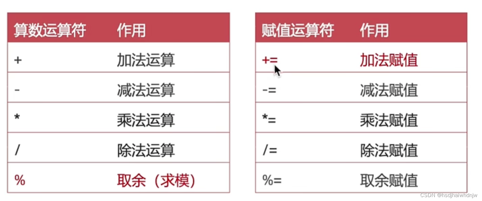
// 算术运算符
console.log('计算结果:', 1+1)	// 2
console.log('计算结果:', 2-1)	// 1
console.log('计算结果:', 2*2)	// 4
console.log('计算结果:', 4/2)	// 2
console.log('计算结果:', 5%2)	// 1
//赋值运算符
let num1: number = 10
num1 += 10
console.log('计算结果:',num1)	//20
5、一元运算符、比较运算符、逻辑运算符
1)一元运算符
常见一元运算符:++ 和 –
- 后置写法(num++):先赋值,后自增/自减
- 前置写法:先自增/自减,后赋值
// let num: number = 1
// let num1: number = num ++
// console.log('num:',num) // 2
// console.log('num1:',num1) //1

let num: number = 1
let num1: number = ++num
console.log('num:',num) // 2
console.log('num1:',num1) //2
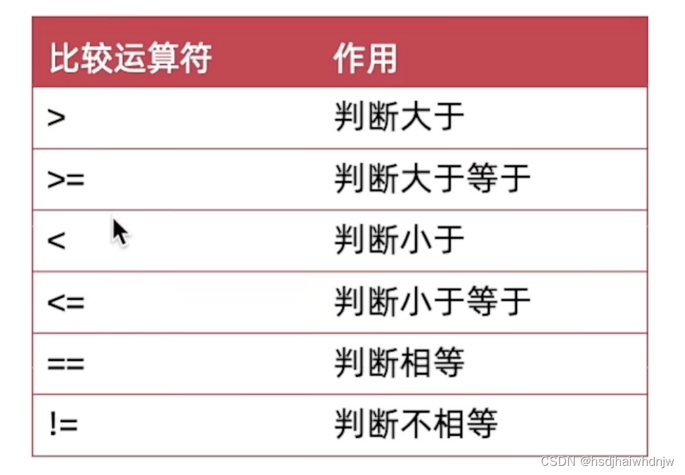
2)比较运算符
用来判断比较两个数据的大小,返回一个布尔值(true/false)。
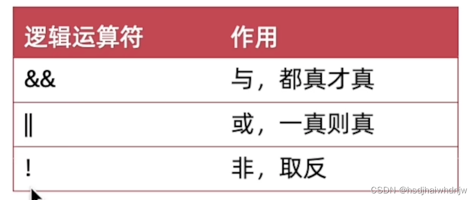
3)逻辑运算符
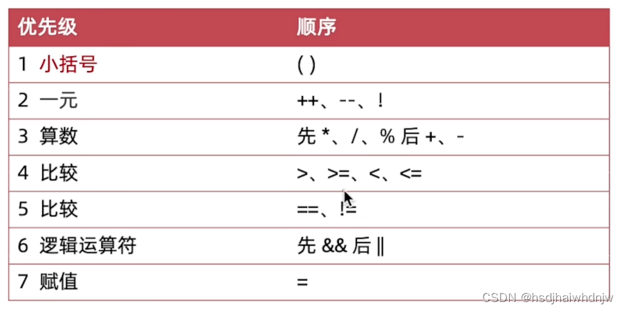
4)运算符优先级
案例–美团购物车
@Entry
@Component
struct Index {
  @State count:number = 1
  @State oldPrice:number = 40.1
  @State newPrice:number = 10.1
  build() {
    Column() {
      Row() {
        Image($r('app.media.IMG102346'))
          .width(100)
          .margin({right:8})
          .borderRadius(10)
        Column() {
          Text('冲销量1000ml缤纷八果水果捞')
            .width('100%')
            .fontWeight(600)
            .fontColor('#46474d')
          Text('含1份折扣商品')
            .width('100%')
            .fontSize(12)
            .margin({top: 8})
            .fontColor('#848483')
          Row() {
            Row() {
              Text('¥').fontSize(12).fontColor('#d13a2e')
              Text(this.newPrice.toFixed(2)).fontSize(20).fontColor('#d13a2e').margin({right:10})
              Text(this.oldPrice.toFixed(2)).fontSize(16).fontColor('#a09f9e').decoration({type:TextDecorationType.LineThrough})
            }.alignItems(VerticalAlign.Bottom)
            Row() {
              Text('-')
                .height(30)
                .padding({left:8,right:8})
                .onClick(() => {
                  this.count --
                })
              Text(this.count.toString())
                .height(30)
                .padding({left:8,right:8})
                .border({
                  width: {left:1,right:1},
                  color: '#ccc'
                })
              Text('+')
                .height(30)
                .padding({left:8,right:8})
                .onClick(() => {
                  this.count ++
                })
            }.border( {width:1,color:'#ccc'}).borderRadius(5)
          }.width('100%').margin({top: 10}).justifyContent(FlexAlign.SpaceBetween)
        }
        .layoutWeight(1)
      }
      .width('100%')
      .padding(10)
      Blank()

      Row() {
        Column() {
          Row() {
            Text(`已选 ${this.count} 件`).fontColor('#8e8f8f')
            Text(',合计:')
            Text(`${(this.count*this.newPrice).toFixed(2)}`).fontColor('#b45643')
          }.width('100%').justifyContent(FlexAlign.End)
          Text(`共减 ¥${(this.oldPrice-this.newPrice)*this.count}`)
            .width('100%')
            .margin({top: 8})
            .fontColor('#b45643')
            .fontSize(14).textAlign(TextAlign.End)
        }.layoutWeight(1).margin({right:10})
        Button('结算外卖').fontColor('#5a4413').backgroundColor('#f7d963')
      }
        .width('100%')
        .height(100)
      .padding(10)
        .backgroundColor('#fff')
    }
    .width('100%')
    .height('100%')
    .backgroundColor('#f3f3f4')
  }
}
6、数组方法
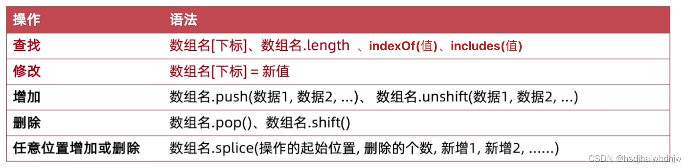
1)返回值
- 查找:通常返回查找到的值,indexOf 和 includes 除外
indexOf:查找某一项的下标,存在某一项时,返回对应的下标,否则返回 -1
includes:查找数组种是否存在某个值,存在返回 true,否则返回 false - 修改:返回修改后的那一项的值
- 增加:
push(新增的值) :数组末尾增加;返回数组长度 length;
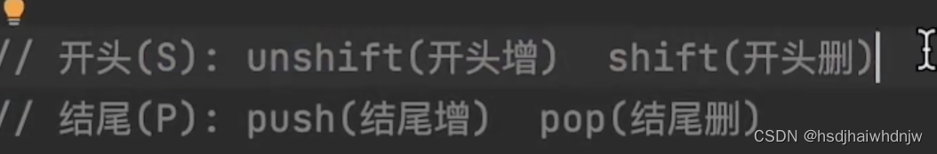
unshift(新增的值):数组开头增加;返回数组长度 length; - 删除:
pop():删除数组末尾的元素;返回被删除的数据;
shift():删除数组开头的元素;返回被删除的数据; - 任意位置增加或删除
splice(操作的起始位置, 删除几个(, 新增的项1, 新增的项2))
arr.splice(1,2):从下标为 1 的地方(包含1)开始删除,删除 2 个值;返回被删除的元素;
arr.splice(1,1, ‘hhh’):将下标为 1 值更换为 ‘hhh’;返回被替换掉的值;
arr.splice(1,0, ‘hhh’):在下标为 1 的值之前,插入值 ‘hhh’;无返回值;
arr.splice(1,0, ‘hhh’, ‘aaa’):在下标为 1 的值之前,插入值 ‘hhh’ ‘aaa’;无返回值;
let arr = ['张三','李四','王武']
// console.log('结果',arr.indexOf('12'))  // 0
// console.log('结果',arr.includes('张三')) // true
// console.log('结果',arr.push('hhh'))  // 4
// console.log('结果',arr.unshift('hhh')) // 4
// console.log('结果',arr.pop())  // 王武
// console.log('结果',arr.shift())  // 张三

// console.log('结果', arr.splice(1,1))  // 李四,arr = 张三,王武
// console.log('结果', arr.splice(1,1, 'hhh'))  // 李四,arr = 张三,hhh,王武
// console.log('结果', arr.splice(1,0, 'hhh'))  // arr = 张三,hhh,李四,王武
console.log('结果', arr.splice(1,0, 'hhh', 'aaa'))  // arr = 张三,hhh,aaa,李四,王武
console.log('arr值',arr)
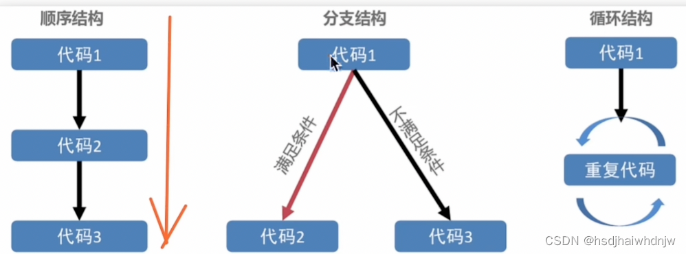
7、分支语句
语句:一段 可以执行 的代码,是一个行为(num = a + b)
表达式:可以 被求值 的代码,并将计算出一个 结果(1+1,3*5,3>2)
语句执行结构:
1)if 分支语句
根据逻辑条件不同,执行不同语句。
- 单分支语法:
if(条件) {条件成立时执行的代码} - 双分支语法:
if(条件) {条件成立时执行的代码} else {条件不成立时执行的代码} - 多分支语法:
if(条件1) {条件1成立时执行的代码} else if (条件2) {条件2不成立时执行的代码} else if (条件3) {条件3不成立时执行的代码} . . . else {以上条件都不成立时执行的代码}
2)switch 分支语句
switch (表达式) {
  case 值1:
    与值1匹配执行的语句
    break
  case 值2:
    与值2匹配执行的语句
    break
  default :
    以上都未成功匹配执行的语句
}
3)三元条件表达式
语法:条件 ? 条件成立执行的表达式 : 条件不成立执行的表达式
let num1: number = 2
let num2: number = 7
let num3: number = num1 > num2 ? num1 : num2
console.log('num3',num3) // 7
4)while 语句
/*
while (条件) {
  条件成立时重复执行的代码
}
*/
5)for 循环语句
循环执行指定的一段代码。
循环三要素:
- 初始值(变量)
- 循环条件
- 变化量
/*
for(初始值;条件;变化量) {
	重复执行的代码
}
*/
for(let i = 0;i <= 10;i++) {
  console.log('for内部打印i',i)
}
6)退出循环 break、continue
作用:满足指定条件,可以退出循环
- break:终止整个循环,后续不再执行
- continue:退出当前一次循环的执行,继续后面的循环
for(let i = 0; i<=10;i++) {
  if(i === 5) {
    // break 终止整个循环,后续不再打印 i
    // console.log('终止循环了吧?')
    // break

    // continue 跳出当前循环,继续执行下一次循环
    // i = 5 时,不打印 i,其他时候都会打印
    console.log('这是continue')
    continue
  }
  console.log('i', i)
}
练习:
需求1:打印 1-100 的数字,遇到7的倍数就跳过
需求2:打印 1-100 的偶数,遇到 20,后面的就不打印了
// for(let i = 0; i<=100; i++) {
//   if(i % 7 === 0) {
//     //跳过7的倍数
//     continue
//   }
//   console.log('i',i)
// }

for(let i = 0; i <= 100; i++) {
  if (i % 2 === 0) {
    console.log('i', i)
    // 遇到20以后,就跳出循环
    if(i === 20) {
      break
    }
  }
}
7)遍历数组 for 和 for of
遍历:将数组中的每个数据,按顺序访问一遍。
- for … of
for(let item of 数组) {},item 声明的一个变量,用来在循环的时候,接收 每一个数组元素。 - for
for(let i = 0; i <= arr.length - 1; i++) {},
let arr = ['aaa', 'bbb', 'ccc']
for(let i = 0; i <= arr.length - 1; i++) {
 console.log('for循环的item', i, arr[i])
}
for(let item of arr) {
 console.log('for of 的 item', item)
}
8、条件渲染
使用 if、else 和 else if,可基于不同状态渲染对应不同UI内容。
@State age: number = 80
build() {
   Column() {
     Text(this.age.toString())
     if(this.age < 18) {
       Text('未满18岁')
     } else if (this.age < 60) {
       Text('未满60岁')
     } else {
       Text('60岁以上')
     }
   }
 }
案例:京东加购
  @State count:number = 0
  build() {
    Column() {
      Column() {
        Text(`当前数量是:${this.count}`).width('100%')
        Row() {
          Button('数量加1')
            .onClick(() => {
              this.count ++
            })
          Button('数量减1')
            .onClick(() => {
              this.count --
            })
        }.width('100%')


        if(this.count <= 0) {
          // 没有库存时的提示消息
          Row() {
            Row() {
              Image($r('app.media.ic_jd_notice'))
                .width(20)
                .margin({right:6})
                .fillColor('#b28568')
              Text('该商品暂时没有库存,看看类似商品吧')
                .fontSize(14)
                .fontColor('#b28568')
            }.layoutWeight(1)
            Image($r('app.media.ic_jd_arrow_top'))
              .width(16)
              .fillColor('#b28568')
          }
          .width('100%')
          .height(36)
          .padding({left: 18, right: 18})
          .backgroundColor('#fbf8e0')
        }

        // 底部按钮
        Row() {
          Row() {
            Column() {
              Image($r('app.media.ic_jd_shop'))
                .width(26)
                .fillColor('#6e6e6e')
              Text('店铺').fontWeight(600).fontSize(14).margin({top:8})
            }
            Column() {
              Image($r('app.media.ic_jd_notice'))
                .width(26)
                .fillColor('#6e6e6e')
              Text('客服').fontWeight(600).fontSize(14).margin({top:8})
            }
            Column() {
              Image($r('app.media.ic_jd_cart'))
                .width(26)
                .fillColor('#6e6e6e')
              Text('购物车').fontWeight(600).fontSize(14).margin({top:8})
            }
          }.layoutWeight(1).justifyContent(FlexAlign.SpaceBetween)

          if(this.count <= 0) {
            Button('查看类似商品')
              .width(120)
              .fontWeight(700)
              .margin({left:10,right:10})
              .backgroundColor('#f8cd5f')
          } else {
            Row() {
              Button('加入购物车')
                .fontWeight(700)
                .margin({left:4})
                .backgroundColor('#f8cd5f')
              Button('立即购买')
                .fontWeight(700)
                .margin({left:4})
                .backgroundColor('#e7333a')
            }
          }
        }
          .width('100%')
          .height(80)
          .backgroundColor('#fff')
          .padding({left:18,right:10})
      }
      .width('100%')
      .height('100%')
      .justifyContent(FlexAlign.End)
    }
    .width('100%')
    .height('100%')
    .backgroundColor('#eee')
  }
9、ForEach 渲染控制
基于数组个数,渲染组件的个数。
语法:ForEach(arr, (item, index) => {})
Column() {
  ForEach(this.titles, (item:string, index) => {
      Text(item)
        .fontSize(20)
        .fontWeight(700)
        .fontColor(Color.Orange)
   })
}
五、扩展组件
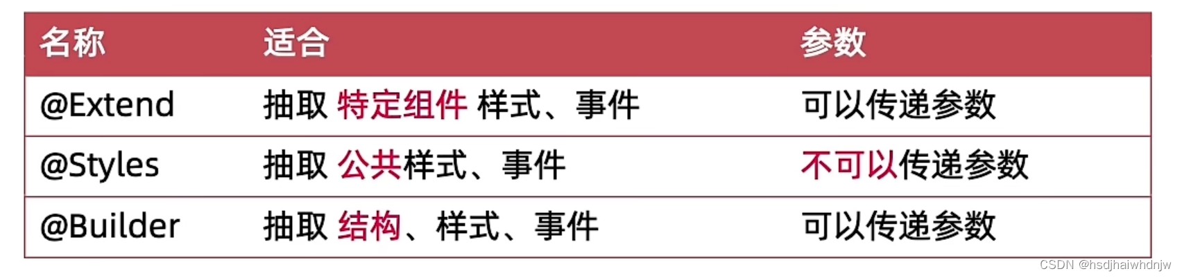
1、 @Extend
扩展组件抽取特定组件的样式和事件,函数中可以传参数,无法直接组件的使用状态变量。
语法:
/*@Extend(组件名)
funcitn fn() {
  组件样式及事件
}*/
案例:
@Extend(Text)
function textExtend(bgcColor, msg) {
  .fontSize(30)
  .fontColor(Color.White)
  .textAlign(TextAlign.Center)
  .backgroundColor(bgcColor)
  .onClick(() => {
    AlertDialog.show({
      message: msg
    })
  })
}
@Entry
@Component
struct Index {
  build() {
    Column() {
      Swiper() {
        Text('1')
          .textExtend(Color.Orange, '点击了卡片1')
        Text('2')
          .textExtend(Color.Gray, '点击了卡片2')
        Text('3')
          .textExtend(Color.Yellow, '点击了卡片1')
      }
        .width('100%')
        .height(200)
        .autoPlay(true)
        .interval(1000)
    }
  }
}
2、@Styles
抽取公共样式、事件,不可以传参。有两种定义方法:
- 组件外定义:无法通过this访问组件的状态变量。
- 组件内定义:可以通过this访问组件的状态变量。
语法:
//组件外部定义:
@Styles
function commonStyles () {
  .backgroundColor(Color.Gray)
  .width(100)
  .height(100)
}
// 组件内部定义:
@Styles commonStyles() {
    .backgroundColor(this.bgcColor)
    .width(100)
    .height(100)
}
案例:
// 1、组件外定义,无法通过this访问组件到状态
@Styles
function commonStyles () {
  .backgroundColor(Color.Gray)
  .width(100)
  .height(100)
}

@Entry
@Component
struct Index {
  @State msg:string = '@styles'
  @State bgcColor: Color = Color.Gray

  // 1、@Styles 组件内定义,才能通过this访问到自己到状态
  @Styles commonStyles() {
    .backgroundColor(this.bgcColor)
    .width(100)
    .height(100)
    .onClick(() => {
      AlertDialog.show({
        message: '123'
      })
    })
  }
  build() {
    Column({space:10}) {
      Text(this.msg)
        .fontColor(Color.White)
        // .backgroundColor(this.bgcColor)
        .commonStyles()
        // .onClick(() => {
        //   this.bgcColor = Color.Orange
        // })

      Column()
        .commonStyles()
        // .backgroundColor(this.bgcColor)
        .onClick(() => {
          this.bgcColor = Color.Pink
        })

      Button('按钮')
        .fontColor(Color.White)
        .borderRadius(50)
        .commonStyles()
        // .backgroundColor(this.bgcColor)
        .onClick(() => {
          this.bgcColor = Color.Yellow
        })
    }
      .width('100%')
      .height('100%')
  }
}
3、@Builder
抽取 结构、样式、事件,可以传递参数。有两种定义方法:
- 组件为定义:
@Builder function navItem (imgSrc,str) { ),不可以使用组件的状态变量 - 组件内定义:
@Builder navItem (imgSrc,str) { ),可以使用费组件的状态变量
// 组件外定义:
@Builder
function navItem (imgSrc,str) {
  Column() {
    Image(imgSrc)
      .width(60)
    Text(str)
  }
  .onClick(() => {
    AlertDialog.show({
      message: `点击了${str}`
    })
  })
}
// 组件内定义
@Builder navItem (imgSrc,str) {
    Column() {
      Image(imgSrc)
        .width(60)
      Text(str)
    }
    .onClick(() => {
      AlertDialog.show({
        message: `点击了${str}`
      })
    })
  }
案例:
@Builder
function navItem (imgSrc,str) {
  Column() {
    Image(imgSrc)
      .width(60)
    Text(str)
  }
  .onClick(() => {
    AlertDialog.show({
      message: `点击了${str}`
    })
  })
}
@Entry
@Component
struct Index {
  @Builder navItem (imgSrc,str) {
    Column() {
      Image(imgSrc)
        .width(60)
      Text(str)
    }
    .onClick(() => {
      AlertDialog.show({
        message: `点击了${str}`
      })
    })
  }

  build() {
    Row({space:10}) {
      navItem($r('app.media.zfb_nav1'), '滴滴出行')
      navItem($r('app.media.zfb_nav4'), '蚂蚁森林')
      this.navItem($r('app.media.zfb_nav9'), '淘票票')
      this.navItem($r('app.media.zfb_nav5'), '手机充值')
    }
      .width('100%')
      .justifyContent(FlexAlign.SpaceBetween)
      .padding({top: 50, left: 20, right: 20})
  }
}


 345
345

 被折叠的 条评论
为什么被折叠?
被折叠的 条评论
为什么被折叠?
 到【灌水乐园】发言


