


目录
1.动画
动画是CSS3中具有颠覆性的特征之一,可通过设置多个节点来精确控制一个或一组动画,常用来实现复杂的动画效果。
1.1 创建动画及添加动画效果


1.2 时钟案例
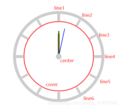
<style>
        *{
            padding: 0;
            margin: 0;
        }
        .clock{
            width: 300px;
            height: 300px;
            border: 10px solid #ccc;
            /*百分比参照元素的实际宽高*/
            border-radius: 50%;
            margin:100px auto;
            position: relative;
        }
        .line{
            width:8px;
            height: 300px;
            background-color: #ccc;
            position: absolute;
            /*居中*/
            left: 50%;
            top:0;
            transform: translate(-50%,0);
        }
        .line1,.line4{
            width: 10px;
        }
        .line2{
            transform: translate(-50%,0) rotate(30deg);
        }
        .line3{
            transform: translate(-50%,0) rotate(60deg);
        }
        .line4{
            transform: translate(-50%,0) rotate(90deg);
        }
        .line5{
            transform: translate(-50%,0) rotate(120deg);
        }
        .line6 {
            transform: translate(-50%, 0) rotate(150deg);
        }
        .cover{
            width: 250px;
            height: 250px;
            border-radius: 50%;
            background-color: #fff;
            position: absolute;
            left: 50%;
            top: 50%;
            transform: translate(-50%,-50%);
        }
        /*时*/
        .hour{
            width: 6px;
            height: 80px;
            background-color: red;
            position: absolute;
            left: 50%;
            top: 50%;
            transform: translate(-50%,-100%);
            transform-origin: center bottom;
            animation: clockAnimation 43200s linear infinite;
        }
        /*分*/
        .minute{
            width: 4px;
            height: 90px;
            background-color: green;
            position: absolute;
            left: 50%;
            top: 50%;
            transform: translate(-50%,-100%);
            transform-origin: center bottom;
            animation: clockAnimation 3600s linear infinite;
        }
        /*秒*/
        .second{
            width: 2px;
            height: 100px;
            background-color: blue;
            position: absolute;
            left: 50%;
            top: 50%;
            transform: translate(-50%,-100%);
            /*设置旋转轴心*/
            transform-origin: center bottom;
            /*添加动画*/
            /*秒针:匀速且分为60步*/
            /*steps(60)与animation-timing-function的其它属性(linear...)冲突*/
            animation: clockAnimation 60s infinite steps(60);
        }

        /*圆心*/
        .center{
            width: 20px;
            height: 20px;
            background-color: #ccc;
            border-radius: 50%;
            position: absolute;
            left: 50%;
            top: 50%;
            transform: translate(-50%,-50%);
        }

        /*创建动画*/
        @keyframes clockAnimation {
            from{
                transform:translate(-50%,-100%) rotate(0deg);
            }
            to{
                transform:translate(-50%,-100%) rotate(360deg);
            }
        }
</style>

<div class="clock">
    <div class="line line1"></div>
    <div class="line line2"></div>
    <div class="line line3"></div>
    <div class="line line4"></div>
    <div class="line line5"></div>
    <div class="line line6"></div>
    <div class="cover"></div>
    <div class="hour"></div>
    <div class="minute"></div>
    <div class="second"></div>
    <div class="center"></div>
</div>
2.多列布局
CSS3中新出现的多列布局(multi-column)是传统HTML网页中块状布局模式的有力扩充,能让文本呈现多列显示。我们知道,当一行文字太长时,读者读起来就比较费劲,有可能读错行或读串行;人们的视点从文本的一端移到另一端、然后换到下一行的行首,如果眼球移动浮动过大,他们的注意力就会减退,容易读不下去。所以,为了最大效率的使用大屏幕显示器,页面设计中需要限制文本的宽度,让文本按多列呈现,就像报纸上的新闻排版一样。(主要是为了提高用户体验)


3.伸缩布局
布局的传统解决方案,基于盒状模型,依赖display属性 +position属性 +float属性。它对于那些特殊布局非常不方便。CSS3在布局方面做了非常大的改进,使得对块级元素的布局排列变得十分灵活,适应性非常强,其强大的伸缩性,在响应式开中可以发挥极大的作用。


3.1 flex-flow
(在flex容器里设置)
flex-flow属性是flex-direction属性(定义flex容器子元素的排列方向)和flex-wrap属性(控制flex容器子元素是否换行显示)的简写形式,默认值为row nowrap。


flex-flow:row wrap;相当于flex-direction:row; flex-wrap:wrap;
3.2 flex-grow:定义比例值,扩展子元素宽度
(在子元素里设置)

3.3 flex-shink:定义比例值,收缩子元素宽度
(在子元素里设置)


3.4 flex
(在子元素里设置)
flex属性:flex属性是flex-grow, flex-shrink 和 flex-basis的简写,默认值为0 1 auto,后两个属性可选。
语法:
- flex: [flex-grow] [flex-shrink] [flex-basis] 大多数情况下没必要使用这种语法,当使用flex缩写时,大多数情况下没必要使用这种语法
- flex: [number] 指定了一个数字,代表了这个伸缩项目该占用的剩余空间比例(最常用,这种语法相当于在设置flex-grow,默认为0)
- flex: auto 被设为auto的伸缩项目,会根据主轴自动伸缩以占用所有剩余空间
应用场景:

3.5 align-items和align-self
align-items:设置子元素(伸缩项)在侧轴方向上的对齐方式(在flex容器里设置)
align-self:设置单个元素在侧轴方向上的对齐方式(在子元素里设置)

align-self的属性值与align-items的属性值一样,不再赘述
3.6 案例1:宽高自适应
  <style>
        *{
            padding: 0;
            margin: 0;
        }
        .layout{
            width: 500px;
            height: 600px;
            background-color: #CCCCCC;
            margin:10px auto;
            /*设置父容器为伸缩盒子*/
            display: flex;
            /*默认的主轴是row,这里需要以column的方式进行排列*/
            flex-direction: column;
        }
        header{
            width: 100%;
            height: 60px;
            background-color: red;
        }
        main{
            width: 100%;
            background-color: green;
            /*main高度不好确定,所以让当前伸缩项占据父容器的剩余空间(这时主轴为column)*/
            flex: 1;
            /*让main成为伸缩盒子*/
            display: flex;
        }
        main > article{
            height: 100%;
            flex: 1;
            background-color: pink;
        }
        main > aside{
            height: 100%;
            flex: 3;
            background-color: darkblue;
        }
        footer{
            width: 100%;
            height: 80px;
            background-color: purple;
        }
    </style>

<div class="layout">
    <header>header</header>
    <main>
        <article>article</article>
        <aside>aside</aside>
    </main>
    <footer>footer</footer>
</div>
3.7 案例2:携程网
<!DOCTYPE html>
<html lang="en">
<head>
<meta charset="UTF-8">
<title>携程网</title>
<style>
*{
padding: 0;
margin: 0;
}
/*顶部块样式*/
header{
width: 100%;
/*设置为伸缩盒子*/
display: flex;
}
header > a{
/*flex:设置当前子元素占据父容器剩余宽度的比例*/
flex: 1;
}
header > a > img{
width: 100%;
}
/*主体内容块样式*/
main{
width: 100%;
padding:0 10px;
/*设置盒模型*/
box-sizing: border-box;
}
main > .item{
width: 100%;
height: 100px;
background-color: #57c3ae;
border-radius: 10px;
margin-top:10px;
/*设置为伸缩盒子*/
display: flex;
}
main > .item:nth-of-type(2){
background-color: #33aa46;
}
main > .item:nth-of-type(3){
background-color: #aa4b40;
}
main > .item:nth-of-type(4){
background-color: #445faa;
}
main > .item > .left{
flex: 1;
}
main > .item > .right{
flex: 2;
/*设置换行显示*/
flex-wrap: wrap;
/*设置为伸缩盒子*/
display: flex;
}
main > .item > .right > a{
/*如果想让子元素换行显示,必须为子元素设置宽度(子元素宽度总和超过父元素时)*/
width: 50%;
box-sizing: border-box;
border-left: 1px solid #fff;
border-bottom: 1px solid #fff;
display: block;
color: #fff;
line-height: 50px;
text-align: center;
text-decoration: none;
}
main > .item > .right > a:nth-last-of-type(-n+2){
border-bottom:none;
}
main > .extra{
width: 100%;
display: flex;
}
main > .extra > a{
flex: 1;
}
main > .extra > a > img{
width: 100%;
}
/*底部块样式*/
footer{
width: 100%;
font-size: 13px;
}
footer > nav{
width: 100%;
display: flex;
border-top:1px solid #ccc;
border-bottom:1px solid #ccc;
}
footer > nav > a{
flex: 1;
line-height: 30px;
text-align: center;
color: #888;
text-decoration: none;
}
footer > .link{
text-align: center;
line-height: 25px;
}
footer > .copyRight{
text-align: center;
}
</style>
</head>
<body>
<div class="container">
<header>
<a href="">
<img src="../images/banner.jpg" alt="">
</a>
</header>
<main>
<section class="item">
<div class="left"></div>
<div class="right">
<a href="">海外酒店</a>
<a href="">团购</a>
<a href="">特惠酒店</a>
<a href="">客栈公寓</a>
</div>
</section>
<section class="item">
<div class="left"></div>
<div class="right">
<a href="">海外酒店</a>
<a href="">团购</a>
<a href="">特惠酒店</a>
<a href="">客栈公寓</a>
</div>
</section>
<section class="item">
<div class="left"></div>
<div class="right">
<a href="">海外酒店</a>
<a href="">团购</a>
<a href="">特惠酒店</a>
<a href="">客栈公寓</a>
</div>
</section>
<section class="item">
<div class="left"></div>
<div class="right">
<a href="">海外酒店</a>
<a href="">团购</a>
<a href="">特惠酒店</a>
<a href="">客栈公寓</a>
</div>
</section>
<section class="extra">
<a href="">
<img src="../images/extra_1.png" alt="">
</a>
<a href="">
<img src="../images/extra_2.png" alt="">
</a>
</section>
</main>
<footer>
<nav>
<a href="">电话预订</a>
<a href="">下载客户端</a>
<a href="">我的订单</a>
</nav>
<p class="link">
<a href="">网站地图</a>
<a href="">ENGLISH</a>
<a href="">电脑版</a>
</p>
<p class="copyRight">©20** 携程旅行</p>
</footer>
</div>
</body>
</html>


 410
410


 被折叠的 条评论
为什么被折叠?
被折叠的 条评论
为什么被折叠?
 到【灌水乐园】发言


