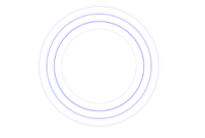
水波纹效果
<!DOCTYPE html>
<html>
	<head>
		<meta charset="utf-8">
		<title></title>
		<style type="text/css">
			.pie {
				position: relative;
				width: 200px;
				height: 200px;
				margin: 100px auto;
			}
			.wave {
				position: absolute;
				top: 0;
				left: 0;
				height: 100%;
				width: 100%;
				transform-origin: center center;
				background-color: transparent;
				border: 1px solid blue;
				box-shadow: 0 0 5px #0000FF;
				border-radius: 50%;
				opacity: 0;
				animation: wv linear infinite 7s;
			}

			.wave1 {
				animation-delay: 0s;
			}
			.wave2 {
				animation-delay: 1.5s;
			}
			.wave3 {
				animation-delay: 3s;
			}
			.wave4 {
				animation-delay: 4.5s;
			}
			@keyframes wv{
				0% {
					opacity: 0;
					transform: scale(0.5);
				}
				30% {
					opacity: 0.5;
					transform: scale(0.65);
				}
				70% {
					opacity: 0.1;
					transform: scale(0.85);
				}
				100% {
					opacity: -0.2;
					transform: scale(1);
				}
			}
		</style>
	</head>
	<body>
		<div class="pie">
			<div class="wave wave1"></div>
			<div class="wave wave2"></div>
			<div class="wave wave3"></div>
			<div class="wave wave4"></div>
		</div>
	</body>
</html>


 1735
1735


 被折叠的 条评论
为什么被折叠?
被折叠的 条评论
为什么被折叠?
 到【灌水乐园】发言


