


目录
介绍
-
本组件基于React、Ant Design,适用于React + Ant Design项目
-
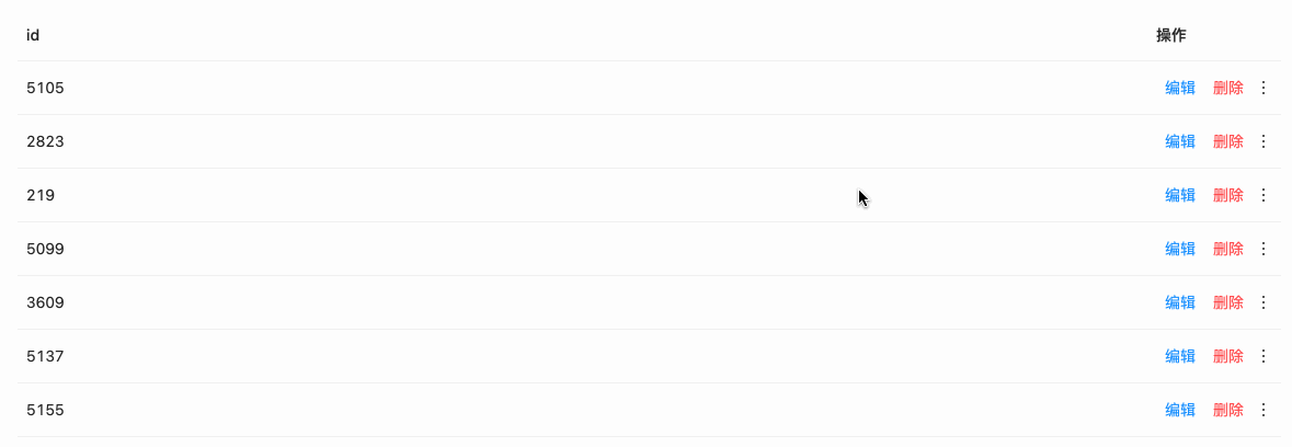
本组件设计为超过一定数量的按钮将展示在
Dropdown中
使用方式
安装
npm i antd-button-group使用
import ButtonGroup from 'antd-button-group'<ButtonGroup>
<Button size='small' type='link' onClick={() => message.success('编辑')}>编辑</Button>
<Button size='small' type='link' danger onClick={() => message.warning('删除')}>删除</Button>
<Button size='small' type='link' onClick={() => message.success('随便什么操作')}>随便什么操作</Button>
<Button type='primary' onClick={() => message.success('primary to link')}>primary to link</Button>
<Button size='small' type='link' danger onClick={() => message.error('按钮 danger')}>按钮 danger</Button>
<Menu.Divider />
<a onClick={() => message.success('a标签')}>a标签</a>
</ButtonGroup>API
Props
| 属性 | 说明 | 类型 | 默认值 | 可选值 |
|---|---|---|---|---|
| max | 外部显示几个按钮,其余放在Dropdown中 | Number|String | 2 | |
| placement | Dropdown弹出位置 | String | bottomLeft | bottomLeft、bottomCenter、 bottomRight topLeft、topCenter、topRight |
| arrow | Dropdown下拉框箭头是否显示 | Boolean | false | |
| trigger | 触发下拉的行为, 移动端不支持 hover | Array|String | click | click、hover、contextMenu |
| icon | 右侧更多 icon | PropTypes.elementType | Antd Icon MoreOutlined | |
| iconStyle | 右侧更多 icon 样式 | Object | { fontSize: 16, verticalAlign: 'middle', marginLeft: 2 } | |
| children | 按钮 | PropTypes.node | - |
children
| PropTypes.node | 说明 |
|---|---|
<Button type='primary'>按钮</Button> | Dropdown中的Button将会自动转为<Button type='link'>按钮</Button> |
<Menu.Divider /> | 使用该组件渲染分割线 |
|
<a disabled onClick={() => message.success('a标签')}>a标签</a> | disabled不可用 |
欢迎点赞、评论、MR (*^▽^*)


 2742
2742


 被折叠的 条评论
为什么被折叠?
被折叠的 条评论
为什么被折叠?
 到【灌水乐园】发言


