


引入
虽然element-plus中已经提供了很多图标,但多数时候我们仍然需要引入自定义的图标,而svg图我们可以自定义css样式,更加灵活,这里在vite环境下,我们使用vite-plugin-svg-icons插件灵活的自动导入svg图标
- 灵活,提供代码提示
1.引入依赖
npm i vite-plugin-svg-icons -D
2.集成配置
1.调整vite.config.ts文件,如下所示:
// vite.config.ts
import { createSvgIconsPlugin } from 'vite-plugin-svg-icons'
export default defineConfig({
  // .....
    plugins: [
        createSvgIconsPlugin({
            iconDirs: [path.resolve(__dirname, "src/assets/icons")],
            symbolId: "icon-[dir]-[name]", // 注意这里的icon- 前缀我在svgIcon.vue中写死了的,如果调整了记得同步改一下
            // 有特殊需求可不进行该配置
            svgoOptions: {
              // 删除一些填充的属性
              plugins: [
                {
                  name: "removeAttrs",
                  params: { attrs: ["class", "data-name", "fill", "stroke"] },
                },
                // 删除样式标签
                "removeStyleElement",
              ],
            },
      }),
  ],
})
2.调整src下的main.ts
// src\main.ts
import "virtual:svg-icons-register";
3.封装组件SvgIcon.vue
- src\components\SvgIcon.vue
<template>
  <svg
    aria-hidden="true"
    class="svg-icon"
    :style="{ width: size + 'px', height: size + 'px' }"
  >
    <use :xlink:href="symbolId" />
  </svg>
</template>
<script setup lang="ts">
import { computed } from "vue";

const props = defineProps({
  name: {
    type: String,
    required: true,
  },
  size: {
    type: [Number, String],
    default: 18,
  },
});
console.log(props.name);
const symbolId = computed(() => `#icon-${props.name}`);
</script>

<style scoped>
.svg-icon {
  fill: currentColor;
  vertical-align: middle;
  overflow: hidden;
  width: 30px;
  height: 30px;
}
</style>
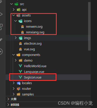
4.目录结构如图所示:
3.测试图标的使用
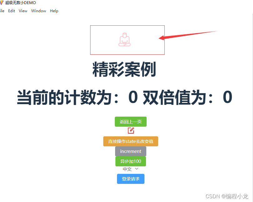
我们直接在helloWorld.vue文件中使用:
 <SvgIcon
    name="renwen"
    :size="60"
    style="color: pink"
  ></SvgIcon>
运行显示如图所示:


 71
71

 被折叠的 条评论
为什么被折叠?
被折叠的 条评论
为什么被折叠?
 到【灌水乐园】发言


