


1.去掉边框和百分比
2.文字上移至牵引线的上方
3.自定义样式
代码如下
app.title = '环形图';
option = {
tooltip: {
trigger: 'item',
formatter: " {b}:{c} "
// ({d}%) 代表该模块所占圆环比例
// formatter: "{a} <br/>{b}: {c} ({d}%)"
},
//环形颜色
color:['#ffb616','#ccc'],
legend: {
orient: 'vertical',
show: false,
x: 'left',
data: ['视频广告', '其他']
},
series: [
{
name: '访问来源',
type: 'pie',
radius: ['30%', '40%'],
labelLine: {
normal: {
show: true,//控制线条显示
length: 20,
length2: 70,
lineStyle: {
color: '#333'
}
}
},
label: {
normal: {
position: 'outer',// 设置标签位置,默认在饼状图外 可选值:'outer' ¦ 'inner(饼状图上)
// \n\n可让文字居于牵引线上方,很关键
// {b} 代表显示的内容标题
// {c}代表数据
formatter: ' {b}:{c} \n\n',
borderWidth: 20,
borderRadius: 4,
padding: [0, -70],
rich: {
a: {
color: '#333',
fontSize: 12,
lineHeight: 20
},
b: {
fontSize: 12,
lineHeight: 20,
color: '#333'
}
}
}
},
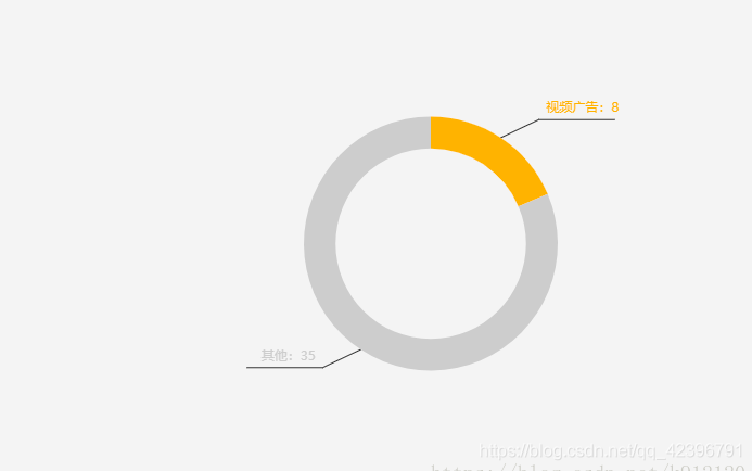
data: [{
value: 8,
name: '视频广告'
}, {
value: 35,
name: '其他'
}]
}
]
};


 1675
1675

 被折叠的 条评论
为什么被折叠?
被折叠的 条评论
为什么被折叠?
 到【灌水乐园】发言


