


css 3 的一些特性,阴影 shadow 动画 animation 形变 transform 渐变 gradient 滤镜 filter 等。
三角形
利用 border-color 支持 transparent 这一特性,隐藏 三条边框,实现三角形。
<style>
.triangle {
width: 0;
height: 0;
border-style: solid;
box-sizing: border-box;
border-width: 0 10px 10px;
border-color: transparent transparent #c5c5c5 transparent;
}
</style>
<div class="triangle"></div>
效果 : 
左上三角形
<style>
.left-top-triangle {
width: 0;
height: 0;
border-style: solid;
box-sizing: border-box;
border-width: 10px;
border-color: #c5c5c5 transparent transparent #c5c5c5;
}
</style>
<div class="left-top-triangle"></div>
效果: 
正五边形
<style>
.pentagon {
width: 54px;
position: relative;
border-width: 50px 18px 0;
border-style: solid;
border-color: #c5c5c5 transparent;
}
.pentagon::before {
content: "";
position: absolute;
width: 0;
height: 0;
top: -85px;
left: -18px;
border-width: 0 45px 35px;
border-style: solid;
border-color: transparent transparent #c5c5c5;
}
</style>
<div class="pentagon"></div>
效果: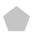
气泡框
使用绝对定位进行三角形覆盖,实现气泡框突出部分。
<style>
.bubble-tip {
width: 100px;
height: 30px;
line-height: 30px;
margin-left: 10px;
border: 1px solid #c5c5c5;
border-radius: 4px;
position: relative;
background-color: #fff;
}
.bubble-tip::before {
content: "";
width: 0;
height: 0;
border-style: solid;
border-width: 10px 10px 10px 0;
border-color: transparent #ffffff transparent transparent;
position: absolute;
top: 5px;
left: -10px;
z-index: 2;
}
.bubble-tip::after {
content: "";
width: 0;
height: 0;
border-style: solid;
border-width: 10px 10px 10px 0;
border-color: transparent #c5c5c5 transparent transparent;
position: absolute;
top: 5px;
left: -11px;
z-index: 1;
}
</style>
<div class="bubble-tip"></div>
效果: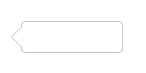
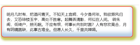
阴影效果
box-shadow实现
语法:box-shadow: offest-x offest-y blur-radius spread-radius color inset;

注意:
1、若元素设置了 broder-radius 属性,那么阴影也会有圆角效果。
2、同一个元素可以设置多个阴影效果,使用逗号分隔。
3、同个元素上的多个阴影在 Z 轴上,按照第一个阴影在最上面的顺序依次排列
<style>
.box-shadow {
width: 500px;
border-radius: 10px;
padding: 20px;
box-shadow: 0 -1em 1em rgba(100, 150, 200, .5) inset,
0 0 0 2px #ff3333,
0.3em 0.3em 0.5em 10px rgb(198, 200, 100);
}
</style>
<div class="box-shadow">
明月几时有,把酒问青天。不知天上宫阙,今夕是何年。我欲乘风归去,又恐琼楼玉宇,高处不胜寒。起舞弄清影,何似在人间。
转朱阁,低绮户,照无眠。不应有恨,何事长向别时圆?人有悲欢离合,月有阴晴圆缺,此事古难全。但愿人长久,千里共婵娟。
</div>
效果:
 fi
fi
filter 滤镜实现
filter属性将模糊或颜色偏移等图形效果应用于元素。通常用于调整图像,背景和边框的渲染。配合其内置函数,可以实现许多丰富多彩的效果。比如阴影图像、灰度图像等。详见filter-MDN。

<style>
.filter-shadow {
width: 500px;
padding: 20px;
filter: drop-shadow(0.3em 0.3em 0.5em rgb(198, 200, 100));
}
</style>
<div class="filter-shadow">
明月几时有,把酒问青天。不知天上宫阙,今夕是何年。我欲乘风归去,又恐琼楼玉宇,高处不胜寒。起舞弄清影,何似在人间。
转朱阁,低绮户,照无眠。不应有恨,何事长向别时圆?人有悲欢离合,月有阴晴圆缺,此事古难全。但愿人长久,千里共婵娟。
</div>
效果:
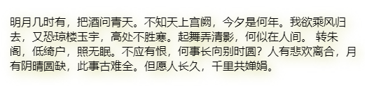
两者区别
其实代码和效果上就可以看出来:
box-shadow是给元素“盒子”的添加阴影,drop-shadow是给元素“自身”增加阴影。
box-shadow支持阴影叠加,dropshadow不行。
参数值不同。有些浏览器drop-shadow不支持spread-radius,且drop-shadow没有inset关键字。
兼容性不同。box-shadow从IE9就开始支持,而drop-shadow从IE13才开始支持。详见css-boxshadow 、css-filters
全屏灰色(特殊日期使用)
使用滤镜filter的grayscale函数。
<style>
.filter {
-webkit-filter: grayscale(100%); /* webkit */
-moz-filter: grayscale(100%); /*firefox*/
-ms-filter: grayscale(100%); /*ie9*/
-o-filter: grayscale(100%); /*opera*/
filter: grayscale(100%);
filter: progid:DXImageTransform.Microsoft.BasicImage(grayscale=1); /*ie*/
filter: gray; /*ie9- */
}
</style>
<html class="filter">
<img src="img.jpg" />
</html>

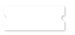
卡券贴
在CSS3当中,background添加了background-size属性,控制背景图片的大小,配合background-position属性,可以在一个背景下面展示多张图片。详见background-MDN。
卡券贴的核心是使用透明白色径向渐变radial-gradient,分别让4张背景图中的左下角、右下角、右上角和左下角出现缺省,再利用drop-shadow实现元素阴影,从而达到效果。
radial-gradient语法如下:
radial-gradient(shape size at position, start-color, ..., last-color)
值 描述
shape 确定圆的类型:
ellipse (默认): 指定椭圆形的径向渐变。
circle :指定圆形的径向渐变
size 定义渐变的大小,可能值:
farthest-corner (默认) : 指定径向渐变的半径长度为从圆心到离圆心最远的角
closest-side :指定径向渐变的半径长度为从圆心到离圆心最近的边
closest-corner : 指定径向渐变的半径长度为从圆心到离圆心最近的角
farthest-side :指定径向渐变的半径长度为从圆心到离圆心最远的边
position 定义渐变的位置。可能值:
center(默认):设置中间为径向渐变圆心的纵坐标值。
top:设置顶部为径向渐变圆心的纵坐标值。
bottom:设置底部为径向渐变圆心的纵坐标值。
可混合使用,如top right
start-color, …, last-color 用于指定渐变的起止颜色。
<style>
.coupon{
width: 200px;
height: 80px;
background: radial-gradient(circle at right bottom, transparent 10px, #ffffff 0) top right / 50% 40px no-repeat,
radial-gradient(circle at left bottom, transparent 10px, #ffffff 0) top left / 50% 40px no-repeat,
radial-gradient(circle at right top, transparent 10px, #ffffff 0) bottom right / 50% 40px no-repeat,
radial-gradient(circle at left top, transparent 10px, #ffffff 0) bottom left / 50% 40px no-repeat;
filter: drop-shadow(3px 3px 3px #c5c5c5);
}
</style>
<div class="coupon"></div>


 1579
1579


 被折叠的 条评论
为什么被折叠?
被折叠的 条评论
为什么被折叠?
 到【灌水乐园】发言


