


实现一种这样的布局:屏幕中间有一块滚动区域,滚动滚动条时,里面的猫猫图片会随之滚动。
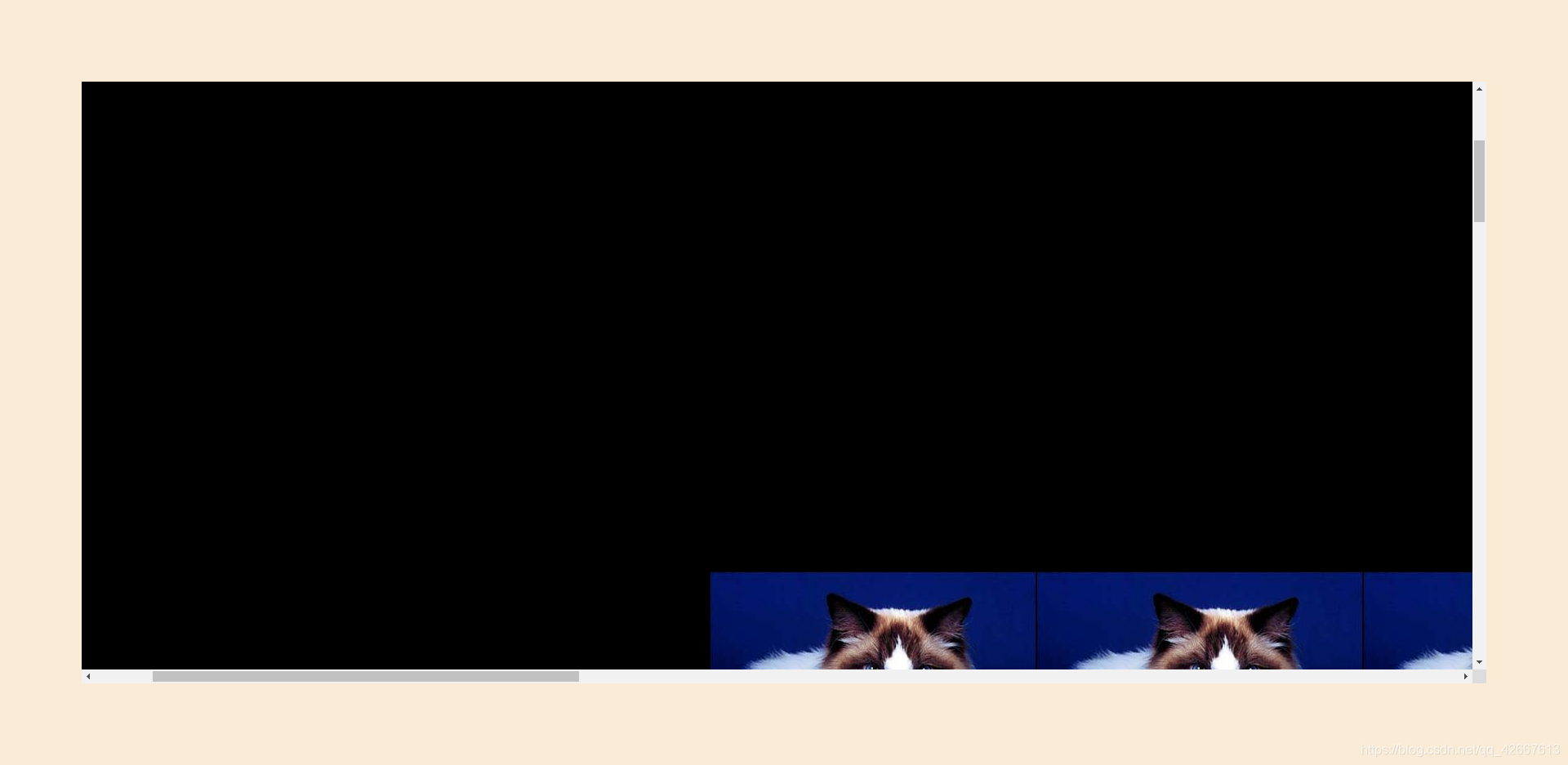
滚动条滚动一点时:
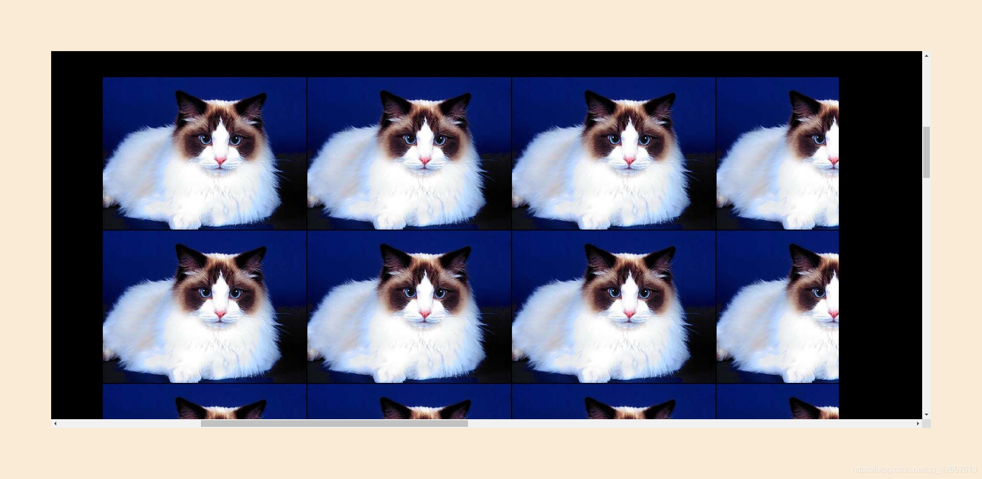
继续滚动滚动条,把猫猫图片展示在中间区域:
代码:
<style>
body {
background-color: antiquewhite;
}
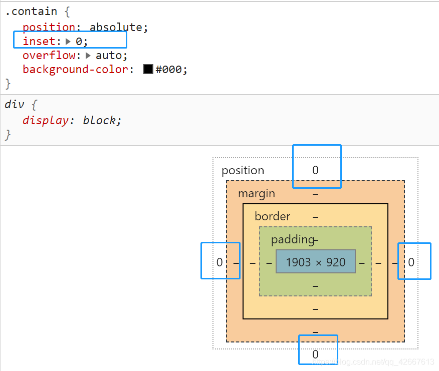
.contain {
position: absolute;
inset: 100px;
overflow: auto;
background-color: #000;
}
.fa {
width: 3440px;
height: 2960px;
padding: 1000px;
}
.son {
width: 1440px;
height: 960px;
background-image: url('../img/1.jpg');
}
</style>
<div class="contain">
<div class="fa">
<div class="son"></div>
</div>
</div>
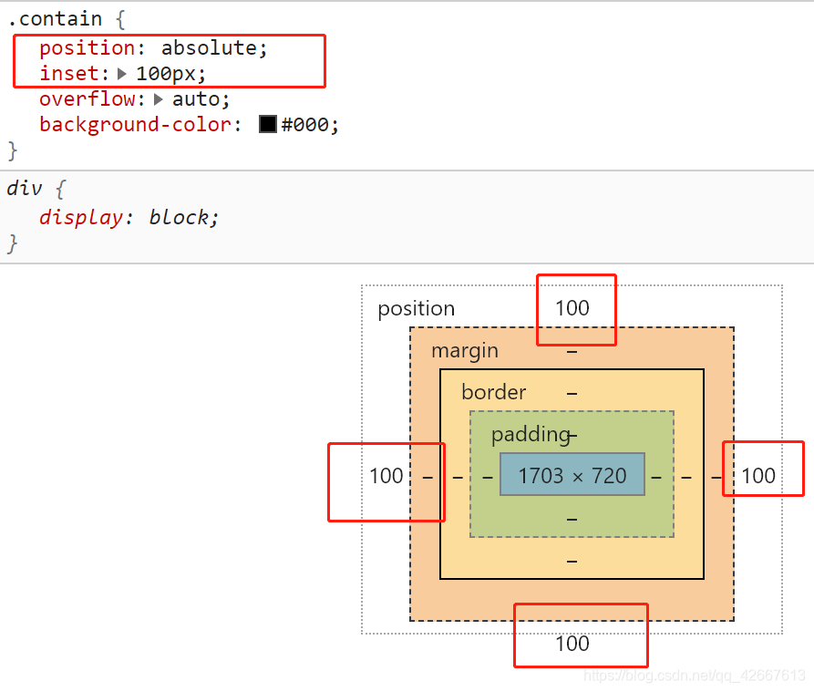
定位以后,inset属性才有效。
inset:100px; 意思是当前定位元素相对于最近定位的祖先元素的位置。因为这个例子中没有定位的祖先元素,所以相对于html进行定位,那么当前元素距离浏览器窗口的 “距离” (不是外边距)为100px。也就是说当inset:0; 时,当前元素是紧贴着浏览器窗口的。
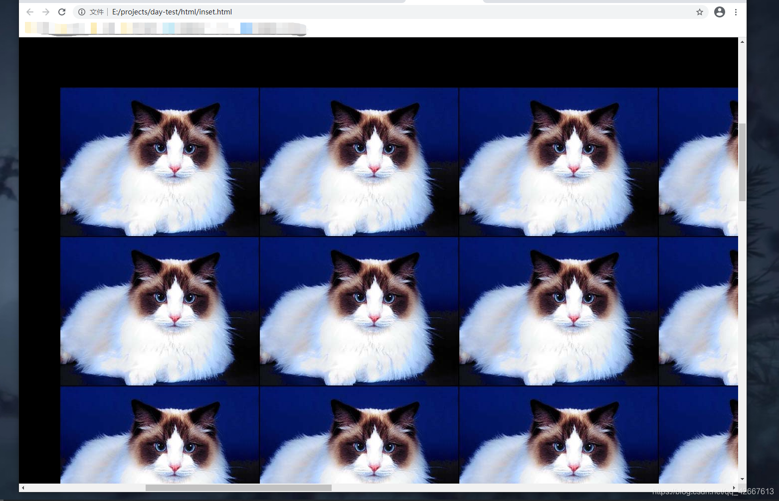
(1)inset: 0;时,contain元素紧贴浏览器窗口。contain元素要绝对定位哦
效果图:
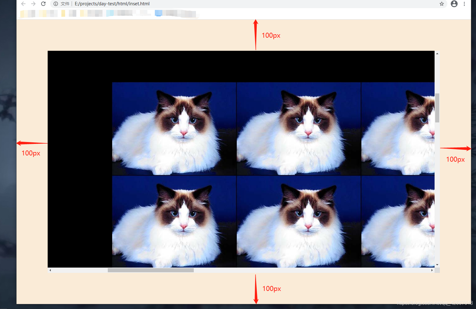
(2)inset: 100px;时:
效果图:
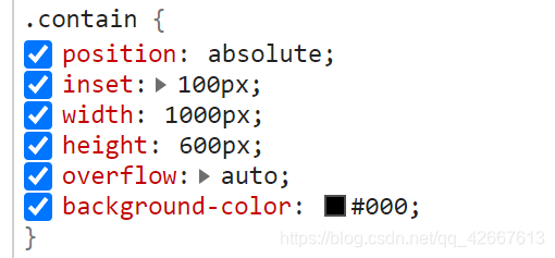
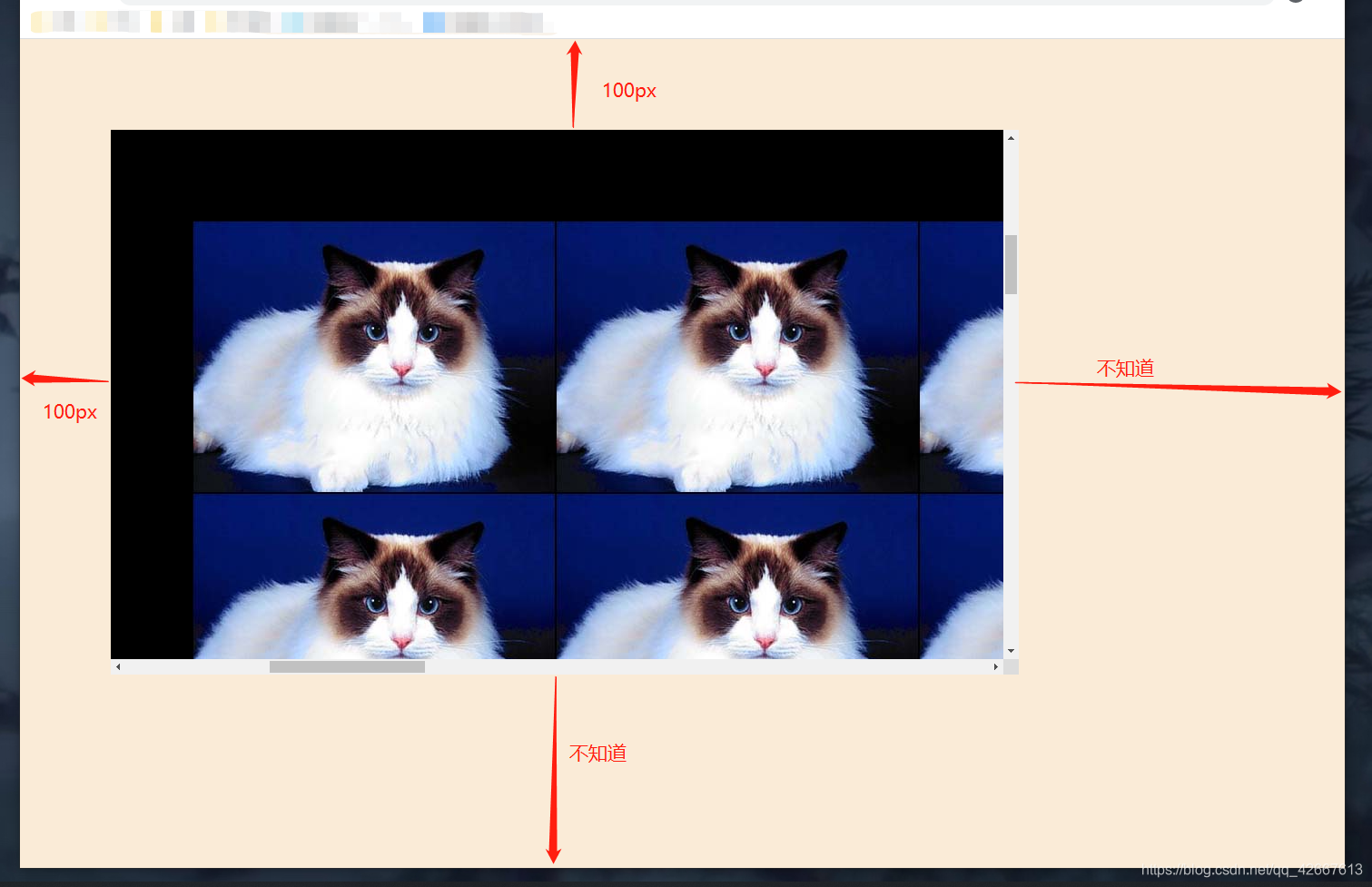
注意: contain不能有宽高,如果给contain加上宽高,效果会发生变化,就不会在屏幕中居中显示了


 扫一扫
扫一扫


 509
509

 被折叠的 条评论
为什么被折叠?
被折叠的 条评论
为什么被折叠?
 到【灌水乐园】发言


