


先来看一下效果:
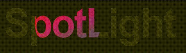
实现原理:将两个SpotLight文字完全重叠,后面那个是深灰色,前面的是亮颜色的,再将前面的文字套用圆形遮罩,最后加上CSS Animation就可以了。如果要实现渐变色,只需给伪元素添加渐变背景图片,将文字颜色设成透明,然后使用background-clip:text属性设置背景的裁剪区域即可
主要应用到的 CSS 属性包括:
- ::after
- clip-path
- @keyframes & animation
- attr()
- background-clip
::after :选择器向选定元素的最后子元素后面插入内容
clip-path:使用裁剪方式创建元素的可显示区域。区域内的部分显示,区域外的隐藏。其中ellipse属性表示定义一个椭圆
@keyframes:通过在动画序列中定义关键帧(或 waypoints)的样式来控制 CSS 动画序列中的中间步骤
attr():返回选择元素的属性值,一般与content搭配使用
background-clip:设置元素的背景(背景图片或颜色)是否延伸到边框、内边距盒子、内容盒子下面。其中text属性表示背景被裁剪成文字的前景色
最后附上源码:
<!DOCTYPE html>
<html lang="en">
<head>
  <meta charset="UTF-8">
  <meta http-equiv="X-UA-Compatible" content="IE=edge">
  <meta name="viewport" content="width=device-width, initial-scale=1.0">
  <title>spotlight</title>
  <style>
    html {
      font-size: 15px;
    }

    body {
      background-color: #222;
      display: flex;
      justify-content: center;
      align-items: center;
      min-height: 100vh;
    }

    h1 {
      color: #333;
      font-family: Helvetica;
      margin: 0;
      padding: 0;
      font-size: 8rem;
      letter-spacing: -0.3rem;
      position: relative;
    }

    h1::after {
      content: attr(data-spotlight);
      color: transparent;
      position: absolute;
      top: 0;
      left: 0;
      -webkit-clip-path: ellipse(100px 100px at 0% 50%);
      clip-path: ellipse(100px 100px at 0% 50%);
      animation: spotlight 5s infinite;
      background-image: url(https://images.unsplash.com/photo-1579547621869-0ddb5f237392?ixlib=rb-1.2.1&ixid=eyJhcHBfaWQiOjEyMDd9&auto=format&fit=crop&w=1500&q=80);
      background-size: 150%;
      background-position: center center;
      -webkit-background-clip: text;
      background-clip: text;
    }

    @keyframes spotlight {
      0% {
        -webkit-clip-path: ellipse(100px 100px at 0% 50%);
        clip-path: ellipse(100px 100px at 0% 50%);
      }

      50% {
        -webkit-clip-path: ellipse(100px 100px at 100% 50%);
        clip-path: ellipse(100px 100px at 100% 50%);
      }

      100% {
        -webkit-clip-path: ellipse(100px 100px at 0% 50%);
        clip-path: ellipse(100px 100px at 0% 50%);
      }
    }
  </style>
</head>
<body>
  <h1 data-spotlight="SpotLight!">SpotLight</h1>
</body>
</html>


 4664
4664


 被折叠的 条评论
为什么被折叠?
被折叠的 条评论
为什么被折叠?
 到【灌水乐园】发言


