


目录
Vue3实现高仿word自定义颜色选择器组件(支持 v-model)
需求分析
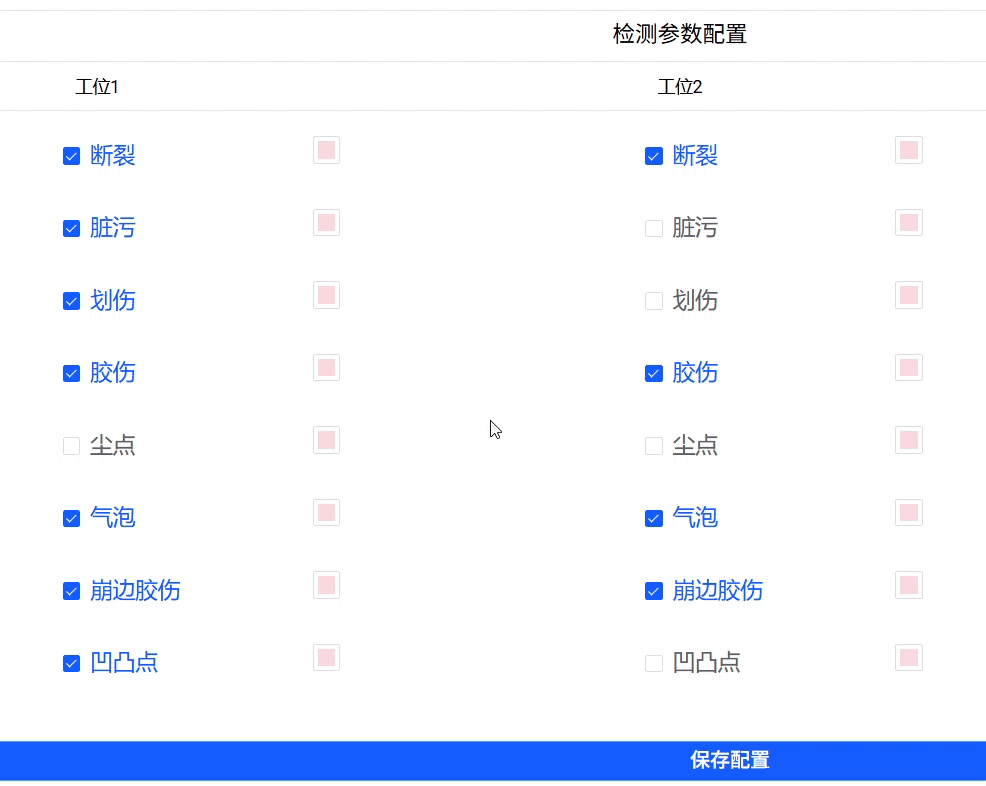
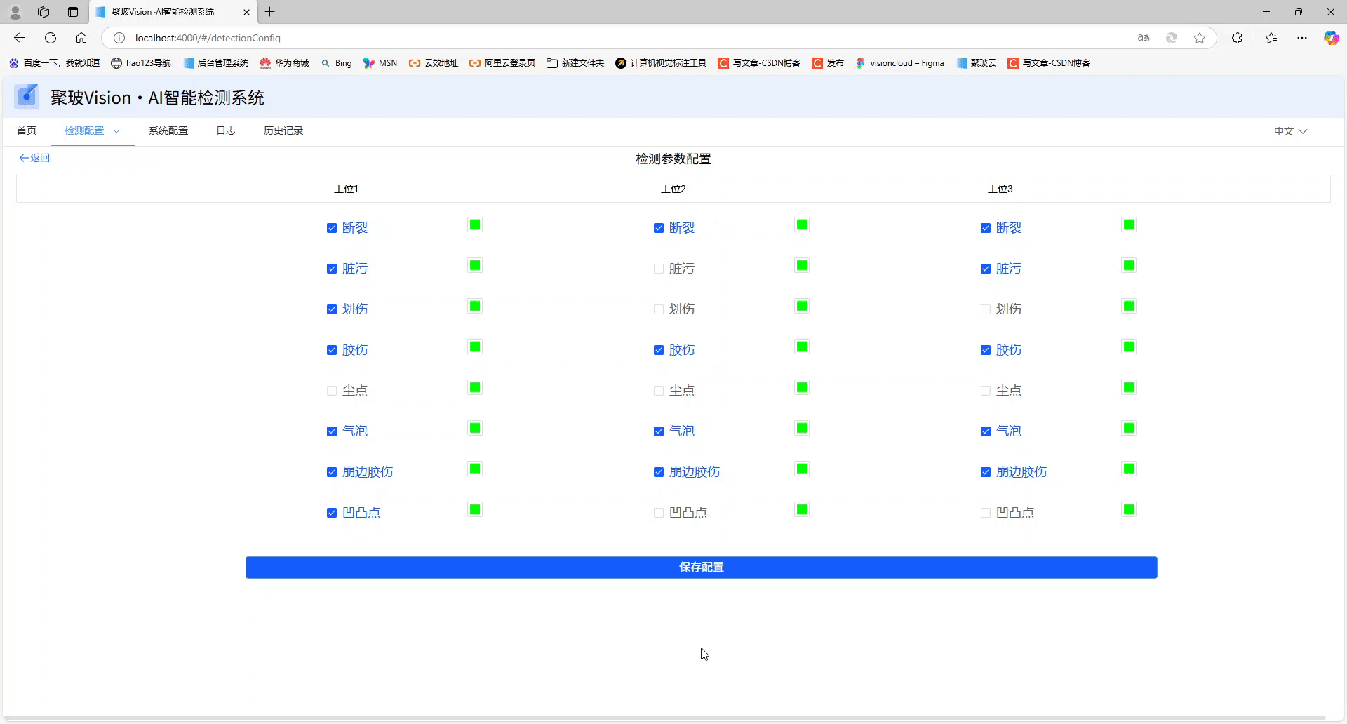
最近接到一个需求,前端拿到AI组通过检测算法得到的瑕疵数据,为了标识每个瑕疵,通过设置瑕疵的颜色进行标志,产品要求仿照word的颜色设置来进行设置取色器。
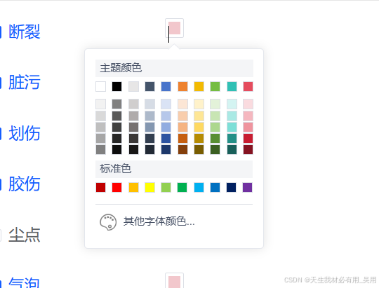
大致效果
需求功能
- 颜色选择:用户可以通过点击预定义的颜色块或使用颜色选择器选择颜色。
- 双向绑定:子组件支持 v-model,可以与父组件进行双向数据绑定。
- 弹出式设计:颜色选择器以弹窗形式展示,提供更好的用户体验。
- 可以选择默认主题色,标准色,及其自定义其他字体颜色。
- 样式优化:通过 SCSS 样式美化组件。
实现所需技术
vue3+elementPlus。elementPlus的Popconfirm气泡确认框。elementPlus的ColorPicker颜色选择器。
从UI哪里拿到主题颜色标准色
// 主题色
const themeColors = ref([
  "#FFFFFF",
  "#000000",
  "#E7E6E6",
  "#44546A",
  "#4874CB",
  "#EE822F",
  "#F2BA02",
  "#75BD42",
  "#30C0B4",
  "#E54C5E",
]);
// 标准色 Standard color
const standardColors = ref([
  "#C00000",
  "#FF0000",
  "#FFC000",
  "#FFFF00",
  "#92D050",
  "#00B050",
  "#00B0F0",
  "#0070C0",
  "#002060",
  "#7030A0",
]);
// 主题渐变色
const gradientColors = ref([
  ["#F2F2F2", "#D9D9D9", "#BFBFBF", "#A6A6A6", "#808080"],
  ["#808080", "#595959", "#404040", "#262626", "#0D0D0D"],
  ["#D0CECE", "#AFABAB", "#767171", "#3B3838", "#181717"],
  ["#D6DCE5", "#ADB9CA", "#8497B0", "#333F50", "#222A35"],
  ["#DAE3F5", "#B6C7EA", "#91ACE0", "#2E54A1", "#1E386B"],
  ["#FCE6D5", "#F8CDAC", "#F5B482", "#C65F10", "#843F0B"],
  ["#FFF2CA", "#FEE695", "#FED961", "#B68C02", "#795D01"],
  ["#E3F2D9", "#C8E5B3", "#ACD78E", "#588E32", "#3B5F21"],
  ["#D4F4F2", "#A9E9E4", "#7DDFD7", "#249087", "#18605A"],
  ["#FADBDF", "#F5B7BF", "#EF949E", "#C81D31", "#851321"],
]);
进行子主组件的v-model实现
const emit = defineEmits(["update:modelValue"]);
const props = defineProps({
  modelValue: {
    type: String,
    default: "#FFFFFF",
  },
});
watch(
  () => props.modelValue,
  (newVal) => {
    // console.log("modelValue changed:", newVal);
    colorValue.value = newVal; // 更新子组件的内部状态
  }
);
const colorSelect = (val: any) => {
  colorValue.value = val;
  emit("update:modelValue", colorValue.value); // 更新父组件中的值
  handleCancel();
};
子组件布局实现
使用el-popover套一层,然后遍历主题色标准色进行flex布局,如果弹窗组件使用了:visible="popconfirmVisible" 则需要配置trigger="focus"进行鼠标移出弹窗隐藏弹窗。
<template>
  <div class="color-picker-wrapper" ref="wrapperRef">
    <el-popover
      width="205px"
      ref="colorPopover"
      @confirm="handleConfirm"
      @cancel="handleCancel"
      v-model:visible="popconfirmVisible"
      trigger="focus"
    >
      <template #reference>
        <div @click="handleClick" class="color-box">
          <div
            class="color-pice"
            :style="{ backgroundColor: colorValue }"
          ></div>
        </div>
      </template>
      <div style="width: 180px; text-align: left">
        <div
          style="
            font-size: 12px;
            width: 100%;
            background-color: #f4f5f7;
            height: 20px;
            line-height: 20px;
            padding-left: 5px;
            margin-bottom: 5px;
            color: #444e63;
          "
        >
          主题颜色
        </div>
        <div
          style="height: 20px; display: flex; justify-content: space-between"
        >
          <div
            class="theme-color-item"
            v-for="(item, index) in themeColors"
            @click="colorSelect(item)"
            :key="index"
            :style="{ background: item }"
          ></div>
        </div>
        <div style="width: 100%; display: flex; justify-content: space-between">
          <div
            v-for="(item, index) in gradientColors"
            :key="index"
            style="
              height: 64px;
              width: 12px;
              display: flex;
              flex-direction: column;
              justify-content: space-between;
            "
          >
            <div
              v-for="(item1, index1) in item"
              :key="index1"
              @click="colorSelect(item1)"
              :style="{ background: item1 }"
              class="theme-color-block"
            ></div>
          </div>
        </div>
      </div>
      <div class="theme-color">标准色</div>
      <div style="height: 20px; display: flex; justify-content: space-between">
        <div
          class="theme-color-item"
          v-for="(item, index) in standardColors"
          :key="index"
          @click="colorSelect(item)"
          :style="{ background: item }"
        ></div>
      </div>
      <el-divider style="margin: 0; margin-top: 5px"></el-divider>

      <div class="colorPalette-box">
        <!-- <img :src="'../../assets/image/colorPalette.png':'../../assets/image/colorPalette.png'" style="width: 26px" /> -->
        <div class="colorPalette-text" @click="showColor" style="display: flex">
          <div style="" class="colorPalette-icon"></div>
          <div style="width: 90px">其他字体颜色...</div>
          <el-color-picker
            :teleported="false"
            v-model="colorValue"
            @change="colorChange"
            size="small"
          />
        </div>
      </div>
    </el-popover>
  </div>
</template>
子组件样式实现
样式中,需要修改elementPlus的组件,其中最需要修改el-color-picker使其拉长得以点击其他字体颜色...的div块唤醒弹窗。
<style lang="scss" scoped>
.color-box:hover {
  border-color: #409eff;
  transition: 0.5s;
}
.color-box {
  width: 22px;
  height: 22px;
  background-color: #fff;
  border: 1px solid #dcdfe6;
  border-radius: 2px;
  display: flex;
  justify-content: center;
  align-items: center;
  cursor: pointer;
  .color-pice {
    width: 14px;
    height: 14px;
  }
}
::v-deep .el-popconfirm__action {
  margin-top: 0px !important;
  text-align: left;
}
.theme-color-block {
  width: 12px;
  height: 12px;
  cursor: pointer;
  border: 1px solid #dcdfe6;
}
.theme-color-block:hover {
  border: 1px solid #ffa800 !important;
  transition: 0.5s !important;
}
.theme-color-item {
  width: 12px;
  height: 12px;
  cursor: pointer;
  border: 1px solid #dcdfe6;
}
.theme-color-item:hover {
  border: 1px solid #ffa800;
  transition: 0.5s;
}
.colorPalette-box {
  display: flex;
  font-size: 12px;
  width: 100%;
  cursor: pointer;
  height: 26px;
  line-height: 26px;
  padding-left: 2px;
  margin-bottom: 5px;
  margin-top: 6px;
  text-align: left;
  color: #444e63;
}
.colorPalette-box:hover {
  color: #165dff;
  .colorPalette-icon {
    background-image: url("../../assets/image/colorPaletteActive.png");
  }
}
.colorPalette-box:hover {
  background: #f2f2f2;
  transition: 0.3s;
}
.colorPalette-icon {
  width: 26px;
  height: 26px;
  position: relative;
  left: -5px;
  background-image: url("../../assets/image/colorPalette.png");
  background-repeat: repeat; /* 在两个方向上平铺背景图片 */
  background-size: cover; /* 覆盖整个元素,可能会被裁剪以适应尺寸 */
  background-position: center; /* 背景图片居中 */
}
.colorPalette-text {
  position: relative;
  margin-left: 4px;
}
.theme-color {
  font-size: 12px;
  width: 100%;
  background-color: #f4f5f7;
  height: 20px;
  text-align: left;
  line-height: 20px;
  padding-left: 5px;
  margin-bottom: 5px;
  margin-top: 6px;
  color: #444e63;
}
::v-deep .el-color-picker__panel {
  position: absolute;
  top: -0px !important;
  left: 180px !important;
}
::v-deep .el-color-picker__trigger {
  width: 179px;
  border: none;
  position: relative;
  top: 0px;
  left: -142px;
  z-index: 10000;
}
::v-deep .el-color-picker__color {
  display: none !important;
}
</style>
子组件全部代码:
<template>
  <div class="color-picker-wrapper" ref="wrapperRef">
    <el-popover
      width="205px"
      ref="colorPopover"
      @confirm="handleConfirm"
      @cancel="handleCancel"
      v-model:visible="popconfirmVisible"
      trigger="focus"
    >
      <template #reference>
        <div @click="handleClick" class="color-box">
          <div
            class="color-pice"
            :style="{ backgroundColor: colorValue }"
          ></div>
        </div>
      </template>
      <div style="width: 180px; text-align: left">
        <div
          style="
            font-size: 12px;
            width: 100%;
            background-color: #f4f5f7;
            height: 20px;
            line-height: 20px;
            padding-left: 5px;
            margin-bottom: 5px;
            color: #444e63;
          "
        >
          主题颜色
        </div>
        <div
          style="height: 20px; display: flex; justify-content: space-between"
        >
          <div
            class="theme-color-item"
            v-for="(item, index) in themeColors"
            @click="colorSelect(item)"
            :key="index"
            :style="{ background: item }"
          ></div>
        </div>
        <div style="width: 100%; display: flex; justify-content: space-between">
          <div
            v-for="(item, index) in gradientColors"
            :key="index"
            style="
              height: 64px;
              width: 12px;
              display: flex;
              flex-direction: column;
              justify-content: space-between;
            "
          >
            <div
              v-for="(item1, index1) in item"
              :key="index1"
              @click="colorSelect(item1)"
              :style="{ background: item1 }"
              class="theme-color-block"
            ></div>
          </div>
        </div>
      </div>
      <div class="theme-color">标准色</div>
      <div style="height: 20px; display: flex; justify-content: space-between">
        <div
          class="theme-color-item"
          v-for="(item, index) in standardColors"
          :key="index"
          @click="colorSelect(item)"
          :style="{ background: item }"
        ></div>
      </div>
      <el-divider style="margin: 0; margin-top: 5px"></el-divider>

      <div class="colorPalette-box">
        <!-- <img :src="'../../assets/image/colorPalette.png':'../../assets/image/colorPalette.png'" style="width: 26px" /> -->
        <div class="colorPalette-text" @click="showColor" style="display: flex">
          <div style="" class="colorPalette-icon"></div>
          <div style="width: 90px">其他字体颜色...</div>
          <el-color-picker
            :teleported="false"
            v-model="colorValue"
            @change="colorChange"
            size="small"
          />
        </div>
      </div>
    </el-popover>
  </div>
</template>

<script setup lang="ts">
import { onUnmounted, ref, watch } from "vue";
const emit = defineEmits(["update:modelValue"]);
const props = defineProps({
  modelValue: {
    type: String,
    default: "#FFFFFF",
  },
});
watch(
  () => props.modelValue,
  (newVal) => {
    // console.log("modelValue changed:", newVal);
    colorValue.value = newVal; // 更新子组件的内部状态
  }
);
const colorValue = ref(props.modelValue);
const colorPopover: any = ref(null);
// 主题色
const themeColors = ref([
  "#FFFFFF",
  "#000000",
  "#E7E6E6",
  "#44546A",
  "#4874CB",
  "#EE822F",
  "#F2BA02",
  "#75BD42",
  "#30C0B4",
  "#E54C5E",
]);
// 标准色 Standard color
const standardColors = ref([
  "#C00000",
  "#FF0000",
  "#FFC000",
  "#FFFF00",
  "#92D050",
  "#00B050",
  "#00B0F0",
  "#0070C0",
  "#002060",
  "#7030A0",
]);
// 主题渐变色
const gradientColors = ref([
  ["#F2F2F2", "#D9D9D9", "#BFBFBF", "#A6A6A6", "#808080"],
  ["#808080", "#595959", "#404040", "#262626", "#0D0D0D"],
  ["#D0CECE", "#AFABAB", "#767171", "#3B3838", "#181717"],
  ["#D6DCE5", "#ADB9CA", "#8497B0", "#333F50", "#222A35"],
  ["#DAE3F5", "#B6C7EA", "#91ACE0", "#2E54A1", "#1E386B"],
  ["#FCE6D5", "#F8CDAC", "#F5B482", "#C65F10", "#843F0B"],
  ["#FFF2CA", "#FEE695", "#FED961", "#B68C02", "#795D01"],
  ["#E3F2D9", "#C8E5B3", "#ACD78E", "#588E32", "#3B5F21"],
  ["#D4F4F2", "#A9E9E4", "#7DDFD7", "#249087", "#18605A"],
  ["#FADBDF", "#F5B7BF", "#EF949E", "#C81D31", "#851321"],
]);
const popconfirmVisible = ref(false);
const showColor = () => {};
const colorChange = (val: any) => {
  emit("update:modelValue", colorValue.value); // 更新父组件中的值
  handleCancel();
};
const handleClick = () => {
  popconfirmVisible.value = true; // 显示 Popconfirm
};

const handleConfirm = () => {
  popconfirmVisible.value = false; // 隐藏 Popconfirm
};
const colorSelect = (val: any) => {
  colorValue.value = val;
  emit("update:modelValue", colorValue.value); // 更新父组件中的值
  handleCancel();
};
const handleCancel = () => {
  popconfirmVisible.value = false; // 隐藏 Popconfirm
};
const clicked = ref(false);
</script>
<style lang="scss" scoped>
.color-box:hover {
  border-color: #409eff;
  transition: 0.5s;
}
.color-box {
  width: 22px;
  height: 22px;
  background-color: #fff;
  border: 1px solid #dcdfe6;
  border-radius: 2px;
  display: flex;
  justify-content: center;
  align-items: center;
  cursor: pointer;
  .color-pice {
    width: 14px;
    height: 14px;
  }
}
::v-deep .el-popconfirm__action {
  margin-top: 0px !important;
  text-align: left;
}
.theme-color-block {
  width: 12px;
  height: 12px;
  cursor: pointer;
  border: 1px solid #dcdfe6;
}
.theme-color-block:hover {
  border: 1px solid #ffa800 !important;
  transition: 0.5s !important;
}
.theme-color-item {
  width: 12px;
  height: 12px;
  cursor: pointer;
  border: 1px solid #dcdfe6;
}
.theme-color-item:hover {
  border: 1px solid #ffa800;
  transition: 0.5s;
}
.colorPalette-box {
  display: flex;
  font-size: 12px;
  width: 100%;
  cursor: pointer;
  height: 26px;
  line-height: 26px;
  padding-left: 2px;
  margin-bottom: 5px;
  margin-top: 6px;
  text-align: left;
  color: #444e63;
}
.colorPalette-box:hover {
  color: #165dff;
  .colorPalette-icon {
    background-image: url("../../assets/image/colorPaletteActive.png");
  }
}
.colorPalette-box:hover {
  background: #f2f2f2;
  transition: 0.3s;
}
.colorPalette-icon {
  width: 26px;
  height: 26px;
  position: relative;
  left: -5px;
  background-image: url("../../assets/image/colorPalette.png");
  background-repeat: repeat; /* 在两个方向上平铺背景图片 */
  background-size: cover; /* 覆盖整个元素,可能会被裁剪以适应尺寸 */
  background-position: center; /* 背景图片居中 */
}
.colorPalette-text {
  position: relative;
  margin-left: 4px;
}
.theme-color {
  font-size: 12px;
  width: 100%;
  background-color: #f4f5f7;
  height: 20px;
  text-align: left;
  line-height: 20px;
  padding-left: 5px;
  margin-bottom: 5px;
  margin-top: 6px;
  color: #444e63;
}
::v-deep .el-color-picker__panel {
  position: absolute;
  top: -0px !important;
  left: 180px !important;
}
::v-deep .el-color-picker__trigger {
  width: 179px;
  border: none;
  position: relative;
  top: 0px;
  left: -142px;
  z-index: 10000;
}
::v-deep .el-color-picker__color {
  display: none !important;
}
</style>
父组件调用方式
 <template>
	ColourSle v-model="selectedColor"></ColourSle>
</template><
<script lang="ts" setup>
  const ColourSle = defineAsyncComponent(
    () => import("../../components/colourSle/index.vue")
  );
  const selectedColor = ref("#00FF00");
</script>
使用效果:
后续代码待优化,优化后会替换当前代码。
十六进制转RGB或RGBA方法:
调用方法:
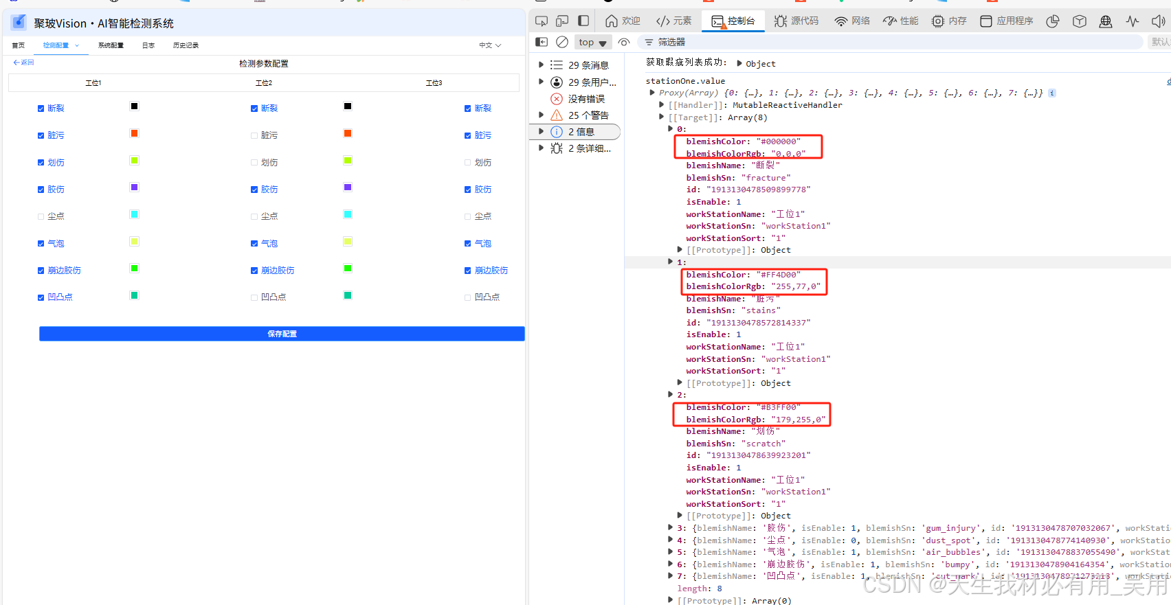
for (let i = 0; i < stationOne.value.length; i++) {
     if (stationOne.value[i]) {
       stationOne.value[i].blemishColorRgb = hexToRgba(
         stationOne.value[i].blemishColor,
         -1
       );
     } else {
       console.warn(`stationOne[${i}] 数据不完整`);
     }
   }
方法实现:
// 十六进制转换成RGB颜色
function hexToRgba(hexColor: any, a = 1) {
  // 移除前缀#符号
  hexColor = hexColor.replace(/^\s*#|\s*$/g, "");
  // 将三位十六进制转换为六位
  if (hexColor.length === 3) {
    hexColor = hexColor.replace(/(.)/g, "$1$1");
  }
  // 提取R、G、B各自的十六进制表示方式
  const r = parseInt(hexColor.substr(0, 2), 16);
  const g = parseInt(hexColor.substr(2, 2), 16);
  const b = parseInt(hexColor.substr(4, 2), 16);
  const rgb = a < 0 || a > 1 ? `${r},${g},${b}` : `${r},${g},${b},${a}`;
  return rgb;
}
效果:


 扫一扫
扫一扫


 4052
4052

 被折叠的 条评论
为什么被折叠?
被折叠的 条评论
为什么被折叠?
 到【灌水乐园】发言


