


声明:本人是小白,第一次接触机器学习大型项目,感谢天池Datawhale提供学习机会,由于刚入门,能力有限,故只能跟着课程照猫画虎复现代码,内容完全尊重原意。Datawhale天池
二、EDA-数据探索性分析
2.1 EDA目标
- EDA的价值主要在于熟悉数据集,了解数据集,对数据集进行验证来确定所获得数据集可以用于接下来的机器学习或者深度学习使用。
- 当了解了数据集之后我们下一步就是要去了解变量间的相互关系以及变量与预测值之间的存在关系。
- 引导数据科学从业者进行数据处理以及特征工程的步骤,使数据集的结构和特征集让接下来的预测问题更加可靠。
- 完成对于数据的探索性分析,并对于数据进行一些图表或者文字总结。
2.2 内容介绍
1.载入各种数据科学以及可视化库:
- 数据科学库 pandas、numpy、scipy;
- 可视化库 matplotlib、seabon;
- 其他;
2.载入数据:
- 载入训练集和测试集;
- 简略观察数据(head()+shape);
3.数据总览:
- 通过describe()来熟悉数据的相关统计量
- 通过info()来熟悉数据类型
4.判断数据缺失和异常
- 查看每列的存在nan情况
- 异常值检测
5.了解预测值的分布
- 总体分布概况(无界约翰逊分布等)
- 查看skewness and kurtosis
- 查看预测值的具体频数
6.特征分为类别特征和数字特征,并对类别特征查看unique分布
7.数字特征分析
- 相关性分析
- 查看几个特征得 偏度和峰值
- 每个数字特征得分布可视化
- 数字特征相互之间的关系可视化
- 多变量互相回归关系可视化
8.类型特征分析
- unique分布
- 类别特征箱形图可视化
- 类别特征的小提琴图可视化
- 类别特征的柱形图可视化类别
- 特征的每个类别频数可视化(count_plot)
9.用pandas_profiling生成数据报告
2.3 代码示例
2.3.1 载入各种数据科学以及可视化库
以下库都是pip install 安装, 有特殊情况我会单独说明 例如 pip install pandas -i https://pypi.tuna.tsinghua.edu.cn/simple
#coding:utf-8
#导入warnings包,利用过滤器来实现忽略警告语句。
import warnings
warnings.filterwarnings('ignore')

import pandas as pd
import numpy as np
import matplotlib.pyplot as plt
import seaborn as sns
import missingno as msno
2.3.2 载入数据
head()+.shape
# 载入数据集和测试集,sep[]将文本转换成DataFrame结构
Train_data = pd.read_csv('used_car_train_20200313.csv',sep=' ')
Test_data = pd.read_csv('used_car_testA_20200313.csv',sep=' ')
所有特征集均脱敏处理:
name - 汽车编码
regDate - 汽车注册时间
model - 车型编码
brand - 品牌
bodyType - 车身类型
fuelType - 燃油类型
gearbox - 变速箱
power - 汽车功率
kilometer - 汽车行驶公里
notRepairedDamage - 汽车有尚未修复的损坏
regionCode - 看车地区编码
seller - 销售方
offerType - 报价类型
creatDate - 广告发布时间
price - 汽车价格
v_0', 'v_1', 'v_2', 'v_3', 'v_4', 'v_5', 'v_6', 'v_7', 'v_8', 'v_9', 'v_10', 'v_11', 'v_12', 'v_13','v_14' 【匿名特征,包含v0-14在内15个匿名特征】
# 简略观察数据(head()+shape),head()表示从数据集开头预览,默认5行,tail()表示从数据集尾部预览,默认5行
print(Train_data.head().append(Train_data.tail()))
print(Train_data.shape)
print(Test_data.head().append(Test_data.tail()))
print(Test_data.shape)

 要养成看数据集的head()以及shape的习惯,这会让你每一步更放心,导致接下里的连串的错误, 如果对自己的pandas等操作不放心,建议执行一步看一下,这样会有效的方便你进行理解函数并进行操作
2.3.3 总览数据概况
1.describe种有每列的统计量,个数count、平均值mean、方差std、最小值min、中位数25% 50% 75% 、以及最大值 看这个信息主要是瞬间掌握数据的大概的范围以及每个值的异常值的判断,比如有的时候会发现999 9999 -1 等值这些其实都是nan的另外一种表达方式,有的时候需要注意下
2.info 通过info来了解数据每列的type,有助于了解是否存在除了nan以外的特殊符号异常
# 1) 通过describe()来熟悉数据的相关统计量
print(Train_data.describe())
print(Test_data.describe())
## 2) 通过info()来熟悉数据类型
print(Train_data.info())
print(Test_data.info())


 2.3.4 判断数据缺失和异常
1) 查看每列的存在nan情况
# 查看每列的存在NaN情况
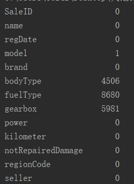
print(Train_data.isnull().sum())
print(Test_data.isnull().sum())
SaleID 0
name 0
regDate 0
model 1
brand 0
bodyType 4506
fuelType 8680
gearbox 5981
power 0
kilometer 0
notRepairedDamage 0
regionCode 0
seller 0
offerType 0
creatDate 0
price 0
v_0 0
v_1 0
v_2 0
v_3 0
v_4 0
v_5 0
v_6 0
v_7 0
v_8 0
v_9 0
v_10 0
v_11 0
v_12 0
v_13 0
v_14 0
dtype: int64
SaleID 0
name 0
regDate 0
model 0
brand 0
bodyType 1413
fuelType 2893
gearbox 1910
power 0
kilometer 0
notRepairedDamage 0
regionCode 0
seller 0
offerType 0
creatDate 0
v_0 0
v_1 0
v_2 0
v_3 0
v_4 0
v_5 0
v_6 0
v_7 0
v_8 0
v_9 0
v_10 0
v_11 0
v_12 0
v_13 0
v_14 0
dtype: int64
# nan可视化
missing = Test_data.isnull().sum()
missing = missing[missing > 0]
missing.sort_values(inplace=True)
missing.plot.bar()
 通过以上两句可以很直观的了解哪些列存在 “nan”, 并可以把nan的个数打印,主要的目的在于 nan存在的个数是否真的很大,如果很小一般选择填充,如果使用lgb等树模型可以直接空缺,让树自己去优化,但如果nan存在的过多、可以考虑删掉
msno.matrix(Train_data.sample(250))
msno.bar(Train_data.sample(1000))

plt.rcParams['font.sans-serif']=['SimHei']   #这两行用来显示汉字
plt.rcParams['axes.unicode_minus'] = False
plt.show()


 测试集的缺省和训练集的差不多情况, 可视化有四列有缺省,notRepairedDamage缺省得最多notRepairedDamage是特殊符号“-”缺失
2) 查看异常值检测
# 查看异常值检测
print(Train_data.info())
<class ‘pandas.core.frame.DataFrame’>
RangeIndex: 150000 entries, 0 to 149999
Data columns (total 31 columns):
SaleID 150000 non-null int64
name 150000 non-null int64
regDate 150000 non-null int64
model 149999 non-null float64
brand 150000 non-null int64
bodyType 145494 non-null float64
fuelType 141320 non-null float64
gearbox 144019 non-null float64
power 150000 non-null int64
kilometer 150000 non-null float64
notRepairedDamage 150000 non-null object
regionCode 150000 non-null int64
seller 150000 non-null int64
offerType 150000 non-null int64
creatDate 150000 non-null int64
price 150000 non-null int64
v_0 150000 non-null float64
v_1 150000 non-null float64
v_2 150000 non-null float64
v_3 150000 non-null float64
v_4 150000 non-null float64
v_5 150000 non-null float64
v_6 150000 non-null float64
v_7 150000 non-null float64
v_8 150000 non-null float64
v_9 150000 non-null float64
v_10 150000 non-null float64
v_11 150000 non-null float64
v_12 150000 non-null float64
v_13 150000 non-null float64
v_14 150000 non-null float64
dtypes: float64(20), int64(10), object(1)
memory usage: 35.5+ MB
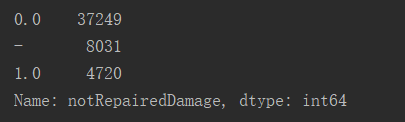
可以发现除了notRepairedDamage 为object类型其他都为数字 这里我们把他的几个不同的值都进行显示就知道了
print(Train_data['notRepairedDamage'].value_counts())
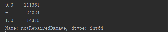 可以看出来‘ - ’也为空缺值,因为很多模型对nan有直接的处理,这里我们先不做处理,先替换成nan
print(Train_data['notRepairedDamage'].value_counts())
Train_data['notRepairedDamage'].replace('-',np.nan,inplace=True)
print(Train_data['notRepairedDamage'].value_counts())
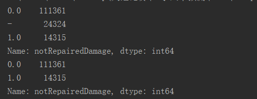
将notRepairedDamage中的特殊缺失符号“-”修改为nan前后比较:
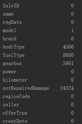
print(Train_data.isnull().sum())
Train_data['notRepairedDamage'].replace('-',np.nan,inplace=True)
# print(Train_data['notRepairedDamage'].value_counts())
print(Train_data.isnull().sum())
 同理,处理Test_data:
Test_data['notRepairedDamage'].value_counts()
Test_data['notRepairedDamage'].replace('-',np.nan,inplace=True)
以下两个类别特征严重倾斜,一般不会对预测有什么帮助,故这边先删掉,当然你也可以继续挖掘,但是一般意义不大
print(Train_data[‘seller’].value_counts())
print(Train_data[‘offerType’].value_counts())
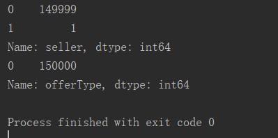
del Train_data['seller']
del Train_data['offerType']
del Test_data['seller']
del Test_data['offerType']
2.3.5 了解预测值的分布
print(Train_data['price'])
print(Train_data['price'].value_counts())
0 1850
1 3600
2 6222
3 2400
4 5200
5 8000
6 3500
7 1000
8 2850
9 650
10 3100
…
149990 450
149991 24950
149992 950
149993 4399
149994 14780
149995 5900
149996 9500
149997 7500
149998 4999
149999 4700
Name: price, Length: 150000, dtype: int64
500 2337
1500 2158
1200 1922
1000 1850
2500 1821
600 1535
3500 1533
800 1513
…
3760 1
24250 1
11360 1
10295 1
25321 1
8886 1
8801 1
37920 1
8188 1
Name: price, Length: 3763, dtype: int64
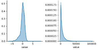
1) 总体分布概况(无界约翰逊分布等)
y = Train_data['price']
plt.figure(1)
plt.title('Johnson SU')
sns.distplot(y,kde=False,fit=st.johnsonsu)
plt.figure(2)
plt.title('Normal')
sns.distplot(y,kde=False,fit=st.norm)
plt.figure(3)
plt.title('Log Normal')
sns.distplot(y,kde=False,fit=st.lognorm)
plt.rcParams['font.sans-serif']=['SimHei']   #这两行用来显示汉字
plt.rcParams['axes.unicode_minus'] = False
plt.show()


 价格不服从正态分布,所以在进行回归之前,它必须进行转换。虽然对数变换做得很好,但最佳拟合是无界约翰逊分布
2) 查看skewness and kurtosis
sns.distplot(Train_data['price'])
print("Skewness:%f"%Train_data['price'].skew())
print("Kurtosis:%f"%Train_data['price'].kurt())
plt.rcParams['font.sans-serif']=['SimHei']
plt.rcParams['axes.unicode_minus']=False
plt.show()
Skewness:3.346487
Kurtosis:18.995183

print(Train_data.skew())
print(Train_data.kurt())
plt.rcParams['font.sans-serif']=['SimHei']
plt.rcParams['axes.unicode_minus']=False
plt.show()
SaleID 0.000000
name 0.557606
regDate 0.028495
model 1.484388
brand 1.150760
bodyType 0.991530
fuelType 1.595486
gearbox 1.317514
power 65.863178
kilometer -1.525921
regionCode 0.688881
seller 387.298335
offerType 0.000000
creatDate -79.013310
price 3.346487
v_0 -1.316712
v_1 0.359454
v_2 4.842556
v_3 0.106292
v_4 0.367989
v_5 -4.737094
v_6 0.368073
v_7 5.130233
v_8 0.204613
v_9 0.419501
v_10 0.025220
v_11 3.029146
v_12 0.365358
v_13 0.267915
v_14 -1.186355
dtype: float64
SaleID -1.200000
name -1.039945
regDate -0.697308
model 1.740483
brand 1.076201
bodyType 0.206937
fuelType 5.880049
gearbox -0.264161
power 5733.451054
kilometer 1.141934
regionCode -0.340832
seller 150000.000000
offerType 0.000000
creatDate 6881.080328
price 18.995183
v_0 3.993841
v_1 -1.753017
v_2 23.860591
v_3 -0.418006
v_4 -0.197295
v_5 22.934081
v_6 -1.742567
v_7 25.845489
v_8 -0.636225
v_9 -0.321491
v_10 -0.577935
v_11 12.568731
v_12 0.268937
v_13 -0.438274
v_14 2.393526
dtype: float64
sns.distplot(Train_data.skew(),color='blue',axlabel='Skewness')
sns.distplot(Train_data.kurt(),color='orange',axlabel='Kurtness')
plt.rcParams['font.sans-serif']=['SimHei']
plt.rcParams['axes.unicode_minus']=False
plt.show()

 3) 查看预测值的具体频数
plt.hist(Train_data['price'],orientation='vertical',histtype='bar',color='red')
plt.show()
 查看频数, 大于20000得值极少,其实这里也可以把这些当作特殊得值(异常值)直接用填充或者删掉,在前面进行运算
# log变换 z之后的分布较均匀,可以进行log变换进行预测,这也是预测问题常用的trick
plt.hist(np.log(Train_data['price']),orientation='vertical',histtype='bar',color='red')
plt.show()

2.3.6 特征分为类别特征和数字特征,并对类别特征查看unique分布
数据类型
列
name - 汽车编码
regDate - 汽车注册时间
model - 车型编码
brand - 品牌
bodyType - 车身类型
fuelType - 燃油类型
gearbox - 变速箱
power - 汽车功率
kilometer - 汽车行驶公里
notRepairedDamage - 汽车有尚未修复的损坏
regionCode - 看车地区编码
seller - 销售方 【以删】
offerType - 报价类型 【以删】
creatDate - 广告发布时间
price - 汽车价格
v_0', 'v_1', 'v_2', 'v_3', 'v_4', 'v_5', 'v_6', 'v_7', 'v_8', 'v_9', 'v_10', 'v_11', 'v_12', 'v_13','v_14'【匿名特征,包含v0-14在内15个匿名特征】
# 分离label即预测值
Y_train = Train_data['price']
# 这个区别方式适用于没有直接label coding的数据
# 这里不适用,需要人为根据实际含义来区分
# 数字特征
# numeric_features = Train_data.select_dtypes(include=[np.number])
# numeric_features.columns
# # 类型特征
# categorical_features = Train_data.select_dtypes(include=[np.object])
# categorical_features.columns
numeric_features = ['power', 'kilometer', 'v_0', 'v_1', 'v_2', 'v_3', 'v_4', 'v_5', 'v_6', 'v_7', 'v_8', 'v_9', 'v_10', 'v_11', 'v_12', 'v_13','v_14' ]

categorical_features = ['name', 'model', 'brand', 'bodyType', 'fuelType', 'gearbox', 'notRepairedDamage', 'regionCode',]
# 特征nunique分布
for cat_fea in categorical_features:
	print(cat_fea + "的特征分布如下:")
    print("{}特征有个{}不同的值".format(cat_fea, Train_data[cat_fea].nunique()))
    print(Train_data[cat_fea].value_counts())
    print(cat_fea + "的特征分布如下:")
    print("{}特征有个{}不同的值".format(cat_fea, Test_data[cat_fea].nunique()))
    print(Test_data[cat_fea].value_counts())
name的特征分布如下:
name特征有个99662不同的值
708 282
387 282
55 280
1541 263
203 233
53 221
713 217
290 197
1186 184
911 182
2044 176
1513 160
1180 158
631 157
893 153
2765 147
473 141
1139 137
1108 132
444 129
…
89083 1
95230 1
164864 1
173060 1
179207 1
181256 1
…
7123 1
11221 1
13270 1
174485 1
Name: name, Length: 99662, dtype: int64
model的特征分布如下:
model特征有个248不同的值
0.0 11762
19.0 9573
4.0 8445
1.0 6038
29.0 5186
48.0 5052
40.0 4502
26.0 4496
8.0 4391
31.0 3827
13.0 3762
17.0 3121
65.0 2730
49.0 2608
46.0 2454
30.0 2342
44.0 2195
5.0 2063
10.0 2004
21.0 1872
73.0 1789
11.0 1775
23.0 1696
22.0 1524
69.0 1522
63.0 1469
7.0 1460
16.0 1349
88.0 1309
66.0 1250
…
141.0 37
133.0 35
216.0 30
202.0 28
151.0 26
226.0 26
231.0 23
234.0 23
233.0 20
198.0 18
224.0 18
227.0 17
237.0 17
220.0 16
230.0 16
239.0 14
223.0 13
236.0 11
241.0 10
232.0 10
229.0 10
235.0 7
246.0 7
243.0 4
244.0 3
245.0 2
209.0 2
240.0 2
242.0 2
247.0 1
Name: model, Length: 248, dtype: int64
brand的特征分布如下:
brand特征有个40不同的值
0 31480
4 16737
14 16089
10 14249
1 13794
6 10217
9 7306
5 4665
13 3817
11 2945
3 2461
7 2361
16 2223
8 2077
25 2064
27 2053
21 1547
15 1458
19 1388
20 1236
12 1109
22 1085
26 966
30 940
17 913
24 772
28 649
32 592
29 406
37 333
2 321
31 318
18 316
36 228
34 227
33 218
23 186
35 180
38 65
39 9
Name: brand, dtype: int64
bodyType的特征分布如下:
bodyType特征有个8不同的值
0.0 41420
1.0 35272
2.0 30324
3.0 13491
4.0 9609
5.0 7607
6.0 6482
7.0 1289
Name: bodyType, dtype: int64
fuelType的特征分布如下:
fuelType特征有个7不同的值
0.0 91656
1.0 46991
2.0 2212
3.0 262
4.0 118
5.0 45
6.0 36
Name: fuelType, dtype: int64
gearbox的特征分布如下:
gearbox特征有个2不同的值
0.0 111623
1.0 32396
Name: gearbox, dtype: int64
notRepairedDamage的特征分布如下:
notRepairedDamage特征有个2不同的值
0.0 111361
1.0 14315
Name: notRepairedDamage, dtype: int64
regionCode的特征分布如下:
regionCode特征有个7905不同的值
419 369
764 258
125 137
176 136
462 134
428 132
24 130
1184 130
122 129
828 126
70 125
827 120
207 118
1222 117
2418 117
85 116
2615 115
2222 113
759 112
188 111
1757 110
1157 109
2401 107
1069 107
3545 107
424 107
272 107
451 106
450 105
129 105
…
6324 1
7372 1
7500 1
…
7786 1
6414 1
7063 1
4239 1
5931 1
7267 1
Name: regionCode, Length: 7905, dtype: int64
2.3.7 数字特征分析
1) 相关性分析
numeric_features.append('price')
print(Train_data.head())
# 1) 相关性分析
price_numeric = Train_data[numeric_features]
# 得到一个19*19的相关性系数表格
correlation = price_numeric.corr()
# print(correlation)
# 返回表格中price列并排序
print(correlation['price'].sort_values(ascending=False),'\n')
price 1.000000
v_12 0.692823
v_8 0.685798
v_0 0.628397
power 0.219834
v_5 0.164317
v_2 0.085322
v_6 0.068970
v_1 0.060914
v_14 0.035911
v_13 -0.013993
v_7 -0.053024
v_4 -0.147085
v_9 -0.206205
v_10 -0.246175
v_11 -0.275320
kilometer -0.440519
v_3 -0.730946
Name: price, dtype: float64
# 修改画布大小
f,ax = plt.subplots(figsize=(7,7))
# 修改标题
plt.title('Correlation of Numeric Features with Prics',y=1,size=16)
sns.heatmap(correlation,square=True,vmax=0.8)
plt.show()
del price_numeric['price']

# 2) 查看几个特征得 偏度和峰值
for col in numeric_features:
    print('{:15}'.format(col),
          'Skewness:{:05.2f}'.format(Train_data[col].skew()),
          ' ',
          'Kurtosis:{:06.2f}'.format(Train_data[col].kurt())
          )
power Skewness: 65.86 Kurtosis: 5733.45
kilometer Skewness: -1.53 Kurtosis: 001.14
v_0 Skewness: -1.32 Kurtosis: 003.99
v_1 Skewness: 00.36 Kurtosis: -01.75
v_2 Skewness: 04.84 Kurtosis: 023.86
v_3 Skewness: 00.11 Kurtosis: -00.42
v_4 Skewness: 00.37 Kurtosis: -00.20
v_5 Skewness: -4.74 Kurtosis: 022.93
v_6 Skewness: 00.37 Kurtosis: -01.74
v_7 Skewness: 05.13 Kurtosis: 025.85
v_8 Skewness: 00.20 Kurtosis: -00.64
v_9 Skewness: 00.42 Kurtosis: -00.32
v_10 Skewness: 00.03 Kurtosis: -00.58
v_11 Skewness: 03.03 Kurtosis: 012.57
v_12 Skewness: 00.37 Kurtosis: 000.27
v_13 Skewness: 00.27 Kurtosis: -00.44
v_14 Skewness: -1.19 Kurtosis: 002.39
price Skewness: 03.35 Kurtosis: 019.00
3) 每个数字特征得分布可视化
f = pd.melt(Train_data,value_vars=numeric_features)
g = sns.FacetGrid(f,col='variable',col_wrap=2,sharex=False,sharey=False)
g = g.map(sns.distplot,'value')
plt.show()


 可以看出匿名特征相对分布均匀
4) 数字特征相互之间的关系可视化
sns.set()
columns = ['price','v_12', 'v_8' , 'v_0', 'power', 'v_5',  'v_2', 'v_6', 'v_1', 'v_14']
sns.pairplot(Train_data[columns],size=2,kind='scatter',diag_kind='kde')
plt.show()
 此处是多变量之间的关系可视化,可视化更多学习可参考很不错的文章
5) 多变量互相回归关系可视化
fig, ((ax1, ax2), (ax3, ax4), (ax5, ax6), (ax7, ax8), (ax9, ax10)) = plt.subplots(nrows=5, ncols=2, figsize=(24, 20))
# ['v_12', 'v_8' , 'v_0', 'power', 'v_5',  'v_2', 'v_6', 'v_1', 'v_14']
v_12_scatter_plot = pd.concat([Y_train,Train_data['v_12']],axis = 1)
sns.regplot(x='v_12',y = 'price', data = v_12_scatter_plot,scatter= True, fit_reg=True, ax=ax1)

v_8_scatter_plot = pd.concat([Y_train,Train_data['v_8']],axis = 1)
sns.regplot(x='v_8',y = 'price',data = v_8_scatter_plot,scatter= True, fit_reg=True, ax=ax2)

v_0_scatter_plot = pd.concat([Y_train,Train_data['v_0']],axis = 1)
sns.regplot(x='v_0',y = 'price',data = v_0_scatter_plot,scatter= True, fit_reg=True, ax=ax3)

power_scatter_plot = pd.concat([Y_train,Train_data['power']],axis = 1)
sns.regplot(x='power',y = 'price',data = power_scatter_plot,scatter= True, fit_reg=True, ax=ax4)

v_5_scatter_plot = pd.concat([Y_train,Train_data['v_5']],axis = 1)
sns.regplot(x='v_5',y = 'price',data = v_5_scatter_plot,scatter= True, fit_reg=True, ax=ax5)

v_2_scatter_plot = pd.concat([Y_train,Train_data['v_2']],axis = 1)
sns.regplot(x='v_2',y = 'price',data = v_2_scatter_plot,scatter= True, fit_reg=True, ax=ax6)

v_6_scatter_plot = pd.concat([Y_train,Train_data['v_6']],axis = 1)
sns.regplot(x='v_6',y = 'price',data = v_6_scatter_plot,scatter= True, fit_reg=True, ax=ax7)

v_1_scatter_plot = pd.concat([Y_train,Train_data['v_1']],axis = 1)
sns.regplot(x='v_1',y = 'price',data = v_1_scatter_plot,scatter= True, fit_reg=True, ax=ax8)

v_14_scatter_plot = pd.concat([Y_train,Train_data['v_14']],axis = 1)
sns.regplot(x='v_14',y = 'price',data = v_14_scatter_plot,scatter= True, fit_reg=True, ax=ax9)

v_13_scatter_plot = pd.concat([Y_train,Train_data['v_13']],axis = 1)
sns.regplot(x='v_13',y = 'price',data = v_13_scatter_plot,scatter= True, fit_reg=True, ax=ax10)
plt.show()

2.3.8 类别特征分析
1) unique分布
## 1) unique分布
for fea in categorical_features:
    print(Train_data[fea].nunique())
99662
248
40
8
7
2
2
7905
print(categorical_features)
[‘name’,
‘model’,
‘brand’,
‘bodyType’,
‘fuelType’,
‘gearbox’,
‘notRepairedDamage’,
‘regionCode’]
2) 类别特征箱形图可视化
# 因为 name和 regionCode的类别太稀疏了,这里我们把不稀疏的几类画一下
categorical_features = ['model',
 'brand',
 'bodyType',
 'fuelType',
 'gearbox',
 'notRepairedDamage']
for c in categorical_features:
    Train_data[c] = Train_data[c].astype('category')
    if Train_data[c].isnull().any():
        Train_data[c] = Train_data[c].cat.add_categories(['MISSING'])
        Train_data[c] = Train_data[c].fillna('MISSING')

def boxplot(x, y, **kwargs):
    sns.boxplot(x=x, y=y)
    x=plt.xticks(rotation=90)

f = pd.melt(Train_data, id_vars=['price'], value_vars=categorical_features)
g = sns.FacetGrid(f, col="variable",  col_wrap=2, sharex=False, sharey=False, size=5)
g = g.map(boxplot, "value", "price")

3) 类别特征的小提琴图可视化
catg_list = categorical_features
target = 'price'
for catg in catg_list :
    sns.violinplot(x=catg, y=target, data=Train_data)
    plt.show()


categorical_features = ['model',
 'brand',
 'bodyType',
 'fuelType',
 'gearbox',
 'notRepairedDamage']
4) 类别特征的柱形图可视化
def bar_plot(x, y, **kwargs):
    sns.barplot(x=x, y=y)
    x=plt.xticks(rotation=90)

f = pd.melt(Train_data, id_vars=['price'], value_vars=categorical_features)
g = sns.FacetGrid(f, col="variable",  col_wrap=2, sharex=False, sharey=False, size=5)
g = g.map(bar_plot, "value", "price")

5) 类别特征的每个类别频数可视化(count_plot)
def count_plot(x,  **kwargs):
    sns.countplot(x=x)
    x=plt.xticks(rotation=90)

f = pd.melt(Train_data,  value_vars=categorical_features)
g = sns.FacetGrid(f, col="variable",  col_wrap=2, sharex=False, sharey=False, size=5)
g = g.map(count_plot, "value")

2.3.9 用pandas_profiling生成数据报告
用pandas_profiling生成一个较为全面的可视化和数据报告(较为简单、方便) 最终打开html文件即可
import pandas_profiling
pfr = pandas_profiling.ProfileReport(Train_data)
pfr.to_file("./example.html")
#!/user/bin/env python
# -*- coding:utf-8 -*-
#@Time  : 2020/3/22 21:03
#@Author: fangyuan
#@File  : 二手汽车数据分析.py

import warnings
warnings.filterwarnings('ignore')

import pandas as pd
import numpy as np
import matplotlib.pyplot as plt
import seaborn as sns
import missingno as msno
import scipy.stats as st

import pandas_profiling

# 载入数据集和测试集,sep[]将文本转换成DataFrame结构
Train_data = pd.read_csv('used_car_train_20200313.csv',sep=' ')
Test_data = pd.read_csv('used_car_testA_20200313.csv',sep=' ')

# 简略观察数据(head()+shape),head()表示从数据集开头预览,默认5行,tail()表示从数据集尾部预览,默认5行
# print(Train_data.head().append(Train_data.tail()))
# print(Train_data.shape)
# print(Test_data.head().append(Test_data.tail()))
# print(Test_data.shape)

# 总览数据状况
# print(Train_data.describe())
# print(Test_data.describe())
# print(Train_data.info())
# print(Test_data.info())

# 查看每列的存在NaN情况
# print(Train_data.isnull().sum())# nan可视化
# missing = Test_data.isnull().sum()
# missing = missing[missing > 0]
# missing.sort_values(inplace=True)
# print(missing.plot.bar())
# print(Test_data.isnull().sum())

# 可视化看下缺省值
# msno.matrix(Train_data.sample(250))
# msno.bar(Test_data.sample(1000))
# plt.rcParams['font.sans-serif']=['SimHei']   #这两行用来显示汉字
# plt.rcParams['axes.unicode_minus'] = False
# plt.show()

# 查看异常值检测
# print(Train_data.info())
# print(Train_data['notRepairedDamage'].value_counts())
# print(Train_data.isnull().sum())
# Train_data['notRepairedDamage'].replace('-',np.nan,inplace=True)
# print(Train_data['notRepairedDamage'].value_counts())
# print(Train_data.isnull().sum())
# print(Test_data['notRepairedDamage'].value_counts())
# Test_data['notRepairedDamage'].replace('-',np.nan,inplace=True)
# print(Train_data['seller'].value_counts())
# print(Train_data['offerType'].value_counts())
del Train_data['seller']
del Train_data['offerType']
del Test_data['seller']
del Test_data['offerType']

# 2.3.5 了解预测值的分布
# print(Train_data['price'])
# print(Train_data['price'].value_counts())
# 1) 总体分布概况(无界约翰逊分布等)
# y = Train_data['price']
# plt.figure(1)
# plt.title('Johnson SU')
# sns.distplot(y,kde=False,fit=st.johnsonsu)
# plt.figure(2)
# plt.title('Normal')
# sns.distplot(y,kde=False,fit=st.norm)
# plt.figure(3)
# plt.title('Log Normal')
# sns.distplot(y,kde=False,fit=st.lognorm)
# plt.rcParams['font.sans-serif']=['SimHei']   #这两行用来显示汉字
# plt.rcParams['axes.unicode_minus'] = False
# plt.show()

# 2) 查看skewness and kurtosis
# sns.distplot(Train_data['price'])
# print("Skewness:%f"%Train_data['price'].skew())
# print("Kurtosis:%f"%Train_data['price'].kurt())
# print(Train_data.skew())
# print(Train_data.kurt())
# sns.distplot(Train_data.skew(),color='blue',axlabel='Skewness')
# plt.rcParams['font.sans-serif']=['SimHei']
# plt.rcParams['axes.unicode_minus']=False
# plt.show()
# sns.distplot(Train_data.kurt(),color='orange',axlabel='Kurtness')
# plt.hist(Train_data['price'],orientation='vertical',histtype='bar',color='red')
# plt.rcParams['font.sans-serif']=['SimHei']
# plt.rcParams['axes.unicode_minus']=False
# plt.hist(np.log(Train_data['price']),orientation='vertical',histtype='bar',color='red')
# plt.show()

# 2.3.6 特征分为类别特征和数字特征,并对类别特征查看unique分布
# 分离Label即预测值
Y_train = Train_data['price']
numeric_features = ['power','kilometer','v_0','v_1','v_2','v_3','v_4','v_5','v_6','v_7','v_8','v_9','v_10','v_1',
                    'v_11','v_12','v_13','v_14']
categorical_features = ['name','model','brand','bodyType','fuelType','gearbox','notRepairedDamage','regionCode']
# 特征nunique分布
# for cat_fea in categorical_features:
#     print(cat_fea + "的特征分布如下:")
#     print("{}特征有个{}不同的值".format(cat_fea, Train_data[cat_fea].nunique()))
#     print(Train_data[cat_fea].value_counts())
#     print(cat_fea + "的特征分布如下:")
#     print("{}特征有个{}不同的值".format(cat_fea, Test_data[cat_fea].nunique()))
#     print(Test_data[cat_fea].value_counts())

# 2.3.7数字特征分析
numeric_features.append('price')
# print(Train_data.head())
# 1) 相关性分析
# price_numeric = Train_data[numeric_features]
# print(price_numeric)
# 得到一个19*19的相关性系数表格
# correlation = price_numeric.corr()
# print(correlation)
# 返回表格中price列并排序
# print(correlation['price'].sort_values(ascending=False),'\n')
# 修改画布大小
# f,ax = plt.subplots(figsize=(7,7))
# 修改标题
# plt.title('Correlation of Numeric Features with Prics',y=1,size=16)
# sns.heatmap(correlation,square=True,vmax=0.8)
# plt.show()
# del price_numeric['price']

# 2) 查看几个特征得 偏度和峰值
# for col in numeric_features:
#     print('{:15}'.format(col),
#           'Skewness:{:05.2f}'.format(Train_data[col].skew()),
#           ' ',
#           'Kurtosis:{:06.2f}'.format(Train_data[col].kurt())
#           )
# f = pd.melt(Train_data,value_vars=numeric_features)
# g = sns.FacetGrid(f,col='variable',col_wrap=2,sharex=False,sharey=False)
# g = g.map(sns.distplot,'value')
# plt.show()

# 4) 数字特征相互之间的关系可视化
# sns.set()
# columns = ['price','v_12', 'v_8' , 'v_0', 'power', 'v_5',  'v_2', 'v_6', 'v_1', 'v_14']
# sns.pairplot(Train_data[columns],size=2,kind='scatter',diag_kind='kde')
# plt.show()

## 5) 多变量互相回归关系可视化
# fig, ((ax1, ax2), (ax3, ax4), (ax5, ax6), (ax7, ax8), (ax9, ax10)) = plt.subplots(nrows=5, ncols=2, figsize=(24, 20))
# # ['v_12', 'v_8' , 'v_0', 'power', 'v_5',  'v_2', 'v_6', 'v_1', 'v_14']
# v_12_scatter_plot = pd.concat([Y_train,Train_data['v_12']],axis = 1)
# sns.regplot(x='v_12',y = 'price', data = v_12_scatter_plot,scatter= True, fit_reg=True, ax=ax1)
#
# v_8_scatter_plot = pd.concat([Y_train,Train_data['v_8']],axis = 1)
# sns.regplot(x='v_8',y = 'price',data = v_8_scatter_plot,scatter= True, fit_reg=True, ax=ax2)
#
# v_0_scatter_plot = pd.concat([Y_train,Train_data['v_0']],axis = 1)
# sns.regplot(x='v_0',y = 'price',data = v_0_scatter_plot,scatter= True, fit_reg=True, ax=ax3)
#
# power_scatter_plot = pd.concat([Y_train,Train_data['power']],axis = 1)
# sns.regplot(x='power',y = 'price',data = power_scatter_plot,scatter= True, fit_reg=True, ax=ax4)
#
# v_5_scatter_plot = pd.concat([Y_train,Train_data['v_5']],axis = 1)
# sns.regplot(x='v_5',y = 'price',data = v_5_scatter_plot,scatter= True, fit_reg=True, ax=ax5)
#
# v_2_scatter_plot = pd.concat([Y_train,Train_data['v_2']],axis = 1)
# sns.regplot(x='v_2',y = 'price',data = v_2_scatter_plot,scatter= True, fit_reg=True, ax=ax6)
#
# v_6_scatter_plot = pd.concat([Y_train,Train_data['v_6']],axis = 1)
# sns.regplot(x='v_6',y = 'price',data = v_6_scatter_plot,scatter= True, fit_reg=True, ax=ax7)
#
# v_1_scatter_plot = pd.concat([Y_train,Train_data['v_1']],axis = 1)
# sns.regplot(x='v_1',y = 'price',data = v_1_scatter_plot,scatter= True, fit_reg=True, ax=ax8)
#
# v_14_scatter_plot = pd.concat([Y_train,Train_data['v_14']],axis = 1)
# sns.regplot(x='v_14',y = 'price',data = v_14_scatter_plot,scatter= True, fit_reg=True, ax=ax9)
#
# v_13_scatter_plot = pd.concat([Y_train,Train_data['v_13']],axis = 1)
# sns.regplot(x='v_13',y = 'price',data = v_13_scatter_plot,scatter= True, fit_reg=True, ax=ax10)
# plt.show()

# 2.3.9 用pandas_profiling生成数据报告
# pfr = pandas_profiling.ProfileReport(Train_data)
# pfr.to_file('./example.html')
2.4 经验总结
所给出的EDA步骤为广为普遍的步骤,在实际的不管是工程还是比赛过程中,这只是最开始的一步,也是最基本的一步。
接下来一般要结合模型的效果以及特征工程等来分析数据的实际建模情况,根据自己的一些理解,查阅文献,对实际问题做出判断和深入的理解。
最后不断进行EDA与数据处理和挖掘,来到达更好的数据结构和分布以及较为强势相关的特征
数据探索在机器学习中我们一般称为EDA(Exploratory Data Analysis):
是指对已有的数据(特别是调查或观察得来的原始数据)在尽量少的先验假定下进行探索,通过作图、制表、
方程拟合、计算特征量等手段探索数据的结构和规律的一种数据分析方法。
数据探索有利于我们发现数据的一些特性,数据之间的关联性,对于后续的特征构建是很有帮助的。
1.对于数据的初步分析(直接查看数据,或.sum(), .mean(),.descirbe()等统计函数)可以从:样本数量,训练集数量,是否有时间特征,是否是时许问题,特征所表示的含义(非匿名特征),特征类型(字符类似,int,float,time),特征的缺失情况(注意缺失的在数据中的表现形式,有些是空的有些是”NAN”符号等),特征的均值方差情况。
2.分析记录某些特征值缺失占比30%以上样本的缺失处理,有助于后续的模型验证和调节,分析特征应该是填充(填充方式是什么,均值填充,0填充,众数填充等),还是舍去,还是先做样本分类用不同的特征模型去预测。
3.对于异常值做专门的分析,分析特征异常的label是否为异常值(或者偏离均值较远或者事特殊符号),异常值是否应该剔除,还是用正常值填充,是记录异常,还是机器本身异常等。
4.对于Label做专门的分析,分析标签的分布情况等。
5.进步分析可以通过对特征作图,特征和label联合做图(统计图,离散图),直观了解特征的分布情况,通过这一步也可以发现数据之中的一些异常值等,通过箱型图分析一些特征值的偏离情况,对于特征和特征联合作图,对于特征和label联合作图,分析其中的一些关联性。


 1040
1040


 被折叠的 条评论
为什么被折叠?
被折叠的 条评论
为什么被折叠?
 到【灌水乐园】发言


