


通常绘制了多张图,但是不清楚如何排版,或者是图中如何插入其他图,这里可以利用R包ppubr包完成。
定义主题格式
本次分享的例子使用R自带的数据集mtcars,画散点图和箱线图等
#首选安装和加载包
install.packages('ppubr')
library(ppubr)
#设定我们下面将要用到的主题格式
mytheme <-  theme_bw()+
  theme(
    axis.ticks.y= element_line(colour='black', size = 1),
    panel.grid.minor = element_blank(),
    panel.grid.major = element_line(colour = NA),
    axis.text.x = element_text(hjust = 1, size = 15,colour='black'),
    axis.text.y = element_text(hjust = 1, size = 15,colour='black',),
    axis.title = element_text(size = 15,colour='black'),
    panel.border = element_rect(colour="black", size=1),
    legend.title=element_text(size=15,colour='black'),
    legend.text=element_text(size=15,colour='black')
  )
完成多图拼凑
#画三个散点图,拼起来
p1 <- ggplot(mtcars,aes(x=mpg ,drat))+
geom_point()+
geom_smooth(method = lm)+
mytheme
p2 <- ggplot(mtcars,aes(x=mpg ,disp))+
geom_point()+
geom_smooth(method = lm)+
mytheme
p3 <- ggplot(mtcars,aes(x=disp ,drat))+
geom_point()+
geom_smooth(method = lm)+
mytheme
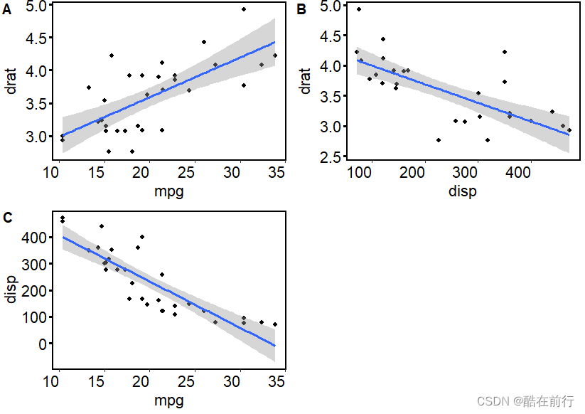
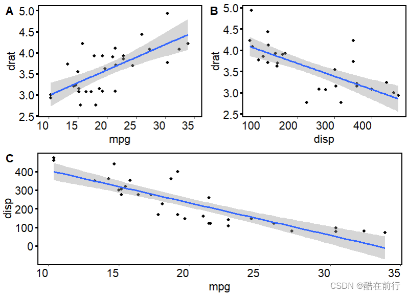
ggarrange(p1,p3, p2, labels = c("A", "B", "C"), ncol = 2, nrow = 2)

使用ggarrange函数中align参数完成上下对齐
但我们发现A,C图上下没有对齐,在代码里加上align = "v", 就可以
fig <- ggarrange(p1,p3, p2, labels = c("A", "B", "C"), align = "v", ncol = 2, nrow = 2)
fig
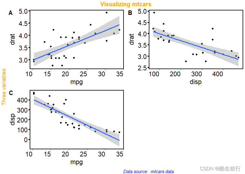
使用annotate_figure函数添加批注
annotate_figure(
  p,
  top = NULL,
  bottom = NULL,
  left = NULL,
  right = NULL,
  fig.lab = NULL,
  fig.lab.pos = c("top.left", "top", "top.right", "bottom.left", "bottom",
    "bottom.right"),
  fig.lab.size,
  fig.lab.face
)
annotate_figure的五个参数,top , bottom , left, right , fig.lab就是在不同位置给予批注
annotate_figure(fig,
        top = text_grob("Visualizing mtcars", color = "orange", face = "bold", size = 14),
        bottom = text_grob("Data source: mtcars data", color = "blue", hjust = 1, x = 0.7, face = "italic", size = 10),
       left = text_grob("Three variables", color = "orange", rot = 90)
                )
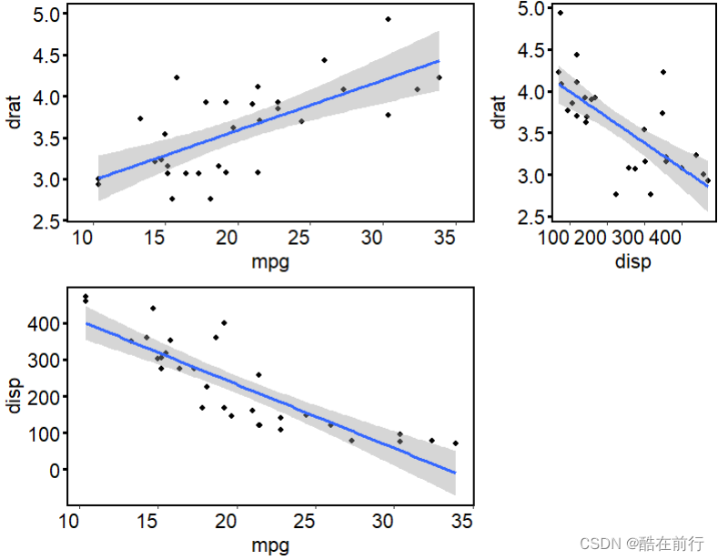
但不一定所有图都是把面板平分,比如下图:
ggarrange(p1, p3, p2,NULL,
          ncol = 2, nrow = 2,
          align = "hv",
          widths = c(1, 0.5),#第一列图宽度是第二列的2倍
          heights = c(1, 1),
          common.legend = TRUE)
总是不够如意,假设现在我想的是AB一样大小, C铺满下层。可以用cowplot包完成,代码如下
ggdraw() +
  draw_plot(p1, x = 0, y = .5, width = .5, height = .5) +
  draw_plot(p3, x = .5, y = .5, width = .5, height = .5) +
  draw_plot(p2, x = 0, y = 0, width = 1, height = 0.5,hjust =0.01) +
  draw_plot_label(label = c("A", "B", "C"), size = 15,
                  x = c(0, 0.5, 0), y = c(1, 1, 0.5))
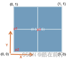
这里的x,y是每张图的左下角位置,width,height是每张图的高度,具体示意图看下面的。
只不过P2的图片宽度是另外两个的2倍,所以能占据所有下层
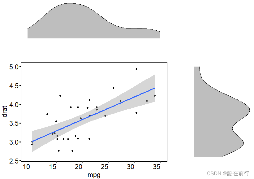
但利用ggarange可以很好的吧边际的箱线图或密度曲线放在边边,代码如下
p7 <- mtcars %>%  #生成密度曲线
  ggplot(aes(x=mpg))+
  geom_density(fill='grey')+
  labs(x=NULL,y=NULL)+
  theme(
    rect = element_blank(),
    axis.ticks = element_blank(),
    axis.text = element_blank(),
    axis.line = element_blank(),
    panel.grid.minor = element_blank()
  )

p8 <- mtcars %>%  #生成密度曲线
  ggplot(aes(y=drat))+
  geom_density(fill='grey')+
  labs(x=NULL,y=NULL)+
  theme(
    rect = element_blank(),
    axis.ticks = element_blank(),
    axis.text = element_blank(),
    axis.line = element_blank(),
    panel.grid.minor = element_blank()
  )
#把密度曲线和散点图结合,两个轴分别表示变量的分布
ggarrange(p7, NULL, p1, p8,
          ncol = 2, nrow = 2,
          align = "hv",
          widths = c(1, 0.5),
          heights = c(0.5, 1),
          common.legend = TRUE)
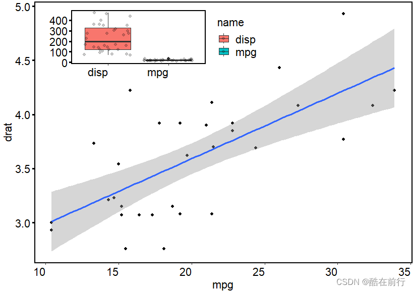
有时候,我们还需要在大图里面插入小图,这里使用annotation_custom函数 ,annotation_custom(grob, xmin = -Inf, xmax = Inf, ymin = -Inf, ymax = Inf),其中xmin , xmax , ymin , ymax分别是插入图片的4个顶点的位置
# 添加副图
#在散点图添加两种数据的直方图
p4 <- mtcars %>% select(mpg,disp) %>%
  pivot_longer(everything()) %>%
  ggplot(aes(y=value,x=name, fill=name))+
  geom_boxplot()+
  geom_jitter(alpha=0.2)+mytheme+
  labs(x=NULL,y=NULL)


p1+annotation_custom(ggplotGrob(p4),
                  xmin = 10, xmax = 25,
                  ymin = 4.3, ymax = 5)
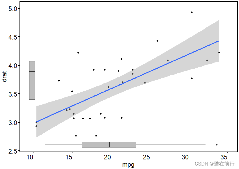
下面这个图类似于上面在外面插入密度曲线,只不过这是在内部分贝插入箱线图
#为散点图数据两个维度分布添加直方图
p1 <- ggplot(mtcars,aes(x=mpg ,drat))+
  geom_point()+
  geom_smooth(method = lm)+
  mytheme+
  ylim(2.6,5)+xlim(9.5,35)
p5 <- mtcars %>%
  ggplot(aes(x=mpg))+
  geom_boxplot(fill='grey')+
  labs(x=NULL,y=NULL)+
 theme(
    rect = element_blank(),
    axis.ticks = element_blank(),
    axis.text = element_blank(),
    axis.line = element_blank(),
    panel.grid.minor = element_blank()
  )

p6 <- mtcars %>%
  ggplot(aes(y=drat))+
  geom_boxplot(fill='grey')+
  labs(x=NULL,y=NULL)+
  theme(
    rect = element_blank(),
    axis.ticks = element_blank(),
    axis.text = element_blank(),
    axis.line = element_blank(),
    panel.grid.minor = element_blank()
  )
p1 + annotation_custom(ggplotGrob(p5),
                       xmin = 10, xmax = 35,
                       ymin = 2.5, ymax = 2.7) +
  annotation_custom(ggplotGrob(p6),
                    xmin = 9, xmax = 10.5,
                    ymin = 3, ymax = 5)


 1847
1847

 被折叠的 条评论
为什么被折叠?
被折叠的 条评论
为什么被折叠?
 到【灌水乐园】发言


