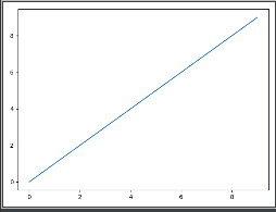
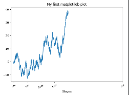
#9.3刻度、标签和图例fig=plt.figure()ax=fig.add_subplot(1,1,1)ax.plot(np.random.randn(1000).cumsum())ticks=ax.set_xticks([0,255,500,750,2000])#数据范围内设定刻度的位置(x轴的刻度)labels=ax.set_xticklabels(['one','two','three','four','fivr'],rotation=30,fontsize='small')#为标签赋值ax.set_title('My first matplotilob plot')#标题ax.set_xlabel('Stages')#横坐标标签'''props={'title':'My first matplotilob plot''xlabel':'Stages'}ax.set(**props)'''plt.show()
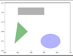
#9.1.4注释与子图加工'''text、arrow、annote方法:添加注释和文本text在表图上给定坐标(x,y),根据可选的定制样式绘制文本ax.text(x,y,'Hello'',family='monospace',fontsize=10)'''###绘制标普500指数从2007年以来的收盘价,并在图表中注释从2008到2009年金融危机的重要日期#importpandasaspd#fromdatetimeimportdatetime##fig=plt.figure()#ax=fig.add_subplot(1,1,1)##date=pd.read_csv('example/spx.csv',index_col=0,parse_dates=True)#读取数据#spx=date['SPX']##spx.plot(ax=ax,style='k--')##crisis_date=[#(datetime(2007,10,11),'Peak of bull market'),#(datetime(2008,3,12),'Bear Stearns Fails'),#(datetime(2008,9,15),'Lehman Bankruptcy'),#]##fordate,labelincrisis_date:#ax.annotate(label,xy=(date,spx.asof(date)+75),#xytext=(date,spx.asof(date)+75),#arrowprops=dict(facecolor='black',headwidth=4,width=2,headlength=4),#horizontalalignment='left',verticalalignment='top')#ax.annotate方法在指定的x,y坐标上绘制标签###放大2007年-2010年#'''#ax.set_xlim和ax.set_ylim:手动绘制图表的边界#'''#ax.set_xlim(['1/1/2007','1/1/2011'])#ax.set_ylim([600,1800])##ax.set_title('Improtant dates in the 2008-2009 financial crisis')##plt.show()'''常见的图形,matplotlib.pyplot图形全集:matplotlib.patches'''fig=plt.figure()ax=fig.add_subplot(1,1,1)rect=plt.Rectangle((0.2,0.75),0.4,0.15,color='k',alpha=0.3)circ=plt.Circle((0.7,0.2),0.15,color='b',alpha=0.3)pgon=plt.Polygon([[0.15,0.15],[0.35,0.4],[0.2,0.6]],color='g',alpha=0.5)ax.add_patch(rect)ax.add_patch(circ)ax.add_patch(pgon)plt.show()


 5997
5997


 被折叠的 条评论
为什么被折叠?
被折叠的 条评论
为什么被折叠?
 到【灌水乐园】发言


