


Android自定义View
尽管Android系统提供了不少控件,但是有很多酷炫效果仍然是系统原生控件无法实现的。好在Android允许自定义控件,来弥补原生控件的不足。但是在很多初学者看来,自定义View似乎很难掌握。其中有很大一部分原因是我们平时看到的自定义View使用中,有多种形式,有的寥寥数笔,有的逻辑很复杂,有的直接继承View或ViewGroup,有的却直接继承系统的原生控件,有的可以直接使用系统定义的属性,而有的却自定义了自己的属性…所以不明白使用规则的开发者,很容易被这只“纸老虎”吓到。
实际上实现自定义View的方式,从整体上看,只分为三种:组合控件,继承控件,自绘控件。然后就是根据需要来添加自定义的属性,就这么简单。本文将会针对这4个方面进行详细的讲解。主要内容如下:
提示:以下是本篇文章正文内容,下面案例可供参考
一、组合控件
组合控件,顾名思义,就是将系统原有的控件进行组合,构成一个新的控件。这种方式下,不需要开发者自己去绘制图上显示的内容,也不需要开发者重写onMeasure,onLayout,onDraw方法来实现测量、布局以及draw流程。所以,在实现自定义view的三种方式中,这一种相对比较简单。实际开发中,标题栏就是一个比较常见的例子。因为在一个app的各个界面中,标题栏基本上是大同小异,复用率很高。所以经常会将标题栏单独做成一个自定义view,在不同的界面直接引入即可,而不用每次都把标题栏布局一遍。本节就自定义一个标题栏,包含标题和返回按钮两个控件,来介绍这种组合控件的实现方式。
二、使用步骤
1.定义标题栏布局文件
定义标题栏的布局文件custom_title_view.xml,将返回按钮和标题文本进行组合。这一步用于确定标题栏的样子,代码如下(示例):
<?xml version="1.0" encoding="utf-8"?>
<RelativeLayout xmlns:android="http://schemas.android.com/apk/res/android"
    android:layout_width="match_parent"
    android:layout_height="wrap_content"
    android:background="@android:color/holo_orange_light">
    <Button
        android:id="@+id/btn_left"
        android:layout_width="wrap_content"
        android:layout_height="wrap_content"
        android:layout_centerVertical="true"
        android:layout_marginLeft="5dp"
        android:text="Back"
        android:textColor="@android:color/white" />

    <TextView
        android:id="@+id/title_tv"
        android:layout_width="wrap_content"
        android:layout_height="wrap_content"
        android:layout_centerInParent="true"
        android:text="Title"
        android:textColor="@android:color/white"
        android:textSize="20sp" />
</RelativeLayout>
2. 根据给定布局实现自定义View
代码如下(示例):
public class CustomTitleView extends FrameLayout implements View.OnClickListener {
    private View.OnClickListener mLeftOnClickListener;
    private Button mBackBtn;
    private TextView mTittleView;

    public CustomTitleView(@NonNull Context context, @Nullable AttributeSet attrs) {
        super(context, attrs);
        LayoutInflater.from(context).inflate(R.layout.custom_title_view, this);
        mBackBtn = findViewById(R.id.btn_left);
        mBackBtn.setOnClickListener(this);
        mTittleView = findViewById(R.id.title_tv);
    }

    @Override
    public void onClick(View v) {
        switch (v.getId()) {
            case R.id.btn_left:
                if (mLeftOnClickListener != null) {
                    mLeftOnClickListener.onClick(v);
                }
                break;
        }
    }

    public void setLeftOnClickListener(View.OnClickListener leftOnClickListener) {
        mLeftOnClickListener = leftOnClickListener;
    }

    public void setTittle(String title){
        mTittleView.setText(title);
    }
}
为了编译理解和记忆,这里对该部分做一点说明:
(1)代码中对外提供了两个接口,一是动态设置标题,二是使用者可以自定义返回按钮的点击事件。

(2)CustomTitleView的构造函数,要选择两个参数的,选择其它参数的构造函数会报错。这一点是笔者开发机测试的结果,暂时不清楚是不是所有手机上都是这样。

(3)这里是继承的FrameLayout,但是继承LinearLayout,RelativeLayout等系统布局控件都可以。之所以要继承这些系统现成的ViewGroup,是因为这样可以不用再重写onMeasure,onLayout等,这样省事很多。由于这里是一个布局控件,要用LayoutInflater来填充,所以需要继承ViewGroup,如果继承View的直接子类,编译会不通过。所以,CustomTitleView自己就是一个容器,完全可以当成容器使用,此时CustomTitleView自身的内容会和其作为父布局添加的子控件,效果会叠加,具体的叠加效果是根据继承的容器特性决定的。
3、在Activity的布局文件中添加CustomTitleView
在Activity的布局文件activity_custom_view_compose_demo.xml中,像使用系统控件一样使用CustomTitleView即可。前说了,CustomTitleView自己就是继承的现成的系统布局,所以它们拥有的属性特性,CustomTitleView一样拥有。
<?xml version="1.0" encoding="utf-8"?>
<RelativeLayout xmlns:android="http://schemas.android.com/apk/res/android"
    android:layout_width="match_parent"
    android:layout_height="match_parent">
    <com.example.demos.customviewdemo.CustomTitleView
        android:id="@+id/customview_title"
        android:layout_width="match_parent"
        android:layout_height="wrap_content">
    </com.example.demos.customviewdemo.CustomTitleView>
</RelativeLayout>
4、在Activity中操作CustomTitleView
public class CustomViewComposeDemoActivity extends AppCompatActivity {

    private CustomTitleView mCustomTitleView;
    @Override
    protected void onCreate(Bundle savedInstanceState) {
        super.onCreate(savedInstanceState);
        setContentView(R.layout.activity_custom_view_compose_demo);
        mCustomTitleView = findViewById(R.id.customview_title);
        mCustomTitleView.setTittle("This is Title");
        mCustomTitleView.setLeftOnClickListener(new View.OnClickListener() {
            @Override
            public void onClick(View v) {
                finish();
            }
        });

    }
}
在第8行中,获取到CustomTitleView实例,第9行设置标题文字,第10行自定义“Back”按钮点击事件。
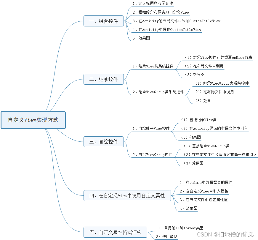
5、效果图
按照如上的4步,就通过组合控件完成了一个比较简单的自定义标题栏。可见,这种方式是非常简单的。
二、继承控件
通过继承系统控件(View子类控件或ViewGroup子类控件)来完成自定义View,一般是希望在原有系统控件基础上做一些修饰性的修改,而不会做大幅度的改动,如在TextView的文字下方添加下划线,在LinearLayout布局中加一个蒙板等。这种方式往往都会复用系统控件的onMeasure和onLayout方法,而只需要重写onDraw方法,在其中绘制一些需要的内容。下面会分别继承View类控件和ViewGroup类控件来举例说明。
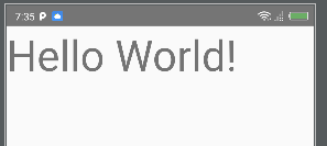
1、继承View类系统控件
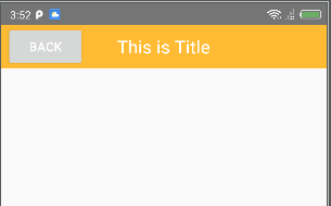
   如下示例为在TextView文字下方显示红色下划线,其基本步骤如下:

(1)继承View控件,并重写onDraw方法
@SuppressLint("AppCompatCustomView")
public class UnderlineTextView extends TextView{
    public UnderlineTextView(Context context, @Nullable AttributeSet attrs) {
        super(context, attrs);
    }

    @Override
    protected void onDraw(Canvas canvas) {
        super.onDraw(canvas);
        Paint paint = new Paint();
        paint.setColor(Color.RED);
        paint.setStrokeWidth(5);
        int width = getWidth();
        int height = getBaseline();
        canvas.drawLine(0,height,width,height,paint);
    }
}
(2)在布局文件中调用
就像使用一个普通TextView一样使用UnderlineTextView。
<?xml version="1.0" encoding="utf-8"?>
<RelativeLayout xmlns:android="http://schemas.android.com/apk/res/android"
  android:layout_width="match_parent"
  android:layout_height="match_parent">
  <com.example.demos.customviewdemo.UnderlineTextView
      android:layout_width="wrap_content"
      android:layout_height="wrap_content"
      android:textSize="50dp"
      android:layout_centerInParent="true"
      android:text="Hello World!"/>
</RelativeLayout>
(3)效果图
2、继承ViewGroup类系统控件
如下示例演示,在layout布局上添加一个浅红色的半透明蒙板,这种需求在工作中也是非常常见的。
(1)继承ViewGroup类系统控件
public class ForegroundLinearLayout extends LinearLayout{
    public ForegroundLinearLayout(Context context, @Nullable AttributeSet attrs) {
        super(context, attrs);
    }

    @Override
    protected void dispatchDraw(Canvas canvas) {
        super.dispatchDraw(canvas);
        canvas.drawColor(Color.parseColor("#50FF0000"));
    }
}
在布局文件中调用
对ForegroundLinearLayout的使用,就和使用其父类LinearLayout一样。
<?xml version="1.0" encoding="utf-8"?>
<RelativeLayout xmlns:android="http://schemas.android.com/apk/res/android"
    android:layout_width="match_parent"
    android:layout_height="match_parent">
       <com.example.demos.customviewdemo.ForegroundLinearLayout
        android:layout_width="match_parent"
        android:layout_height="200dp"
        android:layout_centerInParent="true"
        android:gravity="center">

        <TextView
            android:layout_width="wrap_content"
            android:layout_height="wrap_content"
            android:layout_centerInParent="true"
            android:text="Hello World!"
            android:textColor="@android:color/black"
            android:textSize="50dp" />
    </com.example.demos.customviewdemo.ForegroundLinearLayout>
</RelativeLayout>
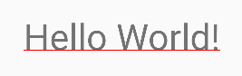
(3)效果图
在宽为全屏宽度,高为200dp的布局范围内,绘制完子其子控件TextView后,在上面覆盖了一层浅红色的半透明蒙板。
从上面两个例子可见,继承系统原有的控件来实现自定义View,步骤非常简单,比组合控件简单多了。但是这一节需要对Canvas,paint等绘制方面的知识有一定的了解,且还需要对ViewGroup的中内容的绘制顺序有一定的了解,才能在原生控件的基础上做出想要的效果来。
三、自绘控件
这三种方法中,自绘控件是最复杂的,因为所有的绘制逻辑和流程都需要自己完成。采用自绘控件这种方式时,如果自定义View为最终的叶子控件,那么需要直接继承View;而不过自定义View为容器类控件,则需要直接继承ViewGroup。这里依然针对直接继承View和ViewGroup分别举例进行说明。
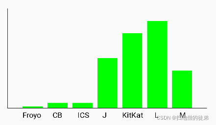
1、自绘叶子View控件
这里通过画一个直方图来展示自绘View控件的实现。
(1)直接继承View类
自绘叶子View控件时,最主要工作就是绘制出丰富的内容,这一过程是在重写的onDraw方法中实现的。由于是叶子view,它没有子控件了,所以重写onLayout没有意义。onMeasure的方法可以根据自己的需要来决定是否需要重写,很多情况下,不重写该方法并不影响正常的绘制。
public class HistogramView extends View{

    private Paint mPaint;
    private Path mPath;

    public HistogramView(Context context, @Nullable AttributeSet attrs) {
        super(context, attrs);
        mPaint = new Paint();
        mPath = new Path();
    }

    @Override
    protected void onDraw(Canvas canvas) {
        super.onDraw(canvas);
        //绘制坐标轴
        mPaint.reset();
        mPath.reset();
        mPaint.setColor(Color.BLACK);
        mPaint.setStyle(Paint.Style.STROKE);
        mPath.moveTo(100,100);
        mPath.rLineTo(0,402);
        mPath.rLineTo(800,0);
        canvas.drawPath(mPath,mPaint);
        //绘制文字
        mPaint.reset();
        mPaint.setTextSize(30);
        mPaint.setStyle(Paint.Style.FILL);
        canvas.drawText("Froyo",160,540,mPaint);
        canvas.drawText("CB",280,540,mPaint);
        canvas.drawText("ICS",380,540,mPaint);
        canvas.drawText("J",480,540,mPaint);
        canvas.drawText("KitKat",560,540,mPaint);
        canvas.drawText("L",690,540,mPaint);
        canvas.drawText("M",790,540,mPaint);
        //绘制直方图,柱形图是用较粗的直线来实现的
        mPaint.reset();
        mPaint.setColor(Color.GREEN);
        mPaint.setStrokeWidth(80);
        float[] lines3={
                200,500,200,495,
                300,500,300,480,
                400,500,400,480,
                500,500,500,300,
                600,500,600,200,
                700,500,700,150,
                800,500,800,350,
        };
        canvas.drawLines(lines3,mPaint);
    }
}
## (2)在Activity界面的布局文件中引入 和其它自定义控件一样,直接在布局文件中引入即可。
<?xml version="1.0" encoding="utf-8"?>
<RelativeLayout xmlns:android="http://schemas.android.com/apk/res/android"
    android:layout_width="match_parent"
    android:layout_height="match_parent">

    <com.example.demos.customviewdemo.HistogramView
        android:layout_width="match_parent"
        android:layout_height="wrap_content"/>

</RelativeLayout>
(3)效果图
2、自绘ViewGroup控件
这里通过自定义一个父布局控件,并添加一个子view来作为例子讲解该方法的实现。
(1)直接继承ViewGroup类
自绘ViewGroup控件,需要直接继承ViewGroup,在该系列第一篇文章中将绘制流程的时候就讲过,onLayout是ViewGroup中的抽象方法,其直接继承者必须实现该方法。所以这里,onLayout方法必须要实现的,如果这里面的方法体为空,那该控件的子view就无法显示了。要想准确测量,onMeasure方法也是要重写的。下面例子中,只演示了第一个子view的测量和布局,onLayout方法中的child.layout,就完成了对子view的布局。
public class CustomLayout extends ViewGroup {
    public CustomLayout(Context context, AttributeSet attrs) {
        super(context, attrs);
    }

    @Override
    protected void onMeasure(int widthMeasureSpec, int heightMeasureSpec) {
        super.onMeasure(widthMeasureSpec, heightMeasureSpec);
        if (getChildCount() > 0) {
            //只测量第一个child
            View child = getChildAt(0);
            measureChild(child, widthMeasureSpec, heightMeasureSpec);
        }
    }

    @Override
    protected void onLayout(boolean changed, int l, int t, int r, int b) {
        if (getChildCount() > 0) {
            //只布局第一个child
            View child = getChildAt(0);
            child.layout(0, 0, child.getMeasuredWidth(), child.getMeasuredHeight());
        }
    }
}
(2)在布局文件中和普通父布局一样被引入
<?xml version="1.0" encoding="utf-8"?>
<RelativeLayout xmlns:android="http://schemas.android.com/apk/res/android"
   android:layout_width="match_parent"
   android:layout_height="match_parent">

   <com.example.demos.customviewdemo.CustomLayout
       android:layout_width="match_parent"
       android:layout_centerInParent="true"
       android:layout_height="wrap_content">
       <TextView
           android:layout_width="wrap_content"
           android:layout_height="wrap_content"
           android:text="Hello World!"
           android:textSize="50dp"/>

   </com.example.demos.customviewdemo.CustomLayout>

</RelativeLayout>
(3)效果图
上述代码中第8行没有起效,从布局上看TextView应该是处于屏幕的正中央,但是实际结果却还是在左上方显示。这是因为CustomLayout控件,并没有实现“android:layout_centerInParent”这个属性,所以是无效的。关于属性的问题,正是下一节要介绍的内容。
四、在自定义View中使用自定义属性
我们在使用Android原生控件的时候,经常可以看到在布局文件中可以设置很多的属性值,如
<TextView
        android:id="@+id/title_tv"
        android:layout_width="wrap_content"
        android:layout_height="wrap_content"
        android:layout_centerInParent="true"
        android:text="Title"
        android:textColor="@android:color/white"
        android:textSize="20sp" />
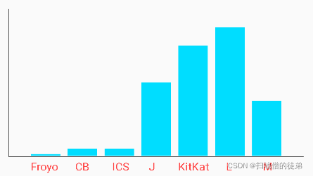
这里可以根据需要随时设置TextView要显示的文字,文字颜色,文字大小等各种属性,给使用者带来了极大的方便。我们在使用自定义View的时候,也非常希望能够像TextView等系统原生控件一样通过设置属性值来个性化自定义View。本节咱们在上一节自定义直方图的基础上,来介绍自定义属性的基本使用流程。
1、在values中编写需要的属性
在res/values/下新建资源文件,这里咱们命名为attrs.xml,在其中编写所需要的属性
<?xml version="1.0" encoding="utf-8"?>
<resources>
 <declare-styleable name="HistogramView">
     <attr name="textColor" format="color"/>
     <attr name="histogramColor" format="color"/>
 </declare-styleable>
</resources>
这里中的name是自行命名的,可以理解为这个自定义属性集合的名称。代码中包含了两个自定义属性,名称分别为“textColor”和“histogramColor”,这里用来设置直方图中文字的颜色和直方图的颜色。format表示的是属性的格式,这里均设置为“color”,表示对应的属性是用来设置颜色值的。对于“format”,后面还会详细讲到。其它的就是固定的格式了,直接套用就行。
2、在自定义View中引入属性
public class HistogramView extends View{

   private Paint mPaint;
   private Path mPath;
   private int mTextColor,mHistogramColor;

   public HistogramView(Context context, @Nullable AttributeSet attrs) {
       super(context, attrs);
       mPaint = new Paint();
       mPath = new Path();
       initAttrs(context,attrs);
   }


   private void initAttrs(Context context, AttributeSet attrs){
       TypedArray typedArray = context.obtainStyledAttributes(attrs, R.styleable.HistogramView);
       mTextColor = typedArray.getColor(R.styleable.HistogramView_textColor,Color.BLACK);
       mHistogramColor = typedArray.getColor(R.styleable.HistogramView_histogramColor,Color.GREEN);
       typedArray.recycle();
   }

   @Override
   protected void onDraw(Canvas canvas) {
       super.onDraw(canvas);
       //绘制坐标轴
       mPaint.reset();
       mPath.reset();
       mPaint.setColor(Color.BLACK);
       mPaint.setStyle(Paint.Style.STROKE);
       mPath.moveTo(100,100);
       mPath.rLineTo(0,402);
       mPath.rLineTo(800,0);
       canvas.drawPath(mPath,mPaint);
       //绘制文字
       mPaint.reset();
       mPaint.setTextSize(30);
       mPaint.setColor(mTextColor);
       mPaint.setStyle(Paint.Style.FILL);
       canvas.drawText("Froyo",160,540,mPaint);
       canvas.drawText("CB",280,540,mPaint);
       canvas.drawText("ICS",380,540,mPaint);
       canvas.drawText("J",480,540,mPaint);
       canvas.drawText("KitKat",560,540,mPaint);
       canvas.drawText("L",690,540,mPaint);
       canvas.drawText("M",790,540,mPaint);
       //绘制直方图,柱形图是用较粗的直线来实现的
       mPaint.reset();
       mPaint.setColor(mHistogramColor);
       mPaint.setStrokeWidth(80);
       float[] lines3={
               200,500,200,495,
               300,500,300,480,
               400,500,400,480,
               500,500,500,300,
               600,500,600,200,
               700,500,700,150,
               800,500,800,350,
       };
       canvas.drawLines(lines3,mPaint);
   }
}
将上述代码和前面第三节中自绘直方图代码对比,红色部分是修改或新增的代码。第15~20行代码就是初始化属性的地方,这个过程需要在构造函数中完成。其中,第16行是和自定义属性集建立联系,第17和18行是获取开发者在布局文件中使用时设置的相应属性值,如果没有设置,则会使用默认设置的颜色,分别为Color.BLACK和Color.GREEN。这里注意第19行,用完后一定要回收资源。这样就初始化了文字颜色mTextColor值和mHistogramColor值,在后面onDraw中就使用该值来绘制对应的部分。
3、在布局文件中设置属性值
<?xml version="1.0" encoding="utf-8"?>
<RelativeLayout xmlns:android="http://schemas.android.com/apk/res/android"
    xmlns:app="http://schemas.android.com/apk/res-auto"
    android:layout_width="match_parent"
    android:layout_height="match_parent">

    <com.example.demos.customviewdemo.HistogramView
        android:layout_width="match_parent"
        android:layout_height="wrap_content"
        app:textColor="@android:color/holo_red_light"
        app:histogramColor="@android:color/holo_blue_bright"/>

</RelativeLayout>
这段代码中,第3,10,11行和以往的布局文件有些不一样,这是使用自定义属性时的固定格式。第3行中,如果布局文件中没有这一句,一定要加上,这句是声明命名空间,只有声明了命名空间才能使用自定义属性。“app”是该命名空间的名称,这里是自行命名的,不一定非要用“app”。第10行和11行,“app:attrName”表示用的是自定义的属性,固定用法,前面mTextColor和mHistogramColor值就是从这里获取的。
还记得上一节结尾处说“android:layout_centerInParent”没有起效吗?现在我们知道,这里设置的属性,是在自定义View代码中获取该值,根据该值来确定显示效果的。“android:layout_centerInParent”的值在View的源码中没有被使用,所以设置后也就无效了。“android:layout_width”和“android:layout_height”属性是必须要有的,所有的View的实现都要用到这两个属性来确定宽高。现在,咱们应该明白,设置控件属性值是如何起作用的了吧。
4、效果图
五、自定义属性格式汇总
在上面一节中,仅仅只是对文字颜色和直方图颜色的属性值做了设置,是为了演示自定义属性的使用步骤。在实际开发中,完全可以定义更多类型的属性,如显示文字的内容,文字的大小,直方图的宽度等。format也不只限定于“color”,还有“String”,“Integer”等,多种多样。本节就汇总一下平时比较常用的一些属性format。
1、常用的11种format类型
<?xml version="1.0" encoding="utf-8"?>
<resources>
    <declare-styleable name="SelfAttr">
        <!--1.reference:参考某一资源ID-->
        <attr name="background" format="reference" />
        <!--2. color:颜色值-->
        <attr name = "textColor" format = "color" />
        <!--3.boolean:布尔值-->
        <attr name = "focusable" format = "boolean" />
        <!--4.dimension:尺寸值-->
        <attr name = "layout_width" format = "dimension" />
        <!--5. float:浮点值-->
        <attr name = "fromAlpha" format = "float" />
        <!--6.integer:整型值-->
        <attr name = "lines" format="integer" />
        <!--7.string:字符串-->
        <attr name = "text" format = "string" />
        <!--8.fraction:百分数-->
        <attr name = "pivotX" format = "fraction" />
        <!--9.enum:枚举值。属性值只能选择枚举值中的一个-->
        <attr name="orientation">
            <enum name="horizontal" value="0" />
            <enum name="vertical" value="1" />
        </attr>
        <!--10.flag:位或运算。属性值可以选择其中多个值-->
        <attr name="gravity">
            <flag name="top" value="0x01" />
            <flag name="bottom" value="0x02" />
            <flag name="left" value="0x04" />
            <flag name="right" value="0x08" />
            <flag name="center_vertical" value="0x16" />
            ...
        </attr>
        <!--11.混合类型:属性定义时可以指定多种类型值-->
        <attr name = "background_2" format = "reference|color" />
    </declare-styleable>
</resources>
如上列出了平时工作中在常见的11种类型的格式,说是11种,但最后一种是前面10种的组合而已。看到上述的属性名称应该很熟悉吧,都是系统原生控件的属性名称。
2、使用举例
如下对上述属性的使用一一举例演示,可以对照着来理解,都是平时常用的系统控件。
<!--1.reference:参考某一资源ID-->
    <ImageView android:background = "@drawable/图片ID"/>
    <!--2. color:颜色值-->
    <TextView android:textColor = "#00FF00"/>
    <!--3.boolean:布尔值-->
    <Button android:focusable = "true"/>
    <!--4.dimension:尺寸值-->
    <Button android:layout_width = "42dp"/>
    <!--5. float:浮点值-->
    <alpha android:fromAlpha = "1.0"/>
    <!--6.integer:整型值-->
    <TextView android:lines="1"/>
    <!--7.string:字符串-->
    <TextView android:text = "我是文本"/>
    <!--8.fraction:百分数-->
    <rotate android:pivotX = "200%"/>
    <!--9.enum:枚举值-->
    <LinearLayout
        android:orientation = "vertical">
    </LinearLayout>
    <!--10.flag:位或运算-->
    <TextView android:gravity="bottom|left"/>
    <!--11.混合类型:属性定义时可以指定多种类型值-->
    <ImageView android:background = "@drawable/图片ID" />
    <!--或者-->
    <ImageView android:background = "#00FF00" />
总结
关于自定义View的3中实现方式以及自定义属性的使用,这里就讲完了。读完后,是不是发现基本的实现流程其实非常简单呢?当然,本文为了说明实现流程,所以举的例子都比较简单,但不是说绘制内容也一样简单。就好像办理入学手续很简单,但读书这件事却不那么容易一样。要完成一些酷炫的自定义View,还需要好好地掌握Canvas,Paint,Path等工具的使用,以及View的绘制流程原理。当然,本文肯定有很多描述不妥或不准确的地方,欢迎来拍砖。。


 718
718


 被折叠的 条评论
为什么被折叠?
被折叠的 条评论
为什么被折叠?
 到【灌水乐园】发言


