


微信小程序components组件封装(消息提示框)
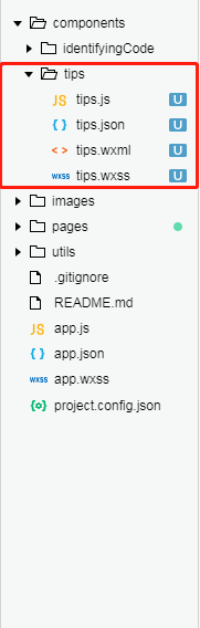
一 、文件列表 根目录下创建 组件模板
二 、写入组件模板样式
<!--components/tips/tips.wxml-->

<!-- 模态对话框 -->
<view class="mask" catchtouchmove="preventTouchMove"></view>

<view class="toast-wrap">
  <view class="toast-title">提示</view>
  <view class="toast-content">{{paramAtoB}}</view> <!-- {{paramAtoB}} 父组件向子组件中传入的参数-->
  <view class="click-wrap">
    <view class="cancel" bindtap='cancelShowModal'>取消</view>
    <view class="sure" bindtap='goAuthentication'>去认证</view>
  </view>
</view>
/* components/tips/tips.wxss */

/* 模态框 */
.mask{
    width: 100%;
    height: 100%;
    position: fixed;
    top: 0;
    left: 0;
    background: #000;
    z-index: 9000;
    opacity: 0.7;
}

.modalDlg{
    width: 500rpx;
    height: 620rpx;
    position: fixed;
    top: 50%;
    left: 5%;
    z-index: 99;
    margin: -370rpx 85rpx;
    background-color: #fff;
    border-radius: 8rpx;
    display: flex;
    flex-direction: column;
    align-items: center;
}

.toast-wrap{
  width:550rpx;
  height:290rpx;
  background-color: #fff;
  position: fixed;
  left:13%;
  top:40%;
  z-index: 9999;
  border-radius: 10rpx;
}
.toast-title{
  width:100%;
  height:80rpx;
  text-align: center;
  line-height: 80rpx;
  color: #000;
  font-size: 32rpx;
  font-weight: bold;
  margin-top:30rpx;
}
.toast-content{
  width:100%;
  height:90rpx;
  line-height: 90rpx;
  font-size: 30rpx;
  color:#ccc;
  text-align: center;
}
.click-wrap{
  width:100%;
  height:90rpx;
  line-height: 90rpx;
  display: flex;
  font-size: 32rpx;
  border-top:2rpx solid #f2f2f2;
  box-sizing: border-box;
}
.click-wrap .cancel{
  width:50%;
  height:100%;
  line-height: 90rpx;
  text-align: center;
  border-right:2rpx solid #f2f2f2;
  box-sizing: border-box;
}
.click-wrap .sure{
  width:50%;
  height:100%;
  line-height: 90rpx;
  text-align: center;
  color:#ef4631;
}
// components/tips/tips.js

Component({
  /**
   * 组件的属性列表
   */
  properties: {
    paramAtoB: String   //接收父组件传递过来的参数
  },

  /**
   * 组件的初始数据
   */
  data: {

  },

  /**
   * 组件的方法列表
   */
  methods: {

    // 取消弹出提示框
    cancelShowModal: function () {
      var that = this
      var pages = getCurrentPages();
      var prevPage = pages[pages.length - 1];  //当前页面
      prevPage.setData({
        showModal: false
      })
    },

    //提示框 点击确认事件
    goAuthentication: function () {
      var that = this
      wx.navigateTo({
        url: '/pages/cooperationSupply/cooperationSupply'
      })
      var pages = getCurrentPages();
      var prevPage = pages[pages.length - 1];  //当前页面
      prevPage.setData({
        showModal: false
      })
    },
  }
})
三 、页面中引入组件模板
1. .json中定义组件模板名称和路径
"usingComponents": {
"tips": "/components/tips/tips"
},  //tips:组件名称
2. .wxml中引入组件模板
<!-- 提示框组件 -->
<tips wx:if="{{showModal}}" paramAtoB="{{msg}}"></tips> //paramAtoB="{{msg}}" 为页面向组件模板中传入的参数
四、封装结果


 1262
1262


 被折叠的 条评论
为什么被折叠?
被折叠的 条评论
为什么被折叠?
 到【灌水乐园】发言


