


蛇形方框加载器
教程地址:原文地址(YouTube)
B站教程:原文转载(bilibili)
两个视频的内容相同,第二个为转载
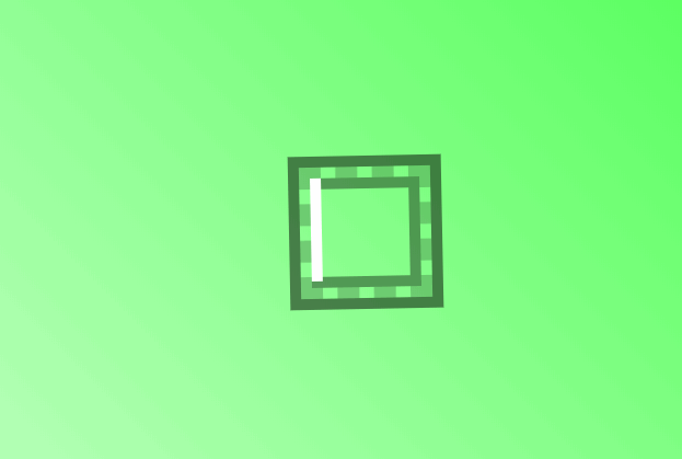
效果图
代码区
html
<div class="square">
  <span></span>
  <span></span>
  <span></span>
  <span></span>
</div>
CSS
body {
  margin: 0; /* 外边框 */
  padding: 0; /* 内边框 */
  display: flex; /* 弹性盒模型 */
  align-items: center; /* 主轴对齐方式 */
  justify-content: center; /* 交叉轴对齐方式 */
  height: 100vh; /* 高度 */
  background: linear-gradient(45deg, #cfffd0, #3fff46); /* 渐变背景色 */
}
/* 外框 */
.square {
  position: relative; /* 相对定位 */
  width: 100px;
  height: 100px;
  animation: rotate 10s linear infinite; /* 动画:名称,时间,速率,重复 */
  border: 10px dashed rgba(0, 0, 0, 0.2); /* 边框:虚线 */
  box-shadow: 0 0 0 10px rgba(0, 0, 0, 0.5), inset 0 0 0 10px rgba(0, 0, 0, 0.4); /*  阴影,外,内*/
}
@keyframes rotate {
  /* 通过修改旋转角度实现转动 */
  0% {
    transform: rotate(360deg);
  }
  100% {
    transform: rotate(0deg);
  }
}
/* 白线 */
.square span {
  position: absolute;
  top: 0;
  left: 0;
  width: 100%;
  height: 100%;
  display: block; /*块级元素*/
  overflow: hidden; /*超出隐藏*/
}
.square span::before { /*之前添加*/
  content: ''; /* 内容 */
  position: absolute;
  width: 100%;
  height: 100%;
  border: none;
  border-top: 10px solid #fff; /* 通过上边框实现白线 */
  animation: animate 2s linear infinite;
  opacity: 0; /* 防止出现视频中的第一次闪烁 */
}
@keyframes animate {
  /* left实现移动 */
  0% {
    left: -100%;
    opacity: 1; /* 防止出现视频中的第一次闪烁 */
  }
  25% {
    left: 0;
    opacity: 1;
  }
  50%, 100% {
    left: 100%;
    opacity: 1;
  }
}
.square span:nth-child(1) { /*子代选择(第一个)*/
  transform: rotate(0deg);
}
/* 通过角度不同实现正方形 */
.square span:nth-child(2) {
  transform: rotate(90deg);
}
.square span:nth-child(3) {
  transform: rotate(180deg);
}
.square span:nth-child(4) {
  transform: rotate(270deg);
}

/* 通过等待实现实现环绕效果 */
.square span:nth-child(1)::before {
  animation-delay: 0s;
}
.square span:nth-child(2)::before {
  animation-delay: 0.5s;
}
.square span:nth-child(3)::before {
  animation-delay: 1s;
}
.square span:nth-child(4)::before {
  animation-delay: 1.5s;
}
JS
教程地址:原文地址(YouTube)
B站教程:原文转载(bilibili)


 782
782


 被折叠的 条评论
为什么被折叠?
被折叠的 条评论
为什么被折叠?
 到【灌水乐园】发言


