


 该文章通过CSS的伪元素before和after,结合定位和不同宽度的盒子,展示了如何在网页设计中创建一个S形状的曲线边框按钮。文章提供了一个代码示例,包括HTML和CSS,用于演示如何实现这一效果。虽然在不同分辨率下可能需要微调,但基本方法是调整伪元素的位置。
老规矩先放图后教学
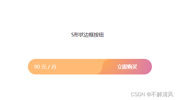
使用CSS 的伪元素来完成 S形状的曲线
1. 在长条盒子形状中,绘制两个宽度不同的盒子
2. 在给最外边的盒子设置伪元素(befor 、after)
3. 调整父盒子的伪元素位置完成S形状曲线
* 附上代码,直接拿走粘贴,在不同分辨率下会造成S形状不美观,可通过CSS的计算(calc(100% - ***%))完成伪元素位置的放置
<!DOCTYPE html>
<html lang="en">

<head>
    <meta charset="UTF-8">
    <meta http-equiv="X-UA-Compatible" content="IE=edge">
    <meta name="viewport" content="width=device-width, initial-scale=1.0">
    <title>S形状操作条</title>
</head>
<style>
    .title {
        margin-top: 15%;
        text-align: center;
    }

    .ljgm {
        width: 400px;
        border-radius: 500px;
        height: 50px;
        line-height: 50px;
        display: flex;
        justify-content: space-between;
        position: relative;
        color: #ffffff;
        position: absolute;
        top: 40%;
        left: 40%;
    }

    .jeBtn {
        background-color: #ffbb76;
        padding: 0 10px;
        width: 60%;
        border-radius: 500px 0 500px 500px;
        z-index: 10;
        padding-left: 20px;
    }

    .ljgm::before {
        content: "";
        width: 50px;
        height: 50px;
        background-color: #ffbb76;
        position: absolute;
        top: 0;
        right: 110px;
    }

    .gmBtn {
        background-image: radial-gradient(circle at top left, #ffaa54 0px, #CD69C9 230px);
        padding: 0 10px;
        width: 40%;
        text-align: center;
        border-radius: 500px 500px 500px 0px;
        z-index: 10;
        font-weight: 700;
    }

    .ljgm::after {
        content: "";
        width: 50px;
        height: 50px;
        background-color: #f79f68;
        position: absolute;
        top: 0;
        left: 190px;
    }
</style>

<body>
    <div>
        <div class="title">S形状边框按钮</div>
        <div class="ljgm">
            <div class="jeBtn">90 元 / 月</div>
            <div class="gmBtn"> 立即购买 </div>
        </div>
    </div>
</body>

</html>


 扫一扫
扫一扫


 被折叠的 条评论
为什么被折叠?
被折叠的 条评论
为什么被折叠?
 到【灌水乐园】发言


