


Android学习笔记2-1~2-5
推荐新手向学习视频:B站https://www.bilibili.com/video/av38409964点我传送
2-1 布局管理器
- 线性布局(LinearLayout)
- 相对布局(RelativeLayout)
2-1-1 LinearLayout
- 常用属性
- android:id 相当于姓名
- android:layout_width 宽度
- android:layout_height 高度
- Android:text 文字,如果是英文默认全大写
- android:textAllCaps=“false” 可以关闭全大写
- android:background 背景
- android:layout_margin 外边距
- android:layout_padding 内边距
- android:orientation 布局方向(横竖)
- 默认为horizontal水平排列
- android:gravity 容器内部元素的排列方式,如居中靠下,靠上等
- android:layout_weight 该容器占父容器剩余空间的权重
- 值
- wrap_content 适应内容,内容有多少,宽度就为多少
- match_parent 适应父容器,上一级宽度是多少,这一级就是多少
- 在安卓里长度单位通常使用dp,字体使用sp
- 因为Andriod手机的屏幕不一样,使用像素px会导致不同的屏幕效果不一样,dp可以自动适配
2-1-2 RelativeLayout
- 常用属性
- android:layout_toLeftOf 在谁的左边,值为id
- android:layout_toRightOf 在谁的右边,值为id
- android:layout_alignBottom 跟谁底部对齐
- android:layout_alignParentBottom 跟父容器底部对齐,值为true或false
- android:layout_alignParentRight 跟父容器右边对齐,值为true或false
- android:layout_below 在谁的下面,值为id
2-2 TextView
- 文字大小单位sp、颜色
- 显示不下使用…表示
- 方法一
- android:maxLines=“1” 最多显示一行,显示不全的就舍弃
- android:ellipsize=“end” 加上这一行,显示不出来的用…表示
- 方法二
- android:singleLine=“true”
- 方法一
- 文字+icon(下拉列表)
- android:text=“下拉列表”
- android:drawableRight="@drawable/icon_arrow_off" 箭头图片
- android:drawablePadding=“5dp” 图片和文字之间的间隔
- 中划线,下划线
- 在Activity里获取到TextView的方法
- private TextView mTv4; //声明
- mTv4 = findViewById(R.id.tv_4); //获取
- 在Activity里通过findViewById()获取TextView后添加以下代码
- mTv4.getPaint().setFlags(Paint.STRIKE_THRU_TEXT_FLAG); //给mTv4添加中划线,有的设备可能会有锯齿
- mTv4.getPaint().setAntiAlias(true); //去除锯齿
- mTv5.getPaint().setFlags(Paint.UNDERLINE_TEXT_FLAG); //给mTv5添加下划线
- 在.xml文件中不设置文字android:text="",在Activity里通过findViewById()获取TextView后添加以下代码
- mTv6.setText(Html.fromHtml(“HTML代码”)); //使用下面的这段HTML添加文字和下划线
-
<u>我的第一个App</u>
- 在Activity里获取到TextView的方法
- 跑马灯效果
- 在.xml文件的TextView里添加以下代码,注意确保android:text足够长,无法在一行显示完,这样才能跑起来
-
  android:singleLine="true"	单行显示
  android:ellipsize="marquee"
  android:marqueeRepeatLimit="marquee_forever"	控制时间,这里是永远跑下去
  android:focusable="true"
  android:focusableInTouchMode="true"
2-3 Button(TextView的子类)
-
字体大小、颜色
-
<Button android:layout_width="match_parent" android:layout_height="wrap_content" android:text="按钮1" android:textSize="20sp" android:textColor="#FFFFFF" android:background="#FF0000"/> -
自定义背景形状
-
在drawable文件夹下新建.xml文件,下面展示的是自定义圆角按钮(.xml文件Root element为shape)
-
<?xml version="1.0" encoding="utf-8"?> <shape xmlns:android="http://schemas.android.com/apk/res/android" android:shape="rectangle"> <solid android:color="#FF9900"/> <corners android:radius="5dp"/> </shape> -
android:background="@drawable/bg_btn2" 引用自定义的背景bg_btn2
-
自定义边框按钮,把上面的
-
<solid android:color="#FF9900"/> -
换成
-
  <stroke
      android:width="1dp"
      android:color="#FF9900"/>
-
-
自定义按压效果
-
  <?xml version="1.0" encoding="utf-8"?>
  <selector xmlns:android="http://schemas.android.com/apk/res/android">
      <item android:state_pressed="true">		当被按压时
          <shape>
              <solid android:color="#CC7A00"/>
              <corners android:radius="5dp"/>
          </shape>
      </item>
      <item android:state_pressed="false">	当没有被按压时
          <shape>
              <solid android:color="#FF9900"/>
              <corners android:radius="5dp"/>
          </shape>
      </item>

  </selector>
-
-
点击事件
- 方法一
- 在ButtonActivity里写一个方法showToast
-
public void showToast (View view) { Toast.makeText(this,"我被点击了",Toast.LENGTH_SHORT).show(); } - android:onClick=“方法名”
- 方法二
- 在ButtonActivity里声明要使用的控件mBtn3,然后在onCreate()方法中写
-
  mBtn3 = findViewById(R.id.btn_3);
  mBtn3.setOnClickListener(new View.OnClickListener() {
      @Override
      public void onClick(View v) {
          Toast.makeText(ButtonActivity.this,"我被点击了",Toast.LENGTH_SHORT).show();
      }
  });
- 方法一
2-4 EditText
- 常用属性
- android:textSize=“16sp” 输入文字的大小
- android:textColor="#FFAD33" 输入文字的颜色
- android:hint=“用户名” 提示文字
- android:inputType=“textPassword” 设置输入属性为密码
- android:inputType=“number” 设置输入属性为数字
- 监听事件
-
  private EditText mEtUserName;
  mEtUserName = findViewById(R.id.et_1);
  mEtUserName.addTextChangedListener(new TextWatcher() {	//对用户名输入框文字变化的监听
      @Override
      public void beforeTextChanged(CharSequence s, int start, int count, int after) {

      }

      @Override
      public void onTextChanged(CharSequence s, int start, int before, int count) {
          Log.d("edittext",s.toString());		//把用户名输入框的输入内容,实时展现在日志中
      }

      @Override
      public void afterTextChanged(Editable s) {

      }
  });
-
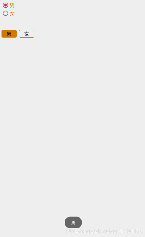
2-5 RadioButton
- 常用属性
-
  <RadioGroup		设置RadioGroup,里面可以包含多个RadioButton
  	android:id="@+id/rg_1"
  	android:layout_width="wrap_content"
  	android:layout_height="wrap_content"
  	android:orientation="vertical">	垂直排列
  	<RadioButton
  	    android:id="@+id/rb_1"
  	    android:layout_width="wrap_content"
  	    android:layout_height="wrap_content"
  	    android:text="男"
  	    android:checked="true"	设置默认选中,要加id,不加id会失效
  	    android:textSize="18sp"
  	    android:textColor="#FF6600"/>
  	<RadioButton
  	    android:id="@+id/rb_2"
  	    android:layout_width="wrap_content"
  	    android:layout_height="wrap_content"
  	    android:text="女"
  	    android:textSize="18sp"
  	    android:textColor="#FF6600"/>
  </RadioGroup>
-
- 自定义样式
-
<RadioGroup android:id="@+id/rg_2" android:layout_width="wrap_content" android:layout_height="wrap_content" android:orientation="horizontal" 水平排列 android:layout_below="@id/rg_1" android:layout_marginTop="50dp"> <RadioButton android:id="@+id/rb_3" android:layout_width="60dp" android:layout_height="30dp" android:gravity="center" android:background="@drawable/selector_orange_radiobutton" 自定义背景 android:text="男" android:button="@null" 把原来的默认按钮去掉 android:checked="true" android:textSize="18sp" android:textColor="#000"/> <RadioButton android:id="@+id/rb_4" android:layout_width="60dp" android:layout_height="30dp" android:gravity="center" android:background="@drawable/selector_orange_radiobutton" android:text="女" android:button="@null" android:textSize="18sp" android:textColor="#000" android:layout_marginLeft="10dp"/> </RadioGroup> - selector_orange_radiobutton.xml文件
-
  <?xml version="1.0" encoding="utf-8"?>
  <selector xmlns:android="http://schemas.android.com/apk/res/android">
      <item android:state_checked="true">
          <shape>
              <solid android:color="#CC7A00"/>
              <corners android:radius="5dp"/>
          </shape>
      </item>
      <item android:state_checked="false">
          <shape>
              <stroke android:width="1dp"
                  android:color="#AA6600"/>
              <corners android:radius="5dp"/>
          </shape>
      </item>

  </selector>
-
- 监听事件
-
  public class RadioButtonActivity extends AppCompatActivity {

      private RadioGroup mRg1;

      @Override
      protected void onCreate(Bundle savedInstanceState) {
          super.onCreate(savedInstanceState);
          setContentView(R.layout.activity_radio_button);
          mRg1 = findViewById(R.id.rg_1);
          mRg1.setOnCheckedChangeListener(new RadioGroup.OnCheckedChangeListener() {
              @Override
              public void onCheckedChanged(RadioGroup group, int checkedId) {
                  RadioButton radioButton = group.findViewById(checkedId);	//获取被选中的Id
                  Toast.makeText(RadioButtonActivity.this,radioButton.getText(),Toast.LENGTH_SHORT).show();		//获取被选中的文字并提示
              }
          });
      }
  }
-
- 效果


 958
958


 被折叠的 条评论
为什么被折叠?
被折叠的 条评论
为什么被折叠?
 到【灌水乐园】发言


