


目录
Matplotlib 是 Python 的绘图库, 可以绘制线图、散点图、等高线图、条形图、柱状图、3D 图形、甚至是图形动画等, 通常与 NumPy 和 SciPy(Scientific Python)一起使用,有助于我们通过 Python 学习数据科学或者机器学习。
一、第一个Matplotlib绘图程序
我们使用 import 导入 pyplot 库,并设置一个别名 plt,Pyplot 是 Matplotlib 的子库,提供了和 MATLAB 类似的绘图 API。Pyplot 包含一系列绘图函数的相关函数,每个函数会对当前的图像进行一些修改,例如:给图像加上标记,生新的图像,在图像中产生新的绘图区域等等。
from matplotlib import pyplot as plt
import numpy as np
x = np.arange(-50,51)
x
输出:
array([-50, -49, -48, -47, -46, -45, -44, -43, -42, -41, -40, -39, -38,
       -37, -36, -35, -34, -33, -32, -31, -30, -29, -28, -27, -26, -25,
       -24, -23, -22, -21, -20, -19, -18, -17, -16, -15, -14, -13, -12,
       -11, -10,  -9,  -8,  -7,  -6,  -5,  -4,  -3,  -2,  -1,   0,   1,
         2,   3,   4,   5,   6,   7,   8,   9,  10,  11,  12,  13,  14,
        15,  16,  17,  18,  19,  20,  21,  22,  23,  24,  25,  26,  27,
        28,  29,  30,  31,  32,  33,  34,  35,  36,  37,  38,  39,  40,
        41,  42,  43,  44,  45,  46,  47,  48,  49,  50])
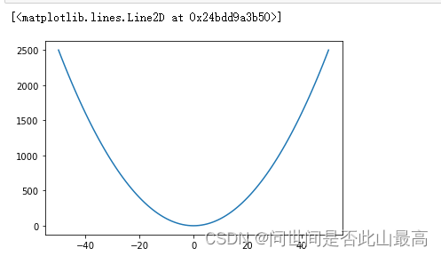
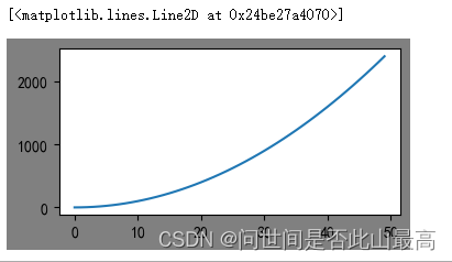
绘制y=x^2的函数图像
y = x **2
plt.plot(x,y)
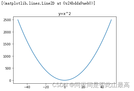
图标名称 plt.title()
import numpy as np
x = np.arange(-50,51)
y =x**2
plt.title("y=x^2")
plt.plot(x,y)
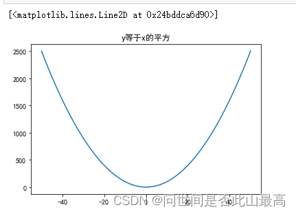
标题写成中文
plt.title("y等于x的平方")
plt.plot(x,y)`
输出:
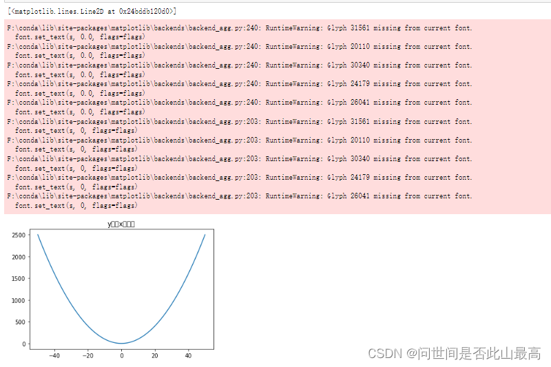 中文显示不出来,需要修改字体配置
 plt.rcParam["font.sans-serif")

plt.rcParams['font.sans-serif'] = ['SimHei']
plt.title("y等于x的平方")
plt.plot(x,y)
输出:
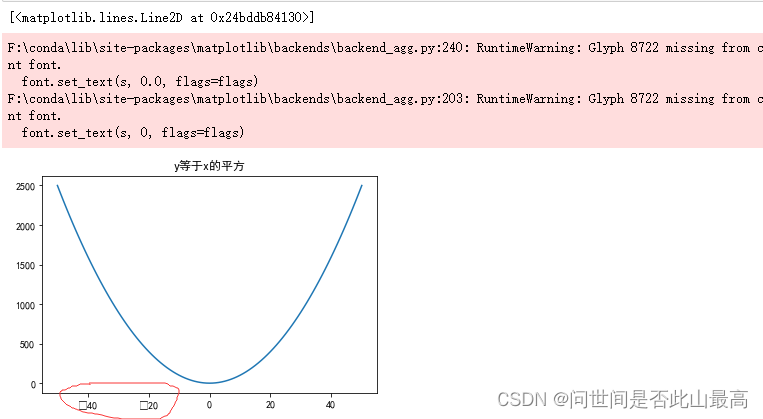
字体设置时,字体名称不区分大小写,
但是,当字体设置支持中文后,必须设置负号,否则当数值中出现负值时,负号无法显示
#解决方式:修改轴中的符号编码
plt.rcParams['axes.unicode_minus'] = False #默认是使用unicode负号,设置正常显示字符
plt.title("y等于x的平方")
plt.plot(x,y)
显示正常。
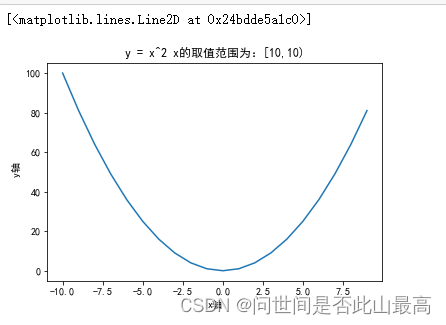
设置x轴和y轴名称xlabel() ylabel()
x = np.arange(-10,10)
y = x ** 2
plt.title("y = x^2 x的取值范围为:[10,10)")
#设置x轴名称
plt.xlabel('x轴')
plt.ylabel(" y轴")
plt.plot(x,y)
输出:
设置标签文字大小和线条粗细
fontsize参数:设置文字大小
linewidth参数:设置线条
x = np.arange(-10,10)
y = x ** 2
plt.title("y = x^2 x的取值范围为:[10,10)",fontsize=16)
#设置x轴名称
plt.xlabel('x轴',fontsize=12)
plt.ylabel("y轴",fontsize=12)
plt.plot(x,y,linewidth=5)
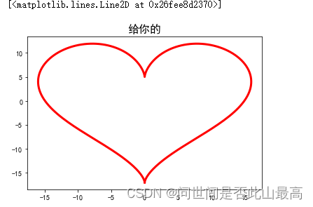
 画颗心:
画颗心:
import matplotlib.pyplot as plt
import numpy as np

# -pi ~ pi, split 256
t = np.linspace(-np.pi, np.pi, 256, endpoint=True)
X = 16 * (np.sin(t))**3
Y = 13 * np.cos(t) - 5 * np.cos(2 * t) - 2 * np.cos(3 * t) - np.cos(4 * t)

# plot at line1 column1
#plt.subplot(121)
plt.title("给你的",fontsize=16)
plt.plot(X, Y,color='r',linewidth=3)
输出:
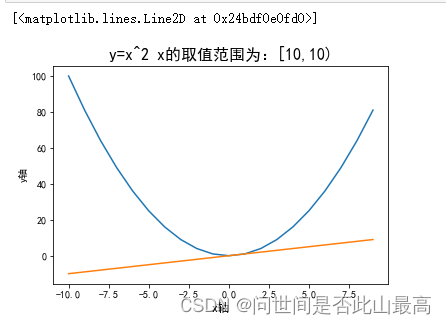
在一张图片中绘制多个线条:
x = np.arange(-10,10)
y1 = x**2
y2 = x
plt.title("y=x^2 x的取值范围为:[10,10)",fontsize=16)
plt.xlabel("x轴",fontsize=12)
plt.ylabel("y轴")
plt.plot(x,y1)
plt.plot(x,y2)
设置x轴和y轴的刻度
matplotlib.pyplot.xticks(ticks=None, label=None, **kwargs)
参数说明:
ticks:此参数是xticks位置的列表。是一个可选参数。如果将一个空列表作为参数传递,则它将删除所有的xticks。
label:此参数包含放置在给定刻度线位置的标签,是一个可选参数。
**kwargs:此参数是文本属性,用于控制标签的外观
rotation:旋转角度 如rotation=45
color:颜色 如:color=“red”
xticks的作用:将坐标轴变成自己想要的样子
例子:
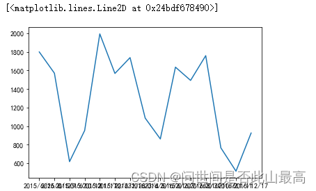
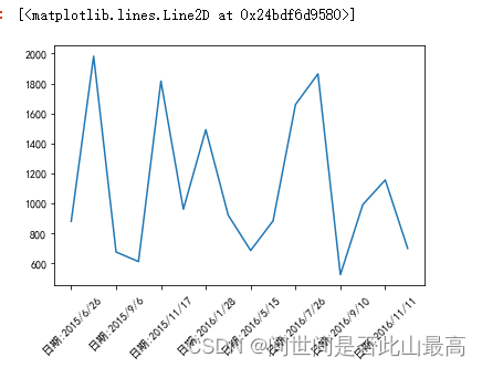
#每个时间点的销售绘图
times = ['2015/6/26','2015/8/1','2015/9/6','2015/10/12','2015/11/17','2015/12/23','2016/1/28','2016/3/4','2016/5/15','2016/6/20','2016/7/26','2016/8/31','2016/10/6','2016/11/11','2016/12/17']
#随机出销量
sales = np.random.randint(500,2000,size=len(times))
#绘制图像
plt.plot(times,sales)
输出:
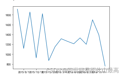
 显示部分时间:
**
plt.xticks(range(1,len(times),2))
plt.plot(times,sales)
**
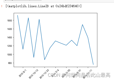
让横坐标中的字体倾斜:
plt.xticks(range(1,len(times),2),rotation=45)
plt.plot(times,sales)
输出:
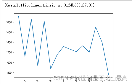
改变横坐标:
plt.xticks(range(1,len(times),2),labels=[1,2,3,4,5,6,7],rotation=45)
plt.plot(times,sales)
输出:
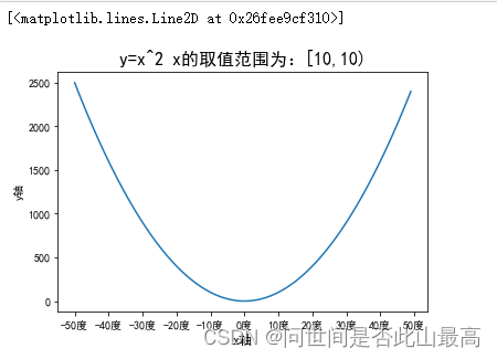
x = np.arange(-50,50)
y = x**2

plt.title("y=x^2 x的取值范围为:[10,10)",fontsize=16)
plt.xlabel("x轴",fontsize=12)
plt.ylabel("y轴")
x_titcks = [-50,-40,-30,-20,-10,0,10,20,30,40,50]
x_labels = ['%s度' % i for i in x_titcks]
plt.xticks(x_titcks,x_labels)
plt.plot(x,y)
输出:
times = ['2015/6/26','2015/8/1','2015/9/6','2015/10/12','2015/11/17','2015/12/23','2016/1/28','2016/3/4','2016/5/15','2016/6/20','2016/7/26','2016/8/31','2016/9/10','2016/10/6','2016/11/11','2016/12/17']
sales = np.random.randint(500,2000,size=len(times))
plt.xticks(range(0,len(times),2),labels=['日期:%s'%times[i] for i in range(0,len(times),2)],rotation=45)
plt.plot(times,sales)
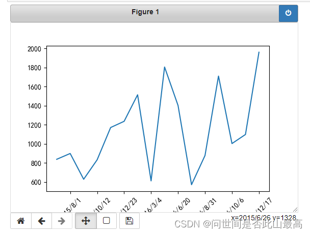
二、显示图表show()
在pycharm环境中,最后添加一行plt.show(),可以得到有图形操作菜单的图像。
如果在jupyter 中也想出现图形操作菜单,可以使用 matplotlib中的魔术方法%matplotlib notebook
%matplotlib notebook
plt.xticks(range(1,len(times),2),rotation=45)
plt.plot(times,sales)
 #如果又想回去原先的展示,使用另一个
%matplotlib inline
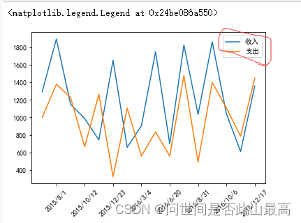
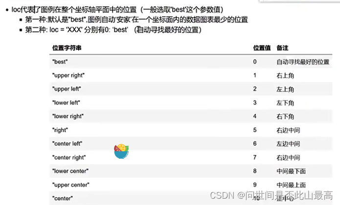
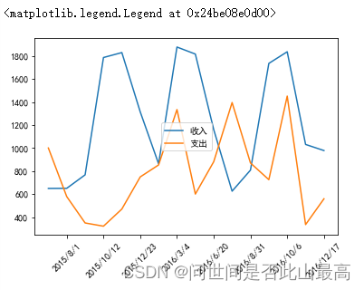
三、图例 legend()
图例是集中于地图一角或一侧的地图上各种符号和颜色所代表的内容与指标的说明
示例:
times = ['2015/6/26','2015/8/1','2015/9/6','2015/10/12','2015/11/17','2015/12/23','2016/1/28','2016/3/4','2016/5/15','2016/6/20','2016/7/26','2016/8/31','2016/9/10','2016/10/6','2016/11/11','2016/12/17']
#随机出收入
income = np.random.randint(500,2000,size=len(times))
#支出
expenses = np.random.randint(300,1500,size=len(times))
#绘制图形
plt.xticks(range(1,len(times),2),rotation=45)
#在每个图例前为每个图形设置label参数
plt.plot(times,income,label="收入")
plt.plot(times,expenses,label="支出")
#默认会使用每个图形的label值作为图例中的说明
plt.legend()
 图例的图例位置设置
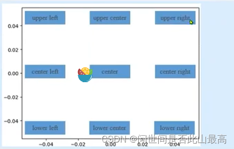 如:
如:
times = ['2015/6/26','2015/8/1','2015/9/6','2015/10/12', '2015/11/17','2015/12/23',
         '2016/1/28','2016/3/4','2016/5/15', '2016/6/20','2016/7/26','2016/8/31',
         '2016/9/10','2016/10/6','2016/11/11','2016/12/17']
income = np.random.randint(500,2000,size=len(times))
#支出
expenses = np.random.randint(300,1500,size=len(times))
#绘制图形
plt.xticks(range(1,len(times),2),rotation=45)
#在每个图例前为每个图形设置label参数
plt.plot(times,income,label="收入")
plt.plot(times,expenses,label="支出")
#默认会使用每个图形的label值作为图例中的说明
plt.legend(loc = "center")
输出:
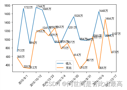
显示每条数据的值 x,y的值的位置
plt.text(x,y, string, fontsize=15,
verticalaignment="top",
horizontalaignment="right")
x,y:表示坐标值上的值
string:表示说明文字
fontsize表示字体大小
verticalalignment:(va)垂直对齐方式,参数:[‘center’|‘top’|‘bottom’|‘baseline’|]
horizontalalignment:(ha)水平对齐方式,参数:[‘center’|‘right’|‘left’|]
示例:
times = ['2015/6/26','2015/8/1','2015/9/6','2015/10/12', '2015/11/17','2015/12/23',
         '2016/1/28','2016/3/4','2016/5/15', '2016/6/20','2016/7/26','2016/8/31',
         '2016/9/10','2016/10/6','2016/11/11','2016/12/17']
#收入
income = np.random.randint(500,2000,size=len(times))
#支出
expenses = np.random.randint(300,1500,size=len(times))
#绘制图形
plt.xticks(range(1,len(times),2),rotation=45)
#在每个图例前为每个图形设置label参数
plt.plot(times,income,label="收入")
plt.plot(times,expenses,label="支出")
#默认会使用每个图形的label值作为图例中的说明
plt.legend()
for x,y in zip(times,income):
     plt.text(x,y,'%s万'%y)
for x,y in zip(times,expenses):
     plt.text(x,y,'%s万'%y)
输出:
四、 其他元素可视性
1.显示网格
plt.grid(True,linestyle = “–”,color=“gray”,linewidth = ‘0.5’,axis = ‘x’)
显示网格
linestyle:线型
color:颜色
linewidth:宽度
axis:x,y,both,显示x/y两者之间的格网
示例:
import numpy as np
from matplotlib import pyplot as plt
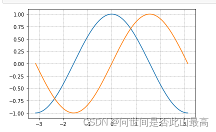
x = np.linspace(-np.pi,np.pi,256,endpoint = True)
c, s = np.cos(x), np.sin(x)
plt.plot(x, c)
plt.plot(x, s)
#plt.grid(True)
plt.grid(True, linestyle = "--", color = "gray", linewidth = "0.5", axis = 'both')
2.plt.gca()对坐标轴的操作
gca即get current axes
对当前坐标轴进行操作
 示例:
示例:
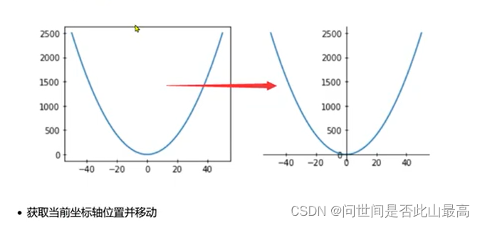
x = np.arange(-50,51)
y = x**2
plt.plot(x,y)
#获取当前坐标轴
ax = plt.gca()
#通过坐标轴spines,确定top,bottom, left,right
#不需要右侧和上侧线条,则可以设置成其他颜色
ax.spines['right'].set_color("none")
ax.spines['top'].set_color("none")
plt.plot(x,y)
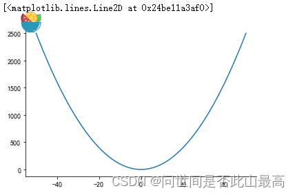
移动下轴到指定位置:
#position位置参数有三种,data,outward,axes
#axes:0.0-1.0之间的值,整个轴上的比例
#ax.spines['left'].set_position(('data',0.0))
ax.spines['left'].set_position(('axes',0.5))
#'data'表示按数值挪动,其后数字代表挪动到Y轴的刻度值
ax.spines['bottom'].set_position(('data',0.0))
#设置坐标区间
#plt.ylim(0,2500)
plt.ylim(0,y.max())
plt.plot(x,y)
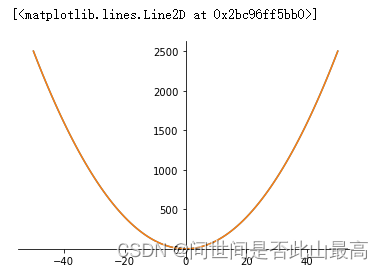
3.plt.rcParam设置画图的分辨率,大小等信息
plt.rcParams["figure.figsize"]=(8.0,4.0) #设置figure_size尺寸
plt.rcParams["figure.dpi"] = 300 #分辨率
默认的像素:[6.0,4.0],分辨率为72,图片尺寸为432*288
指定dpi=100,图片尺寸为600*400
指定dpi=300,图片尺寸为1800*1200
五、 图表的样式参数设置
1、线条样式
传入x,y,通过plot画图,并设置折线颜色、透明度、折线样式和折线宽度、标记点、标记点大小、标记点边颜色、标记点边宽,网格
plt.plot(x,y,color="red",alpha=0.3,linestyle="-",
linewidth=5,marker='o',markeredgecolor='r',
markersize='20',markeredgewidth=10)
alpha:0-1透明度
linestyle:折线样式
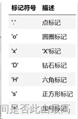
marker:标记点
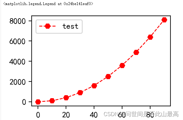
 示例:
示例:
x = np.arange(0,100,10)
y = x**2
'''
linewidth 设置线条粗细
label 设置线条标签
color 设置线条颜色
linestyle 设置线条形状
marker  设置线条样点标记


'''
plt.rcParams['figure.dpi'] = 200
plt.plot(x,y,linewidth = '1',label = "test", color = 'r', linestyle="--", marker='H')
plt.legend(loc="upper left")
输出:
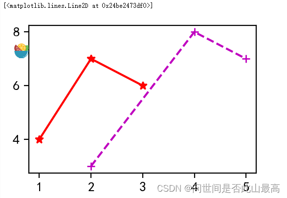
线条样式缩写:颜色 标记 样式
#颜色 标记 样式
plt.plot([1,2,3],[4,7,6],'r*-')
plt.plot([2,4,5],[3,8,7],'m+--')
输出:
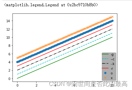
 不同种类不同颜色的线并添加图例:
#不同种类不同颜色的线并添加图例
x = np.linspace(0,10,100)
plt.plot(x,x+0,'-g',label='-g')# 实线 绿色
plt.plot(x,x+1,'--c',label='--c') #虚线 浅蓝色
plt.plot(x,x+2,'-.k',label='-.k') #点划线 黑色
plt.plot(x,x+3,'-r',label='-r')#实线 红色
plt.plot(x,x+4,'o',label='o')   #点 默认是蓝色
plt.plot(x,x+5,'x',label='x')#叉  默认是蓝色
plt.legend(loc="lower right", framealpha=0.1,shadow=True, borderpad=0.2)
输出:
六、创建图形对象
在Matplotlib中,面向对象编程的核心思想是创建图像对象,通过图形对象来调用其它的方法和属性,这样有助于我们更好的处理画布。在这个过程中,pyplot负责生成对象,并通过该对象来添加一个或多个axes对象(即绘图区域)。
Matplotlib提供了matplotlib.figure 图形类模块,它包含了创建图形对象的方法,通过调用pyplot模块中figure函数来实例化figure对象。
figure方法如下:
plt.figure(
num=None,———>图像编号或名称,数字为编号,字符串为名称;
figsize=None,———>指定figure的宽和高,单位为英寸;
dpi=None,——>指定绘图对象的分辨率,即每英寸多少个像素,缺省值为72;
facecolor=None,——>背景颜色
edgecolor=None,——>边框颜色
frameon=True,——>是否显示边框
**kwargs,
)
示例:
x = np.arange(0,50)
y = x**2
fig = plt.figure('f1',figsize=(4,2),dpi=100,facecolor='gray')
plt.plot(x,y)
输出:
 plot(y) x可省略,默认【0,…,N-1]递增,N为y轴元素的个数
例子:
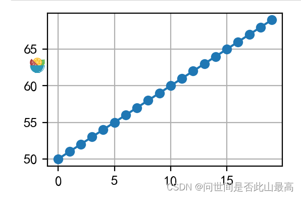
plt.plot(range(50,70),marker="o")
plt.grid()
输出:
绘制多子图
figure是绘制对象(可理解为一个空白的画布),一个figure对象可以包含多个Axes子图,一个Axes是一个绘图区域,不加设置时,Axes为1,且每次绘图其实都是在figure上的Axes上绘图。
接下来将学习绘制子图的几种方式:
add_axes():添加区域
subplot():均等的划分画布,只是创建一个包含子图区域的画布(返回区域对象)
subplots():既创建了一个包含子图区域的画布,又创建了一个figure图形对象(返回图形对象和区域对象)
1.add_axes():添加区域
Matplotlib定义了一个axes类(轴域类),该类的对象被称为axes对象(即轴域对象),它指定了一个有数值范围限制的绘图区域,在一个给定的画布(figure)中可以包含多个axes对象,但是同一个axes对象只能在一个画布中使用。
语法:
add_axes(rect)
该方法用来生成一个axes轴域对象,对象的位置由参数rect决定;
rect是位置参数,接受一个由4个元素组成的浮点数列表,形如[left,bottom,width,height],它表示添加到画布中的矩形区域的左下角坐标(x,y),以及宽度和高度。
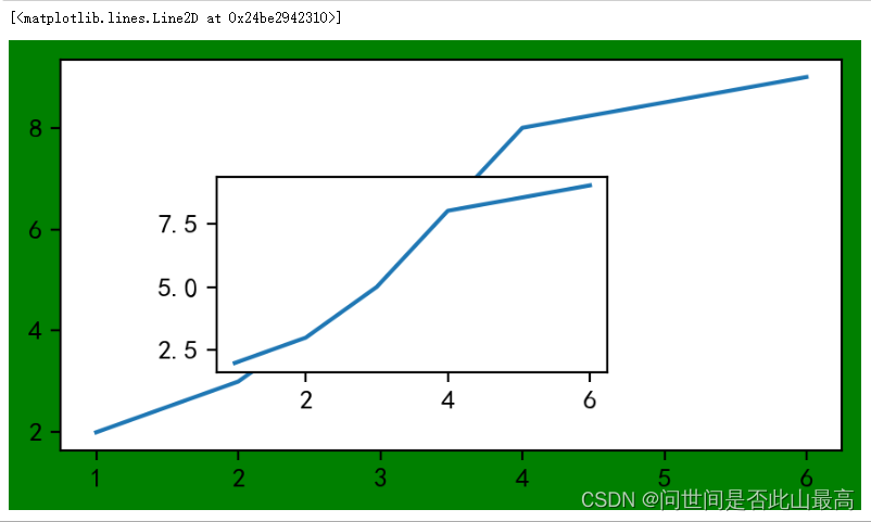
示例:
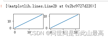
fig = plt.figure(figsize=(4,2),facecolor='g')
#axl从画布起始位置开始绘制,宽高和画布一致
ax1 = fig.add_axes([0,0,1,1])
#ax2 从画布20%的位置开始绘制,宽高是画布的50%
ax2 = fig.add_axes([0.2,0.2,0.5,0.5])
ax1.plot([1,2,3,4,6],[2,3,5,8,9])
ax2.plot([1,2,3,4,6],[2,3,5,8,9])
输出:
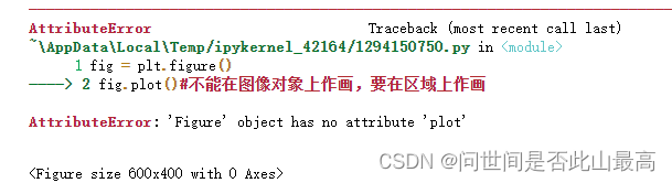
 不能在图像对象上作画,要在区域上作画
fig = plt.figure()
fig.plot()
输出:
2.subplot()函数,它可以均等的划分画布
参数格式:
ax = plt.subplot(nrows,ncols,index,*args,**kwargs)
nrow:行
ncols:列
index:索引
kwargs:title/xlabel/ylabel等.....
也可以直接将几个值写到一起,如:subplot(233)
返回:区域对象
nrow和ncol表示要划分几行几列的子区域,(nrow*ncol表示子图数量),index的初始值为1,用来选定具体的某个子区域。例如:subplot(233)表示在当前画布的右上角创建一个两行三列的绘图区域,同时选择在第三个位置绘制子图。
# 默认画布分割为2行1列,当前所在第一个区域
plt.subplot(211)
#x可省略,默认[0,...N-1]递增,N为y轴的个数
plt.plot(range(50,70),marker="o")
plt.grid()
# 默认画布分割为2行1列,当前所在第2个区域
plt.subplot(212)
plt.plot(np.arange(12)**2)
输出:
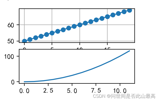
如果新建的子图与现有的子图重叠,那么重叠部分的子图将会被自动删除,因为他们不可以共享绘图区域。比如上图第一行的x轴坐标被覆盖,如果不想覆盖之前的图,需要先创建画布,如:
fig = plt.figure(figsize=(4,2))
fig.add_subplot(221)
plt.plot(range(20))
fig.add_subplot(222)
plt.plot(range(12))
输出:
 对于subplot关键词赋值参数,可以将光标移动到subplot方法上,使用快捷键shift+tab查看内容
设置多图的基本信息方式:
a.在创建的时候直接设置:
示例:创建一个子图,它表示一个有2行1列的网格的顶部图:
plt.subplot(211,title = "pic1", xlabel="a axis")
#x可省略,默认[0,1,...N-1递增]
plt.plot(range(50,70))
plt.subplot(212, title="pic2", xlabel="x axis")
plt.plot(np.arange(12)**2)
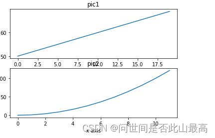
发现子图标题重叠,在最后使用plt.tight_layout()
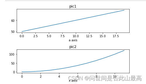 b.也可以使用pyplot模块中的方法设置后再绘制:
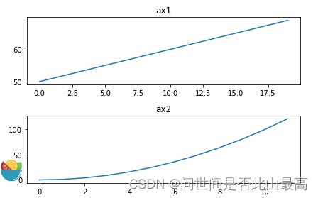
plt.subplot(211)
plt.title("ax1")
plt.plot(range(50,70))
plt.subplot(212)
plt.title("ax2")
plt.plot(np.arange(12)**2)
plt.tight_layout()
输出:
c.还可以使用返回的区域对象设置:
#注意区域对象的方法很多都是set_开头
#使用区域对象将不存在 设置位置
##plt.subplot 返回所在的区域
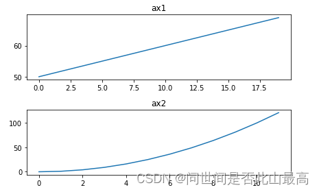
ax1 = plt.subplot(211)
ax2 = plt.subplot(212)
ax1.set_title("ax1")
ax1.plot(range(50,70))
ax2.set_title("ax2")
ax2.plot(np.arange(12)**2)
plt.tight_layout()
输出:
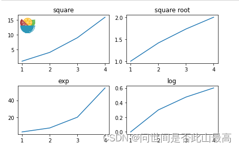
subplot 的使用示例:创建2行2列的子图,返回图形对象(画布),所有子图的坐标轴:
fig, axes = plt.subplots(2,2)
#第一个区域
ax1 = axes[0][0]
#x轴
x = np.arange(1,5)
#绘制平方函数
ax1.plot(x,x*x)
ax1.set_title('square')
#绘制平方根图像
axes[0][1].plot(x, np.sqrt(x))
axes[0][1].set_title('square root')
#绘制指数函数
axes[1][0].plot(x,np.exp(x))
axes[1][0].set_title('exp')
#绘制对数函数
axes[1][1].plot(x,np.log10(x))
axes[1][1].set_title('log')
plt.tight_layout()
输出:
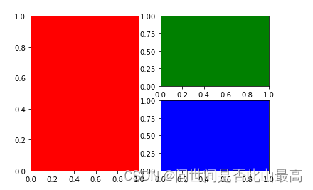
设置颜色:
plt.subplot(121,facecolor = 'r')
plt.subplot(222,facecolor = 'g')
plt.subplot(224,facecolor = 'b')
输出:


 3万+
3万+


 被折叠的 条评论
为什么被折叠?
被折叠的 条评论
为什么被折叠?
 到【灌水乐园】发言


