


数据可以在这里下载
https://github.com/harkbox/DataAnalyseStudy
数据
https://restcountries.com/v3.1/all;建议下载下来,并不是很大
import numpy as np
import matplotlib.pyplot as plt
import requests
import json
#由于访问url过于慢;将数据下载到本地是json数据
#url='https://restcountries.com/v3.1/all'
#r=requests.get(url)
#r.json()获得文件数据
#statuscode判断是否成功访问
filename='/Users/oommnn/Desktop/学习笔记/数据可视化30天项目/all.json'
try:
with open(filename) as f:
data=json.load(f)
except FileNotFoundError:
print(f"{filename}找不到")
#这是姓名的数组print(data[0]['name'])
#这是人口的消息print(data[0]['population'])
results=[]
#250个国家print(len(data))
for i in range(len(data)):
result={'name':data[i]['name']['common'],'population':int(data[i]['population'])}
results.append(result)
print(results[:2])
arr_results=np.array(results)
#列表的排序
results=sorted(results,key=lambda x: x['population'],reverse=True)
#np数组的排序;没有直接的方法
#可视化过程;使用matplotlib
x_values=[result['name'] for result in results]
y_values=[result['population'] for result in results]
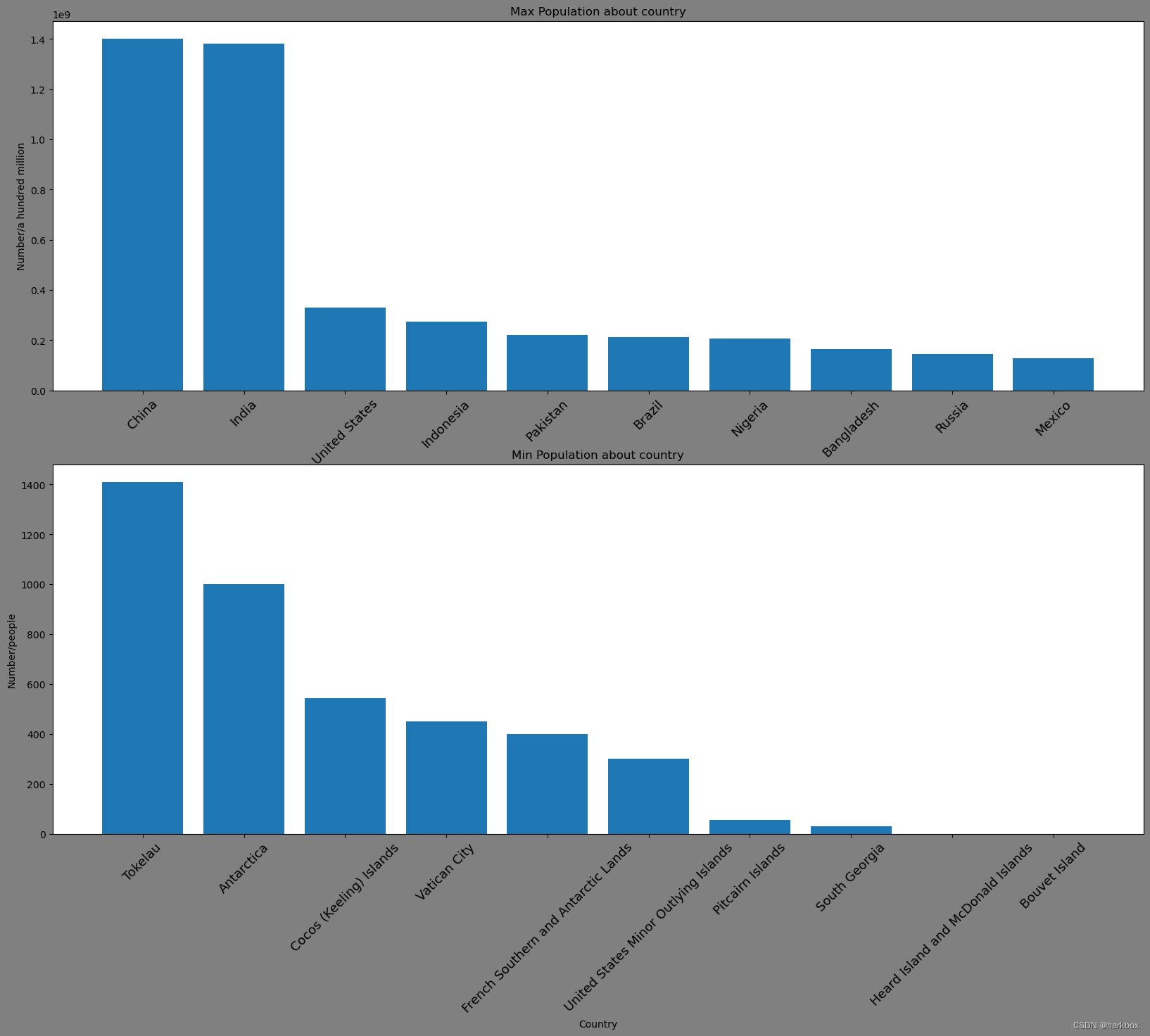
fig,axs=plt.subplot_mosaic([['left_top','left_top'],['left_bottom','left_bottom']],figsize=(20,15),facecolor='gray')
axs['left_top'].bar(x_values[:10],y_values[:10])
axs['left_top'].set_title("Max Population about country")
axs['left_top'].set_xlabel('Country')
axs['left_top'].set_ylabel('Number/a hundred million')
axs['left_top'].set_xticks(x_values[:10],x_values[:10],rotation=45,fontsize=13)
axs['left_bottom'].bar(x_values[-10:],y_values[-10:])
axs['left_bottom'].set_title("Min Population about country")
axs['left_bottom'].set_xlabel('Country')
axs['left_bottom'].set_ylabel('Number/people')
axs['left_bottom'].set_xticks(x_values[-10:],x_values[-10:],rotation=45,fontsize=13)
plt.show()
总结
- 关于数组的字典排序,属于lambda内置排序函数
- set_xticks设置刻度和字体翻转;第一个参数是需要多少个刻度ticks,数值型代表数,字符串代表本身,第二个参数是一一对应刻度的标签labels


 被折叠的 条评论
为什么被折叠?
被折叠的 条评论
为什么被折叠?
 到【灌水乐园】发言


