


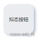
拟态按钮 dome
<!DOCTYPE html>
<html lang="zh">

<head>
    <meta charset="UTF-8">
    <title>新拟态按钮</title>

<body>
    <div>
        拟态按钮
    </div>
</body>
<style>
body {
	display: grid;
	height: 100vh;

	place-items: center;
}

:root {
	--color-background: #ebecf0;
	--color-icon-bg: #ebecf0;
	--color-label: slategrey;
	--color-light: rgba(121, 130, 160, .55);
	--color-shadow: rgb(255, 255, 255);
	--duration-ani: 50ms;
}

div {
	display: flex;
	justify-content: center;
	align-items: center;

/*一个合适的圆角*/
	border-radius: 20px;
	width: 100px;
	height: 100px;

/*颜色和背景颜色相近,低对比度*/
	background-color: var(--color-icon-bg);

/*模拟光照阴影*/
	box-shadow: 5px 5px 10px var(--color-light),
	-5px -5px 10px var(--color-shadow);
	user-select: none;

/*增加过渡*/
	transition: box-shadow var(--duration-ani) ease-out;
}

div:active {
	box-shadow: 0 0 0 rgba(0, 0, 0, 0),
	0 0 0 rgba(0, 0, 0, 0),
	inset 5px 5px 10px var(--color-light),
	inset -5px -5px 10px var(--color-shadow);
	font-weight: 700;
	color: aqua;
}

</style>
</head>

</html>
运行效果:
点击效果:

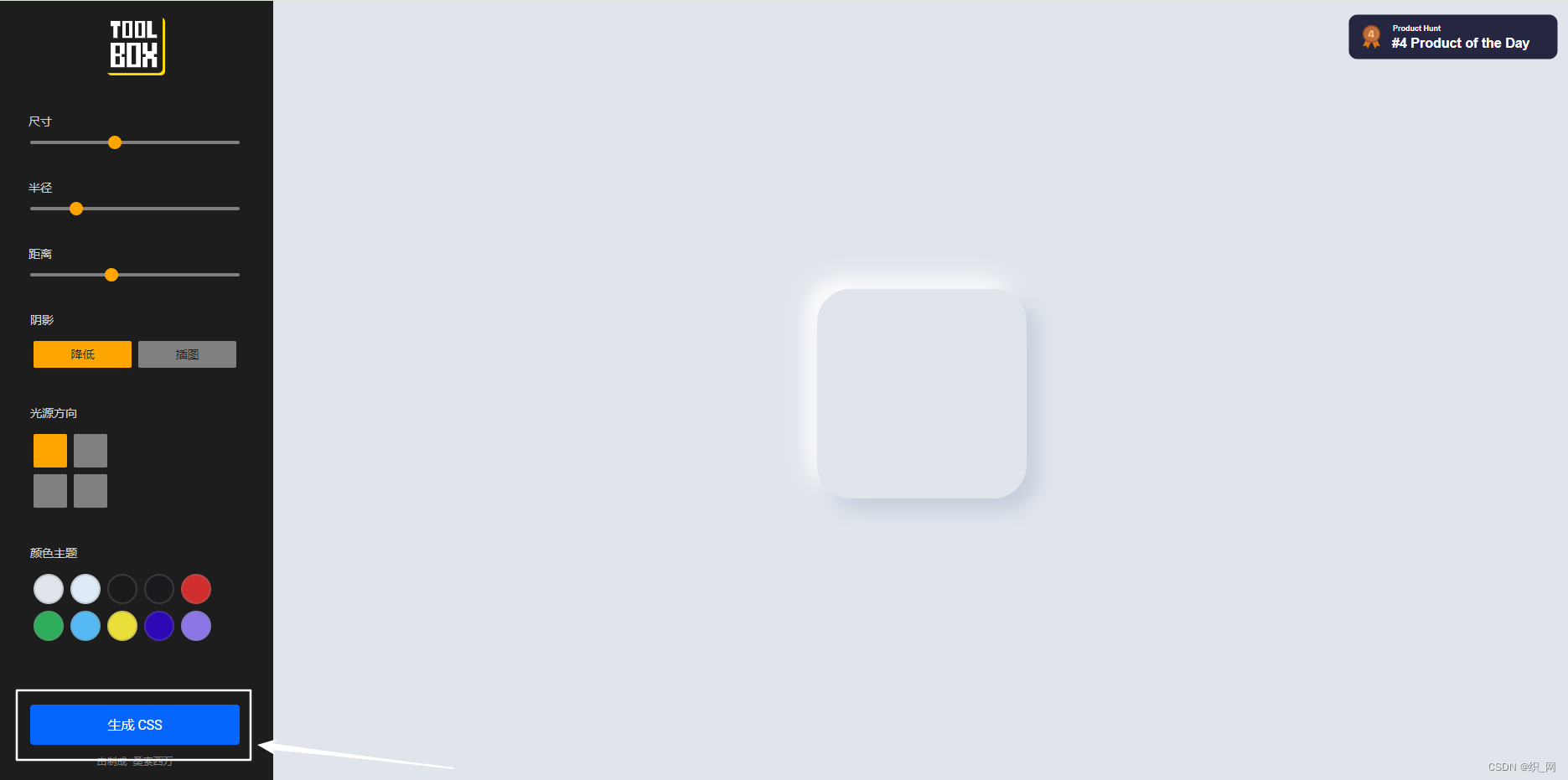
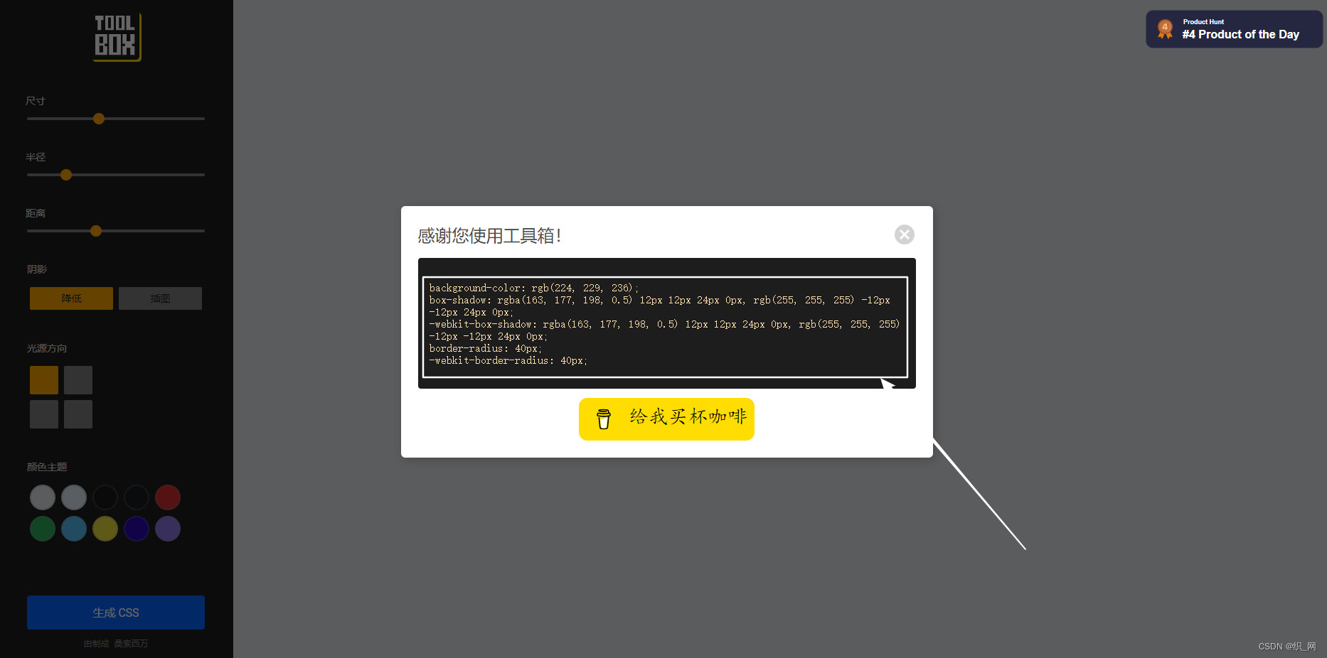
拟态按钮生成器
http://santhoshsivan.com/neu.html


 4144
4144


 被折叠的 条评论
为什么被折叠?
被折叠的 条评论
为什么被折叠?
 到【灌水乐园】发言


