


1、景深
建立3D立体空间的概念,先了解景深
景深:物体的远小近大
属性:perspective
属性值:数值+单位(px,em,cm)
不设置景深
设置景深


2、3D
2D场景,在屏幕上水平和垂直的交叉线x轴和y轴
3D场景,在垂直于屏幕的方法,相对于2D多出个z轴
Z轴:靠近屏幕的方向是正向,远离屏幕的方向是反向
形成3D空间的属性:
<style>
    div{
        transform-style: preserve-3d;
    }
</style>
3D的位移属性:
transform:translate()
translateX()
translateY()
translateZ()
3D的旋转属性
transform:rotate()
rotate() 默认方向是Z轴
rotateX()
totateY()
rotated3d() :四个参数,前三个是x,y,z轴的矢量值,最后一个是角度值

3、关键帧动画
关键帧动画的本质:控制元素在浏览器中移动
1、动画的定义/声明
需要在css样式表中声明
语法:@keyframes 动画名称{动画的运动方式}
@keyframes 声明动画的关键字
动画名称 需自定义
设置动画的运动方式,单次运动和多次运动(百分比控制运动的位置或者时间)
2、注意
动画在css样式表中调用
在需要运动的元素上添加动画
使用动画需要添加定位属性
设置运动方式的时候属性要相同
3、属性详解案例
<!DOCTYPE html>
<html lang="en">
<head>
    <meta charset="UTF-8">
    <meta name="viewport" content="width=device-width, initial-scale=1.0">
    <meta http-equiv="X-UA-Compatible" content="ie=edge">
    <title>Document</title>
    <style>
        section{
            width: 400px;
            height: 400px;
            border: 1px solid black;
            position: relative;
        }
        div{
            width: 100px;
            height: 100px;
            background: gold;
            position: absolute;
            /* 动画的名称 */
            /* animation-name: divMove; */
            /* 动画的运动时间 */
            /* animation-duration: 3s; */

            /* 运动方式 */
            /* animation-timing-function: linear; */
            /* 延时 */
            /* animation-delay: 1s; */

            /* 运动次数 */
            /* animation-iteration-count: infinite; 无限循环 */

            /* 运动方向 */
            /* animation-direction: alternate; alternate折返运动 reverse反向的运动 */

            /* 动画的运动状态 */
            /* animation-play-state: paused running运动 */

            /* 复合属性 简写方式 */
            /* animation:名称 时间 方式 次数 */
            animation: divMove 2s linear 3;

        }
        section:hover div{
            animation-play-state: paused
        }
        @keyframes divMove{
            /* 起始位置 */
            /* from{left: 0;top: 0} */
            /* 结束位置 */
            /* to{left: 300px;top: 0} */

            0%{left: 0;top: 0}
            25%{left: 300px;top: 0}
            50%{left: 300px;top: 300px}
            75%{left: 0;top: 300px}
            100%{left: 0;top: 0}
        }
    </style>
</head>
<body>
    <section>
        <div></div>
    </section>
</body>
</html>
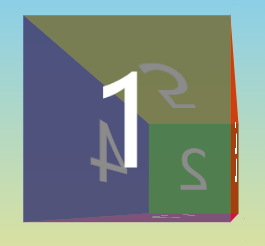
4、3D和动画制作立方体
<!DOCTYPE html>
<html lang="en">
<head>
    <meta charset="UTF-8">
    <meta name="viewport" content="width=device-width, initial-scale=1.0">
    <meta http-equiv="X-UA-Compatible" content="ie=edge">
    <title>Document</title>
    <style>
        section{
            width: 400px;
            height: 400px;
            transform-style: preserve-3d;
            /* transform: rotate3d(1,1,0,30deg); 静态立方体 */

            animation: fk 20s linear 2; /* 利用动画旋转立方体 */

            position: fixed;
            top: 0;
            bottom: 0;
            left: 0;
            right: 0;
            margin: auto;
        }
        div{
            width: 400px;
            height: 400px;
            position: absolute;
            font-size: 100px;
            text-align: center;
            line-height: 400px;
            color: white;
            transition: 0.8s;
             opacity: 0.7;
        }
        div:nth-child(1){
            background: pink;
        }
        div:nth-child(2){
            background: yellow;
        }
        div:nth-child(3){
            background: gray;
        }
        div:nth-child(4){
            background: green;
        }
        div:nth-child(5){
            background: red;
        }
        div:nth-child(6){
            background: orange;
            /* backface-visibility: hidden; 背面不可见 */
        }
        div:nth-child(1){
            transform: translateX(200px) rotateY(90deg)
        }
        div:nth-child(2){
            transform: translateX(-200px) rotateY(-90deg)
        }
        div:nth-child(3){
            transform: translateY(200px) rotateX(90deg)
        }
        div:nth-child(4){
            transform: translateY(-200px) rotateX(90deg)
        }
        div:nth-child(5){
            transform: translateZ(200px)
        }
        div:nth-child(6){
            transform: translateZ(-200px) rotateY(180deg)
        }

        /* 声明动画 */
        @keyframes fk{
            0%{transform: rotateX(30deg) rotateY(0deg)}
            25%{transform: rotateX(30deg) rotateY(90deg)}
            50%{transform: rotateX(30deg) rotateY(180deg)}
            75%{transform: rotateX(30deg) rotateY(270deg)}
            100%{transform: rotateX(30deg) rotateY(360deg)}
        }
    </style>
</head>
<body>
    <section>
        <div>1</div>
        <div>2</div>
        <div>3</div>
        <div>4</div>
        <div>5</div>
        <div>6</div>
    </section>
</body>
</html>


 218
218


 被折叠的 条评论
为什么被折叠?
被折叠的 条评论
为什么被折叠?
 到【灌水乐园】发言


