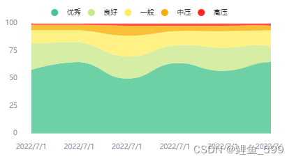
vue + echarts绘制一个堆叠图(基于折线图)可复用的组件

成品图
在这里插入图片描述
组件代码

数据总共是五条,每天的数据的百分数,已设置默认值,可不传参直接引用
但是父组件记得设置高度

<template>
  <div id="test_app">
    <!--echarts的容器-->
    <div ref="pile" class="main"></div>
  </div>
</template>

<script>
export default {
  name: 'pile',
  props: {
    pileData: {
      type: Object,
      default: function () {
        return {
          data1: [58, 65, 50, 64, 57, 65, 55],
          data2: [24, 18, 20, 16, 21, 14, 25],
          data3: [12, 11, 19, 13, 15, 15, 11],
          data4: [5, 5, 9, 5, 5, 4, 8],
          data5: [1, 1, 2, 2, 2, 2, 1]
        }
      }
    }
  },
  data() {
    return {
      charts: ''
    }
  },
  methods: {
    drawpile() {
      const data = this.pileData
      const legend = ['优秀', '良好', '一般', '中压', '高压']
      const color = ['#49C68F', '#CAE88D', '#FFED64', '#F7AF02', '#FF2626']
      this.charts = echarts.init(this.$refs.pile)
      const option = {
        color: color,
        tooltip: {
          trigger: 'axis',
          axisPointer: {
            type: 'cross',
            label: {
              backgroundColor: '#6a7985'
            }
          },
          textStyle: {
            fontSize: 10
          }
        },
        legend: {
          data: legend,
          icon: 'circle',
          itemHeight: 10,
          textStyle: {
            fontSize: 10
          }
        },
        grid: {
          left: '3%',
          right: '4%',
          bottom: '3%',
          top: '12%',
          containLabel: true
        },
        xAxis: [
          {
            type: 'category',
            boundaryGap: false,
            data: ['2022/7/1', '2022/7/1', '2022/7/1', '2022/7/1', '2022/7/1', '2022/7/1'],
            axisTick: {
              show: false,
              alignWithLabel: true // 保证刻度线和标签对齐
            },
            axisLine: {
              show: false // 不显示坐标轴线
            },
            axisLabel: {
              showMaxLabel: true,
              // interval: datax.length > 5 ? 1 : 0,
              textStyle: {
                color: '#8E8DA7' // 横坐标轴上文字颜色
              },
              fontSize: 10,
              margin: 15
            },
          }
        ],
        yAxis: [{
          type: 'value',
          splitLine: {
            show: false
          },
          interval: 25,
          axisLabel: {
            textStyle: {
              color: '#8E8DA7'
            },
            fontSize: 10,
            margin: 20
          },
          nameTextStyle: {
            color: "#8E8DA7",
            fontSize: 10,
            padding: [0, 50, 0, 0]  // 加上padding可以调整其位置
          },
          axisLine: {
            show: false
          },
          axisTick: {
            show: false,
            alignWithLabel: true // 保证刻度线和标签对齐
          },
        }
        ],
        series: [
          {
            name: legend[0],
            type: 'line',
            stack: 'Total',
            smooth: true,
            lineStyle: {
              width: 0
            },
            showSymbol: false,
            areaStyle: {
              opacity: 0.8,
              color: color[0]
            },
            emphasis: {
              focus: 'series'
            },
            data: data.data1
          },
          {
            name: legend[1],
            type: 'line',
            stack: 'Total',
            smooth: true,
            lineStyle: {
              width: 0
            },
            showSymbol: false,
            areaStyle: {
              opacity: 0.8,
              color: color[1]
            },
            emphasis: {
              focus: 'series'
            },
            data: data.data2
          },
          {
            name: legend[2],
            type: 'line',
            stack: 'Total',
            smooth: true,
            lineStyle: {
              width: 0
            },
            showSymbol: false,
            areaStyle: {
              opacity: 0.8,
              color: color[2]
            },
            emphasis: {
              focus: 'series'
            },
            data: data.data3
          },
          {
            name: legend[3],
            type: 'line',
            stack: 'Total',
            smooth: true,
            lineStyle: {
              width: 0
            },
            showSymbol: false,
            areaStyle: {
              opacity: 0.8,
              color: color[3]
            },
            emphasis: {
              focus: 'series'
            },
            data: data.data4
          },
          {
            name: legend[4],
            type: 'line',
            stack: 'Total',
            smooth: true,
            lineStyle: {
              width: 0
            },
            showSymbol: false,
            label: {
              show: true,
              position: 'top'
            },
            areaStyle: {
              opacity: 0.8,
              color: color[4]
              // new echarts.graphic.LinearGradient(0, 0, 0, 1, [ // 可以通过该部分进行渐变颜色的编写
              //   {
              //     offset: 0,
              //     color: 'rgb(255, 191, 0)'
              //   },
              //   {
              //     offset: 1,
              //     color: 'rgb(224, 62, 76)'
              //   }
              // ])
            },
            emphasis: {
              focus: 'series'
            },
            data: data.data5
          }
        ]
      };
      this.charts.setOption(option)
    }
  },
  // 调用
  mounted() {
    this.$nextTick(function () {
      this.drawpile()
    })
  }
}
</script>

<style scoped>
.main {
  width: 100%;
  height: 350px;
  margin: auto;
  background: #fff
}
</style>


  • 1
    点赞
  • 2
    收藏
    觉得还不错? 一键收藏
  • 3
    评论
Vue Echarts一个基于Vue.js框架的表库,用于绘制各种类型的表,包括 k 线。 要使用 Vue Echarts 绘制 k 线,首先需要在项目中引入 EchartsVue Echarts,可以通过 npm 或者通过 CDN 引入。 在 Vue 组件中,可以创建一个 div 元素作为容器,将其绑定到 Echarts 实例上。代码类似于以下形式: ```html <template> <div ref="chart"></div> </template> <script> import echarts from 'echarts'; import VueECharts from 'vue-echarts'; export default { components: { VueECharts }, mounted() { this.chart = echarts.init(this.$refs.chart); this.renderChart(); }, methods: { renderChart() { // 设置表配置项和数据 const option = { // ... }; // 调用 setOption 方法,将配置项应用到表中 this.chart.setOption(option); } } } </script> ``` 在上述代码中,mounted 钩子函数中初始化了 Echarts 实例,并将其绑定到 ref 为 "chart" 的 div 元素上。然后,在 renderChart 方法中,设置表的配置项和数据,并使用 setOption 方法将配置项应用到表中。 绘制 k 线的具体配置项和数据根据需求和数据源的格式而定,可能包括 x 轴和 y 轴的设置、k 线的样式设置等。 在配置项中,需要指定 k 线的类型为 "candlestick",并根据实际情况设置相关参数。 以上是使用 Vue Echarts 绘制 k 线的基本流程,通过设置配置项和数据,可以实现自定义的 k 线效果。

“相关推荐”对你有帮助么?

  • 非常没帮助
  • 没帮助
  • 一般
  • 有帮助
  • 非常有帮助
提交
评论 3
添加红包

请填写红包祝福语或标题

红包个数最小为10个

红包金额最低5元

当前余额3.43前往充值 >
需支付:10.00
成就一亿技术人!
领取后你会自动成为博主和红包主的粉丝 规则
hope_wisdom
发出的红包
实付
使用余额支付
点击重新获取
扫码支付
钱包余额 0

抵扣说明:

1.余额是钱包充值的虚拟货币,按照1:1的比例进行支付金额的抵扣。
2.余额无法直接购买下载,可以购买VIP、付费专栏及课程。

余额充值