


CSS
一.简介
1.CSS是什么?
CSS 指层叠样式表 (Cascading Style Sheets)。是用来美化html这类标记语言的。
2.html如何使用CSS?
html使用CSS有三种方法:1.行内样式表 2.内部样式表 3.外部样式表。
CSS内容较少的时候可以用html内嵌套的方法,但是在大项目中,建议html和CSS分开来写。
1.行内样式表
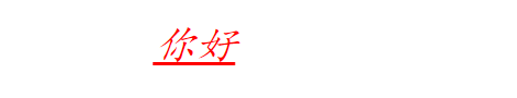
<div style=" color:ret;font-size:12px">你好</div>
2.内部样式表
<style>
p{
...
}
<style>
3.外部样式表
<link rel="stylesheet" href=style.css">
二.CSS的选择器
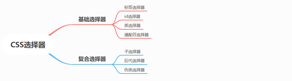
1.标签选择器
对html中所有同一类标签统一进行配置
<style>
     p{
		...
      }
     div{
      }
</style>
<p>你好</p>
<div>大家好</div>
2.id选择器
id具有唯一性,id选择器通常只对单一对象进行配置
<style>
    #hello {
        ...
    }
</style>
<p id="hello">你好</p>
<p>你好</p>
<div>大家好</div>
3.类选择器
<style>
    .hello {
        font-size: 22px;
    }
</style>
<p class="hello">你好</p>
</body>
4.通配符选择器
对html中所有内容都进行统一配置
<style>
    *{
        font-size: 22px;
    }
</style>
<p class="hello">你好</p>
5.复合选择器之子选择器 >
选择class为nav的标签内的所有直接子类为a标签。
.nav>a{
}
6.复合选择器之后代选择器 空格
选择class为nav的标签内的所有为a标签。
.nav a{
}
7.复合选择器之伪类选择器 :
该选择器只有在特定情况下才有效,如下
a:link:链接未访问时
a:visited:链接已访问时
a:hover:鼠标指向时
a:active:鼠标按下且未弹起时
a:link{
}
a:visited{
}
a:hover{
}
a:active{
}
新增:属性选择器 E[att]
1.input[name]:选择具有name属性的所有input元素
2.input[name=“xxx”]选择name为xxx的所有input元素
3.input[name^=‘s’]选择name以s开头的所有input元素
4.input[name$=‘s’]选择name中存在s的所有input元素
5.input[name*=‘s’]选择name以s结尾的所有input元素
新增:结构伪类选择器
E :first-child{} E中的第一个元素
E :last-child{} E中的最后一个元素
E :nth-child(n) E中的第n个孩子 1.n可以为odd奇数,even偶数 2.2n(偶数),2n+1(奇数),5n(5,10,15,…)
E:first-of-type{} 本html文档中第一个E元素
E:last–of-type 本html文档中最后一个E元素
E:nth-of-type(n) 本html文档中第n个E类型 1.n可以为odd奇数,even偶数 2.2n(偶数),2n+1(奇数),5n(5,10,15,…)
【注意】:前三个要用 E+空格+:才有效果,后三个不能用空格,要用E+:
新增:伪元素选择器
element::before{}在element内的第一个子元素前插入内容
element::after{}在element内的最后一个子元素后插入内容
- before和after内要有content属性才能生效
- before和after创建的默认是行内元素
- 伪元素使用场景:1.配置字体图标2.给视频配上阴影反馈3.清除浮动
三.CSS配置文字
1.示例
<style>
    .hello{
        font-family:Times New Roman ;
        font-size: 20px;
        font-weight: normal;
        font-style:italic;
        color:red;
        text-align: center;
        text-decoration: underline;
        text-indent: 20px;
        line-height: 20px;
    }
</style>
<p class="hello">你好</p>
效果如下:
2.CSS配置字体相关
【fornt-family】:微软雅黑/楷体/宋体/Times New Roman/…
【font-size】:没px是一个像素
【font-weight】:nomal(400)/bold(700)/bolder(更粗)/light(更细)
【font-style】:nomal/italic(斜体)
【color】:red/blue/rgb(0.5,1,0.3)(自己调色)/rgba(0.5,1,0.3,0.4)(自己调色,且带有透明度)
【text-align】:center/left/right
【text-decoration】:none/underline(下划线)/overline(上划线)/line-through(删除线)
【text-index】:20px(文本缩进)
【line-height】:20px(行间距)
【text-shadow】:5px 5px 6px rbga(0,0,0,0.5)
1.注意line-height要放在font之后配置才能生效
3.使用font的复合写法来配置字体(推荐)
<style>
    .hello{
        font:italic 700 16px   微软雅黑;
        color:red;
        text-align: center;
        text-decoration: underline;
        text-indent: 20px;
        line-height: 20px;
    }
</style>
<p class="hello">你好</p>dfd
4.字体字号与行高之间的关系。
文字的font-size字号是如下构成的,而line-height是两行文字的基线之间的距离。
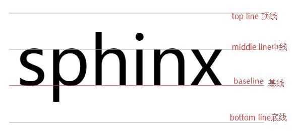
如下图所示,当一个文字行高等于盒子的高度时将会保持居中的状态,而关键点在于这时行高会使得文字的上行间距达到了它应有的大小从而显得文字居中。由于font-size的大小与line-height的单位有所偏差,我们并不知道上行间距的具体大小,但能估计是(30-18)/2=6px。

常见问题1.如何让字体在盒子里水平居中和垂直居中
文字在<p>中水平居中:text-align:center
文字在<p>中垂直居中:line-height为盒子高度(width)。但是要注意line-height要放在font之后配置才能生效
常见问题2.如何让文字与一张图片对齐vertial-align:baseline/top/middle/bottom
vertial-align:baseline:文字的基线与图片底部对齐
vertial-align:bottom:文字的最下端与图片对齐。
四.CSS元素(盒子)类型
行内元素:1.设置宽高无效,2.(2)对margin仅设置左右方向有效,上下无效;padding设置上下左右都有效,
行内块元素:可以设置宽高,不独占一行
块状元素:独占一行。
【行内元素】inline:a、strong、b、em、i、del、s、ins、u、span
【行内块元素】inline-block:img、input、td
【块状元素】block:div、h1~h6、p、hr、form、ul、dl、ol、li
在css中配置模式可以用display:block/inline/inline-block
五.盒子边框配置
盒子分为外边框(margin),边框(border),内边框(padding),内容(content)
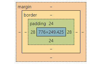
1.边框border
border-width:5px;
border-style:none/hidden/dotted(点线)/dashed(虚线)/solid(实线)/double(双实线)/groove/ridge/inset/outset
border-color:red;
border-collapse:collapse(相邻单元格边框合并而不是叠加)
边框的复合写法(常用):
border:width style color;(三者无规定的顺序)
2.内边框padding
可以用padding-left,padding-right,padding-top,padding-bottom来分别设置四个方向的内边框,也可以用
padding: 1px 2px;上下1px,左右2px;
padding:1px 2px 3px 4px;上右下左的顺序。
3.外边框margin
同上
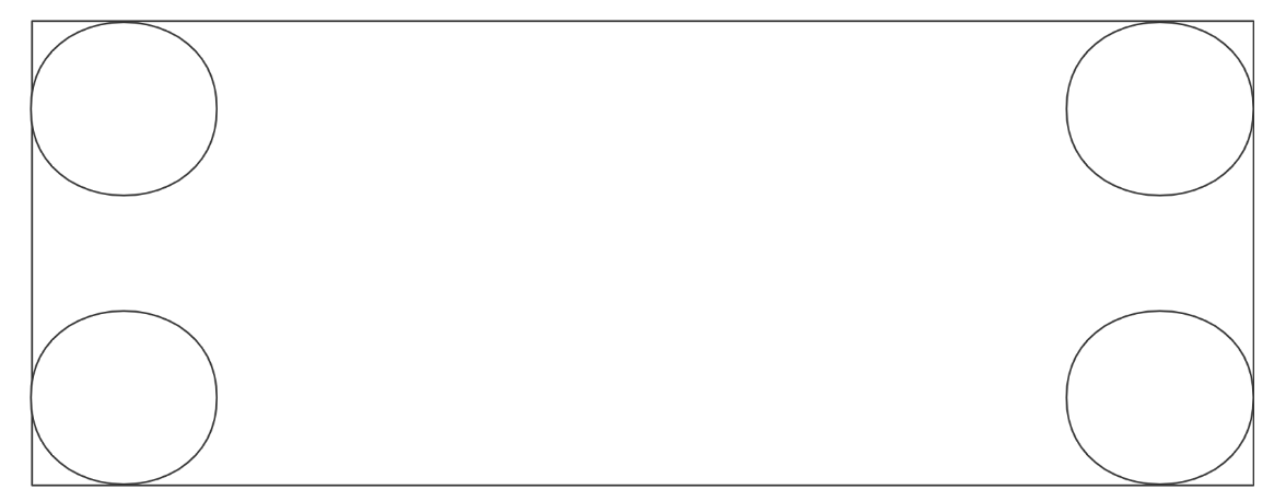
常见问题1.如何形成圆角边框
使用border-radius:40px (形成圆角边框,每个圆的半径都是40px)
想要得到圆可以用border-radius:50%;
常见问题2.如何制作三角形盒子
div{
    height: 0;
    width:0;
    border:10px solid transparent;
    border-bottom-color: black;
}
</style>
<div></div>
这样一个三角形就做成了

可以考虑用:after伪类来做出带尖矩形的效果的效果。
常见问题3.如何使得盒子在父盒子里水平居中和垂直居中
六.盒子其他配置
1.背景
background-color:transparent/red/rgba();
background-image: url;
backgroup-repeat:no-repeat(不平铺)/repeat(默认平铺)/repeat-x/repeat-y;
backgroup-position:left/center/right/30px top/center/bottom/40px;
backgroup-attachment:scoll(随盒子变化而变化)/fixed(盒子变大背景大小不变)
复合背景设置:
background:color image repeat attachment position
background:black url repeat fixed center top;
2.阴影
box-shadow:10px(水平阴影位置) 10px(垂直阴影位置) 10xp(模糊距离) -4px(大小) rbga(0,0,0,0.3)
7.盒子布局配置
1.浮动float:left/right
(1)浮动元素的效果
1.浮动元素会脱离标准流(脱标),即浮动元素在更高一层层次。
2.浮动元素不影响前面盒子,只影响后面盒子。
3.浮动元素具有行内块元素的特性(因此可以不用写display:inline-block)
(2)清除浮动的方法
由于浮动元素会影响后面所有的元素,所有我们用完浮动元素要清除浮动
1.末尾额外标签法:在最后一个浮动标签后面加上一个新标签 <div style=“clear:both”/>
2.父级额外属性法:在父级中加上属性 overflow:hidden/auto/scoll
3.父级伪类选择器法(和第一个方法一模一样,相当于在父亲内部最后一个子类后再添加一个元素):
.father:after{
content="";//一定要有这个,否则伪类after不生效。
display:block;
clear:both;
height=0;
visibility:hidden;
}
若为IE6,IE7还要加上
.father{
*zoom=1;
}
2.定位 position:static/relative/absolute/fixed
(1)static
默认,即无定位效果,按标准留意摆放位置
(2)relative
相对原来的位置发生移动。
1.原来位置会继续占有,不脱标
2.如top:10px表示向下移动10px
(3)absolute
1.若父级无定位:则以浏览器左上角为参照标准
2.若父级有定位:以最近的一级有定位的祖先元素为参考标准来移动位置。
常用:子绝父相和子绝父绝的方法。
(4)fixed
相对定位和绝对定位的结合。
常用来制作固定界面
常见问题1:如何决定定位的摆放层次?
用z-index=1,2,…来表示,数字越大,盒子越靠上。
七.CSS鼠标样式cursor
cursor:default 默认光标(通常是一个箭头)
cursor:auto 默认。浏览器设置的光标。
cursor:crosshair 光标呈现为十字线。
cursor:pointer 光标呈现为指示链接的指针(一只手)
cursor:move 此光标指示某对象可被移动。
cursor:text 此光标指示文本。
cursor:wait 此光标指示程序正忙(通常是一只表或沙漏)。
cursor:help 此光标指示可用的帮助(通常是一个问号或一个气球)。
cursor:e-resize 此光标指示矩形框的边缘可被向右(东)移动。
cursor:ne-resize 此光标指示矩形框的边缘可被向上及向右移动(北/东)。
cursor:nw-resize 此光标指示矩形框的边缘可被向上及向左移动(北/西)。
cursor:n-resize 此光标指示矩形框的边缘可被向上(北)移动。
cursor:se-resize 此光标指示矩形框的边缘可被向下及向右移动(南/东)。
cursor:sw-resize 此光标指示矩形框的边缘可被向下及向左移动(南/西)。
cursor:s-resize 此光标指示矩形框的边缘可被向下移动(南)。
cursor:w-resize 此光标指示矩形框的边缘可被向左移动(西)。
八.CSS初始化代码
body, h1, h2, h3, h4, h5, h6, hr, p, blockquote, dl, dt, dd, ul, ol, li, pre, form, fieldset, legend, button, input, textarea, th, td {
    margin: 0;
    padding: 0
}

html {
    color: #000;
    overflow-y: scroll;
    overflow: -moz-scrollbars
}

body, button, input, select, textarea {
    font: 12px arial
}

h1, h2, h3, h4, h5, h6 {
    font-size: 100%
}

em {
    font-style: normal
}

small {
    font-size: 12px
}

ul, ol {
    list-style: none
}

a {
    text-decoration: none
}

a:hover {
    text-decoration: underline
}

legend {
    color: #000
}

fieldset, img {
    border: 0
}

button, input, select, textarea {
    font-size: 100%
}

table {
    border-collapse: collapse;
    border-spacing: 0
}

img {
    -ms-interpolation-mode: bicubic
}

textarea {
    resize: vertical
}
九.CSS常见样式顺序
<style>
div{
/*   1.位置属性*/
    display: inline-block;
    float:right;
    position: absolute;
    top:20px;
    bottom:20px;
    left:20px;
    right:20px;
    over-flow:hidden;
    clear:both;
    z-index: 2;
/*    2.盒子大小*/
    height: 300px;
    width: 300px;
    border:10px solid red;
    padding:10px 10px;
    margin:10px 10px;
    background:black url("study.jpg") repeat fixed center top;
    /*    3.文字与文本*/
    font:normal 700 16px 楷体;
    color:red;
    text-align: center;
    vertical-align: center;
    line-height: 30px;
    text-indent: 2px;
    text-decoration: underline;
/*    4.美化效果*/
    text-shadow: black;
    box-shadow: black;
    border-radius: 30px;
    cursor:pointer;
}
</style>
六.CSS的动态效果
CSS动态效果通常和伪类选择器搭配使用,如hover,visited…
1.CSS的动态效果transform(建议卸载伪类元素上)
1.移动:
transform:translate(100px,100px):同时向下向右移动100px距离
transform:translate(100%,100%):同时向下向右移动一个自身的距离(content+border+pardding,无margin)
2.旋转:
transform:rotate(30deg)顺时针旋转30度
【注意】:transform:rotate是相对于最初状态的旋转角度,要回正只需要用rocate(0deg)
3.伸长:
transform:scale(2,3),长2倍,宽3倍。
transform-origin:left bottom/50% 100%。设置旋转和缩放的中心点,可以用left/right/top/bottom, 也可以用百分比
transform的综合写法
transform-orgin:
transform:translate() rotate() scale()
2.CSS的动态效果实现transition(写在原来元素上)
transition:过度的属性 花费时间 运动曲线(可以省略) 何时开始(可省略)
transition:width/height/all 1s ease 0s;
3.简单案例
<style>
    div{
        height: 300px;
        width: 200px;
        background-color: red;
        transition: all 10s;
    }
    div:hover{
        transform: scale(2,4);
    }
</style>
<div></div>


 791
791


 被折叠的 条评论
为什么被折叠?
被折叠的 条评论
为什么被折叠?
 到【灌水乐园】发言


