


style
<style>
.box-move {
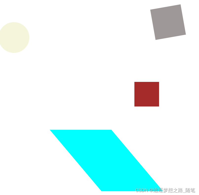
background: rgb(158, 152, 152);
width: 100px;
height: 100px;
/* border-radius: 50px; */
}
.box-move1 {
/* animation: my3d 5s; */
background-color: aqua;
width: 100px;
height: 100px;
margin-top: 300px;
}
.box-move2 {
width: 100px;
height: 100px;
border-radius: 50%;
background-color: beige;
}
</style>
html
  <!-- 盒子使用transform、translate、rotate、scale、skew基本使用 -->
    <div class="box-move" id="boxMove"></div>
    <div class="box-move2" id="boxMove2"></div>
    <div class="box-move1" id="boxMove1"></div>
javascript
 const boxMove = document.getElementById('boxMove');
      const boxMove1 = document.getElementById('boxMove1');
      const boxMove2 = document.getElementById('boxMove2');

      boxMove.onclick = function () {
        boxMove.style.transform = `translate(500px, 50px) rotate(80deg)`;
        boxMove.style.transitionProperty = `transform`;
        boxMove.style.transitionDuration = `3s`;
      };

      boxMove1.onclick = function () {
        boxMove1.style.transform = `translate(300px) rotate(180deg) scale(2) skew(40deg)`;
        boxMove1.style.transitionProperty = `transform`;
        boxMove1.style.transition = `.5s`;
        boxMove1.style.transitionDuration = `3s`;
      };

      boxMove2.onclick = function () {
        boxMove2.style.transform = `translate(300px) rotate(45deg) scale(2)`;
        boxMove2.style.transitionProperty = `transform`;
        boxMove2.style.transitionDuration = `2s`;
      };


 586
586


 被折叠的 条评论
为什么被折叠?
被折叠的 条评论
为什么被折叠?
 到【灌水乐园】发言


