


HTML代码:
<body>
<div class="container">
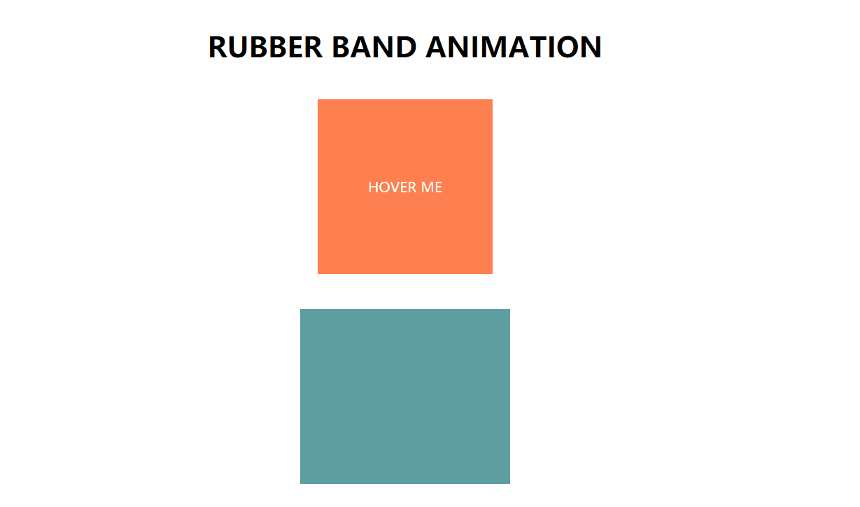
<h1 class="text">Rubber Band Animation</h1>
<button class="btn">Hover me </button>
<div class="box"></div>
</div>
</body>
css代码:
下面有详解
*{
    margin: 0%;
    padding: 0%;
    font-family: "Open Sans",sans-serif;
}
body{
    height: 100vh;
    display: flex;
    align-items: center;
    justify-content: center;
    text-align: center;
}

.text{
    text-transform: uppercase;
}

.btn{
    width: 200px;
    height: 200px;
    margin: 40px 0;
    background-color:coral ;
    border: none;
    color: #fff;
    font-size: 16px;
    text-transform: uppercase;
    cursor: pointer;

}
.box{
    width: 240px;
    height: 200px;
    background-color: cadetblue;
    margin: 0 auto;

}
.box:hover{
    animation: rubberBand 1s;
}
.btn:hover{
    animation: rubberBand 1s;
}

.text:hover{
    animation: rubberBand 1s;
}

@keyframes rubberBand{
    0%{
        transform: scale3d(1,1,1);
    }
    35%{
        transform: scale3d(1.25,.75,1);
    }
    45%{
        transform: scale3d(.75,1,1);
    }
    60%{
        transform: scale3d(1.2,.8,1);
    }
    75%{
        transform: scale3d(1.05,.95,1);
    }
    100%{
        transform: scale3d(1,1,1);
    }
}
详解:
*{
    margin: 0%;
    padding: 0%;
    /* 设置字体样式 */
    font-family: "Open Sans",sans-serif;
}
body{
    height: 100vh;
    /* 弹性布局 */
    display: flex;
    /* 弹性子元素居中,左右居中对齐 */
    justify-content: center;
    /* 使盒子在纵轴居中对齐 */
    align-items: center;

    /* 设置文本居中对齐 */
    text-align: center;
}

.text{
    /* 文本转为大写 */
    text-transform: uppercase;
}

.btn{
    /* 设置按钮的宽高 */
    width: 200px;
    height: 200px;
    /* 上边边距40px ,0写不写无所谓 */
    margin: 40px 0;
    /* 按钮背景色 */
    background-color:coral ;
    /* 边框设置为没有 */
    border: none;
    /* 设置字体颜色 */
    color: #fff;
    /* 字体大小 */
    font-size: 16px;
    /* 字母转为大写 */
    text-transform: uppercase;
    /* 鼠标落在字母上所产生的鼠标样式 */
    cursor: pointer;

}
.box{
    /* 设置大小 */
    width: 240px;
    height: 200px;
    /* 背景色 */
    background-color: cadetblue;
    margin: auto;

}
.box:hover{
    animation: rubberBand 1s;
}
.btn:hover{
    animation: rubberBand 1s;
}

.text:hover{
    animation: rubberBand 1s;
}

@keyframes rubberBand{
   /* 起始状态 */
    0%{
        /* scale放大特效 */
        transform: scale3d(1,1,1);
    }
    35%{
        transform: scale3d(1.25,.75,1);
    }
    45%{
        transform: scale3d(.75,1,1);
    }
    60%{
        transform: scale3d(1.2,.8,1);
    }
    75%{
        transform: scale3d(1.05,.95,1);
    }
    /*末尾状态*/
    100%{
        transform: scale3d(1,1,1);
    }
}


 557
557


 被折叠的 条评论
为什么被折叠?
被折叠的 条评论
为什么被折叠?
 到【灌水乐园】发言


