


css简介
CSS:Cascading Style Sheet 层叠样式表,用于控制页面的外观。
长度单位
- 像素
相同的px不同设备下展示效果不同 - 百分比
相对于父元素属性的百分比。 - em
em是相对于自身元素字体大小来计算。
1em=1px的font-size,浏览器默认字体大小16px。
em会随着字体的大小改变而改变。 - rem
rem相对于根元素(html)字体大小来计算。
1rem=1px的font-size
颜色单位
-
RGB
通过三种颜色的不同浓度来调配
R red, G green , B blue。
每种颜色范围:0~255(0%·100%)之间
rgb(0,0,0) -
RGBA
在rgb的前提下加了一个a表示不透明度。
1完全不透明 0全透明 .5半透明
rgba(0,0,0,.5) -
十六进制的rgb值
#红色绿色蓝色
#00~ff
块元素和行内元素
- 块元素
块元素会在页面独占一行
默认高度是把内容撑开
默认宽度是父元素的全部
元素的高度,宽度,行高,以及顶部和底部的(padding,margin)都是可以设置的
设置display:block,将元素转成块级元素。
<div></div>,<h1>~<h6>,<p>,<ul>,<ol>,<li>,<table>,<address>
- 行内元素
行内元素不会独占一行,只占自身的大小
行内元素的默认宽度和高度都是被内容所撑开。
高度和宽度及顶部和底部边距不可设置
display:inline可以将块级元素转成内联元素
<a>,<b>,<span>,<strong>
- 内联块级元素
和其他元素在一行上
高度和宽度及顶部和底部边距可设置
常用的内联块级元素:,,display:inline-block
float:left,position:absolute/fixed可以设置成内联块级元素(BFC)
css样式的特性
- 继承性
文本样式和字体样式的继承
a标签不继承字体颜色color - 堆叠性
为一个标签定义多个样式规则
如果样式属性不冲突,都会作用到这个标签上 - 优先级
默认优先级
高 内联样式
中 内部样式,外部样式(就近原则)
低 浏览器默认样式
调整成最高优先级 !important,比内联都高,内联样式不允许设置!important
color: red !important ;
css的用法
样式属性用分号连接。
如 color:red; 字体颜色
内联样式,行内样式
<div style="color:red;"></div>
外部样式
在head中,link标签的方式引入
<link rel="stylesheet" href="demo.css"></link>
内部样式
在head标签中,加style标签,在style标签内部编写css属性
选择器{样式声明;样式声明}
选择器:使用这个样式的元素条件
<head>
	 <style>
        .map {
            width: 100%;
            height:400px;
        }
        #map {
            position: relative;
        }
        #info {
            position: absolute;
            height: 1px;
            width: 1px;
            z-index: 100;
        }
        .tooltip.in {
            opacity: 1;
        }
        .tooltip.top .tooltip-arrow {
            border-top-color: white;
        }
        .tooltip-inner {
            border: 2px solid white;
        }
    </style>
</head>
css选择器
id选择器 以#开头,自定义名称
<div id='box'></div>
#box{
  width:100px;
  height:100px;
}
类选择器 .开头,自定义名称
<div class='box'></div>
.box{
  width:100px;
  height:100px;
}
通用选择器 *
*{
  width:100px;
  height:100px;
}
元素选择器
<div id='box'></div>
div{
  width:100px;
  height:100px;
}
子代选择器
<div id='box'>
	<span>库里</span>
</div>
#box >span{
 color:red;
}
后代选择器
<div id='box'>
	<span>库里</span>
</div>
#box span{
 color:red;
}
伪元素选择器
:first-letter 为第一个字符的样式。
:first-line 为第一行添加样式。
:before 在元素内容的最前面添加内容,需配合content属性进行使用。
:after 在元素内容的最后面添加内容,需配合content属性进行使用。
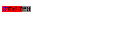
<!DOCTYPE html>
<html lang="en">
<head>
    <meta charset="UTF-8">
    <title>伪元素选择器</title>
    <style>
        div:first-letter{
            color:blue;
            font-size:20px;
        }
        div:first-line{
            background:red;
        }
        div:before{
            content:"太阳";
        }
        div:after{
            background: #8c8c8c;
            content:"篮球";
        }
    </style>
</head>
<body>
<div>你好</div>
</body>
</html>
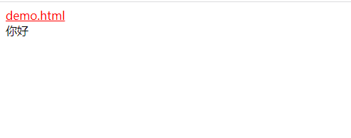
伪类选择器
:link 未访问的链接
:visited 已访问的链接
:hover 鼠标悬浮到连接上,即移动在连接上
:active 选定的链接,被激活
<!DOCTYPE html>
<html lang="en">
<head>
	<meta charset="UTF-8">
	<title>伪类选择器</title>
	<style>
		/*a:link{
			font-size: 12px;
			color:black;
			text-decoration: none;
		}
		a:visited{
			font-size: 15px;
			color:;
		}
		a:hover{
			font-size: 20px;
			color:blue;
		}
		a:active{
			font-size: 28px;
			color:red;
		}*/
		a:link,a:visited{
			color:red;
			font-size: 16px;

		}
		a:hover,a:active{
			color:#ff6300;
		}
		/*普通的标签也可以使用伪类选择器*/
		div:hover{
			color:blue;
		}
		div:active{
			color:yellow;
		}
	</style>
</head>
<body>
	<a href="demo.html">demo.html</a>
	<div>你好</div>
</body>
</html>
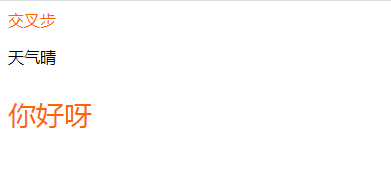
交集选择器
并且的意思,即…又
<!DOCTYPE html>
<html lang="en">
<head>
    <meta charset="UTF-8">
    <title>交集选择器</title>
</head>
<style>
.box1{
    color: #ff6300;
}
p.box1{
    font-size: 28px;
}
</style>
<body>
    <div class="box">
        <div class="box1">交叉步</div>
        <p>天气晴</p>
        <p class="box1">你好呀</p>
    </div>
</body>
</html>
并集选择器
和的意思,逗号相隔,通常用于集体声明
<!DOCTYPE html>
<html lang="en">
<head>
    <meta charset="UTF-8">
    <title>并集选择器</title>
</head>
<style>
   p,h1,.box1{
        color: aqua;
    }
</style>
<body>
<div class="box">
    <span class="box1">交叉步</span>
    <p>天气晴</p>
    <span>胡歌</span>
    <p class="box1">你好呀</p>
    <h1>周杰伦</h1>
</div>
</body>
</html>

属性选择器
选择标签带有某些属性的
<!DOCTYPE html>
<html lang="en">
<head>
    <meta charset="UTF-8">
    <title>属性选择器</title>
</head>
<style>
a[title]{
    color: #ff6300;
}
input[type=text]{
    color: #ff6300;
}
    div[class^=box]{
    /*    class是box开始的位置*/
        color: red;
        font-size: 22px;
    }
div[class$=footer]{
    /*    class是footer结束的位置*/
    color: blue;
    font-size: 22px;
}
div[class*=aa]{
    /*aa在任意位置*/
    color: aqua;
    font-size: 22px;
}
</style>
<body>
    <div>
        <a href="#" title="属性选择器">我是属性选择器</a>
        <a href="#" >你好属性选择器</a>
        <input type="text" value="文本框"/>
        <input type="text" value="文本框"/>
        <input type="text" value="文本框"/>
        <input type="submit"/>
        <div class="box1">1</div>
        <div class="box2">2</div>
        <div class="box3">3</div>
        <div class="box4">4</div>
        <div class="jd-footer">5</div>
        <div class="tb-footer">6</div>
        <div class="aa-b">7</div>
        <div class="aa-c">8</div>

    </div>
</body>
</html>

盒子模型(box model)
- 标准的盒子模型:宽度=content宽度+padding+border。内容区大小由width和height设置
- 低版本IE的盒子模型:宽度=content+border+padding。
- Box-sizing属性:用于控制元素盒子模型的解析模式,content-box:w3c的标准盒子,设置元素的 height/width 属性指的是content部分的高/宽
border-box: IE传统盒子模型。设置元素的height/width属性指的是border + padding + content部分的高/宽
对于行级元素,margin-top,margin-bottom是无效的,
对于行级元素,padding-top,padding-bottom显示上有效,但对周围元素没有影响,也可以认为无效
<!DOCTYPE html>
<html lang="en">
<head>
    <meta charset="UTF-8">
    <title>盒子模型</title>
<style>
    .main{
        /*box-sizing: content-box;*/
        box-sizing: border-box;
        width: 300px;
        height: 300px;
        background: red;
        padding: 10px;
        border: 1px solid blue;
    }
    .inile{
        /*margin-bottom: 100px;*/
        background: #8c8c8c;
        padding: 10px;
         /*  对于行级元素,margin-top,margin-bottom是无效的,对于行级元素,padding-top,padding-bottom显示上有效,但对周围元素没有影响,也可以认为无效  */
    }
    .box{
        width: 100px;
        height: 100px;
        background-color: #ff6300;
        margin-bottom: 10px;
        /*display: inline-block; 可以解决垂直外边距塌陷*/
    }
    .box1{
        width: 100px;
        height: 100px;
        background-color:gold;
        margin-top: 20px;
    /*    外边距合并,当上下两个块级元素相遇时,上元素有margin-bottom,下元素有上边距margin-top,
    则他们之间的垂直间距不是margin-top和margin-bottom的合,而是较大值。这现象称相邻垂直外边距的合并(也称外边距塌陷)*/
    }
</style>
</head>
<body>
    <div class="main">
        content
        <span>123</span>
    </div>
    <div>
        <span class="inile">demo</span>
        <div>123</div>
    </div>
    <div class="box">
        1
    </div>
    <div class="box1">
        2
    </div>
</body>
</html>
浮动布局
float:left/right
<!DOCTYPE html>
<html lang="en">
<head>
    <meta charset="UTF-8">
    <title>浮动布局</title>
</head>
<style>
    .box{
        width: 100%;
        height: 100px;
        background-color: #ff6300;
    }
    .box1{
        width: 50%;
        height: 100px;
        background-color: #8c8c8c;
        float: left;
    }
    .box2{
        float: left;
        width:50%;
        height: 100px;
        background: red;
    }
</style>
<body>
    <div class="box">

    </div>
    <div class="box1">

    </div>
    <div class="box2">

    </div>
</body>
</html>
定位布局
position(定位)
absolute:绝对定位,脱离文档流的布局,遗留下来的空间由后面的元素填充,定位的起始位置为最近的父元素(position不为static),否则为body文档本身。
relative:相对定位,不脱离文档流的布局,只改变自身的位置,在文档流原先的位置遗留空白区域,定位的起始位置为此元素原先文档流的位置。
fixed:固定定位,类似与absolute,但不随滚动条的移动而改变位置。
static:默认值;默认布局。忽略top,bottom,left,right,z-index.
sticky:类似relative和fixed的结合。
<!DOCTYPE html>
<html lang="en">
<head>
    <meta charset="UTF-8">
    <title>定位</title>
</head>
<style>
    .box{
        width: 100px;
        height: 100px;
        margin-top: 100px;
        background-color: #8c8c8c;
        position: relative;
        left: 100px;
    }
    .box-header{
        position: absolute;
        top: 10px;
        width: 60px;
        height: 60px;
        background-color: #ff6300;
    }
    .box-fixed{
        width: 100px;
        height: 100px;
        background-color: antiquewhite;
        position: fixed;
        top: 10px;
    }
</style>
<body>
    <div class="box">
        <div class="box-header">123</div>
        <div class="box-fixed"></div>
    </div>
</body>
</html>
grid布局
flex布局
适用于移动端的布局,pc端支持比较差,ie11或更低版本,不支持或仅部分支持
display:flex;
- flex的布局原理
flexible Box的缩写,弹性布局。
父盒子设置为flex布局以后,子元素的float,clear和vertical-align属性失效。
伸缩布局=弹性布局=伸缩盒布局=弹性盒布局=flex布局
常见的父亲属性
-
justify-content属性
作用:属性定义了项目在主轴上的对齐方式
取值:flex-start | flex-end | center | space-between | space-around
flex-start:默认的是从主轴开始位置对齐
flex-end:默认的是从主轴结束位置对齐
center:居中对齐,项目形成的总宽度不变
space-between:两端对齐,中间间隔宽度一样
space-around:所有项目的两侧间隔相等,主轴两端会留边
-align-items属性
设置侧轴上的子元素排列方式 -
flex-direction属性
设置主轴方向
注意:主轴和侧轴是会变化的,就看flex-direction设置谁为主轴,子元素是跟着主轴来排序的。
属性值:row|row-reverse|column|column-reverse
row:默认值从左到右
row-reverse:从右向左
column:从上到下
column-reverse:从下到上 -
align-content属性
作用:定义交叉轴上的堆砌方式
属性值:flex-start | flex-end | center | baseline | stretch
flex-start:交叉轴的开始位置对齐
flex-end:交叉轴的结束位置堆砌
center:交叉轴居中
baseline:基线对齐,文字第一行对齐
stretch:默认值!如果项目未设置高度或者设置为auto,将沾满整个容器的高度(自动填充) -
flex-flow属性
是flex-direction和flex-wrap和合并缩写形式
属性值:flex-direction|flex-wrap的属性值 -
flex-wrap属性
作用:描述如果一个轴线排列不下,如何换行
属性值:nowrap | wrap | wrap-reverse
nowrap:默认不换行,会压缩子元素
wrap:换行,第一行在上方
wrap-reverse:换行,第一行在下方
flex布局常见的子项属性
flex属性
定义子项分配的剩余空间,用flex来表示占多少份数
align-self控制子项自己在侧轴上的对齐方式
order属性定义项目的排列顺序,默认的是0,数值越小排列越靠前
<!DOCTYPE html>
<html lang="en">
<head>
    <meta charset="UTF-8">
    <title>flex布局</title>
</head>
<style>
    .box{
        display: flex;
        width: 400px;
        height: 300px;
        background-color: #8c8c8c;
        /*默认的主轴是x轴 row*/
        flex-direction: row;
        /*设置主轴上子元素的排列方式*/
        justify-content: space-around;
        /*是否换行,默认值不换行nowrap wrap*/
        flex-wrap: wrap;
        /*设置侧轴的子元素排列方式(单行)*/
        align-items: center;
        /*设置侧轴上的子元素的排列方式(多行)*/
        align-content: center;
    }
    .box span{
        width: 100px;
        height: 100px;
        background-color: pink;
        margin-left: 5px;
    }
    .box1{
        display: flex;
        width: 400px;
        height: 600px;
        margin-top: 10px;
        background-color: #8c8c8c;
        /*默认的主轴是y轴 column*/
        flex-direction: column;
        /*设置主轴上子元素的排列方式*/
        justify-content: space-around;
        align-items: center;
    }
    .box1 span{
        width: 100px;
        height: 100px;
        background-color: pink;
        margin-left: 5px;
    }
    section{
        display: flex;
        width: 500px;
        height: 150px;
        background-color: #8c8c8c;
        margin: 0 auto;
    }
    section div:nth-child(1){
        width: 100px;
        height: 150px;
        background-color: #ff6300;
    }
    section div:nth-child(2){
        flex: 1;
        background-color: blue;
        order: -1;
    }
    section div:nth-child(3){
        width: 100px;
        height: 150px;
        background-color: red;
    }
</style>
<body>
    <div class="box">
        <span>1</span>
        <span>2</span>
        <span>3</span>
        <span>4</span>
        <span>5</span>
    </div>
    <div class="box1">
        <span>1</span>
        <span>2</span>
        <span>3</span>
    </div>
    <section>
        <div></div>
        <div></div>
        <div></div>
    </section>
</body>
</html>```


 155
155


 被折叠的 条评论
为什么被折叠?
被折叠的 条评论
为什么被折叠?
 到【灌水乐园】发言


