微信小程序自定义评分小组件

大致逻辑是 使用两个标签 用第二行标签覆盖第一行的标签,其中第一行为未选中状态,第二行为点亮状态。再通过calc 根据传入的百分比计算第二行要显示的宽度,溢出隐藏。这样就可以实现评分点亮的状态,以及亮半星 或 亮3分之一等。
如图一 把第红色那一行覆盖前一行
在这里插入图片描述
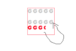
如总评分为10分 当评分为8.4时 评分组件就显示如下红色行状态


在这里插入图片描述

具体代码如下:


<view class="um-rate">
    <view class="rate-default" style="column-gap: {{gutter}}px;">
        <view class="rate-item" wx:for="{{rates}}" wx:key="item" bindtap="changeRate" data-index="{{index}}">
            <um-icon type="jiansheyinhang" size="{{size}}" color="{{voidColor}}" />
        </view>
    </view>
    <view class="rate-active" style="column-gap: {{gutter}}px;width:calc({{percent + '%'}})">
        <view  wx:for="{{rates}}" wx:key="item" bindtap="changeRate" data-index="{{index}}">
            <um-icon type="jiansheyinhang" size="{{size}}" color="{{color}}" />
        </view>
    </view>
</view>
// components/um-rate/index.js
import { getNodes } from '../../utils/util'
Component({
    /**
     * 组件的属性列表
     */
    properties: {
        value: {
            type: Number,
            value: 0
        },
        totalValue: {
            type: Number,
            value: 5
        },
        count: {
            type: Number,
            value: 5
        },
        size: {
            type: Number,
            value: 16
        },
        gutter: {
            type: Number,
            value: 4
        },
        icon: {
            type: String,
            value: 'star'
        },
        color: {
            type: String,
            value: '#ffd21e'
        },
        voidColor: {
            type: String,
            value: '#c7c7c7'
        },
        disabled: {
            type: Boolean,
            default: false
        }
    },

    /**
     * 组件的初始数据
     */
    data: {

    },
    observers: {
        value(value) {
            let { gutter, count, totalValue } = this.properties
            if (value > totalValue) value = totalValue
            this.setData({
                percent: value / totalValue * 100,
                interval: gutter / count
            })
        }
    },
    /**
     * 组件的方法列表
     */
    methods: {
        changeRate(e) {
            if (this.properties.disabled) return
            let { index } = e.currentTarget.dataset
            this.setData({
                value: ++index
            }, () => {
                this.triggerEvent('change', this.data.value)
            })
        }
    },
    lifetimes: {
        attached() {
            const { count } = this.properties
            let rates = []
            for (let i = 1; i <= count; i++) {
                rates.push(i)
            }
            this.setData({
                rates
            })
        }
    }
})

/* components/um-rate/index.wxss */
.um-rate{
    position: relative;
    display: inline-block
}

.rate-active,
.rate-default {
    position: relative;
    display: flex;
}
.rate-active{
    position: absolute;
    left: 0;
    top: 0;
    width: 0;
    overflow: hidden;
    transition:all .3s;
}

  • 0
    点赞
  • 0
    收藏
    觉得还不错? 一键收藏
  • 0
    评论
微信小程序是一种基于微信平台的应用程序,它可以在微信中直接运行,无需下载安装。而自定义组件是小程序中的一种重要功能,它允许开发者将一些常用的UI元素封装成组件,以便在不同的页面中复用。 自定义组件具有以下特点: 1. 组件是由wxml、wxss和js文件组成,可以独立定义样式和逻辑。 2. 组件可以接受外部传入的数据,通过属性进行配置。 3. 组件可以触发事件,向外部传递消息。 4. 组件可以包含子组件,形成组件的嵌套结构。 使用自定义组件的步骤如下: 1. 在小程序项目中创建一个新的文件夹,用于存放自定义组件的相关文件。 2. 在该文件夹中创建一个wxml文件,定义组件的结构。 3. 在同一文件夹中创建一个wxss文件,定义组件的样式。 4. 在同一文件夹中创建一个js文件,定义组件的逻辑。 5. 在需要使用该组件的页面中引入组件,并在wxml中使用组件标签。 例如,我们创建一个名为"custom-component"的自定义组件,其文件结构如下: ``` custom-component/ ├── custom-component.wxml ├── custom-component.wxss └── custom-component.js ``` 在custom-component.wxml中定义组件的结构,例如: ```html <view class="custom-component"> <text>{{text}}</text> <button bindtap="handleClick">点击按钮</button> </view> ``` 在custom-component.wxss中定义组件的样式,例如: ```css .custom-component { background-color: #f5f5f5; padding: 10px; } ``` 在custom-component.js中定义组件的逻辑,例如: ```javascript Component({ properties: { text: { type: String, value: '默认文本' } }, methods: { handleClick() { this.triggerEvent('click', { message: '按钮被点击了' }); } } }) ``` 在需要使用该组件的页面中引入组件,并在wxml中使用组件标签,例如: ```html <custom-component text="Hello World" bind:click="handleCustomComponentClick"></custom-component> ``` 以上就是微信小程序定义组件的简单介绍。

“相关推荐”对你有帮助么?

  • 非常没帮助
  • 没帮助
  • 一般
  • 有帮助
  • 非常有帮助
提交
评论
添加红包

请填写红包祝福语或标题

红包个数最小为10个

红包金额最低5元

当前余额3.43前往充值 >
需支付:10.00
成就一亿技术人!
领取后你会自动成为博主和红包主的粉丝 规则
hope_wisdom
发出的红包
实付
使用余额支付
点击重新获取
扫码支付
钱包余额 0

抵扣说明:

1.余额是钱包充值的虚拟货币,按照1:1的比例进行支付金额的抵扣。
2.余额无法直接购买下载,可以购买VIP、付费专栏及课程。

余额充值