


引入包:
import numpy as np
import matplotlib.pyplot as plt
可省略plt.show():
%matplotlib inline
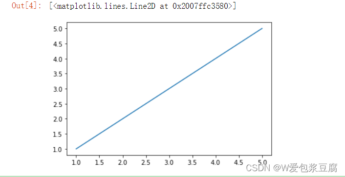
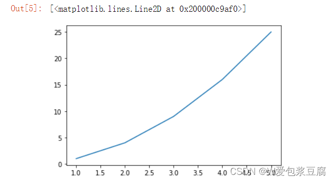
描点画线:
plt.plot([1,2,3,4,5],[1,2,3,4,5])#x y取值范围相同
plt.plot([1,2,3,4,5],[1,4,9,16,25])#相当于描点画线
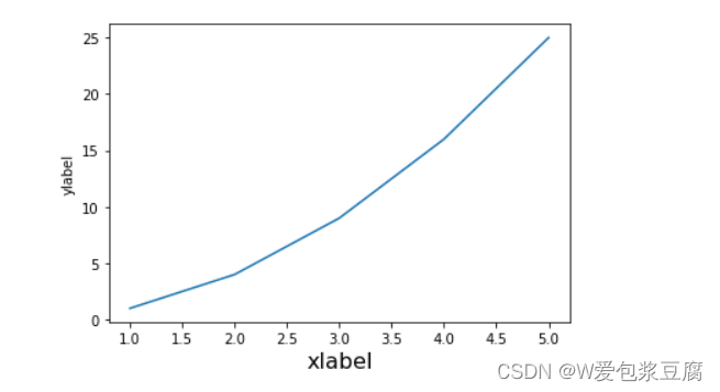
添加XY轴解释:
plt.plot([1,2,3,4,5],[1,4,9,16,25])
plt.xlabel('xlabel',fontsize = 16)
plt.ylabel('ylabel')#增加XY轴解释
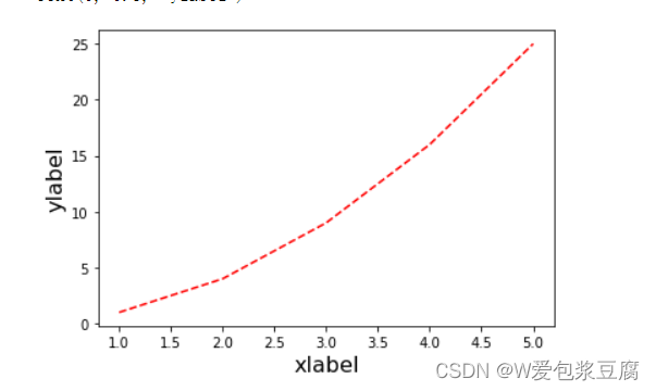
使用不同形态的线条:
plt.plot([1,2,3,4,5],[1,4,9,16,25],'--',color = 'r')#使用虚线
plt.xlabel('xlabel',fontsize = 16)
plt.ylabel('ylabel',fontsize = 16)#增加XY轴解释
可以选择的全部风格:
plt.style.available#可使用的风格
[‘Solarize_Light2’,
‘_classic_test_patch’,
‘_mpl-gallery’,
‘_mpl-gallery-nogrid’,
‘bmh’,
‘classic’,
‘dark_background’,
‘fast’,
‘fivethirtyeight’,
‘ggplot’,
‘grayscale’,
‘seaborn’,
‘seaborn-bright’,
‘seaborn-colorblind’,
‘seaborn-dark’,
‘seaborn-dark-palette’,
‘seaborn-darkgrid’,
‘seaborn-deep’,
‘seaborn-muted’,
‘seaborn-notebook’,
‘seaborn-paper’,
‘seaborn-pastel’,
‘seaborn-poster’,
‘seaborn-talk’,
‘seaborn-ticks’,
‘seaborn-white’,
‘seaborn-whitegrid’,
‘tableau-colorblind10’]
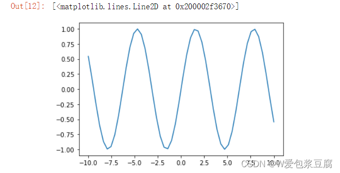
sin图像:
x = np.linspace(-10,10)
y = np.sin(x)
plt.plot(x,y)
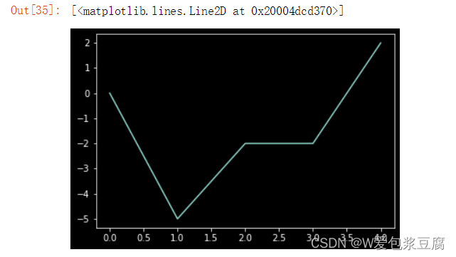
选择背景为黑色的风格:
plt.style.use('dark_background')#使用某种风格
plt.plot(x,y)
import numpy as np
import matplotlib
matplotlib.use('nbagg')#图片仅在plt.show()后显示
import matplotlib.pyplot as plt
np.random.seed(0)
x = np.arange(5)
y = np.random.randn(5)
print(x)
print(y)
fig,axes = plt.subplots(ncols = 2)
v_bars = axes[0].bar(x,y,color='red')
h_bars = axes[1].barh(x,y,color='red')#一个横向一个纵向
plt.show()
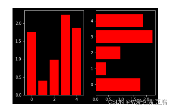
ps:当我们设置相同的seed,每次生成的随机数相同。
如果不设置seed,则每次会生成不同的随机数。
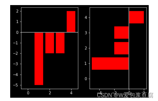
画条形图:
#条形图
np.random.seed(0)
x = np.arange(5)
y = np.random.randint(-5,5,5)
print(x)
print(y)
fig,axes = plt.subplots(ncols = 2)
v_bars = axes[0].bar(x,y,color='red')
h_bars = axes[1].barh(x,y,color='red')#一个横向一个纵向

axes[0].axhline(0,color='grey',linewidth=2)#画线
axes[1].axvline(0,color='grey',linewidth=2)
plt.show()
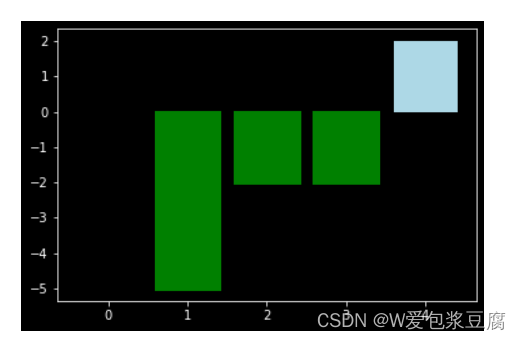
fig,ax = plt.subplots()
v_bars = ax.bar(x,y,color = 'lightblue')
for bar,height in zip(v_bars,y):
    if height < 0:
        bar.set(edgecolor = 'darkred',color = 'green',linewidth = 3)
plt.show()
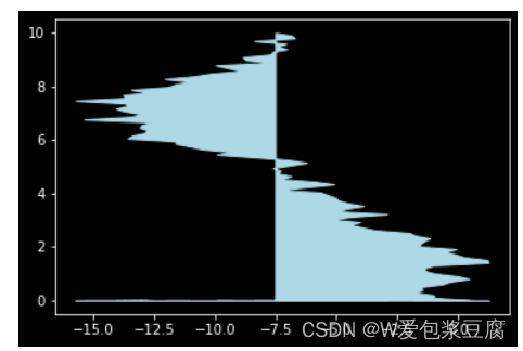
#折线图
x = np.random.randn(100).cumsum()
y = np.linspace(0,10,100)

fig,ax = plt.subplots()
ax.fill_between(x,y,color='lightblue')
plt.show()
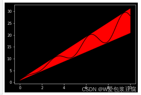
x = np.linspace(0,10,200)
y1 = 2*x +1
y2 = 3*x +1.2
y_mean = 0.5*x*np.cos(2*x) + 2.5*x +1.1
fig,ax = plt.subplots()
ax.fill_between(x,y1,y2,color='red')
ax.plot(x,y_mean,color='black')
plt.show()
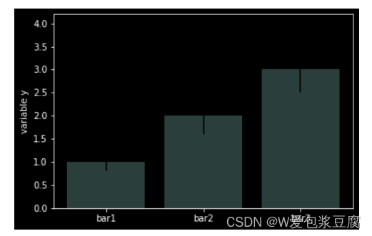
#条形图,误差棒
mean_values = [1,2,3]
variance = [0.2,0.4,0.5]
bar_label = ['bar1','bar2','bar3']

x_pos = list(range(len(bar_label)))
plt.bar(x_pos,mean_values,yerr=variance,alpha=0.3)
max_y = max(zip(mean_values,variance))
plt.ylim([0,(max_y[0]+max_y[1])*1.2])
plt.ylabel('variable y')
plt.xticks(x_pos,bar_label)
plt.show()
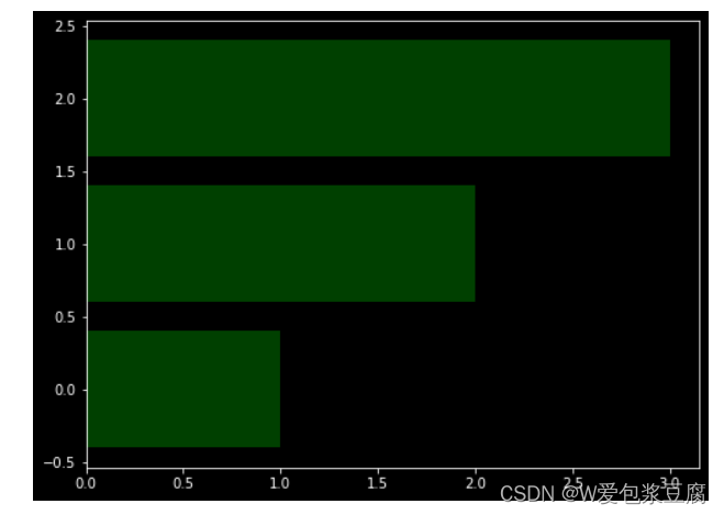
x1 = np.array([1,2,3])
x2 = np.array([2,2,3])

bar_labels = ['bar1','bar2','bar3']
fig = plt.figure(figsize = (8,6))
y_pos = np.arange(len(x1))
y_pos = [x for x in y_pos]
plt.barh(y_pos,x1,color='g',alpha=0.5)
plt.show()


 1295
1295


 被折叠的 条评论
为什么被折叠?
被折叠的 条评论
为什么被折叠?
 到【灌水乐园】发言


