


HTML + CSS 实现光影按钮
效果图
打包下载
https://download.csdn.net/download/qq_45136860/85459255
HTML
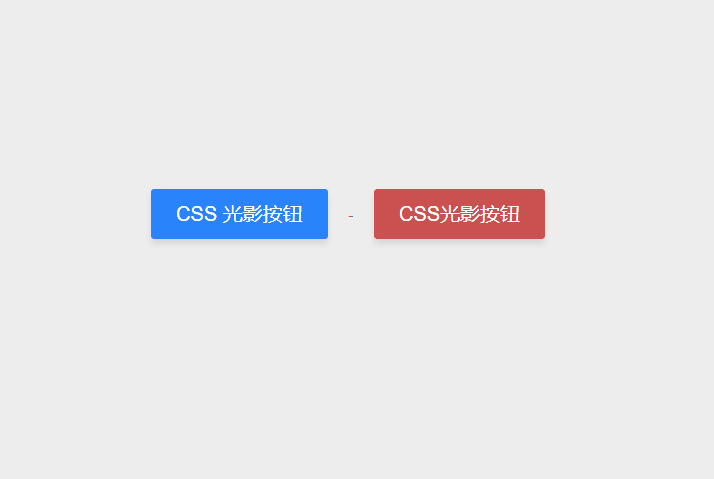
<button class="shiny">CSS 光影按钮</button>-
<button class="shinydarken">CSS光影按钮</button>
CSS
body {
    background-color: #eeeeee;
    display: -webkit-box;
    display: flex;
    -webkit-box-pack: center;
    justify-content: center;
    -webkit-box-align: center;
    align-items: center;
    height: 100vh;
    font-family: -apple-system,BlinkMacSystemFont,"Segoe UI",Roboto,Oxygen-Sans,Ubuntu,Cantarell,"Helvetica Neue",sans-serif;
}

button {
  display: block;
  position: relative;
  top: 0;
  border: 0;
  cursor: pointer;
  background: #cc5151;
  color: white;
  border-radius: 3px;
  line-height: 1;
  font-size: 20px;
  padding: 15px 25px;
  outline: 0;
  margin: 20px;
  box-shadow: 0 5px 10px rgba(0, 0, 0, 0.1);
}
button.shiny {
    background: #0587af;
    background: linear-gradient(-45deg, #2984fb 50%, #050892 60%, #3077d4 70%);
    background-size: 600% 100%;
    -webkit-animation: shine 20s infinite;
    animation: shine 20s infinite;
    -webkit-animation-delay: 0s;
    animation-delay: 0s;
    -webkit-animation-timing-function: linear;
    animation-timing-function: linear;
}
button.shinydarken {
  background: #cc5151;
  background: linear-gradient(-45deg, #cc5151 50%, #ff4a4a 60%, #cc5151 70%);
  background-size: 600% 100%;
  -webkit-animation: shine 20s infinite;
          animation: shine 20s infinite;
  -webkit-animation-delay: 0s;
          animation-delay: 0s;
  -webkit-animation-timing-function: linear;
          animation-timing-function: linear;
}
button:active {
  top: 2px;
}

@-webkit-keyframes shine {
  0% {
    background-position-x: 400%;
  }
  50% {
    background-position-x: 0%;
  }
  100% {
    background-position-x: -400%;
  }
}

@keyframes shine {
  0% {
    background-position-x: 400%;
  }
  50% {
    background-position-x: 0%;
  }
  100% {
    background-position-x: -400%;
  }
}


 1044
1044


 被折叠的 条评论
为什么被折叠?
被折叠的 条评论
为什么被折叠?
 到【灌水乐园】发言


