


// 遇到这种问题不用去看全部,因为格式是一样的,可以只看一个字符的变化,其他的遮住,就可以总结出动画效果。
<style>
.father{
width: calc(100% - 100px);
height: calc(100vh - 100px); // 这里有很多种居中的方法
display: flex;
padding: 0 50px;
margin: 0;
justify-content: space-between;
align-items: center;
font-size: 100px;
box-sizing: border-box;
}
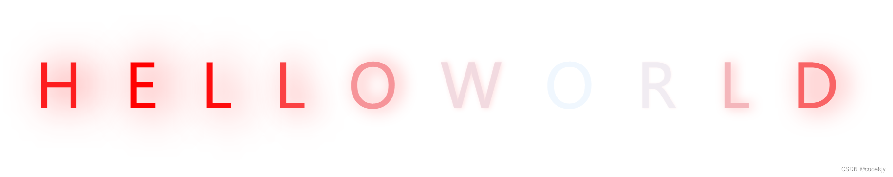
span{
color: aliceblue;
animation: trans 1s ease-in-out infinite alternate; // 动画名 一次动画的时间 动画出现消失 无限循环动画 动画交替变化
}
span:nth-child(n + 2){
animation-delay: 0.2s; // 后面字母延迟出现
}
span:nth-child(n + 3){
animation-delay: 0.4s;
}
span:nth-child(n + 4){
animation-delay: 0.6s;
}
span:nth-child(n + 5){
animation-delay: 0.8s;
}
span:nth-child(n + 6){
animation-delay: 1s;
}
span:nth-child(n + 7){
animation-delay: 1.2s;
}
span:nth-child(n + 8){
animation-delay: 1.4s;
}
span:nth-child(n + 9){
animation-delay:1.6s;
}
span:nth-child(n + 10){
animation-delay: 1.8s;
}
@keyframes trans{
to {
color: red;
text-shadow: 20px 0 70px red;
}
}
</style>
</head>
<body>
<div class="father">
<span>H</span>
<span>E</span>
<span>L</span>
<span>L</span>
<span>O</span>
<span>W</span>
<span>O</span>
<span>R</span>
<span>L</span>
<span>D</span>
</div>


 670
670


 被折叠的 条评论
为什么被折叠?
被折叠的 条评论
为什么被折叠?
 到【灌水乐园】发言


