


Python 数据可视化–Seaborn绘图总结2
Seaborn其实是在matplotlib的基础上进行了更高级的API封装,从而使得作图更加容易。同时它能高度兼容numpy与pandas数据结构以及scipy与statsmodels等统计模式

reference
文章目录
推荐阅读:
matplotlib实用绘图技巧总结
Python 数据可视化–Seaborn绘图总结1
Python数据可视化–Seaborn绘图总结2
Tableau数据分析-Chapter01条形图、堆积图、直方图
Tableau数据分析-Chapter02数据预处理、折线图、饼图
Tableau数据分析-Chapter03基本表、树状图、气泡图、词云
Tableau数据分析-Chapter04标靶图、甘特图、瀑布图
Tableau数据分析-Chapter05数据集合并、符号地图
Tableau数据分析-Chapter06填充地图、多维地图、混合地图
Tableau数据分析-Chapter07多边形地图和背景地图
Tableau数据分析-Chapter08数据分层、数据分组、数据集
Tableau数据分析-Chapter09粒度、聚合与比率
Tableau数据分析-Chapter10 人口金字塔、漏斗图、箱线图
Tableau中国五城市六年PM2.5数据挖掘
类型

-
Relational plots 关系类图表
- relplot() 关系类图表的接口,其实是下面两种图的集成,通过指定kind参数可以画出下面的两种图
- scatterplot() 散点图
- lineplot() 折线图
-
Categorical plots 分类图表
- catplot() 分类图表的接口,其实是下面八种图表的集成,通过指定kind参数可以画出下面的八种图
- stripplot() 分类散点图
- swarmplot() 能够显示分布密度的分类散点图
- boxplot() 箱图
- violinplot() 小提琴图
- boxenplot() 增强箱图
- pointplot() 点图
- barplot() 条形图
- countplot() 计数图
-
Distribution plot 分布图
- jointplot() 双变量关系图
- pairplot() 变量关系组图
- distplot() 直方图,质量估计图
- kdeplot() 核函数密度估计图
- rugplot() 将数组中的数据点绘制为轴上的数据
-
Regression plots 回归图
- lmplot() 回归模型图
- regplot() 线性回归图
- residplot() 线性回归残差图
-
Matrix plots 矩阵图
- heatmap() 热力图
- clustermap() 聚集图
pip install -i https://pypi.tuna.tsinghua.edu.cn/simple jieba
import seaborn as sns
import numpy as np
import pandas as pd
import matplotlib.pyplot as plt
%matplotlib inline
import warnings
warnings.filterwarnings("ignore")
有一套的参数可以控制绘图元素的比例。
首先,让我们通过set()重置默认的参数:
有五种seaborn的风格,它们分别是:darkgrid, whitegrid, dark, white, ticks。它们各自适合不同的应用和个人喜好。默认的主题是darkgrid。
sns.set(style="ticks")
boxplot
箱形图(Box-plot)又称为盒须图、盒式图或箱线图,是一种用作显示一组数据分散情况资料的统计图。它能显示出一组数据的最大值、最小值、中位数及上下四分位数。
"""
Grouped boxplots
================
"""
sns.set(style="ticks", palette="pastel")

# Load the example tips dataset
tips = pd.read_csv("./seaborn-data-master/tips.csv")

# Draw a nested boxplot to show bills by day and time
sns.boxplot(x="day", y="total_bill",
            hue="smoker", palette=["m", "g"],
            data=tips)
sns.despine(offset=10, trim=True)

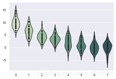
violinplot
violinplot与boxplot扮演类似的角色,它显示了定量数据在一个(或多个)分类变量的多个层次上的分布,这些分布可以进行比较。不像箱形图中所有绘图组件都对应于实际数据点,小提琴绘图以基础分布的核密度估计为特征。
"""
Violinplots with observations
=============================

"""


sns.set()

# Create a random dataset across several variables
rs = np.random.RandomState(0)
n, p = 40, 8
d = rs.normal(0, 2, (n, p))
d += np.log(np.arange(1, p + 1)) * -5 + 10

# Use cubehelix to get a custom sequential palette
pal = sns.cubehelix_palette(p, rot=-.5, dark=.3)

# Show each distribution with both violins and points
sns.violinplot(data=d, palette=pal, inner="points")
<AxesSubplot:>
"""
Grouped violinplots with split violins
======================================
"""
sns.set(style="whitegrid", palette="pastel", color_codes=True)

# Load the example tips dataset
tips = pd.read_csv("./seaborn-data-master/tips.csv")

# Draw a nested violinplot and split the violins for easier comparison
sns.violinplot(x="day", y="total_bill", hue="smoker",
               split=True, inner="quart",
               palette={"Yes": "y", "No": "b"},
               data=tips)
sns.despine(left=True)

"""
Violinplot from a wide-form dataset
===================================

"""

sns.set(style="whitegrid")

# Load the example dataset of brain network correlations
df = pd.read_csv("./seaborn-data-master/brain_networks.csv", header=[0, 1, 2], index_col=0)

# Pull out a specific subset of networks
used_networks = [1, 3, 4, 5, 6, 7, 8, 11, 12, 13, 16, 17]
used_columns = (df.columns.get_level_values("network")
                          .astype(int)
                          .isin(used_networks))
df = df.loc[:, used_columns]

# Compute the correlation matrix and average over networks
corr_df = df.corr().groupby(level="network").mean()
corr_df.index = corr_df.index.astype(int)
corr_df = corr_df.sort_index().T

# Set up the matplotlib figure
f, ax = plt.subplots(figsize=(11, 6))

# Draw a violinplot with a narrower bandwidth than the default
sns.violinplot(data=corr_df, palette="Set3", bw=.2, cut=1, linewidth=1)

# Finalize the figure
ax.set(ylim=(-.7, 1.05))
sns.despine(left=True, bottom=True)

heatmap
热力图
利用热力图可以看数据表里多个特征两两的相似度。
"""
Annotated heatmaps
==================

"""
sns.set()

# Load the example flights dataset and conver to long-form
flights_long = pd.read_csv("./seaborn-data-master/flights.csv")
flights = flights_long.pivot("month", "year", "passengers")

# Draw a heatmap with the numeric values in each cell
f, ax = plt.subplots(figsize=(9, 6))
sns.heatmap(flights, annot=True, fmt="d", linewidths=.5, ax=ax)
<AxesSubplot:xlabel='year', ylabel='month'>

"""
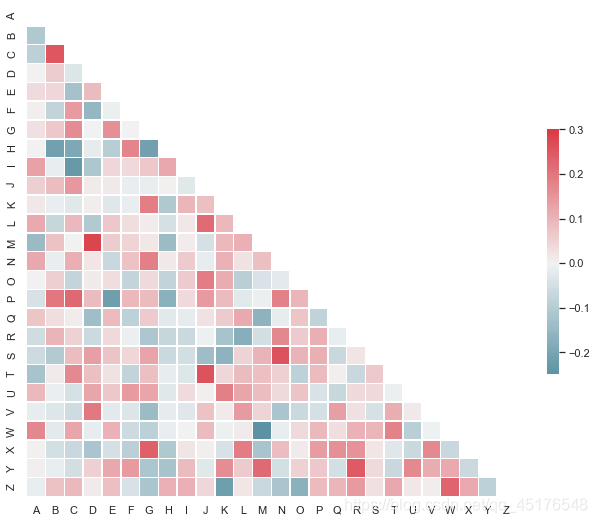
Plotting a diagonal correlation matrix
======================================
"""
from string import ascii_letters
sns.set(style="white")
# Generate a large random dataset
rs = np.random.RandomState(33)
d = pd.DataFrame(data=rs.normal(size=(100, 26)),
columns=list(ascii_letters[26:]))
# Compute the correlation matrix
corr = d.corr()
# Generate a mask for the upper triangle
mask = np.zeros_like(corr, dtype=np.bool)
mask[np.triu_indices_from(mask)] = True
# Set up the matplotlib figure
f, ax = plt.subplots(figsize=(11, 9))
# Generate a custom diverging colormap
cmap = sns.diverging_palette(220, 10, as_cmap=True)
# Draw the heatmap with the mask and correct aspect ratio
sns.heatmap(corr, mask=mask, cmap=cmap, vmax=.3, center=0,
square=True, linewidths=.5, cbar_kws={"shrink": .5})
jointplot
用于2个变量的画图
"""
Joint kernel density estimate
=============================
"""
sns.set(style="white")

# Generate a random correlated bivariate dataset
rs = np.random.RandomState(5)
mean = [0, 0]
cov = [(1, .5), (.5, 1)]
x1, x2 = rs.multivariate_normal(mean, cov, 500).T
x1 = pd.Series(x1, name="$X_1$")
x2 = pd.Series(x2, name="$X_2$")

# Show the joint distribution using kernel density estimation
g = sns.jointplot(x1, x2, kind="kde", height=7, space=0)

HexBin图
直方图的双变量类似物被称为“hexbin”图,因为它显示了落在六边形仓内的观测数。该图适用于较大的数据集。
"""
Hexbin plot with marginal distributions
=======================================
"""
sns.set(style="ticks")

rs = np.random.RandomState(11)
x = rs.gamma(2, size=1000)
y = -.5 * x + rs.normal(size=1000)

sns.jointplot(x, y, kind="hex", color="#4CB391")

"""
Linear regression with marginal distributions
=============================================

"""

sns.set(style="darkgrid")

tips = pd.read_csv("./seaborn-data-master/tips.csv")
g = sns.jointplot("total_bill", "tip", data=tips, kind="reg",
                  xlim=(0, 60), ylim=(0, 12), color="m", height=7)

barplot
条形图表示数值变量与每个矩形高度的中心趋势的估计值,并使用误差线提供关于该估计值附近的不确定性的一些指示。
"""
Horizontal bar plots
====================
"""
sns.set(style="whitegrid")

# Load the example car crash dataset
crashes = pd.read_csv("./seaborn-data-master/car_crashes.csv").sort_values("total", ascending=False)

# Initialize the matplotlib figure
f, ax = plt.subplots(figsize=(6, 15))
# Plot the total crashes
sns.set_color_codes("pastel")
sns.barplot(x="total", y="abbrev", data=crashes,
            label="Total", color="b")

# Plot the crashes where alcohol was involved
sns.set_color_codes("muted")
sns.barplot(x="alcohol", y="abbrev", data=crashes,
            label="Alcohol-involved", color="b")

# Add a legend and informative axis label
ax.legend(ncol=2, loc="lower right", frameon=True)
ax.set(xlim=(0, 24), ylabel="",
       xlabel="Automobile collisions per billion miles")
sns.despine(left=True, bottom=True)

catplot
分类图表的接口,通过指定kind参数可以画出下面的八种图
stripplot() 分类散点图
swarmplot() 能够显示分布密度的分类散点图
boxplot() 箱图
violinplot() 小提琴图
boxenplot() 增强箱图
pointplot() 点图
barplot() 条形图
countplot() 计数图
"""
Grouped barplots
================
"""
sns.set(style="whitegrid")

# Load the example Titanic dataset
titanic = pd.read_csv("./seaborn-data-master/titanic.csv")

# Draw a nested barplot to show survival for class and sex
g = sns.catplot(x="class", y="survived", hue="sex", data=titanic,
                height=6, kind="bar", palette="muted")
g.despine(left=True)
g.set_ylabels("survival probability")
<seaborn.axisgrid.FacetGrid at 0x2c7be6f7e20>

"""
Plotting a three-way ANOVA
==========================

"""

sns.set(style="whitegrid")

# Load the example exercise dataset
df = pd.read_csv("./seaborn-data-master/exercise.csv")

# Draw a pointplot to show pulse as a function of three categorical factors
g = sns.catplot(x="time", y="pulse", hue="kind", col="diet",
                capsize=.2, palette="YlGnBu_d", height=6, aspect=.75,
                kind="point", data=df)
g.despine(left=True)

pointplot
点图
"""
Conditional means with observations
===================================

"""
sns.set(style="whitegrid")
iris = pd.read_csv("./seaborn-data-master/iris.csv")

# "Melt" the dataset to "long-form" or "tidy" representation
iris = pd.melt(iris, "species", var_name="measurement")

# Initialize the figure
f, ax = plt.subplots()
sns.despine(bottom=True, left=True)

# Show each observation with a scatterplot
sns.stripplot(x="value", y="measurement", hue="species",
              data=iris, dodge=True, jitter=True,
              alpha=.25, zorder=1)

# Show the conditional means
sns.pointplot(x="value", y="measurement", hue="species",
              data=iris, dodge=.532, join=False, palette="dark",
              markers="d", scale=.75, ci=None)

# Improve the legend
handles, labels = ax.get_legend_handles_labels()
ax.legend(handles[3:], labels[3:], title="species",
          handletextpad=0, columnspacing=1,
          loc="lower right", ncol=3, frameon=True)

scatterplot
散点图
"""
Scatterplot with categorical and numerical semantics
====================================================
"""
sns.set(style="whitegrid")

# Load the example iris dataset
diamonds = pd.read_csv("./seaborn-data-master/diamonds.csv")

# Draw a scatter plot while assigning point colors and sizes to different
# variables in the dataset
f, ax = plt.subplots(figsize=(6.5, 6.5))
sns.despine(f, left=True, bottom=True)
clarity_ranking = ["I1", "SI2", "SI1", "VS2", "VS1", "VVS2", "VVS1", "IF"]
sns.scatterplot(x="carat", y="price",
                hue="clarity", size="depth",
                palette="ch:r=-.2,d=.3_r",
                hue_order=clarity_ranking,
                sizes=(1, 8), linewidth=0,
                data=diamonds, ax=ax)
<AxesSubplot:xlabel='carat', ylabel='price'>

boxenplot
增强箱图
"""
Plotting large distributions
============================

"""
sns.set(style="whitegrid")

diamonds = pd.read_csv("./seaborn-data-master/diamonds.csv")
clarity_ranking = ["I1", "SI2", "SI1", "VS2", "VS1", "VVS2", "VVS1", "IF"]

sns.boxenplot(x="clarity", y="carat",
              color="b", order=clarity_ranking,
              scale="linear", data=diamonds)
<AxesSubplot:xlabel='clarity', ylabel='carat'>

Scatterplot
散点图
"""
Scatterplot with continuous hues and sizes
==========================================

"""

sns.set()

# Load the example iris dataset
planets = pd.read_csv("./seaborn-data-master/planets.csv")

cmap = sns.cubehelix_palette(rot=-.2, as_cmap=True)
ax = sns.scatterplot(x="distance", y="orbital_period",
                     hue="year", size="mass",
                     palette=cmap, sizes=(10, 200),
                     data=planets)

"""
Scatterplot with marginal ticks
===============================
"""
sns.set(style="white", color_codes=True)

# Generate a random bivariate dataset
rs = np.random.RandomState(9)
mean = [0, 0]
cov = [(1, 0), (0, 2)]
x, y = rs.multivariate_normal(mean, cov, 100).T

# Use JointGrid directly to draw a custom plot
grid = sns.JointGrid(x, y, space=0, height=6, ratio=50)
grid.plot_joint(plt.scatter, color="g")
grid.plot_marginals(sns.rugplot, height=1, color="g")

PairGrid
用于绘制数据集中成对关系的子图网格。
"""
Paired density and scatterplot matrix
=====================================

"""

sns.set(style="white")

df = pd.read_csv("./seaborn-data-master/iris.csv")

g = sns.PairGrid(df, diag_sharey=False)
g.map_lower(sns.kdeplot)
g.map_upper(sns.scatterplot)
g.map_diag(sns.kdeplot, lw=3)

"""
Paired categorical plots
========================

"""
sns.set(style="whitegrid")

# Load the example Titanic dataset
titanic = pd.read_csv("./seaborn-data-master/titanic.csv")

# Set up a grid to plot survival probability against several variables
g = sns.PairGrid(titanic, y_vars="survived",
                 x_vars=["class", "sex", "who", "alone"],
                 height=5, aspect=.5)

# Draw a seaborn pointplot onto each Axes
g.map(sns.pointplot, scale=1.3, errwidth=4, color="xkcd:plum")
g.set(ylim=(0, 1))
sns.despine(fig=g.fig, left=True)

residplot
线性回归残差图
"""
Plotting model residuals
========================

"""

sns.set(style="whitegrid")

# Make an example dataset with y ~ x
rs = np.random.RandomState(7)
x = rs.normal(2, 1, 75)
y = 2 + 1.5 * x + rs.normal(0, 2, 75)

# Plot the residuals after fitting a linear model
sns.residplot(x, y, lowess=True, color="g")

"""
Scatterplot with varying point sizes and hues
==============================================

"""
sns.set(style="white")

# Load the example mpg dataset
mpg = pd.read_csv("./seaborn-data-master/mpg.csv")

# Plot miles per gallon against horsepower with other semantics
sns.relplot(x="horsepower", y="mpg", hue="origin", size="weight",
            sizes=(40, 400), alpha=.5, palette="muted",
            height=6, data=mpg)

swarmplot
能够显示分布密度的分类散点图
"""
Scatterplot with categorical variables
======================================

"""

sns.set(style="whitegrid", palette="muted")

# Load the example iris dataset
iris = pd.read_csv("./seaborn-data-master/iris.csv")

# "Melt" the dataset to "long-form" or "tidy" representation
iris = pd.melt(iris, "species", var_name="measurement")

# Draw a categorical scatterplot to show each observation
sns.swarmplot(x="measurement", y="value", hue="species",
              palette=["r", "c", "y"], data=iris)

pairplot
变量关系组图
"""
Scatterplot Matrix
==================

"""

sns.set(style="ticks")

df = pd.read_csv("./seaborn-data-master/iris.csv")
sns.pairplot(df, hue="species")
<seaborn.axisgrid.PairGrid at 0x2c7c11763a0>

clustermap
聚集图
"""
Discovering structure in heatmap data
=====================================

"""

sns.set()

# Load the brain networks example dataset
df = pd.read_csv("./seaborn-data-master/brain_networks.csv", header=[0, 1, 2], index_col=0)

# Select a subset of the networks
used_networks = [1, 5, 6, 7, 8, 12, 13, 17]
used_columns = (df.columns.get_level_values("network")
                          .astype(int)
                          .isin(used_networks))
df = df.loc[:, used_columns]

# Create a categorical palette to identify the networks
network_pal = sns.husl_palette(8, s=.45)
network_lut = dict(zip(map(str, used_networks), network_pal))

# Convert the palette to vectors that will be drawn on the side of the matrix
networks = df.columns.get_level_values("network")
network_colors = pd.Series(networks, index=df.columns).map(network_lut)

# Draw the full plot
sns.clustermap(df.corr(), center=0, cmap="vlag",
               row_colors=network_colors, col_colors=network_colors,
               linewidths=.75, figsize=(13, 13))


推荐阅读:
Tableau数据分析-Chapter01条形图、堆积图、直方图
Tableau数据分析-Chapter02数据预处理、折线图、饼图
Tableau数据分析-Chapter03基本表、树状图、气泡图、词云
Tableau数据分析-Chapter04标靶图、甘特图、瀑布图
Tableau数据分析-Chapter05数据集合并、符号地图
Tableau数据分析-Chapter06填充地图、多维地图、混合地图
Tableau数据分析-Chapter07多边形地图和背景地图
Tableau数据分析-Chapter08数据分层、数据分组、数据集
Tableau数据分析-Chapter09粒度、聚合与比率
Tableau数据分析-Chapter10 人口金字塔、漏斗图、箱线图
Tableau中国五城市六年PM2.5数据挖掘
到这里就结束了,如果对你有帮助你,欢迎点赞关注,你的点赞对我很重要


 3万+
3万+


 被折叠的 条评论
为什么被折叠?
被折叠的 条评论
为什么被折叠?
 到【灌水乐园】发言


