


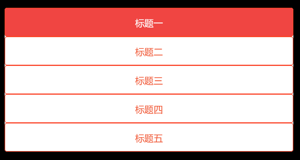
场景一:鼠标经过时背景色从左往右出现
实现思路:
1.通过伪类before复制一个li,设置宽度为0,z-index小于原本的li,复制的li背景色是你需要的变换的背景色。
     li::before {
      content: '';
      position: absolute;
      top:0;
      left:0;
      /* 位于原本li 下面 */
      z-index: -1;
      height: 100%;
      width: 0;
      /* 动画时长 */
      transition:  0.3s;
      /* 变换的背景色,这里是红色背景色 */
      background-color: rgb(240, 69, 66);
}2.鼠标经过li时,提高该li的位置,将文字颜色变为白色,此时将通过before复制出来li,宽度设置为100%。
     li:hover {
      z-index: 1;
      color: #fff;
     }
     li:hover::before {
      width: 100%;
     }
场景二:css实现背景色从左往右自动刷
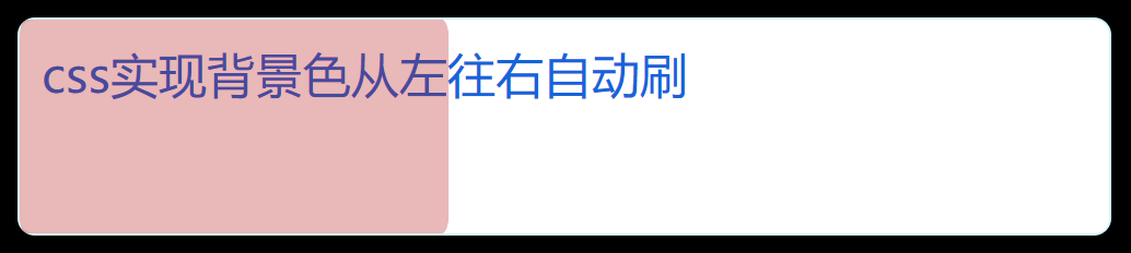
实现思路:思路与场景一相似,也是通过before伪类复制一个盒子,通过transition实现,只不过这里加了一个自动播放的动画效果。
    .box::after {
      content: '';
      position: absolute;
      left: 0;
      top: 0;
      bottom: 0;
      right: 0;
      transition: 0.3s;
      opacity: 0.3;
      border-radius: 8px;
      background: rgb(180, 17, 17);
      transform-origin: left;
      animation: LeftToRight 3s infinite;
    }

    .box:hover::after {
      transform: scaleX(1);
    }

    @keyframes LeftToRight {
      from {
        transform: scaleX(0);
      }
      to {
        transform: scaleX(1);
      }
    }
以上全部代码如下:
<!DOCTYPE html>
<html lang="en">
  <head>
    <meta charset="UTF-8" />
    <meta http-equiv="X-UA-Compatible" content="IE=edge" />
    <meta name="viewport" content="width=device-width, initial-scale=1.0" />
    <title>Document</title>
  </head>
  <body>
    <div class="box">
      <div class="text">
        css实现背景色从左往右自动刷
        </div>
      </div>
    </div>
    <ul class="list">
      <li>标题一</li>
      <li>标题二</li>
      <li>标题三</li>
      <li>标题四</li>
      <li>标题五</li>
    </ul>

  </body>
  <style>
    body {
      background-color: black;
    }
    .box {
      box-sizing: border-box;
      position: relative;
      width: 500px;
      height: 100px;
      padding: 10px;
      background: #fff;
      border-radius: 8px;
      border: 1px solid rgba(3, 210, 242, 0.16);
      color: #1564da;
      font-size: 22px;
    }

    .box::after {
      content: '';
      position: absolute;
      left: 0;
      top: 0;
      bottom: 0;
      right: 0;
      transition: 0.3s;
      opacity: 0.3;
      border-radius: 8px;
      background: rgb(180, 17, 17);
      transform-origin: left;
      animation: LeftToRight 3s infinite;
    }

    .box:hover::after {
      transform: scaleX(1);
    }
    @keyframes LeftToRight {
      from {
        transform: scaleX(0);
      }
      to {
        transform: scaleX(1);
      }
    }


    .list {
      border-radius: 4px;
      width: 500px;
      background-color: #ffffff;
      padding: 0;
    }
     li {
      position: relative;
      box-sizing: border-box;
      list-style: none;
      width: 100%;
      height: 50px;
      text-align: center;
      line-height: 50px;
      border-radius: 4px;
      color: rgb(240, 84, 49);
      border: 1px solid rgb(251, 66, 38);
     }
     li::before {
      content: '';
      position: absolute;
      top:0;
      left:0;
      /* 位于原本li 下面 */
      z-index: -1;
      height: 100%;
      width: 0;
      /* 动画时长 */
      transition:  0.3s;
      /* 变换的背景色 */
      background-color: rgb(240, 69, 66);
     }
     li:hover {
      z-index: 1;
      color: #fff;
     }
     li:hover::before {
      width: 100%;
     }
  </style>
</html>


 851
851

 被折叠的 条评论
为什么被折叠?
被折叠的 条评论
为什么被折叠?
 到【灌水乐园】发言


