


带小三角的边框如何实现
方法:使用伪元素before和after,before和after可以在标签的内部放置一个最前或最后的标签,添加的标签也同样能够继承父元素的属性。
原理图:
第一步:在div中通过before和after添加两个小三角形
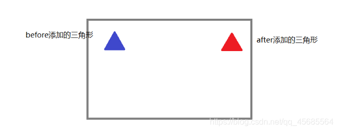
第二步:使用定位让两个三角形重叠
第三步:调整位置,将重叠的三角形移到div边框上。
第四部,将after三角形的背景颜色调整为与div的背景颜色一致,实现想要的效果。
注意:两个三角形的形状要相同,大小不同。
css中三角形的实现方法:
在border中有个transparent参数,这个参数属于border-color属性,从css2开始定义出border的颜色为透明,那么我们指定border四边的时候,只要有一边不透明,则会画出三角形。例如:
border-bottom:23px solid transparent;
border-top:23px solid transparent;
border-left:23px solid #cccccc;
border-right:23px solid transparent;
可是画出来的三角形是实心的,要想得到三角形的边框,就需要一个背景与div一样的小三角形覆盖在大三角形上面,然后通过z-index让小三角形在最上层,就能构成空心的三角形了。
接下来我们看看具体的实现吧。
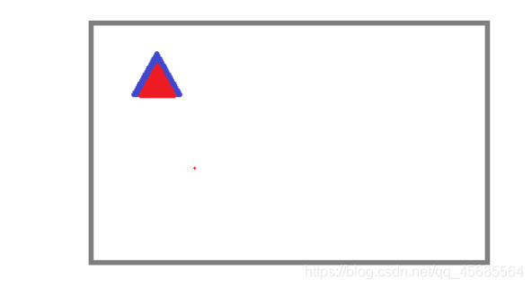
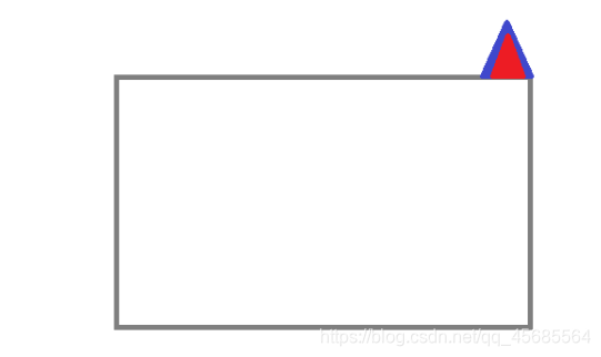
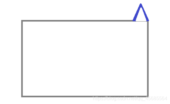
案例1:
效果:
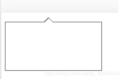
实现代码
<!doctype html>
<html lang="en">
<head>
    <meta charset="UTF-8">
    <meta name="viewport"
          content="width=device-width, user-scalable=no, initial-scale=1.0, maximum-scale=1.0, minimum-scale=1.0">
    <meta http-equiv="X-UA-Compatible" content="ie=edge">
    <title>Document</title>
    <style>
        .test{
            background-color: #fff;
            width: 200px;
            height: 100px;
            position: relative;
            border: 1px solid #000;
        }

        .test::before{
            box-sizing: content-box;
            position: absolute;
            top: -18px;;
            right:101px;
            border-bottom:9px solid #fff;
            border-top:9px solid transparent;
            border-left:9px solid transparent;
            border-right:9px solid transparent;
            display: block;
            content:'';
            z-index: 2;
        }
        .test::after{
            box-sizing: content-box;
            position: absolute;
            top: -20px;
            right:100px;
            border-bottom:10px solid #000;
            border-top:10px solid transparent;
            border-left:10px solid transparent;
            border-right:10px solid transparent;
            display: block;
            content:'';
            z-index:1
        }
    </style>
</head>
<body>
<div class="test"></div>
</body>
</html>
案例2:
效果:
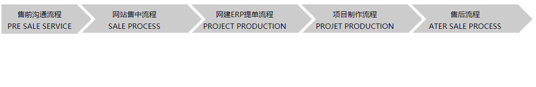
实现代码:
<!doctype html>
<html lang="en">
<head>
    <meta charset="UTF-8">
    <meta name="viewport"
          content="width=device-width, user-scalable=no, initial-scale=1.0, maximum-scale=1.0, minimum-scale=1.0">
    <meta http-equiv="X-UA-Compatible" content="ie=edge">
    <title>Document</title>
    <style>
        .container{
            /* 这个属性设置溢出隐藏*/
            overflow: hidden;
        }
       .center-in-3_bt1{
            width: 122px;
            height: 46px;
            position: relative;
            border: 1px solid #cccccc;
           background-color: #cccccc;
           float: left;
           font-size: 10px;
           text-align: center;
           line-height: 1em;


        }
       .center-in-3_bt1::before{
           box-sizing: content-box;
           position: absolute;
           top: 0px;
           right:-47px;
           border-bottom:23px solid transparent;
           border-top:23px solid transparent;
           border-left:23px solid #cccccc;
           border-right:23px solid transparent;
           display: block;
           content:'';
           z-index: 2;
       }


       .center-in-3_bt2{
           width: 172px;
           height: 44px;
           position: relative;
           border: 1px solid #cccccc;
           background-color: #cccccc;
           float: left;
           margin-left: 6px;
           font-size: 10px;
           text-align: center;
           line-height: 1em;
       }

       .center-in-3_bt2::before{
           box-sizing: content-box;
           position: absolute;
           top: 0px;
           right:-47px;
           border-bottom:23px solid transparent;
           border-top:23px solid transparent;
           border-left:23px solid #cccccc;
           border-right:23px solid transparent;
           display: block;
           content:'';
           z-index: 2;
       }
       .center-in-3_bt2::after{
           box-sizing: content-box;
           position: absolute;
           top: 0px;
           right:127px;
           border-bottom:23px solid transparent;
           border-top:23px solid transparent;
           border-left:23px solid #ffffff;
           border-right:23px solid transparent;
           display: block;
           content:'';
           z-index:1
       }


    </style>
</head>
<body>
<div class="center container">
    <div class="center-in-3_bt1">
        <p>售前沟通流程</p>
        <p>PRE SALE SERVICE</p>
    </div>
    <div class="center-in-3_bt2">
        <p>网站售中流程</p>
        <p> SALE PROCESS</p>
    </div>
    <div class="center-in-3_bt2">
        <p>网建ERP提单流程</p>
        <p> PROJECT PRODUCTION</p>
    </div>
    <div class="center-in-3_bt2">
        <p>项目制作流程</p>
        <p> PROJET PRODUCTION</p>
    </div>
    <div class="center-in-3_bt2">
        <p>售后流程</p>
        <p>ATER SALE PROCESS</p>
    </div>
</div>
</body>
</html>


 扫一扫
扫一扫


 被折叠的 条评论
为什么被折叠?
被折叠的 条评论
为什么被折叠?
 到【灌水乐园】发言


