左右侧固定实现都是一样道理的
前3种方式统一布局:
<body>
    <div class="left"></div>
    <div class="right"></div>
</body>
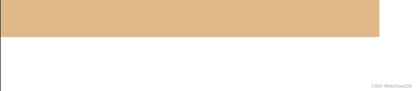
1、float:
右侧固定,左侧自由伸缩。效果图:
* {
    padding: 0;
    margin: 0;
 }
.left {
   float: right;
   width: 100px;
   height: 100px;
   background-color: transparent;
}
.right {
   height: 100px;
   margin-right: 100px;
   background-color: burlywood;
}
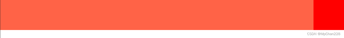
2、position:
右侧固定,左侧自由伸缩。效果图:
* {
    margin: 0;
    padding: 0;
}
.left {
     position: absolute;
     right: 0;
     width: 100px;
     height: 100px;
     background-color: red;
        }
.right {
      height: 100px;
      background-color: tomato;
      margin-right: 100px;
}
3、bfc:
左侧固定,右侧自由伸缩。效果图:

* {
padding: 0;
margin: 0;
}
.left {
float: left;
width: 100px;
height: 100px;
background-color: transparent;
}
.right {
height: 100px;
overflow: hidden;
background-color: crimson;
}
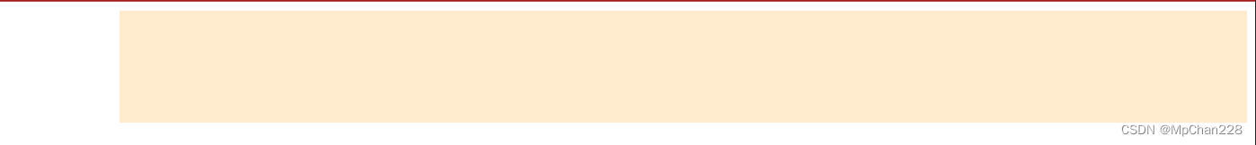
4、flex:
左侧固定,右侧自由伸缩。效果图:
布局:
<body>
    <div class="box">
        <div class="left"></div>
        <div class="right"></div>
    </div>
</body>
css:
.box {
   display: flex;
}
.right {
     flex: 1;
     height: 100px;
     background-color: blanchedalmond;
        }
.left {
     width: 100px;
     height: 100px;
     background-color: transparent;
}


 2214
2214


 被折叠的 条评论
为什么被折叠?
被折叠的 条评论
为什么被折叠?
 到【灌水乐园】发言


