


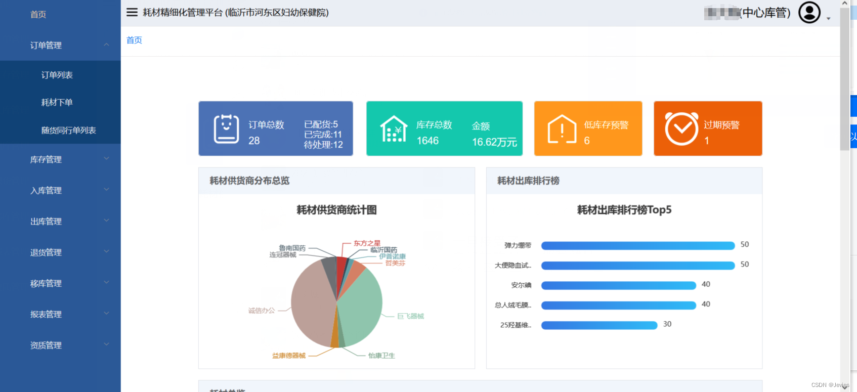
最后补充记录一下登录进行之后第一个看到的页面——也就是首页。
这个首页主要是体现一个全局总览,主要功能的快捷通道,以及近期数据汇总统计的作用,可以给用户一个较好的整体体验。
- 首先可以看到第一排的四个不同颜色的区域,既是数据统计,又是快捷按钮:前两个分别导向订单列表和库存列表;第三个黄色区域会筛选出在特定阈值以下低库存的耗材,红色则是会筛选展示出将要过期的耗材。
- 接下来是两个统计图:饼图对供货商进行了统计;柱状图则是统计了出库的耗材数量,可以看到出库数量top5的耗材。
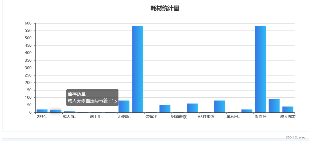
- 其次是耗材统计量,与上图不同,这个统计图涉及的种类更为广泛,更加详细。
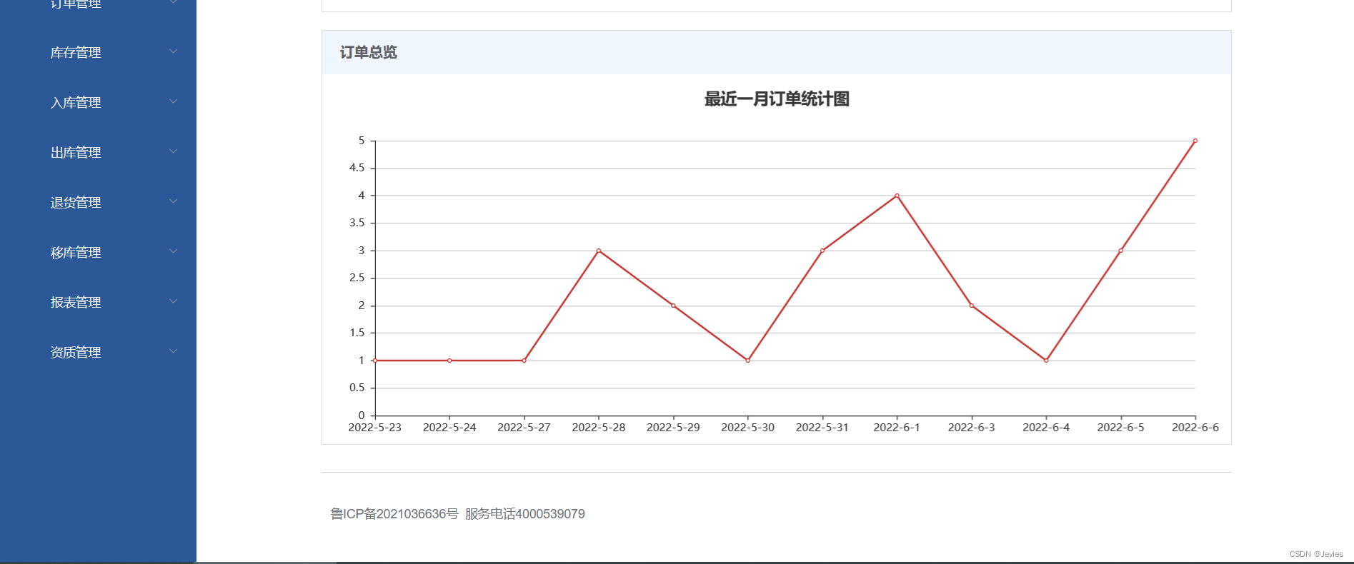
- 最后是最近一个月的订单统计图,可以很直观的看到数量的变化趋势。
 几个图标都是使用echarts画的,浅贴一下其中一个的代码:
drawBarChartTop() {
      getChartBarTop(this.listQuery).then(response => {
        const getName = [];
        const getValue = [];
        //先进行赋值,数据获取
        for (let i = 0; i < response.data.length; i++) {
          getName[i] = response.data[i].name;
          getValue[i] = response.data[i].value;
        }

        this.chartBar = this.$echarts.init(document.getElementById("chartBarTop"));
        this.chartBar.setOption({
          title: {
            text: '耗材出库排行榜Top5',
            x: 'center'
          },
          tooltip: {
            trigger: "item",
            // axisPointer: {
            //   type: "shadow",
            // },
          },
          grid: {
            left: "5%",
            containLabel: true,
          },
          xAxis: {
            type: "value",
            axisLine: {
              show: false,
            },
            axisTick: {
              show: false,
            },
            splitLine: {show: false},
            axisLabel: {show: false},
          },
          yAxis: {
            type: "category",
            data: getName,
            inverse: true,
            axisLabel: {
              //加入这段代码隐藏过长的文字,长度可以自己定义
              formatter: function (value) {
                let res = value;
                if (res.length > 5) {
                  res = res.substring(0, 5) + "..";
                }
                return res;
              }
            },
            splitLine: {show: false},
            axisLine: {
              show: false,
            },
            axisTick: {
              show: false,
            },
            offset: 10,
            nameTextStyle: {
              fontSize: 10,
            },
          },
          series: [
            {
              name: "出库数量",
              type: "bar",
              data: getValue,
              barWidth: 15,
              barGap: 5,
              smooth: true,
              label: {
                normal: {
                  show: true,
                  position: "right",
                  offset: [5, -2],
                  textStyle: {
                    color: "#333",
                    fontSize: 13,
                  },
                },
              },

              itemStyle: {
                emphasis: {
                  shadowBlur: 10,
                  shadowOffsetX: 0,
                  shadowColor: 'rgba(0, 0, 0, 0.5)'
                },
                normal: {
                  barBorderRadius: 7,
                  color: new echarts.graphic.LinearGradient(0, 0, 1, 0, [
                    {offset: 0, color: "#3977E6"},
                    {offset: 1, color: "#37BBF8"},
                  ]),
                },
              },
            },
          ],
        });
      }).catch((e) => {
        //alert(e.name + ": " + e.message);
      });
    },
首页虽然不复杂,但是还是具有相当的重要性。


 520
520


 被折叠的 条评论
为什么被折叠?
被折叠的 条评论
为什么被折叠?
 到【灌水乐园】发言


