


这里是小程序的简单笔记【啥也不懂】
2021/1/7-9/基础篇
第一章
- 开发流程:申请账号 完善信息 提交代码 审核发布
- 申请小程序账号的地址:mp.weixin.qq.com
- 开发者工具 下载
- 设计规范:友好 清晰 便捷 统一
- 运营规范:

第二章

| 文件类型 | 作用 |
|---|---|
| js (必填) | 页面逻辑 |
| wxml(必填) | 页面结构 |
| wxss | 页面样式表 |
| json | 页面配置 |
-
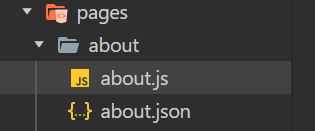
创建项目&目录文件

-
view text image
 /*about.wxml*/
 <view>
  <image src="/image/photo1.jpg"></image> /*本地图片-绝对路径*/
  <text>个人主页</text>
  <text>昵称</text>
  <text>联系方式</text>
 </view>

- 弹性盒子布局 (传统方式暂且不说)
/*about.wxml*/
<view class="container">
 <image src="/image/photo1.jpg"></image>
 <text>个人主页</text>
 <text>昵称</text>
 <text>联系方式</text>
</view>
/*about.wxss*/
.container{
  background-color: #eee;
  height:100vh;

  display: flex;
  //以下三个为新版flex默认格式:队(竖着)、适应(自我理解)、居中
  flex-direction: column;
  justify-content: space-around;
  align-items: center;
}

- 元素大小适配不同
响应式长度单位rpx:相对 (默认750,iPhone6)
/*about.wxml*/
<view class="container">
 <image class='about-banner' src="/image/photo1.jpg"></image>
 <text  style="font-weight: bold; font-size: 60rpx">个人主页</text>
 <text>昵称</text>
 <text>联系方式</text>
</view>
/*about.wxss*/
.container{
  background-color: #eee;
  height:100vh;

  display: flex;
  flex-direction: column;
  justify-content: space-around;
  align-items: center;
}
.about-banner{ //图片的样式
  width: 375rpx;
  height: 375rpx;
  border-radius: 50%; //边框圆角;圆角半径
}

- (本周推荐)新增页面的跳转-navigator
//about.wxml-跳转-url
<view class="container">
 <navigator url='/pages/weekly/weekly' hover-class="nav-hover" class="nav-default">每周推荐</navigator>
</view>

//关于行级元素使用方法
<navigator style="dispaly: inline;">
//about.wxss-注意两者顺序不能颠倒
.nav-default{
  color: blueviolet;
}
.nav-hover{
  color: red;
}


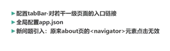
- 配置标签栏-tapBar
{
  "pages":[
    "pages/about/about",
    "pages/weekly/weekly",
    "pages/index/index",
    "pages/logs/logs"
  ],

  "tabBar":{
    "list":[
      {
        "text": "每周推荐",
        "pagePath": "pages/weekly/weekly",
        "iconPath": "image/icon/photo3.JPG",
        "selectedIconPath": "image/icon/icon1.JPG"
      },
      {
        "text":"关于",
        "pagePath":"pages/about/about",
        "iconPath":"image/icon/photo3.JPG",
        "selectdIconPath":"image/icon/icon2.JPG"
      }
    ]
  }

}
//同时实现链接跳转和页面配置跳转:open-type="switchTab"
 <navigator url='/pages/weekly/weekly' hover-class="nav-hover" class="nav-default"
 open-type="switchTab">每周推荐</navigator>
个人补充:
window属性配置
第三章
- 数据绑定
个人补充:
数据绑定
//weekly.js中配置
Page({
	data:{//自行补充
	thisWeekRecommend:{
	name:"",
	price:"",
	imagePath:""
	},
	count:23
  }
})
//weekly.wxml
<image str='{{thisWeekRecommand.imagePath}}'></image>
<text>{{thisWeekRecommand.name}}</text>
- 小程序运行环境与基本架构


- 条件渲染(wx:if="" 与hidden)
//weekly.wxml-wx:if=""  (适合不频繁改动,初始化小)
<text wx:if="{{thisWeeklyRecommand.isHighlyRecommand}}" style="font-size:16px;color:red;">强烈推荐</text>

//weekly.wxml-hidden  (适合频繁改动,初始化大)
注意这里直接取反即可  {{!xxxxx}}
<text hidden="{{!thisWeeklyRecommand.isHighlyRecommand}}" style="font-size:16px;color:red;">强烈推荐</text>
- 列表渲染(wx:for)
个人补充:
W3Cschool-列表渲染
//weekly.wxml
<view class='container' wx:for="{{thisWeeklyRecommandList}}">//注意List是个数组
	//item有点类似于循环体xxxList[i],而index相当于循环体中的i
	<text>{{item.name}}</text>
	<text>{{item.price}}</text>
</view>
//weekly.js
Page({
	data:{//自行补充
	thisWeekRecommendList:[  //每一个{}相当于数组的每个元素,从0开始
	{
	name:"",
	price:"",
	imagePath:""
	},
	{
	name:"",
	price:"",
	imagePath:""
	},
	{
	name:"",
	price:"",
	imagePath:""
	},
	count:23
  ]
})
- swiper组件
个人补充:
W3Cschool-滑块视图容器-传送门
//weekly.wxml
<swiper>
	<swiper-item>
		<text></text>
		<image></image>
	</swiper-item>
	<swiper-item></swiper-item>
	<swiper-item></swiper-item>
</swiper>
- 页面的生命周期函数
个人补充:
页面的生命周期函数-博客园传送门
//weekly.wxml
<swiper current='{{currentIndex}}'>
</swiper>

//weekly.js
Page({
	data:{//自行补充
	thisWeekRecommendList:[  //每一个{}相当于数组的每个元素,从0开始
	{
	name:"",
	price:"",
	imagePath:""
	},
	{
	name:"",
	price:"",
	imagePath:""
	},
	{
	name:"",
	price:"",
	imagePath:""
	}],
	currentIndex:0,
	count:23
	}
	onLoad:function (options){
	this.setData({
		currentIndex:this.data.thisWeekRecommand.length -1

  }
})
- 更新数据

个人补充:
事件处理函数详情-博客园传送门
2021/1/10-14/基础篇
第四章
- 小程序框架


- wxml

1.成对出现
2.不成对的出现


属性
1.通用属性
2.专用属性


常用组件

数据绑定
使用位置:
进行运算:


列表渲染

条件渲染

- wxss


常用属性


 826
826


 被折叠的 条评论
为什么被折叠?
被折叠的 条评论
为什么被折叠?
 到【灌水乐园】发言


