


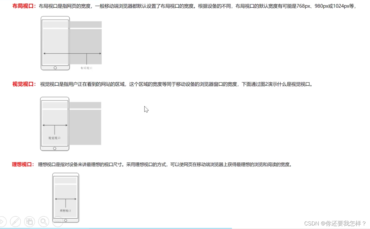
1、移动端布局
模拟器上显示分辨率
css像素:CSS像素是一个抽象的单位,主要使用在浏览器上,用来精确度量Web页面上的内容。一般情况之下,CSS像素称为与设备无关的像素,简称DIPs。CSS像素顾名思义就是我们写CSS时所用的像素。
物理分辨率:设备像素
设备像素比(dpr)=物理像素/css像素
布局像素:
(1)多用百分比
(2)弹性盒布局
(3)rem布局
<meta name="viewport" content="width=device-width,initial-scale=1.0">
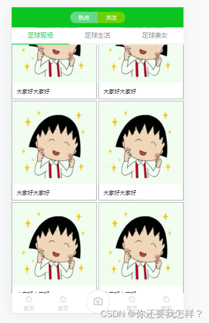
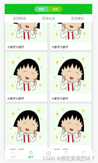
2、足球圈移动端布局案例
效果:
代码:
<!DOCTYPE html>
<html lang="en">
<head>
<meta charset="UTF-8">
<meta http-equiv="X-UA-Compatible" content="IE=edge">
<meta name="viewport" content="width=device-width, initial-scale=1.0">
<title>Document</title>
<link rel="stylesheet" href="font/iconfont.css">
<style>
*{
margin: 0%;
padding: 0%;
}
ul{
list-style: none;
}
html,body{
height: 100%;
}
body{
display: flex;
flex-direction: column;
}
header{
height: 44px;
background: #0cc420;
display: flex;
justify-content: center;
align-items: center;
}
header div{
width: 60px;
height: 25px;
line-height: 25px;
text-align: center;
font-size: 12px;
color: white;
}
header div:nth-child(1){
border-radius: 12px 0 0 12px;
background: #63d985;
}
header div:nth-child(2){
border-radius: 0 12px 12px 0;
background: #6dd006;
}
section{
flex: 1;
overflow: auto;
}
section ul{
position: sticky;
top: 0px;
display: flex;
background: white;
}
section ul li{
flex: 1;
text-align: center;
height: 35px;
line-height: 35px;
border-bottom: 1px solid #d9d9d9;
color: #8c8c8c;
font-size: 14px;
}
section ul li:hover{
border-bottom: 2px solid #08c63e;
color: #08c63e;
}
section .list{
display: flex;
flex-wrap: wrap;
justify-content: space-between;
}
section .list>div{
width: 49%;
margin-top: 4px;
border: 1px solid grey;
}
section .list>div img{
width: 100%;
}
section .list>div p{
height: 30px;
line-height: 30px;
font-size: 12px;
text-indent: 10px;
}
footer{
height: 44px;
background: white;
color: #d5d5d7;
}
footer ul{
display: flex;
height: 100%;
}
footer li{
height: 100%;
flex: 1;
display: flex;
flex-direction: column;
justify-content: center;
}
footer li:hover{
color: #08ca43;
}
footer li i{
height: 21px;
line-height: 21px;
text-align: center;
font-size: 16px;
}
footer li span{
height: 17px;
line-height: 17px;
font-size: 12px;
text-align: center;
}
footer li:nth-child(3){
position: relative;
}
footer li:nth-child(3) i{
width: 50px;
height: 50px;
border: 1px solid #dadada;
border-radius: 50%;
position: absolute;
left: 50%;
margin-left: -25px;
top:-8px;
font-size: 30px;
text-align: center;
line-height: 50px;
background: white;
}
</style>
</head>
<body>
<header>
<div>热点</div>
<div>关注</div>
</header>
<section>
<ul>
<li>足球现场</li>
<li>足球生活</li>
<li>足球美女</li>
</ul>
<div class="list">
<div>
<img src="1.png">
<p>大家好大家好</p>
</div>
<div>
<img src="1.png">
<p>大家好大家好</p>
</div>
<div>
<img src="1.png">
<p>大家好大家好</p>
</div>
<div>
<img src="1.png">
<p>大家好大家好</p>
</div>
<div>
<img src="1.png">
<p>大家好大家好</p>
</div>
<div>
<img src="1.png">
<p>大家好大家好</p>
</div>
</div>
</section>
<footer>
<ul>
<li>
<i class="iconfont icon-shouye"></i>
<span>首页</span>
</li>
<li>
<i class="iconfont icon-shouye"></i>
<span>首页</span>
</li>
<li>
<i class="iconfont icon-xiangji"></i>
</li>
<li>
<i class="iconfont icon-shouye"></i>
<span>首页</span>
</li>
<li>
<i class="iconfont icon-shouye"></i>
<span>首页</span>
</li>
</ul>
</footer>
</body>
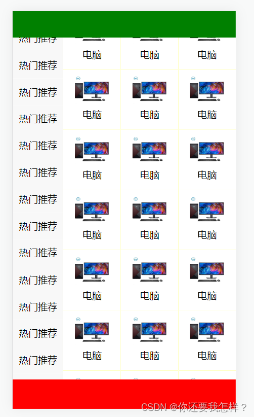
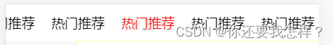
</html>3、京东分类页案例
效果:
代码:
<!DOCTYPE html>
<html lang="en">
<head>
    <meta charset="UTF-8">
    <meta http-equiv="X-UA-Compatible" content="IE=edge">
    <meta name="viewport" content="width=device-width, initial-scale=1.0">
    <title>Document</title>
    <style>
        *{
            margin: 0%;
            padding: 0%;
        }
        html,body{
            height: 100%;
        }
        ul{
            list-style: none;
        }
        body{
            display: flex;
            flex-direction: column;
        }
        header{
            height: 45px;
            background: green;
        }


        section{
            flex: 1;
            display: flex;
            overflow: auto;
        }
        section ul{
            width: 85px;
            overflow: auto;
        }
        section ul li{
            height: 45px;
            line-height: 45px;
            text-align: center;
            font-size: 16px;
            background: #f8f8f8;

        }
        section ul li:hover{
            background: white;
            color: red;
        }
        section>div{
            flex: 1;
            background: yellow;
            display: flex;
            flex-wrap: wrap;
            align-content: flex-start;
            overflow: auto;
        }
        /* 让左边“热门推荐”一栏滚动条形状消失,其实滚动效果还在 */
        ::-webkit-scrollbar{
            display: none;
        }
        section .content>div{
            height: 101px;
            width: 33.33%;
            background:white;
            text-align: center;

        }
       section .content>div img{
           width: 60px;
           height: 50px;
            margin-top: 11px;
       }

        footer{
            height: 50px;
            background: red;

        }
    </style>
</head>
<body>
    <header>

    </header>
    <section>
        <ul>
            <li>热门推荐</li>
            <li>热门推荐</li>
            <li>热门推荐</li>
            <li>热门推荐</li>
            <li>热门推荐</li>
            <li>热门推荐</li>
            <li>热门推荐</li>
            <li>热门推荐</li>
            <li>热门推荐</li>
            <li>热门推荐</li>
            <li>热门推荐</li>
            <li>热门推荐</li>
            <li>热门推荐</li>
            <li>热门推荐</li>
            <li>热门推荐</li>
            <li>热门推荐</li>
            <li>热门推荐</li>
            <li>热门推荐</li>
            <li>热门推荐</li>
            <li>热门推荐</li>
        </ul>
        <div class="content">
            <div>
                <img src="1.jpg" alt="">
                <p>电脑</p>
            </div>
            <div>
                <img src="1.jpg" alt="">
                <p>电脑</p>
            </div>
            <div>
                <img src="1.jpg" alt="">
                <p>电脑</p>
            </div>
            <div>
                <img src="1.jpg" alt="">
                <p>电脑</p>
            </div>
            <div>
                <img src="1.jpg" alt="">
                <p>电脑</p>
            </div>
            <div>
                <img src="1.jpg" alt="">
                <p>电脑</p>
            </div>
            <div>
                <img src="1.jpg" alt="">
                <p>电脑</p>
            </div>
            <div>
                <img src="1.jpg" alt="">
                <p>电脑</p>
            </div>
            <div>
                <img src="1.jpg" alt="">
                <p>电脑</p>
            </div>
            <div>
                <img src="1.jpg" alt="">
                <p>电脑</p>
            </div>
            <div>
                <img src="1.jpg" alt="">
                <p>电脑</p>
            </div>
            <div>
                <img src="1.jpg" alt="">
                <p>电脑</p>
            </div>
            <div>
                <img src="1.jpg" alt="">
                <p>电脑</p>
            </div>
            <div>
                <img src="1.jpg" alt="">
                <p>电脑</p>
            </div>
            <div>
                <img src="1.jpg" alt="">
                <p>电脑</p>
            </div>
            <div>
                <img src="1.jpg" alt="">
                <p>电脑</p>
            </div>
            <div>
                <img src="1.jpg" alt="">
                <p>电脑</p>
            </div>
            <div>
                <img src="1.jpg" alt="">
                <p>电脑</p>
            </div>
            <div>
                <img src="1.jpg" alt="">
                <p>电脑</p>
            </div>
            <div>
                <img src="1.jpg" alt="">
                <p>电脑</p>
            </div>
            <div>
                <img src="1.jpg" alt="">
                <p>电脑</p>
            </div>
            <div>
                <img src="1.jpg" alt="">
                <p>电脑</p>
            </div>
            <div>
                <img src="1.jpg" alt="">
                <p>电脑</p>
            </div>
            <div>
                <img src="1.jpg" alt="">
                <p>电脑</p>
            </div>

        </div>
    </section>
    <footer>

    </footer>
</body>
</html>
4、移动端布局-横向滚动
效果:
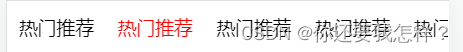
代码:
css
        header{
            height: 45px;
            background: white;
        }
        header ul{
            display: flex;
            overflow: auto;
        }
        header ul li{
            /* flex-shrink */
            /*0 不挤压 */
            /* 1 挤压 */
            flex-shrink: 0;

            line-height: 45px;
            padding: 0 10px;
        }
        header ul li:hover{
            color: red;
        }
html
  <header>
        <ul>
            <li>热门推荐</li>
            <li>热门推荐</li>
            <li>热门推荐</li>
            <li>热门推荐</li>
            <li>热门推荐</li>
            <li>热门推荐</li>
            <li>热门推荐</li>
            <li>热门推荐</li>
            <li>热门推荐</li>
            <li>热门推荐</li>
            <li>热门推荐</li>
            <li>热门推荐</li>
            <li>热门推荐</li>
            <li>热门推荐</li>
            <li>热门推荐</li>
            <li>热门推荐</li>
            <li>热门推荐</li>
            <li>热门推荐</li>
            <li>热门推荐</li>
            <li>热门推荐</li>
        </ul>
    </header>


 5325
5325


 被折叠的 条评论
为什么被折叠?
被折叠的 条评论
为什么被折叠?
 到【灌水乐园】发言


