


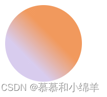
1.线性渐变
基本语法:
background:linear-gradient(direction,color-1,color-2,...);
- direction指明线性渐变的方向,默认是从上到下,css也预定义了一些方向可以选择,to right是从左到右的线性渐变,to bottom right是从左上角到右下角的线性渐变。
- 除了预定义方向,可以定义角度,0deg指创建从下到上的渐变,90deg将创建从左到右的渐变。
- color-1是起点的颜色,color-2是过渡后的颜色
<!doctype html>
<html>
  <head>
    <meta charset="UTF-8">
    <title>背景</title>
    <style>
      #box1{
        width:100px;
        height: 100px;
        border-radius: 50%;
        background-image: linear-gradient(45deg,rgb(216, 204, 238) 30%,rgb(241, 153, 93) 60%);
      }


    </style>
  </head>

  <body>
   <div id="box1"></div>
</body>
</html>
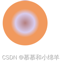
2.径向渐变
基本语法:
blackground:radial-gradient(shape,start-color,...last-color);
- 默认情况下,渐变的中心是center,渐变的形状是ellipse(椭圆形),渐变的大小是farthest-corner(表示到最远的角落)
- shape参数定义形状,其值可以是circle(圆形)或ellipse(椭圆形)
<!doctype html>
<html>
  <head>
    <meta charset="UTF-8">
    <title>背景</title>
    <style>
      #box2{
        width:100px;
        height: 100px;
        border-radius: 50%;
        background-image: radial-gradient(circle at 50% 50%,rgb(180, 126, 126),rgb(216, 204, 238) 30%,rgb(241, 153, 93) 45%);
      }

    </style>
  </head>

  <body>
   <div id="box1"></div>
   <div id="box2"></div>
</body>
</html>
3.重复径向渐变
使用repeating-radial-gradient()函数


 7917
7917


 被折叠的 条评论
为什么被折叠?
被折叠的 条评论
为什么被折叠?
 到【灌水乐园】发言


