


.ti {
        width: 40px;
        height: 100px;
        border: 50px solid red;
        border-color: transparent transparent red transparent;
    }
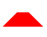
1、 梯形原理是设置一个较粗的边框,将上 右 左 设置为透明,将下边颜色填充即可实现
.yuan {
width: 100px;
height: 100px;
border-radius: 50%;
background-color: orange;
}
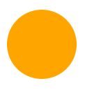
2、 这个简单 border-radius 宽高的一半即可实现
.tuoyuan {
width: 200px;
height: 100px;
background-color: darkblue;
border-radius: 50%;
}
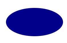
3、椭圆原理是宽是高的一半,或反之也行,形状一样,就是会调一个身位,感兴趣可以试试
.banyuan {
width: 50px;
height: 100px;
background-color: darkcyan;
border-radius: 50px 0 0 50px;
}

/*4、 半圆原理是半径的 一半数值 */
.muye {
width: 100px;
height: 66px;
background-color: red;
border-radius: 50px 0;
}
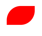
/*5、 根据半圆玩出来的,树叶飞舞之处,火亦生生不息 */
.lingxing {
width: 100px;
height: 100px;
background-color: springgreen;
transform: rotateZ(45deg);
}
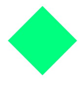
/*6、 菱形,不算太尖,但也能用用 */
.xin {
margin: 50px;
width: 100px;
height: 100px;
transform: rotateZ(45deg);
background: red;
}
    .xin::after,
    .xin::before {
        content: "";
        width: 100%;
        height: 100%;
        border-radius: 50%;
        display: block;
        background: red;
        position: absolute;
        top: -50%;
        left: 0;
    }

    .xin::before {
        top: 0;
        left: -50%;
    }
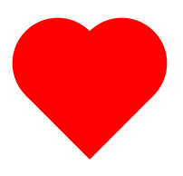
/* 7、心形由两个圆形和一个矩形进行组合得到的。 我写的最掉头发的一个形状 */


 209
209


 被折叠的 条评论
为什么被折叠?
被折叠的 条评论
为什么被折叠?
 到【灌水乐园】发言


