


3D立体圆柱堆叠柱状图
import * as echarts from 'echarts';
var chartDom = document.getElementById('main');
var myChart = echarts.init(chartDom);
var option;
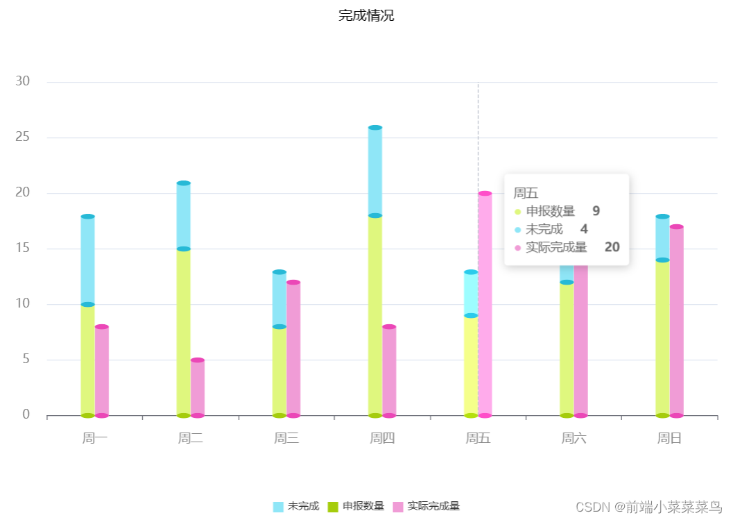
let barData1 = [10, 15, 8, 18, 9, 12, 14];
let barData2 = [8, 6, 5, 8, 4, 6, 4];
let barData3 = [8, 5, 12, 8, 20, 14, 17];
let dateX = [`周一`, '周二', '周三', '周四', '周五', '周六', '周日'];
let pictorialBar = [];
// let pictorialBar2 = [];
// let pictorialBar2 = [];
// let pictorialBar3 = [];
for (let i = 0; i < barData1.length; i++) {
// pictorialBar.push(barData1[i] + barData2[i])
// pictorialBar2.push(barData1[i] + barData2[i] + barData3[i])
if (barData2[i] > 0) {
pictorialBar.push(Number(barData1[i]) + Number(barData2[i]));
} else {
pictorialBar.push('');
}
// if (barData3[i] > 0) {
// pictorialBar2.push(Number(barData3[i]));
// } else {
// pictorialBar2.push('');
// }
}
option = {
title: {
text: '完成情况',
x: 'center',
textStyle: {
//文字颜色
color: '#000',
//字体风格,'normal','italic','oblique'
// fontStyle: 'normal',
//字体粗细 'normal','bold','bolder','lighter',100 | 200 | 300 | 400...
fontWeight: '400',
//字体系列
// fontFamily: 'sans-serif',
//字体大小
fontSize: 16
}
},
legend: {
orient: 'horizontal',
x: 'center',
y: 'bottom',
// padding: this.isDeptBedUsed == '1' ? [0, 0, 20, 0] : [0, 0, 0, 0],
itemWidth: 12,
itemHeight: 12,
data: ['未完成', '申报数量', '实际完成量'],
icon: 'rect'
},
dataZoom: this.dataZoom,
backgroundColor: '#fff',
tooltip: {
trigger: 'axis',
show: true,
formatter: function (value) {
// console.log(value);
return `<span>${value[1].axisValueLabel}</span></br>
<div style="display: inline-block;
width: 10px;
height: 20px;
color:${value[1].color.colorStops[0].color};!important
">●</div> <span>${value[1].seriesName}
</span> <span><strong>${value[1].data}</strong></span></br>
<div style="display: inline-block;
width: 10px;
height: 20px;
color:${value[3].color};!important
">●</div> <span>${value[3].seriesName}
</span> <span><strong>${value[3].data}</strong></span></br>
<div style="display: inline-block;
width: 10px;
height: 20px;
color:${value[6].color.colorStops[0].color};!important
">●</div> <span>${value[6].seriesName}
</span> <span><strong>${value[6].data}</strong></span></br>
`;
}
},
grid: {
left: '2%',
right: '2%',
bottom: '14%',
top: '15%',
containLabel: true
},
xAxis: {
data: dateX,
axisLabel: {
margin: 20,
// show: true,
// interval: 0,
textStyle: {
color: '#888',
fontSize: 14
}
}
},
yAxis: {
axisLabel: {
margin: 20,
textStyle: {
color: '#888',
fontSize: 14
}
}
},
series: [
// 底
{
name: '申报数量',
type: 'pictorialBar',
//圆片大小
symbolSize: [16, 6],
//圆片位置
symbolOffset: [-8, 3],
//显示层级
z: 12,
itemStyle: {
//lenged文本
color: '#a5cc0c'
},
data: barData1
},
//柱状图
{
name: '申报数量',
type: 'bar',
barWidth: 16,
// barCategoryGap: '10%',
barGap: '2%',
barCategoryGap: '-4%',
stack: 'group1',
// barGap: '10%',
itemStyle: {
//lenged文本
color: new echarts.graphic.LinearGradient(0, 1, 0, 0, [
{
offset: 0,
color: '#dff77e'
},
{
offset: 1,
color: '#dff77e'
}
])
},
data: barData1
},
{
name: '',
type: 'pictorialBar',
symbolSize: [16, 6],
symbolOffset: [-8, -3],
symbolPosition: 'end',
z: 12,
itemStyle: {
//lenged文本
color: '#27b9d6'
},
data: barData1
},
{
name: '未完成',
type: 'bar',
barWidth: 30,
barGap: '2%',
barCategoryGap: '-4%',
stack: 'group1',
itemStyle: {
// barBorderRadius: 20,
color: '#8fe6f7'
},
data: barData2
},
{
name: '', //头部
type: 'pictorialBar',
symbolSize: [16, 6],
symbolOffset: [-8, -2],
symbolPosition: 'end',
z: 12,
itemStyle: {
//lenged文本
color: '#27b9d6'
},
data: pictorialBar
},
// 底
{
name: '',
type: 'pictorialBar',
symbolSize: [16, 6],
symbolOffset: [8, 3],
z: 12,
itemStyle: {
//lenged文本
color: '#eb47b7'
},
data: barData3
},
//柱状图
{
name: '实际完成量',
type: 'bar',
barWidth: 16,
barGap: '2%',
barCategoryGap: '-4%',
stack: 'group2',
itemStyle: {
//lenged文本
color: new echarts.graphic.LinearGradient(0, 1, 0, 0, [
{
offset: 0,
color: '#f09cd6'
},
{
offset: 1,
color: '#f09cd6'
}
])
},
data: barData3
},
// 顶
{
name: '',
type: 'pictorialBar',
symbolSize: [16, 6],
symbolOffset: [8, -3],
symbolPosition: 'end',
z: 12,
itemStyle: {
//lenged文本
color: '#eb47b7'
},
data: barData3
}
]
};
option && myChart.setOption(option);


 3892
3892

 被折叠的 条评论
为什么被折叠?
被折叠的 条评论
为什么被折叠?
 到【灌水乐园】发言


