


<template>
  <div class="box">
    <div class="image3">
      <div class="ellipse">
        <div class="circle"></div>
      </div>
      <div class="ellipse">
        <div class="circle"></div>
      </div>
      <div class="ellipse">
        <div class="circle"></div>
      </div>
      <div class="center_circle"></div>
    </div>
  </div>
</template>

<style scoped lang="less">
.box {
  position: absolute;
  height: 500px;
  width: 500px;
  top: 0;
  left: 0;
  background-color: aquamarine;

  .image3 {
    position: fixed;
    top: 77px;
    left: 82px;
    height: 300px;
    width: 250px;
    .ellipse {
      width: 288px;
      height: 274px;
      border-radius: 50%;
      top: 0;
      left: 0;
      right: 0;
      bottom: 0;
      margin: auto;
      position: absolute;
      border: 5px rgba(255, 255, 255, 0.8) solid;
      transform-style: preserve-3d; // 开启3D
    }
    .ellipse .circle {
      width: 18px;
      height: 18px;
      border-radius: 50%;
      top: 0;
      left: 0;
      right: 0;
      bottom: 0;
      margin: auto;
      position: absolute;
      background: #fff;
      box-shadow: 0 0 20px 3px #fff;
      animation: move linear infinite; // 动画名字(name) 以相同的速度播放动画(timing-function) 无限循环(iteration-count)
    }
    .ellipse:nth-child(1) {
      transform: rotateZ(103deg) rotateY(68deg); // 旋转
    }
    .ellipse:nth-child(1) .circle {
      animation-duration: 12s;
      width: 12px;
      height: 12px;
    }
    .ellipse:nth-child(2) {
      transform: rotateZ(141deg) rotateY(68deg);
    }
    .ellipse:nth-child(2) .circle {
      animation-duration: 13s;
    }
    .ellipse:nth-child(3) {
      transform: rotateZ(207deg) rotateY(63deg);
    }
    .ellipse:nth-child(3) .circle {
      animation-duration: 14s;
      width: 12px;
      height: 12px;
    }

    .center_circle {
      width: 20px;
      height: 20px;
      border-radius: 50px;
      box-shadow: 0 0 20px 3px #fff;
      background-color: #fff;
      margin: 142px 0 0 133px;
    }
  }
  // @keyframes 关键帧
  @keyframes move {
    from {
      transform: rotateZ(0) translateX(140px) rotateZ(0) rotateY(-80deg);
    }
    to {
      transform: rotateZ(360deg) translateX(140px) rotateZ(-360deg) rotateY(-80deg);
    }
  }
}
</style>
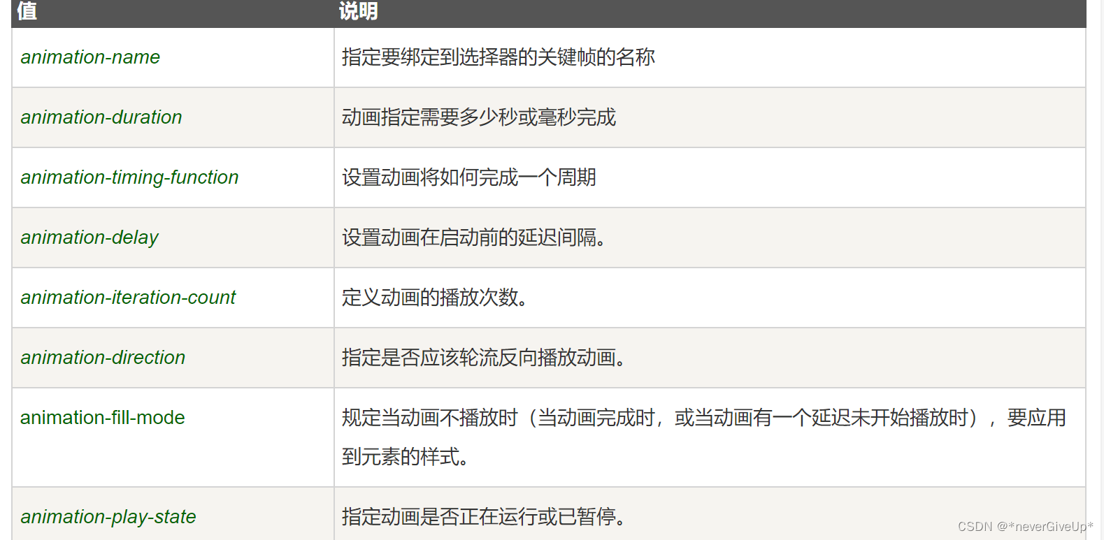
CSS3 animation(动画) 属性
菜鸟教程:https://www.runoob.com/cssref/css3-pr-animation.html
语法:animation : name duration timing-function delay iteration-count direction fill-mode play-state
CSS3 transform 属性
改属性应用于元素的2D或3D转换。这个属性允许你将元素旋转,缩放,移动,倾斜等
菜鸟教程:https://www.runoob.com/cssref/css3-pr-transform.html


 2282
2282


 被折叠的 条评论
为什么被折叠?
被折叠的 条评论
为什么被折叠?
 到【灌水乐园】发言


