


前端必备工具推荐网站(免费图床、API和ChatAI等实用工具):
http://luckycola.com.cn/
前言
H5应用的开发是前端必备技能,h5适配移动端也是业务常见的场景,如何进行必要的适配,今天做一个比较全面的总结
一、简单场景搭建
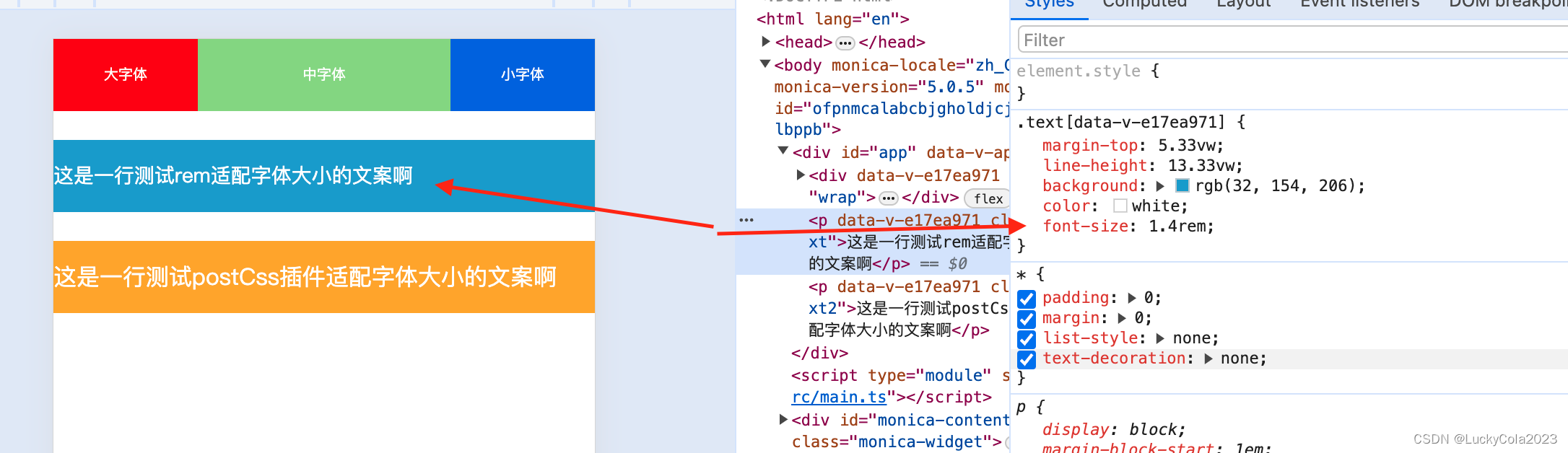
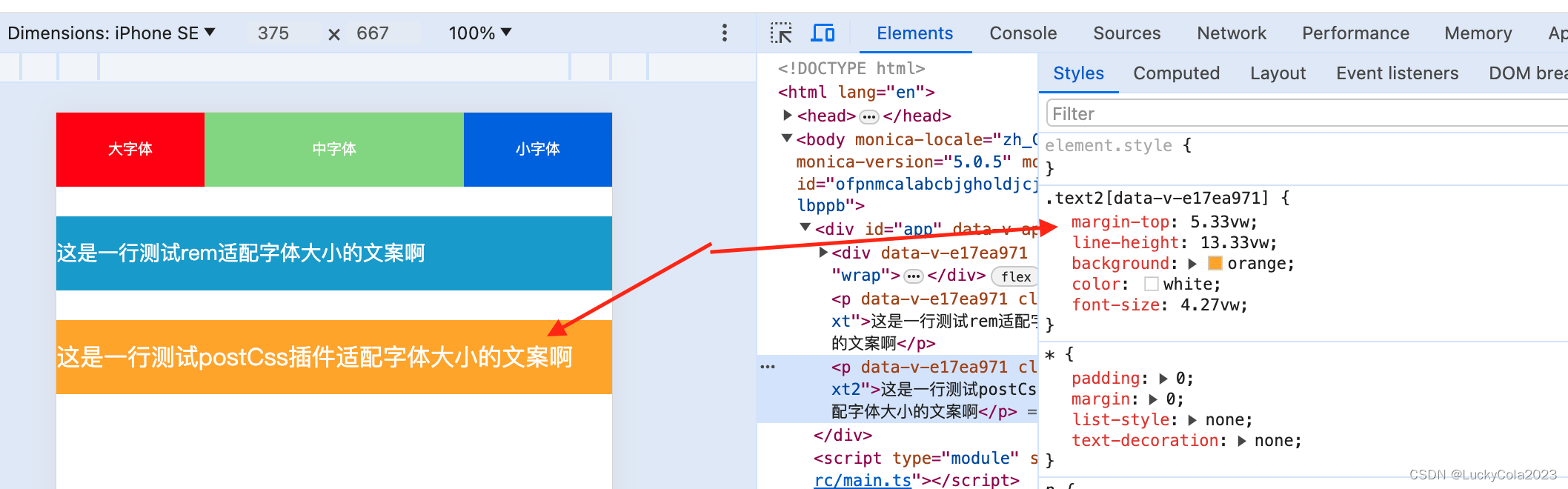
我们先简单搭建这样一个场景,下面是用ve3搭建的一个h5页面,且是一个经典的三栏布局
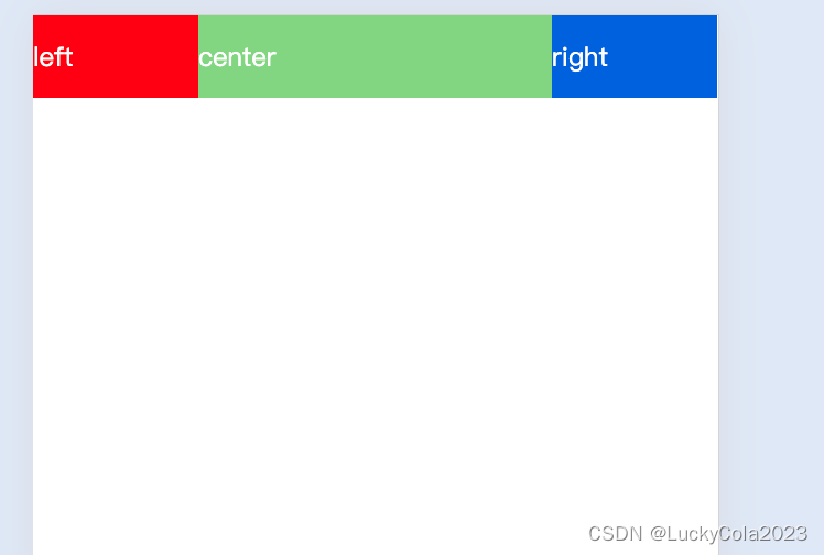
<template>
  <div class="wrap">
    <li class="item" @click="changeFontSize(20)">大字体</li>
    <li class="item" @click="changeFontSize()">中字体</li>
    <li class="item" @click="changeFontSize(12)">小字体</li>
  </div>
  <p class="text">这是一行测试rem适配字体大小的文案啊</p>
  <p class="text2">这是一行测试postCss插件适配字体大小的文案啊</p>
</template>

<style scoped>
.wrap {
  color: #888;
  display: flex;
  width: 100%;
}
.item {
  font-size: var(--myFonstSize, 15px);
  text-align: center;
}
.item:nth-child(1) {
  width: 100px;
  height: 50px;
  line-height: 50px;
  background: red;
  color: white;
}

.item:nth-child(2) {
  flex: 1;
  height: 50px;
  line-height: 50px;
  background: rgba(42, 193, 45, 0.667);
  color: white;
}

.item:nth-child(3) {
  width: 100px;
  height: 50px;
  line-height: 50px;
  background: rgb(5, 93, 226);
  color: white;
}

.text {
  margin-top: 20px;
  line-height: 50px;
  background: rgb(32, 154, 206);
  color: white;
  /* 在375设计稿下14px  使用rem单位 */
  font-size: 1.4rem;
}


.text2 {
  margin-top: 20px;
  line-height: 50px;
  background: orange;
  color: white;
  font-size: 16px;
}
</style>
二、从哪些方面进行适配?
1.对html中的meta标签进行适配
在html的header中加入以下适配移动端场景的meta标签
<meta name="viewport" content="width=device-width, initial-scale=1.0" />
加入这个标签的意义是: 告诉查询此时是移动端场景,防止一些默认样式影响页面(比如默认宽度800px会撑出滚动条)
2.清除默认样式
代码如下(示例):
* {
  padding: 0;
  margin: 0;
  list-style: none;
  text-decoration: none;
}

body {
  display: block;
  /* 触发bfc */
  overflow: hidden;
}
通过这段代码进行默认样式的清除,同时通过“overflow:hidden;”触发BFC,防止浮动塌陷等问题存在:
简单解释下BFC的:
BFC(Block Formatting Context),即块级格式化上下文,它是页面中的一块渲染区域,并且有一套属于自己的渲染规则:
- 内部的盒子会在垂直方向上一个接一个的放置
- 对于同一个BFC的俩个相邻的盒子的margin会发生重叠,与方向无关。
- 每个元素的左外边距与包含块的左边界相接触(从左到右),即使浮动元素也是如此
- 的区域不会与float的元素区域重叠,计算BFC的高度时,浮动子元素也参与计算
- BFC就是页面上的一个隔离的独立容器,容器里面的子元素不会影响到外面的元素,反之亦然,BFC目的是形成一个相对于外界完全独立的空间,让内部的子元素不会影响到外部的元素
3.使用全局变量去控制采用css值
比如整个网站字体大小是统一,那么我们可以用全局变量去控制:
:root {
  --myFonstSize: 14px;
}

.item {
  font-size: var(--myFonstSize, 15px);
  text-align: center;
}
这样做我们还可以通过js去控制全局字体大小;
import { useCssVar } from '@vueuse/core'

const changeFontSize = (size = 14) => {
  let mysize = useCssVar('--myFonstSize');
  mysize.value = size + 'px';
  console.log(mysize);

  // useCssVar实现的原理是如下
  // let _mySize = document.documentElement.style.getPropertyValue('--myFonstSize');
  // document.documentElement.style.setProperty('--myFonstSize', size + 'px')
}
4.绝对单位相对化
在移动端如果使用px这种绝对单位在不同尺寸屏幕下适配不好,所以我们需要使用像 rem \ em这种相对单位,现在提供两种方案:
方案一:结合vw 对root 下的font-size进行相对换算
以375的设计稿场景为例,换算过程如下:
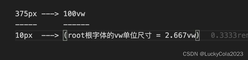
那么我们就可以设置root根字体为2.667vw
/* 375px ---> 100vw
-----      ------
10px  ---> (root根字体的vw单位尺寸 = 2.667vw) */
:root {
  --myFonstSize: 14px;
  font-size: 2.667vw;
}
在使用场景就可以使用rem单位了
.text {
  margin-top: 20px;
  line-height: 50px;
  background: orange;
  color: white;
  /* 在375设计稿下14px  使用rem单位 */
  font-size: 1.4rem;
}
方案二:通过编写postCss插件结合vw 统一对对全部font-size绝对单位进行转换
PostCss官网:
https://postcss.docschina.org/doc/writing-a-plugin.html#%E5%85%A5%E9%97%A8
- 第一步编写插件
const defaultOptions = {
    viewPortWidth: 375,
    mediaQuery: false,
    unitToConvert: 'px'
}
export const mypxToViewport = (options = defaultOptions) => {
    options = Object.assign({}, defaultOptions, options);
    return {
      postcssPlugin: 'postcss-px-to-viewport',
      /*
      Root (root, postcss) {
        // Transform CSS AST here
      }
      */

      Declaration (decl, postcss) {
        // The faster way to find Declaration node
        console.log('Declaration:', decl);
        let value = decl.value;
        //匹配到px 转换成vw
        if (value.includes(options.unitToConvert)) {
          const num = parseFloat(value)
          const transformValue = (num / options.viewPortWidth) * 100
          decl.value = `${transformValue.toFixed(2)}vw` //转换之后的值
        }
      }

      /*
      Declaration: {
        color: (decl, postcss) {
          // The fastest way find Declaration node if you know property name
        }
      }
      */
    }
}
-
注册使用
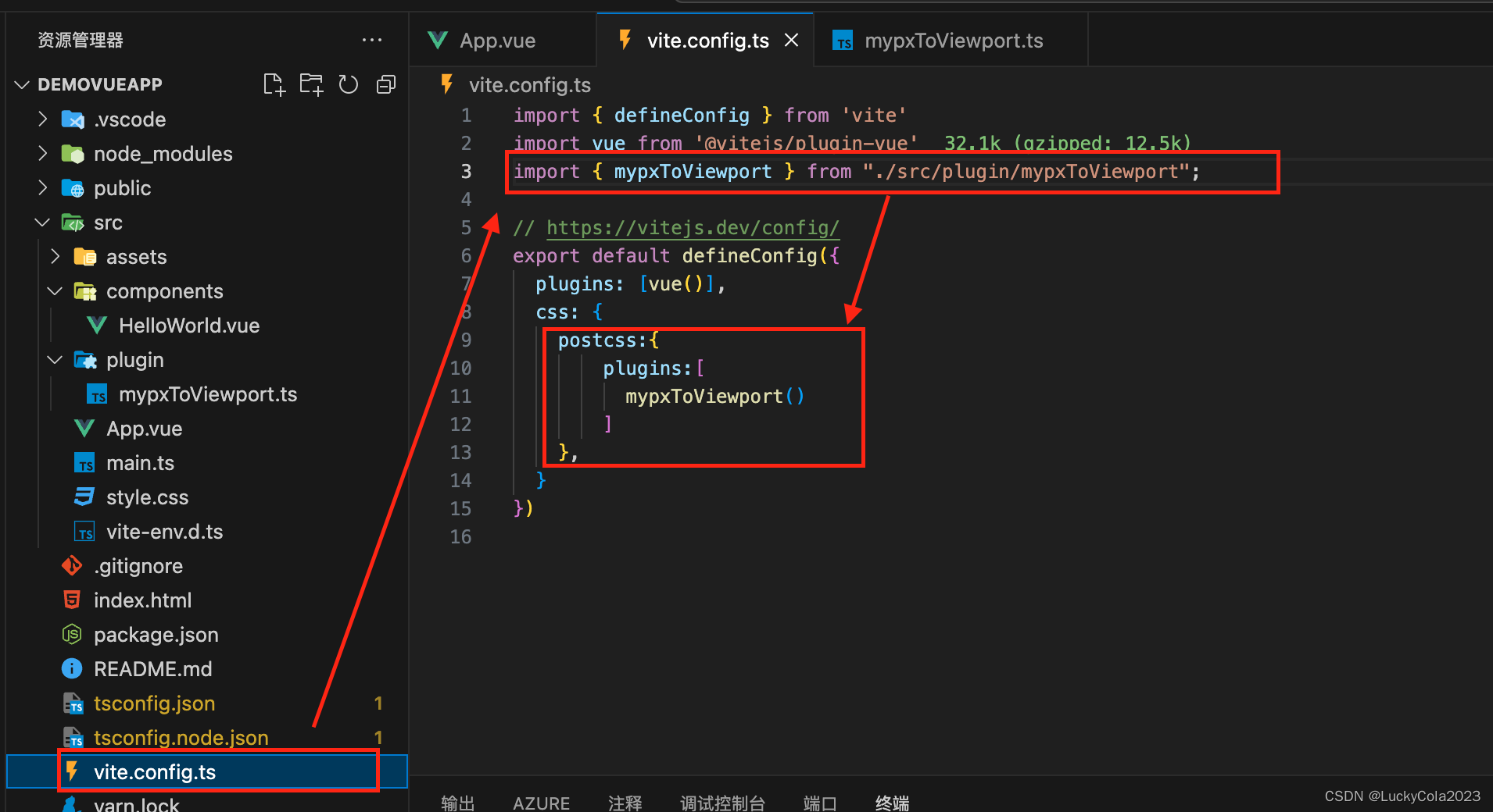
-
转换生效


 扫一扫
扫一扫


 4108
4108

 被折叠的 条评论
为什么被折叠?
被折叠的 条评论
为什么被折叠?
 到【灌水乐园】发言


