


纯HTML+CSS网页设计期末作业
网盘地址
完整代码:
https://drive.uc.cn/s/f1e0070021a94
代码效果
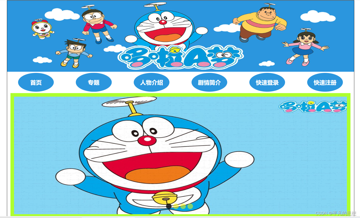
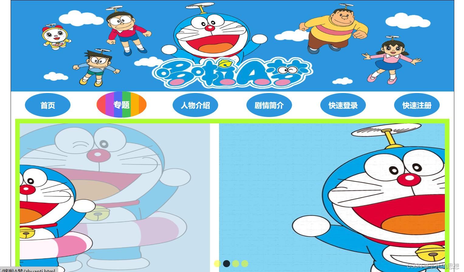
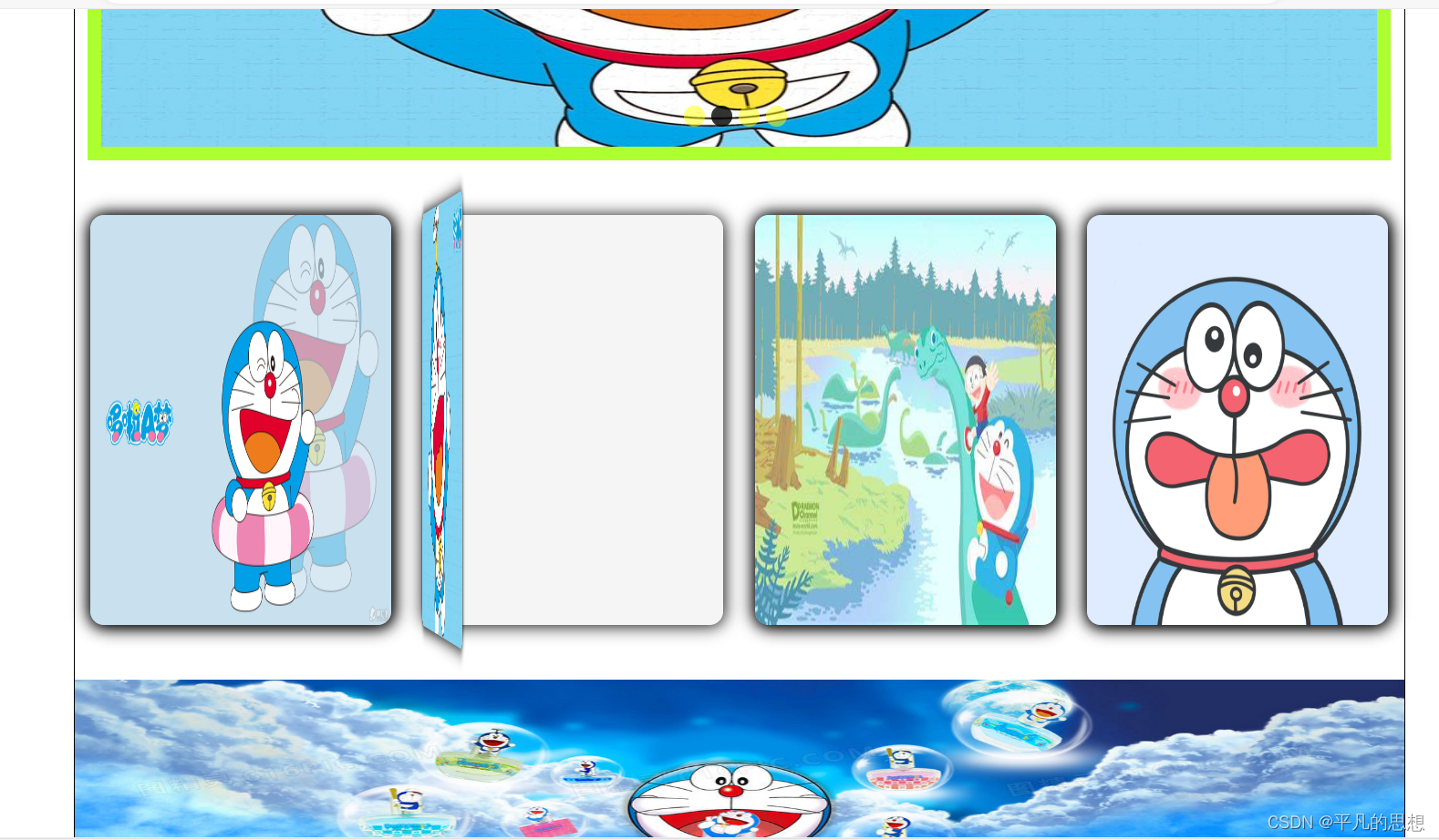
功能
1 在主页面主要实现了 书本翻页效果
2 导航栏点击效果
3 主页轮播图效果
代码实现
  <style>
        *{
            margin: 0;
            padding: 0;
            box-sizing: border-box;
        }
      .main{
        width: 80%;
        height: 100%;
        margin: auto;
        border: 1px black solid;
      }
      .tou img{
        display: block;
          width: 100%;
          height: 200px;
          margin: auto;
      }
      .n1{
        list-style: none;
        display: flex;
        flex-direction: row;
        justify-content: space-around;
        height: 60px;
      }
      .n1 li{
        line-height: 60px;
      }
      .n1 li a{
        text-decoration: none;
      }

      button {
  --width: 100px;
  --timing: 2s;
  border: 0;
  width: var(--width);
  padding-block: 1em;
  color: #fff;
  font-weight: bold;
  font-size: 1em;
 background-image: url(./image/6.jpg);
  transition: all 0.2s;
  border-radius: 50%;
}

button:hover {
  background-image: linear-gradient(to right, rgb(250, 82, 82), rgb(250, 82, 82) 16.65%, rgb(190, 75, 219) 16.65%, rgb(190, 75, 219) 33.3%, rgb(76, 110, 245) 33.3%, rgb(76, 110, 245) 49.95%, rgb(64, 192, 87) 49.95%, rgb(64, 192, 87) 66.6%, rgb(250, 176, 5) 66.6%, rgb(250, 176, 5) 83.25%, rgb(253, 126, 20) 83.25%, rgb(253, 126, 20) 100%, rgb(250, 82, 82) 100%);
  animation: var(--timing) linear dance6123 infinite;
  transform: scale(1.1) translateY(-1px);
}

@keyframes dance6123 {
  to {
    background-position: var(--width);
  }
}

      .banner {
			width: 98%;
			margin: auto;
			border: 10px solid greenyellow;
			height: 350px;
			position: relative;
			overflow: hidden;
		}

		.imgList {
			list-style: none;

			position: absolute;
		}

		.imgList img {
			width: 1000px;
			height: 350px;
		}

		.imgList li {
			float: left;
			margin-right: 20px;
		}

		.circle {
			position: absolute;
			bottom: 15px;
			left: 50%;
			transform: translateX(-50%);
		}

		.circle a {
			width: 15px;
			height: 15px;
			background: yellow;
			display: block;
			border-radius: 50%;
			opacity: .5;
			float: left;
			margin-right: 5px;
			cursor: pointer;
		}

		.circle a.hover {
			background: black;
			opacity: .8;
		}

        .book {
  position: relative;
  border-radius: 10px;
  width: 220px;
  height: 300px;
  background-color: whitesmoke;
  -webkit-box-shadow: 1px 1px 12px #000;
  box-shadow: 1px 1px 12px #000;
  -webkit-transform: preserve-3d;
  -ms-transform: preserve-3d;
  transform: preserve-3d;
  -webkit-perspective: 2000px;
  perspective: 2000px;
  display: -webkit-box;
  display: -ms-flexbox;
  display: flex;
  -webkit-box-align: center;
  -ms-flex-align: center;
  align-items: center;
  -webkit-box-pack: center;
  -ms-flex-pack: center;
  justify-content: center;
  color: #000;

}

.cover {
  top: 0;
  position: absolute;
  background-color: lightgray;
  width: 100%;
  height: 100%;
  border-radius: 10px;
  cursor: pointer;
  -webkit-transition: all 0.5s;
  transition: all 0.5s;
  transform-origin: 0;
  -webkit-box-shadow: 1px 1px 12px #000;
  box-shadow: 1px 1px 12px #000;
  display: -webkit-box;
  display: -ms-flexbox;
  display: flex;
  -webkit-box-align: center;
  -ms-flex-align: center;
  align-items: center;
  -webkit-box-pack: center;
  -ms-flex-pack: center;
  justify-content: center;
}
.cover1{
    background-image: url(./image/2.jpg);
    background-size: 100% 100%;
    background-position: center;
}
.cover2{
    background-image: url(./image/3.jpg);
    background-size: 100% 100%;
    background-position: center;
}
.cover3{
    background-image: url(./image/4.jpg);
    background-position: center;
    background-size: 100% 100%;
}
.cover4{
    background-image: url(./image/5.jpg);
    background-size: 100% 100%;
    background-position: center;
}
.book:hover .cover {
  -webkit-transition: all 0.5s;
  transition: all 0.5s;
  -webkit-transform: rotatey(-80deg);
  -ms-transform: rotatey(-80deg);
  transform: rotatey(-80deg);
}
.card{
    margin-top: 40px;
    display: flex;
        flex-direction: row;
        justify-content: space-around;
}
.font img{
    width: 100%;
    height: 150px;
    margin-top: 40px;
}
    </style>


 2432
2432

 被折叠的 条评论
为什么被折叠?
被折叠的 条评论
为什么被折叠?
 到【灌水乐园】发言


