


html css 期末大作业 登录与注册
一、源码获取
https://drive.uc.cn/s/f1e0070021a94
二、效果图
1演示视频
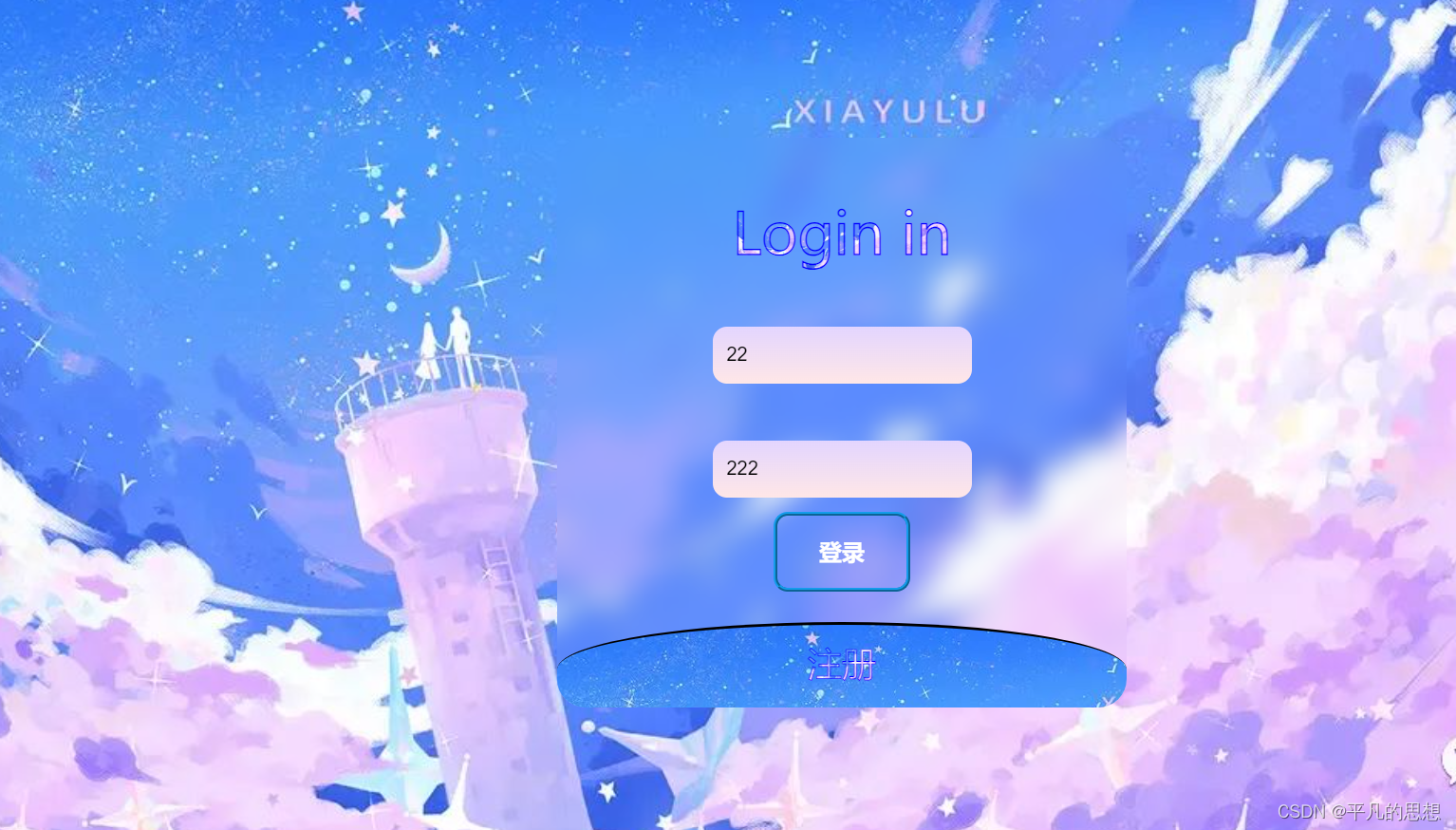
登录01
2.登录页
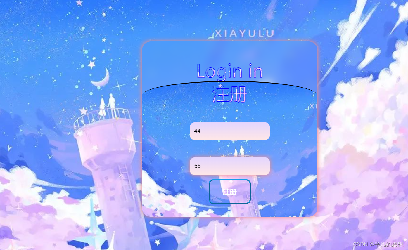
2.注册效果
三、主体代码
代码实现主要是解决动画效果以及相关的形状设计
上代码
<style>

        *{

            margin: 0;

            padding: 0;

            box-sizing: border-box;

        }

        body{

            position: relative;

            height: 100vh;

            background-image: url(./img/04.jpg);

            background-repeat: no-repeat;

            background-size: cover;

        }

        .main{

            position: absolute;

            top: 50%;

            left: 50%;

            transform: translate(-50%,-50%);

            width: 400px;

            height: 400px;

            color: rgba(255, 255, 255, 0.8);

            backdrop-filter: blur(10px);

            overflow: hidden;

            border-radius: 20px;


        }


       .first,.sec{

        display: flex;

        flex-direction: column;

        align-items: center;

        height: 300px;

        width: 100%;

       }

       .first{

        margin-top: 40px;

       }

       p{

        font-size: 40px;

        transition: 1s ease-in;

        font-family: "微软雅黑";

        background-image:url("./img/04.jpg");

        background-size: 100% 100%;

           background-clip:text;

           -webkit-text-stroke:1px #0000FF;

           -webkit-text-fill-color:transparent;


       }

       .p2{

        transform: scale(.6);

        transition: 1s ease-in;

       }

       input{

        margin-top: 40px;

        background: linear-gradient(to bottom,rgb(227, 213, 255),rgb(255, 231, 231));

        padding: 10px;

        border: none;

        outline: none;

        border-radius: 10px;

        height: 40px;

       }

       input:focus{

  box-shadow: 0 0 10px 1px #ee8c8c;

  transition: all .3s;

       }

       .sec{

        height: 400px;

        z-index: 100;

        transition: 1s ease-in;

        border-radius: 60%/10%;

        border-top: 2px black solid;

        background-image: url(./img/04.jpg);

            background-repeat: no-repeat;

            background-size: cover;

       }

       .sec:hover{

          transform: translateY(-250px);

       }

       .sec:hover .p2{

        transform: scale(1);

       }

       .sec:hover .p1{

        transform: scale(.6);

       }

        .main:hover {

            box-shadow: 0 0 10px 1px #ee8c8c;

    }

    button {

        width: 6em;

        height: 20px;

        border-radius: 10px;

        position: relative;

        height: 3.5em;

        border: 3px ridge #149CEA;

        outline: none;

        background-color: transparent;

        color: white;

        transition: 1s;

        font-size: 16px;

        font-weight: bold;

        cursor: pointer;

        margin-top: 10px;

    }


button::after {

  content: "";

  position: absolute;

  top: -10px;

  left: 3%;

  width: 95%;

  height: 40%;

  background-color: transparent;

  transition: 0.5s;

  transform-origin: center;

}


button::before {

    content: "";

    transform-origin: center;

    position: absolute;

    top: 80%;

    left: 3%;

    width: 95%;

    height: 40%;

    background-color:  transparent;

    transition: 0.5s;

}


button:hover::before, button:hover::after {

    transform: scale(0)

}


button:hover {

    box-shadow: inset 0px 0px 25px #1479EA;

}

    </style>
四、总结
代码总体效果就是这样了,记录一下。需要全部代码的,自取。


 被折叠的 条评论
为什么被折叠?
被折叠的 条评论
为什么被折叠?
 到【灌水乐园】发言


