


提示:文章写完后,目录可以自动生成,如何生成可参考右边的帮助文档
一个好看的流光按钮
一个将鼠标放置到按钮上面会出现彩色流光的按钮
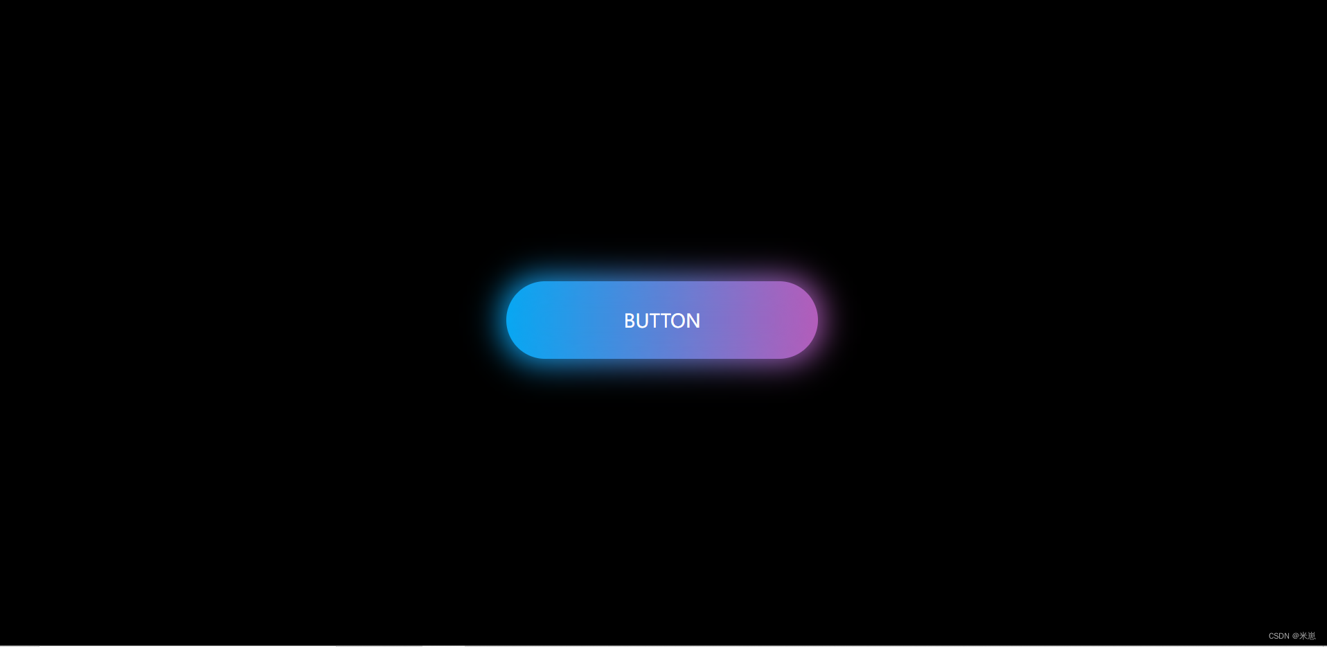
一、先看看效果
如上图,将鼠标移上去之后就会出现流光
二、代码
1.html部分
代码如下:
<!DOCTYPE html>
<html>
	<head>
		<meta charset="utf-8">
		<title>流光按钮</title>
		<link rel="stylesheet" href="css/light-button.css">
	</head>
	<body>
		<a href="#">button</a>
	</body>
</html>
2.css部分
代码如下(示例):
*{
	/* 初始化,取消页面内外边距 */
	margin: 0%;
	padding: 0%;
}

body{
	/* 弹性布局,让页面元素垂直居中 */
	display: flex;
	justify-content: center;
	align-items: center;
	/* 设置body高度100%窗口高度 */
	height: 100vh;
	background: black;
}

a{
	position: relative;
	width: 400px;
	height: 100px;
	line-height: 100px;
	text-align: center;
	/* 取消下划线 */
	text-decoration: none;
	/* 文本中的字母全部大写 */
	text-transform: uppercase;
	font-size: 24px;
	color: #fff;
	/* 渐变颜色,从右边开始 */
	background: linear-gradient(to right,#03a9f4,#f441a5,#ffeb3b,#09a8f4);
	/* 背景渐变色大小 */
	background-size: 400%;
	/* 圆角 */
	border-radius: 50px;
	z-index: 1;
}

/* 发光效果 */
a:before{
	content: "";
	position: absolute;
	top: -5px;
	left: -5px;
	bottom: -5px;
	right: -5px;
	/* 渐变颜色,从右边开始 */
	background: linear-gradient(to right,#03a9f4,#f441a5,#ffeb3b,#09a8f4);
	/* 背景渐变色大小 */
	background-size: 400%;
	/* 圆角 */
	border-radius: 50px;
	z-index: -1;
	/* 设置模糊度  显示发光效果 */
	filter: blur(20px);
}

/* 鼠标移入执行动画 */
a:hover{
	/* 动画:名称  时间  infinite是无限次播放 */
	animation: streamer 8s infinite;
}

a:hover::before{
	animation: streamer 8s infinite;
}

/* 定义动画 */
@keyframes streamer{
	 100%{
		 background-position: -400%;
	 }
}


 3402
3402


 被折叠的 条评论
为什么被折叠?
被折叠的 条评论
为什么被折叠?
 到【灌水乐园】发言


