


提示:文章写完后,目录可以自动生成,如何生成可参考右边的帮助文档
动态天气小图标
一个会动的天气图标
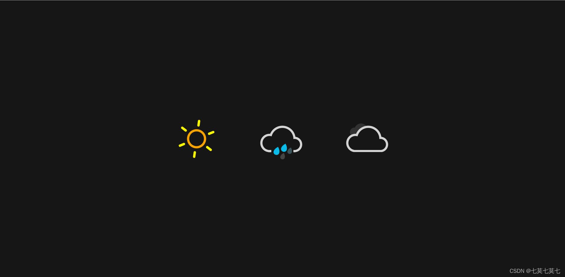
一、先看看效果
如上图
二、代码
1.html部分
代码如下:
<!DOCTYPE html>
<html>
	<head>
		<meta charset="utf-8">
		<title></title>
		<link rel="stylesheet" href="css/weathericon.css">
	</head>
	<body>
		<div class="container">
			<!-- 晴天 -->
			<div class="sunny">
				<div class="sun">
					<div class="rays"></div>
				</div>
			</div>
			<!-- 雨天 -->
			<div class="rainy">
				<div class="cloud"></div>
				<div class="rain"></div>
			</div>
			<!-- 多云 -->
			<div class="cloudy">
				<div class="cloud"></div>
				<div class="cloud"></div>
			</div>
		</div>
	</body>
</html>
2.css部分
代码如下(示例):
*{

	margin: 0;
	padding: 0;
}
body{

	height: 100vh;
	display: flex;
	justify-content: center;
	align-items: center;
	/* 自定义属性 */
	--bg--color:#161616;
	background-color: var(--bg--color);
}
.container{

	width: 700px;
	display: flex;
	justify-content: space-around;
}
.sunny{

	position: relative;
	width: 100px;
	height: 100px;
	display: flex;
	justify-content: center;
	align-items: center;
}
.sunny .sun{

	width: 40px;
	height: 40px;
	border-radius: 50
最低0.47元/天 解锁文章


 扫一扫
扫一扫


 214
214

 被折叠的 条评论
为什么被折叠?
被折叠的 条评论
为什么被折叠?
 到【灌水乐园】发言


